120_Template_variables
Previous Page Next Page Table of content
Depending of the option, the template can use one or more variable in the formula.
Templates are used on 3 places :
- for presenting the Y Axis value (see option scaleLabel)
- for presenting the inGraphData (see option inGraphDataTmpl)
- for presenting the annotates (see option annotateLabel)
For scaleLabel, only one symbolic variable can be used : “value” which present the value on the Y Axis.
Example : see previous chapter.
For inGraphDataTmpl and annotateLabel you can use much more variables. For some graph type, you can use up to 13 different variables. The variables have for name v1, v2, v3, …. V13.
The signification of each variable depends of the graph type where they are used. Let’s go through all those variables for each graph type.
- v1 : label associated to the data;
- v2 : data value
- v3 : cumulated Value
- v4 : total of all data Value
- v5 : Angle in radiant
- v6 : percentage (=100*v2/v4)
- v7 : X coordinate of the mid-point of thecircle;
- v8 : Y coordinate of the mid-point of the circle;
- v9 : inside radius
- v10 : outside radius of the piece of graph
- V11 : start angle (in radiant);
- V12 : stop angle (in radiant);
- v13 : position in the data
Example :
var myoptions = {
  inGraphDataShow : true,
  inGraphDataTmpl : "<%=v1+' '+v2+' '+v3+' '+v4+' '+v5+' '+v6+' '+v7+' '+v8+' '+v9+' '+v10+' '+v11+' '+v12+' '+v13%>"
}
var datapie = [
{
	value : 30,
	color: "#D97041",
	title : "January"
},
{
	value : 90,
	color: "#C7604C",
	title : "February"
},
{
	value : 24,
	color: "#21323D",
	title : "March"
},
{
	value : 58,
	color: "#9D9B7F",
	title : "April"
},
{
	value : 82,
	color: "#7D4F6D",
	title : "May"
},
{
	value : 8,
	color: "#584A5E",
	title : "June"
}
]

Associated to February, the in graph data displays following information when option inGraphDataTmpl has value "<%=v1+' '+v2+' '+v3+' '+v4+' '+v5+' '+v6+' '+v7+' '+v8+' '+v9+' '+v10+' '+v11+' '+v12+' '+v13%>" : “February 90 120 292 1.94 30.8 600 300 0 149.01 5.36 7.29 1”
- V1 = February
- v2 = 90 (= value associated to February in the data)
- v3 = 120 (= total of all value up to February = January (30) + February (90) )
- v4 = 282 (= grand total = January (30) + February (90) + March (24) + … + June(8))
- v5 = 1.94 (= angle in radiant of the “February” piece of chart)
- v6 = 30.8 (= percent of the graph for February = 100*v2/v4)
- (v7,v8) = (600,300) = (X,Y) coordinate of the center of the Pie
- v9 = 0 (=radius of the inside part (0 for Pie chart; >0 for doughnut)
- v10 = 149.01 (=radius of the Pie chart)
- v11 = 5.36 (=start angle in radiant of February)
- v12 = 7.29 (=stop angle in radiant of February)
- v13 = 1 (= February is the second data in the series ; The first data (January has 0 for v13 value)).
- V1 : title associated to the line/area (= title of the data)
- v2 : label associated to the data
- v3 : data value
- v4 : difference between the data of previous line and the data (v3)
- v5 : difference between the data (v3) and the data on next line
- v6 : max value for the data
- v7 : total of the values of the data
- v8 : percentage ( = 100*v3/v7)
- (v9,v10) : (X,Y) coordinate of the point
- v11 : position of the line
- v12: position of the data in the series
Example :
var dataline = {
labels : ["Eating","Drinking","Sleeping","Designing"],
datasets : [
	{
		fillColor : "rgba(220,0,0,0.5)",
		strokeColor : "rgba(220,0,0,0.5)",
		pointColor : "rgba(220,0,0,0.5)",
		pointStrokeColor : "rgba(220,0,0,0.5)",
		data : [90,81,98,98] ,
		title : "Year 2014"
	},
	{
		fillColor : "rgba(0,220,0,0.5)",
		strokeColor : "rgba(0,220,0,0.5)",
		pointColor : "rgba(0,220,0,0.5)",
		pointStrokeColor : "rgba(0,220,0,0.5)",
		data : [65,59,90,81] ,
	title : "Year 2013"
	},
	{
		fillColor : "rgba(0,0,220,0.5)",
		strokeColor : "rgba(0,0,220,0.5)",
		pointColor : "rgba(0,0,220,0.5)",
		pointStrokeColor : "rgba(0,0,220,0.5)",
		data : [30,35,60,20] ,
		title : "Year 2012"
	}
]
}
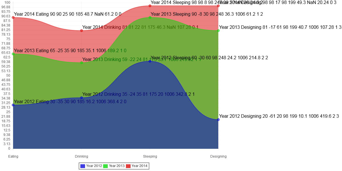
Associated to Sleeping for year 2013, the in graph data displays following information when option inGraphDataTmpl has value "<%=v1+' '+v2+' '+v3+' '+v4+' '+v5+' '+v6+' '+v7+' '+v8+' '+v9+' '+v10+' '+v11+' '+v12%>" : “year 2013 Sleeping 90 -8 30 98 248 36.3 1006 61.2 1 2”
- V1 = Year 2013 (= title of the data)
- v2 = Sleeping (=label of the data)
- v3= 90 (= value associated to “sleeping” in the data)
- v4 = -8 (= difference between the data of previous line (98) and the data (90))
- v5 = 30 (= difference between the data (90) and the data on next line (60))
- v6 = 98 (= max value for “sleeping”)
- v7 = 248 (= total for “sleeping” = 98+90+60)
- v8 = 36.3 (=percentage = 100*v3/v7)
- (v9,v10) = (1006,61.2) = (X,Y) coordinate of the point
- v11 = 1 (=” year 2013” is the second line of data ; The first line (year 2012) has 0 for v11 value).
- v12= 2 (=”sleeping” is the third data in the series)
- V1 : title associated to the bar (= title of the data)
- v2 : label associated to the data
- v3 : data value
- v4 : cumulated value for the group of bar
- v5 : total value for the group of bar
- v6 : percentage (=100*v3/v5)
- (v7,v8) : (X,Y) coordinate of the top left corner of the bar
- (v9,v10) : (X,Y) coordinate of the bottom right corner of the bar
- v11 : position of the line
- v12: position of the data in the series
Example :
var databar = {
labels : ["January","February","March"],
datasets : [
	{
		fillColor : ["rgba(255,0,0,0.8)","rgba(0,255,0,0.8)","rgba(0,0,255,0.8)","rgba(255,0,255,0.8)"],
		strokeColor : ["rgba(255,0,0,1)","rgba(0,255,0,1)","rgba(0,0,255,1)","rgba(255,0,255,1)"],
		pointColor : "rgba(220,220,220,1)",
		pointStrokeColor : "#fff",
		data : [65,37,80],
		title : "Year 2014"
	} ,
	{
		fillColor : ["rgba(255,0,0,0.2)","rgba(0,255,0,0.2)","rgba(0,0,255,0.2)","rgba(255,0,255,0.2)"],
		strokeColor : ["rgba(255,0,0,1)","rgba(0,255,0,1)","rgba(0,0,255,1)","rgba(255,0,255,1)"],
		pointColor : "rgba(151,187,205,1)",
		pointStrokeColor : "#fff",
		data : [60,50,40],
		title : "Year 2013"
	},
	{
		fillColor : ["rgba(255,0,0,0.2)","rgba(0,255,0,0.2)","rgba(0,0,255,0.2)","rgba(255,0,255,0.2)"],
		strokeColor : ["rgba(255,0,0,1)","rgba(0,255,0,1)","rgba(0,0,255,1)","rgba(255,0,255,1)"],
		pointColor : "rgba(151,187,205,1)",
		pointStrokeColor : "#fff",
		data : [90,27,61],
		title : "Year 2012"
	}
]
}
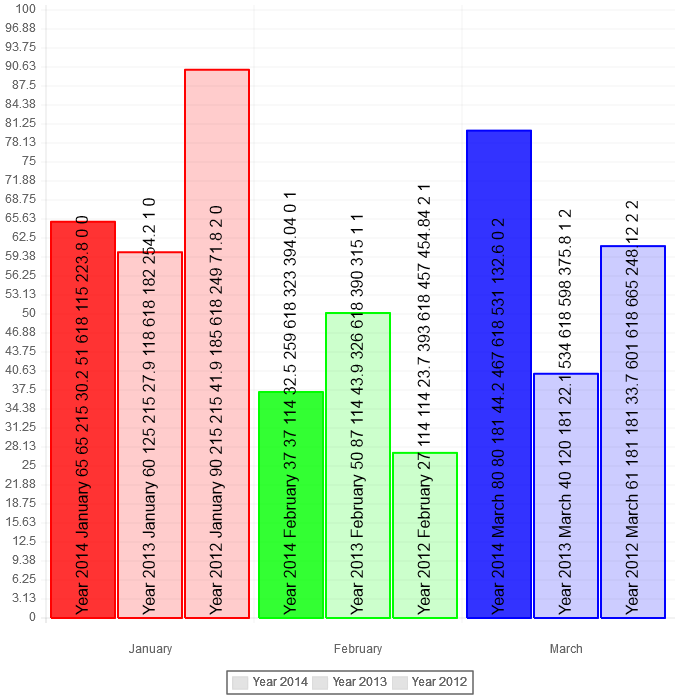
Associated toFebruary for year 2013, the in graph data displays following information when option inGraphDataTmpl has value "<%=v1+' '+v2+' '+v3+' '+v4+' '+v5+' '+v6+' '+v7+' '+v8+' '+v9+' '+v10+' '+v11+' '+v12%>" :
“year 2013 February 50 87 114 43.9 326 618 390 315 1 1”
- V1 = Year 2013 (= title of the data)
- v2 = February (=label of the data)
- v3= 50 (= value associated to “February” in the data)
- v4 = 87 (= cumulated value = 50 (year 2014) + 37 (year 2013)
- v5 = 114 (= total value = 50 (year 2014) + 37 (year 2013) + 27 (year 2012))
- v6 = 43.9 (= percentage = 100*v3/v6)
- (v7,v8) = (326,618) = coordinate of top left corner of the rectangle
- (v9,v10) = (390,315) = coordinate of bottom right corner of the rectangle
- v11 = 1 (=” year 2013” is the second group of data ; The first group (year 2014) has 0 for v11 value).
- v12= 1 (=”February” is the second data in the series)