| title | date | category | slug | summary | description | cover | showtoc | ||||||||
|---|---|---|---|---|---|---|---|---|---|---|---|---|---|---|---|
Dropping Missing Values? You Probably Shouldn’t. |
2020-02-17 |
Data Science |
few-reasons-to-not-drop-missing-values |
Unbeknownst to us, quite often Missing Values contain as much information as just the rest of the data which is why dropping them isn't always a wise thing to do. This article briefly talks about Missing Values & why you probably should analyze the reasons behind why certain values are missing. |
Unbeknownst to us, quite often Missing Values contain as much information as just the rest of the data which is why dropping them isn't always a wise thing to do. This article briefly talks about Missing Values & why you probably should analyze the reasons behind why certain values are missing. |
|
true |
A series of Missing Values can often stand out like a blotch on a series of structured data.
Look at the picture above. The first thing that you might’ve subconsciously observed is that there’s a stroller missing. Indeed, let me break it to you, that’s exactly how the human brain works.
Anything out-of-the-ordinary, needs to be examined. — The Human Brain.
Guess what? While working with Real-World Data, you will seldom come across a dataset devoid of Missing Values!
Like a blotch on a piece of paper Missing Values stand out like an eyesore.
Those white patches in between satisfyingly clean & straight columns, damn, shoot me if I said they don’t trigger my OCD.
Unfortunately, for us, Data Analysts, dealing with noisy data IS half of our day job &, I’ll be honest, to make our lives easier, I’m often tempted to just drop the rows with Missing Values! But doing that wouldn’t be wise as it could lead to a loss of information and/or allow some degree of bias to creep in too which is a topic for discussion on another blog. So if interested, continue reading till the end.
You shouldn’t be surprised but Data Analysts are, actually, always on the offensive to deal with missing values in a dataset. In fact, more often than not, Missing Values actually represent major bits & pieces of information, albeit one that might/mightn’t differ from what the rest of the complete data says!
As such it’s absolutely necessary to ascertain assumptions about the missing values, which are:
- Are the data “Missing Completely At Random (MCAR)”?
- Or are they “Missing At Random (MAR)”?
- And finally if they are “Missing Not At Random (MNAR)”?
For example, if the likelihood for men to disclose their age & weight is higher than women, the resulting collection of data would have a series of Missing Values and they will be considered Missing Not At Random (MNAR). Hence, appropriate steps can be taken to deal with imputing the missing variables for further analysis.
On a side note though, with an open mind, Missing Values should rather be analyzed similarly to the rest of the remaining complete data set. In fact, recent academic research suggests that inconsistencies are more visually perceptive than traditional statistical inferences.
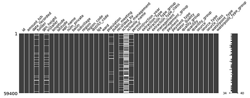
An example of how visualizing Missing Values help us get a better understanding of the data set is showcased through the image of a MissingNo matrix above.
A quick glance at the image and one can see that the “scheme_name” column has a significant amount of values missing. And what could possibly be the reason for such discrepancy?
Well, the dataset in context to that MissingNo Matrix image above is a compilation of information from various sources on Community Water Pumps scattered all over the country of Tanzania and it appears that some of those pumps could’ve been installed by an NGO or a Non-Profit Organization or possibly some considerate individuals. Hence, the maintenance of the pumps do not fall under the jurisdiction of any Government Scheme in Tanzania. Thus it can be safely assumed that the data is MNAR.
Quoting a statement from a recent research publication on visual perception of inconsistent series data, should further strengthen my claim about the reason behind having an open-mindedness towards handling Missing Values.
We found that visualizations that highlight missing values have higher perceived data quality while those that break visual continuity decrease these perceptions and can bias interpretation.— Hayeong Song & Danielle Albers Szafir
Their proposition is that people, in general, are MORE PERCEPTIVE towards inconsistency especially through a visual format that depicts some information to them.
In other words, just like the picture above at the top which subconsciously enforced you to zoom in towards the spot where a baby stroller was supposed to be present, the Human Brain makes a certain set of plausible assumptions through Visual Perception. Hence, it’s safe to assume a common knowledge that, we as humans, instinctively perceive more information visually rather than any other forms of inference.
The authors of the aforementioned publication further go on to say, that human beings do not receive vague visuals with inconsistency in a good light. Rather, it’s preferable and even highly advisable to annotate or provide meaning to the missing data when/if applicable.
To summarize, NaN values doesn’t necessarily mean that quality of the data is bad but as a Data Analyst, it’s a responsibility to be wary of the reason for the existence of such discrepancy in the data before dealing with them properly.
[1] H.Song and A.Szafir, Where’s My Data? Evaluating Visualizations with Missing Data (2018), Visual Lab at the University of Colorado.