-
Notifications
You must be signed in to change notification settings - Fork 64
Input fields for data sources and processors
4CAT offers a range of input fields you can use when configuring a data source or processor. Here we outline how to use these.
The input fields should be inserted in with an options dictionary in the class definition of your datasource or processor. Make sure to import the UserInput script:
from backend.abstract.processor import BasicProcessor
from common.lib.helpers import UserInput

class SuperCoolProcessor(BasicProcessor):
    """
    A dummy processor to show input fields.
    """
    type = "dummy-processor"
    title = "Dummy Processor"
    extension = "csv"

    options = {
		"sample-input": {
			"type": UserInput.OPTION_TEXT,
			"default": "all",
			"help": "A sample text input",
			"tooltip": "This text will show when hovering over the question mark."
		}
	}

    ...
This will show the following input field:

The value set for these options, when running the processor, may then be accessed as follows:
    def process():
        input_text = self.parameters.get("sample-input")
        input_text = self.parameters.get("sample-input", self.options["sample-input"]["default"]) # Will return "all"
The values set for these options will be stored in the metadata of the created dataset and can be retrieved with Dataset.parameters. In some cases, it may be necessary to dynamically change the available values when running a query or a processor. For example, maybe a processor retrieves data from an API, and whether the subsequent processor works depends if a specific type of API key was used. In those cases, you can use the get_options() class method:
    @classmethod
    def get_options(cls, dataset):
        default_options = cls.options
        if dataset.parameters.get("api_level") == "basic":
            del default_options["advanced_option"]
        return default_options
Currently, the following types of options are available:
-
OPTION_INFO, shown as a paragraph of text, using thehelpvalue as content. May contain Markdown. -
OPTION_DIVIDER, purely visual, shows a horizontal separator in the interface -
OPTION_TEXT, shown as a simple text field. Optionally,minandmaxmay be set for this option to parse the value as a (clamped) integer. -
OPTION_TEXT_LARGE, identical to OPTION_TEXT, but shows a larger input field -
OPTION_TOGGLE, a checkbox. Will be eithertrueorfalse. -
OPTION_CHOICE, a select box. Select options are to be provided viaoptionsin the option definition, containing a dictionary with possible values as keys and labels for those values as values. -
OPTION_MULTI, a list of several checkboxes. Requires anoptionsvalue likeOPTION_CHOICE, but the parsed value of the option will be a list of selected values rather than a single value. -
OPTION_DATE, a date selector, which will be stored as a Unix timestamp -
OPTION_DATERANGE, a selector for a start and end date, stored as a tuple of two Unix timestamps. -
OPTION_FILE, a file upload element. To access and properly store/delete uploaded files later, use therequest.filesvariable invalidate_query()orafter_create()methods of the processor.
The general options for input field dictionaries include:
-
type: The type of input field (e.g.OPTION_MULTI). -
help: The label for the option as displayed in the web interface (required). -
default: The default value for this option (required, but can beNoneor""). -
tooltip: Further information on the option may be added through a tooltip which can be displayed through a tooltip anchor displayed next to the option in the interface (optional). -
sensitive: If set, the property value is deleted from the 4CAT database after the processor has started, and will never be shown in the web interface. To be used for e.g. API keys that should not be shared (optional). -
requires: If set, the option will only be available to users whoseuserdatafield contains the value of this setting as a key. Can be used to e.g. limit options for non-privileged users (optional).
-
min: The minimum insertable value. -
max: The maximum insertable value.
A simple text input field as shown above. Useful for strings or numbers. Example:
"sample-text-input": {
	"type": UserInput.OPTION_TEXT,
	"default": "",
	"help": "A sample text input",
	"tooltip": "This text will show when hovering over the question mark."
}

The same as OPTION_TEXT, but with a larger textarea.
"sample-text-large-input": {
	"type": UserInput.OPTION_TEXT_LARGE,
	"default": "",
	"help": "A sample text input",
	"tooltip": "Text to show as placeholder."
}

An input field for a simple dropdown. Create an options dictionary to list the options. Example:
"sample-choice-input": {
	"type": UserInput.OPTION_CHOICE,
	"help": "A sample choice input.",
	"tooltip": "This text will show when hovering over the question mark.",
	"options": {
		"option1": "option1",
		"option2": "option2",
		"option3": "option3",
	}
}

An input field for multiple checkmarks. Create an options dictionary to list the options. Example:
"sample-multi-input": {
	"type": UserInput.OPTION_MULTI,
	"default": "",
	"help": "A sample multi input",
	"tooltip": "This text will show when hovering over the question mark.",
	"options": {
		"option1": "Option 1",
		"option2": "Option 2",
		"option3": "Option 3"
	}
}

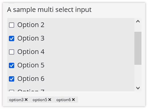
A scrollable multi-select field. Useful for input fields with a lot of different options. Use an options dictionary to list the options. Clicking the checkmarks shows labels below the list. These can be clicked to be deselected.
"sample-multi-select-input": {
	"type": UserInput.OPTION_MULTI_SELECT,
	"default": "",
	"help": "A sample multi select input",
	"tooltip": "This text will show when hovering over the question mark.",
	"options": {
		"option1": "Option 1",
		"option2": "Option 2",
		"option3": "Option 3",
		"option4": "Option 4",
		"option5": "Option 5",
		"option6": "Option 6",
		"option7": "Option 7",
		"option8": "Option 8",
		"option9": "Option 9"
	}
}

Not an input, but can be used to add extra explanation to your processor or dataset.
"sample-info-input": {
	"type": UserInput.OPTION_INFO,
	"help": "A sample info input. Add your explanatory text here.",
	"tooltip": "This text will show when hovering over the question mark."
}
An input date for a date range.
"sample-date-range-input": {
	"type": UserInput.OPTION_DATERANGE,
	"default": None,
	"help": "A sample date range input",
	"tooltip": "This text will show when hovering over the question mark."
}

Not an input, but can be used for a horizontal dividing line.
"divider": {
	"type": UserInput.OPTION_DIVIDER
}

A file input field.
"data_upload": {
	"type": UserInput.OPTION_FILE,
	"help": "File"
}

🐈🐈🐈🐈