-
Notifications
You must be signed in to change notification settings - Fork 0
New issue
Have a question about this project? Sign up for a free GitHub account to open an issue and contact its maintainers and the community.
By clicking “Sign up for GitHub”, you agree to our terms of service and privacy statement. We’ll occasionally send you account related emails.
Already on GitHub? Sign in to your account
[Track 8/8] Taqfy - UX and Frontend #19
Comments
|
Next |
Step 2/4 - Planning our componentsEstimated time: 10 minutesSo, as promised, let's present our suggestions. First, we'd like to show this document, which is a nice Frontend guide and it has some conventions we adopt on our projects. It was not given to you on previous step on purpose, so you could think on your own. Based on it, we can answer the quesitons of the previous step:
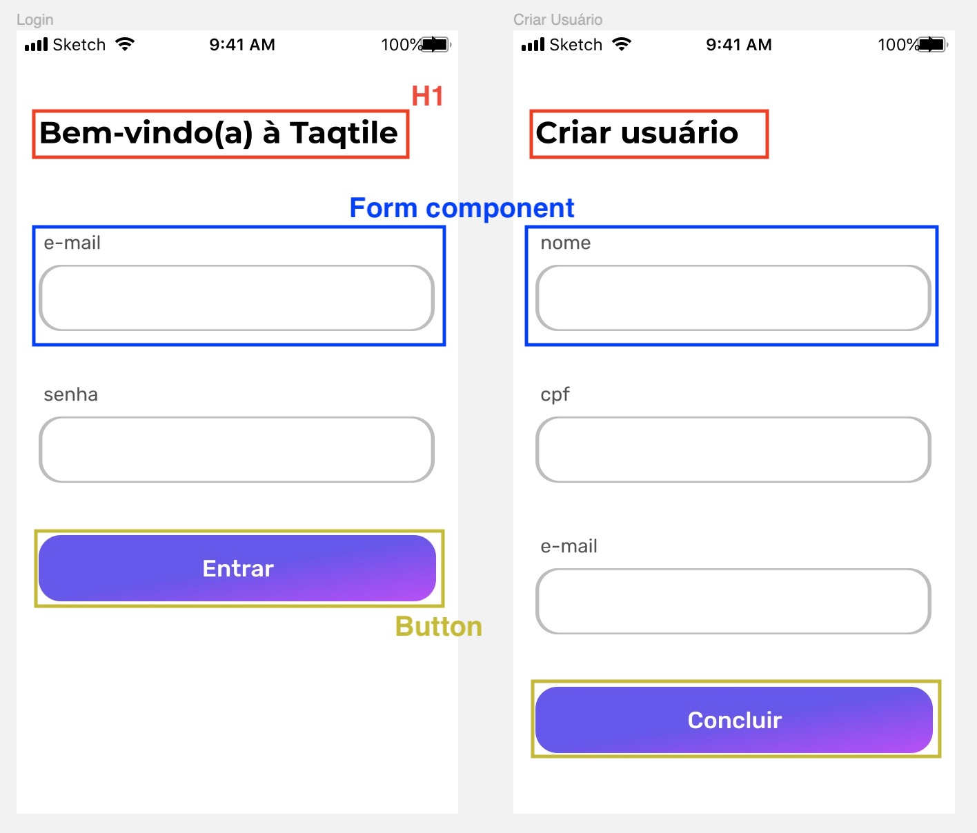
The way we thought about it, basically 3 components, as shown on the image below: H1 (Header1 - text component), Form field and button.
Two of the most important reasons:
There's not only one answer for this either. But, as general rule, a component can contain:
So, for the components of question 1:
|
|
Next |
Step 3/4 - Styled components libraryEstimated time: 1 hourAfter some minutes of theory, it's finally time to put all the previous thoughts on code. We'll start with a setup of some tools for our UX development. Here at Taqtile we use the Styled Components library, which helps us to styling our components in a very convenient way. For now, your job is to install the library and understand at least the basic concepts. Try to use it creating a very simple component to check if it's working, and then go to next step. |
|
Finish |
Step 4/4 - Turning theory into codeEstimated time: 8 hoursNow that you have the most important and powerful tool we use, let's turn our components of steps 1 and 2 into code! To do that in a reasonable time, we will focus only on on Login and Add User, as we did before. Your job is to create some components and use them at both UIs, so you can see all of the thoughts of steps 1 and 2 on action. Here are some specifications our "design team" is giving to help you build the components. You don't exactly need to follow all the detailed values if you don't want to. Whats's extremely important is to have those specs parametrized, as the values as not that important: we should design our code to change them easily if necessary. H1:
Button:
You can add some things to this specs if you want, such as borders radius, gradient, icons, etc. Just be careful with the time you're spending on this styling. Form
As the behaviour, your form should have two states:
TIP: Anytime you implement a component, it's a good practice to test it isolated, so we can make sure it's working properly, including states/behaviours. |
|
Finish |
|
Congratulations! You just finished the onboard! 🎉 Thank you for participating, we hope you've learned a lot. The main goal of this onboard is to make you ready to enter in any of our projects. As you advance on the project, we'd like to hear your feedback. Please, contact your tutors and let them know your thoughts on this onboard:
|

Ok, there is no more features to add to your project by now! Now, you'll just apply the concepts you've learned so far, as well as some practices we use here at Taqtile.
Step 1/4 - Thinking about components
Estimated time: 10 minutes
We ❤️ apps. And a crucial part when making a good app is the User Experience, a.k.a UX. Also, you've learned about componentization and how it contributes to make a good and usable app. So, this step is just a mental exercise. We have below two images representing 2 of the screens you developed so far:
LoginandCreate User:Looking at these screens, you can extract from them some components that can be (re)used. They are relatively simple to componentize, but, as you can imagine, there's not only one way of doing it, specially when the design gets more complex. So, before coding them in a hurry, let's take some minutes to think:
After you answer these questions, go to next step to see our suggestions on how to componentize them.
Then, you'll start coding these components.
Btw, as we are talking about UX, here are some references if you want to know more about it:
The text was updated successfully, but these errors were encountered: