Brightness and temperature sliders #5
Description
Preview
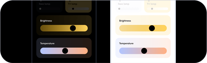
Description
Create a card with entity (domain light) / action holder / icon_color / background_color / slider
Todo
- translations
- editor
- card
- documentation
Button card code
type: custom:button-card
name: Helderheid
custom_fields:
  slider:
    card:
      type: custom:my-slider-v2
      entity: light.actieve_woonkamer_lampen
      colorMode: brightness
      styles:
        container:
          - border-radius: 100px
          - overflow: visible
          - background: none
        card:
          - height: 40px
          - padding: 0 20px
          - background: var(--brightness)
        track:
          - overflow: visible
          - background: none
        progress:
          - background: none
        thumb:
          - background: var(--black)
          - top: 2px
          - right: '-18px'
          - height: 36px
          - width: 36px
          - border-radius: 100px
styles:
  grid:
    - grid-template-areas: '"n" "slider"'
    - grid-template-columns: 1fr
    - grid-template-rows: 1fr min-content min-content
  card:
    - font-family: In case of a custom font, otherwise you can remove this line
    - background: var(--brightness-tint)
    - padding: 16px
    - '--mdc-ripple-press-opacity': 0
  name:
    - justify-self: start
    - font-size: 14px
    - margin: 4px 0 12px 0
    - color: var(--contrast20)