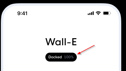
Title card with badge #8
Description
Add badge support to the title card
- Translations
- Editor
- Add a + button to add more informations (one entity at a time)
- Text color for each entity
- Background color for the badge
type: custom:button-card
name: Title here
custom_fields:
  badge:
    card:
      type: custom:button-card
      name: '[[[return states["vacuum.roborock_s5_max"].attributes.status]]]'
      label: >-
        [[[return states["vacuum.roborock_s5_max"].attributes.battery_level +
        "%"]]]
      show_label: true
      show_icon: false
      entity: vacuum.roborock_s5_max
      tap_action:
        action: more-info
        haptic: medium
      styles:
        grid:
          - grid-template-areas: '"n gutter l"'
          - grid-template-columns: min-content 5px min-content
          - grid-template-rows: min-content
        card:
          - font-family: In case of a custom font, otherwise you can remove this line
          - padding: 6px 10px
          - font-size: 12px
          - line-height: 18px
          - font-weight: 500
          - background: var(--contrast20)
        name:
          - color: var(--contrast1)
        label:
          - color: var(--contrast12)
styles:
  grid:
    - grid-template-areas: '"n" "badge"'
  card:
    - font-family: In case of a custom font, otherwise you can remove this line
    - background: none
    - padding: 16px 0
    - '--mdc-ripple-press-opacity': 0
  name:
    - font-size: 32px
    - color: var(--contrast20)
  custom_fields:
    badge:
      - margin: 16px auto 0 auto
      - '--mdc-ripple-press-opacity': 0.5