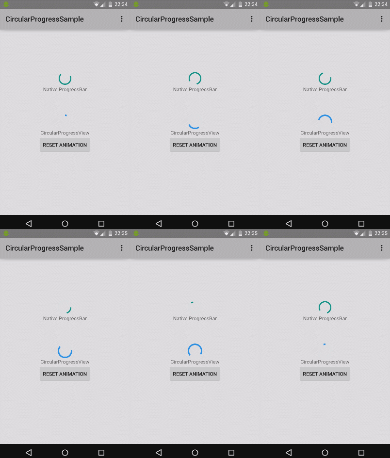
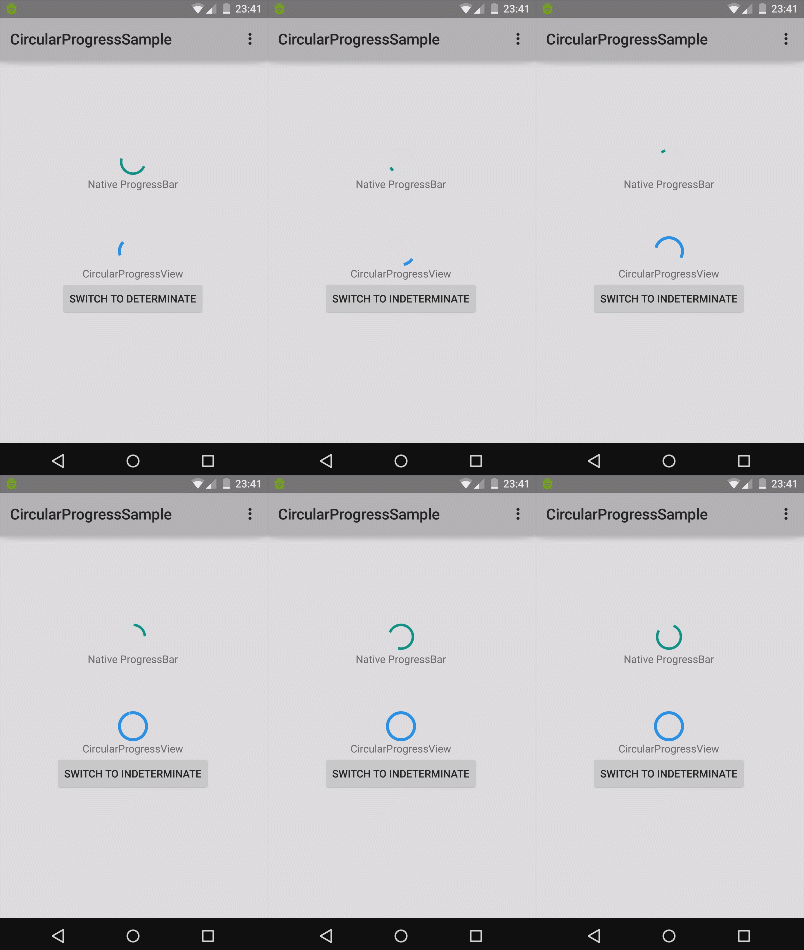
| Indeterminate | Determinate |
|---|---|
 |
 |
This CircularProgressView is a (surprisingly) circular progress bar Android View that is designed to imitate the Material versions of ProgressBar. These versions can be seen on this page of the Material design spec under Circular indicators.
To use CircularProgressView you must add it as a dependency in your Gradle build:
dependencies {
    compile 'com.github.rahatarmanahmed:circularprogressview:2.2.1'
}
Then add the view to your layout:
<com.github.rahatarmanahmed.cpv.CircularProgressView
    xmlns:app="http://schemas.android.com/apk/res-auto"
    android:id="@+id/progress_view"
    android:layout_width="40dp"
    android:layout_height="40dp"
app:cpv_indeterminate="true"/>| Name | Type | Default | Description |
|---|---|---|---|
| cpv_progress | float | 0 | The current progress of the progress bar. |
| cpv_maxProgress | float | 100 | The maximum progress of the progress bar; what's considered as 100% of the bar. |
| cpv_thickness | dimension | 4px | The thickness of the progress bar. |
| cpv_color | color | Theme's accent color. If not available, Material Blue 500 (#2196F3) | The color of the progress bar. |
| cpv_indeterminate | boolean | false | Whether this progress bar is indeterminate or not. If indeterminate, the progress set on this view will not have any effect. |
| cpv_animDuration | integer | 4000 | The duration of the progress bar animation in milliseconds. If the bar is determinate, it is the duration of the initial spin animation. If indeterminate, it is the duration of all "steps" of the indeterminate animation. |
| cpv_animSteps | integer | 3 | The number of "steps" in the indeterminate animation (how many times it does the loopy thing before returning to its original position). It is recommended to use an odd number, as even numbers of steps look the same after half the number of steps. |
| cpv_animAutostart | boolean | false | Whether this progress bar should automatically start animating once it is initialized. |
| Name | Description |
|---|---|
| isIndeterminate() | Returns true if the progress bar is indeterminate, false if determinate. |
| setIndeterminate(boolean) | Set whether this progress bar is indeterminate or not. Will reset the animation if the value changes |
| getThickness() | Gets the thickness of the progress bar. |
| setThickness(int) | Sets thickness of the progress bar. |
| getColor() | Gets the color of the progress bar. |
| setColor(int) | Sets the color of the progress bar. |
| getMaxProgress() | Gets the maximum progress of the progress bar. |
| setMaxProgress(float) | Sets the maximum progress of the progress bar. |
| getProgress() | Gets the current progress of the progress bar. |
| setProgress(float) | Sets the current progress of the progress bar. (Will linearly animate the update.) |
| startAnimation() | Starts the animation of the progress bar. (Alias of resetAnimation().) |
| resetAnimation() | Resets the animation of the progress bar. |
- Fixed ignoring the color #FFFFFF
- Now it uses the actual theme's accent color if possible by default.
- Fixed default thickness using 4px instead of 4dp
- Possible fix for drawArc NullPointerError
- Slight performance improvements
- Removed unnecessary appcompat dependency from example
- Fixed repaint issue by drawing smaller arcs
- Initial release