Cargo 16 - remake of Cargo map #1191
Replies: 13 comments
-
|
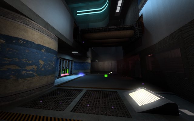
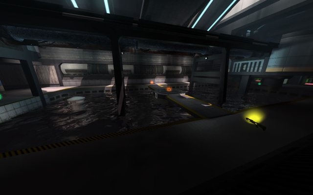
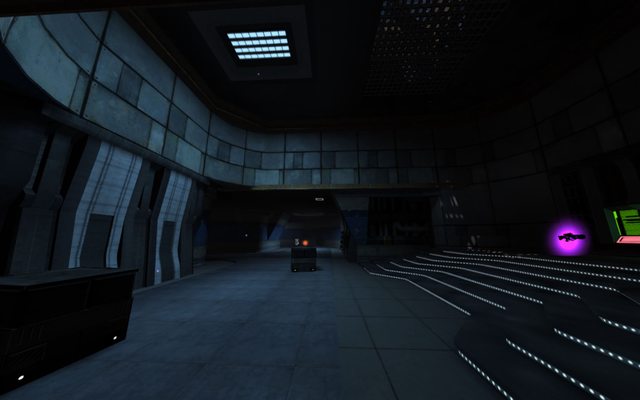
This looks nice, but some areas seem a bit dark to me, perhaps make the lights brighter and/or larger in these areas. It's important to make sure the game is playable on all kinds of monitors, not just ones with poor contrast rates 😃 |
Beta Was this translation helpful? Give feedback.
-
I'd have to agree with this. |
Beta Was this translation helpful? Give feedback.
-
|
From the screenshots, this looks really nice. Although I have noticed a few walls have been changed in such a way that would limit parkour as well as the addition of some objects (such as crates) and the creation of new routes, some play testing would be needed to make sure these changes don't negatively impact the flow of the map or cause unnecessary restriction of movement. |
Beta Was this translation helpful? Give feedback.
-
|
Maybe it's more detailed, but overall there is more places to do parkour than in original Cargo, every place where parkour is possible in original, it is also possible here in the same spots. |
Beta Was this translation helpful? Give feedback.
-
|
Hey guys and ladies, again I need a few words from our community and I have a bad feeling about all this but I decided to write.. place from where I tested with /testpvs 2 (yes, even that low): And look how many surfaces are still there on the other side (view from almost other side of the map - central area): Also the same result is with /dtoutline 0 (seems so) @devs - Question of the month: does checking how occlusion works with /dtoutline 0 and /testpvs give us 'proper' results? |
Beta Was this translation helpful? Give feedback.
-
|
Seems to be a common problem with maps that use extreme levels of detail, this is why I think we need to adopt a simpler and cleaner look with brighter colours, these play really well with global illumination and creates a better atmosphere. |
Beta Was this translation helpful? Give feedback.
-
|
I can go around this and remix layout to be only similar to Cargo (to drastically speed up a map), but for now I searching a way to don't do this, so I think the 'simple and cleaner' is the way to go with this map, otherwise It's going to be running bad. edit: |
Beta Was this translation helpful? Give feedback.
-
|
On my r5 340 (effectively identical to an A8 apu) I'm getting 35-45 fps at min settings 900p, and 55-60 fps at min settings + renderscale 75% 900p. Not great, worse than ctf13 by 25-35%, but considering the lag-prone center with poor occlusion and water, it's not too bad. Addressing base/818 should help lower these performance issues when it gets implemented. |
Beta Was this translation helpful? Give feedback.
-
Beta Was this translation helpful? Give feedback.
-
|
Latest version, sorry for no screenshots for now but barely anyone looking here, it is more for people who want to see all assets when coop. Unpack, move and replace old files if any, :) |
Beta Was this translation helpful? Give feedback.
-
|
Now in master for testing purposes as of 8a3ec68 |
Beta Was this translation helpful? Give feedback.
-
|
uh oh long time without a update.. So long that map was even removed from official rotation Little info about 9th revision of Cargo16: map files to download: kargo09.zip |
Beta Was this translation helpful? Give feedback.
-
|
latest version of (formerly) Kargo, a Cargo 16 (tribute to Deck 16 from UT99) |
Beta Was this translation helpful? Give feedback.


-
Hello, since we have new 'forums', I present here my remake of Cargo map. (It's 'Kargo' for now - wip filename, so you can paste it safely into 'maps' folder without overwriting original map)
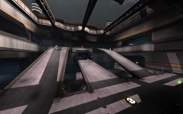
It's all WIP, most of the geometry is changed/moved, of course lighting is redone from scratch, texture work is not complete, but goal was to remove that old 'brownish' look. Map have bigger opening to allow more sun rays to come in, I replaced lava with acid, added some models, map have huge amount of lights (I'll write all stats later) but only these major ones are casting shadows, most of them are static ones. Major problem that I have encountered is that skylight is dependant of sun position on sky, so I moved sun almost to very top (please bring back old skylight ;)
Also earlier the red flag was in middle of corridor, while blue flag have its own room, so I added another room for red team.
As I stated, layout is 95% completed so progress should be faster from now, mostly by optimising and texture work and making nicer blendmaps. Night version is half as complete and it is in bad state for now :\
In attachment you can find two folders: 'dziq_wip' and 'snipergoth', you need to put them in RE home folder or REinstall/data (preferably first option)
here are a few screens, better download and see for yourself:


What do you think about lighting, texturing, etc?
Any suggestions are welcome while this is all in WIP state, cheers :)
old version: KARGO.zip
second revision (outdated): Cargo16.zip
check further posts to download latest revision
Beta Was this translation helpful? Give feedback.
All reactions