The layout specification is a json document that describes the layout of the library view. It outlines the hierarchical structure (i.e. tree structure) of the library view, as well as defines items that should go under each tree node. The layout specification works closely with loadedTypes JSON data, obtained from Loaded Data Types.
At the root of the layout specification json element is a single sections element. This sections element contains a list of sections that should be displayed at the root level of library view.
For starters, the default and Miscellaneous sections are a must to be included in this specification. Please see the details below on how nodes can be included into each section.
{
  "sections": [
    {
      "text": "default",
      "iconUrl": "",
      "elementType": "section",
      "showHeader": false,
      "include": [],
      "childElements": []
    },
    {
      "text": "Miscellaneous",
      "iconUrl": "/src/resources/ui/add-on.svg",
      "elementType": "section",
      "showHeader": true,
      "include": [],
      "childElements": []
    },
    ...
  ]
}
For this example, the library view contains only a single node with Display as its text in the default section:
{
  "sections": [
    {
      "text": "default",
      "iconUrl": "",
      "elementType": "section",
      "showHeader": false,
      "include": [],
      "childElements": [
        {
          "text": "Display",
          "iconUrl": "/src/resources/icons/Category.Display.svg",
          "elementType": "category",
          "include": [],
          "childElements": []
        }]
    }]
}
This results in library view that looks like the following image:

Each element in the hierarchical structure contains the following key-value pairs:
text- the content to display on the corresponding library itemiconUrl- relative or absolute URL of the icon for the corresponding library itemelementType- the type of the element. Possible values are section, category, group, create, action, query and none. See the following section for detailed descriptions of each element types.showHeader- whether the header should be shown. This attribute is necessary only for elements with section aselementTypeinclude- data types that should be included under this given library item (more details on this later)childElements- nested elements under this element (its usage will become clearer below)
section- Section elements represent the root items on the library viewcategory- Category elements represent the root library items contained in section elements.group- Groups comes directly under its parent category, it contains just text without iconcreate- Elements of this type result in library items that get clubbed under the Create clusteraction- Elements of this type result in library items that get clubbed under the Action clusterquery- Elements of this type result in library items that get clubbed under the Query clusternone- All other expandable library items that are not categories or groups

Item classes can be added to a given element by adding them as values to include key, as illustrated in the example below. In this case, both DSCore.Color and DSCore.ColorRange2D classes will be added under Display library item. iconUrl represents the URL (relative or absolute) of the icons for the classes.
{
"sections": [
{
"text": "default",
"iconUrl": "",
"elementType": "section",
"showHeader": false,
"include": [],
"childElements": [
{
"text": "Display",
"iconUrl": "/src/resources/icons/Category.Display.svg",
"elementType": "category",
"include": [
{
"path": "DSCore.Color",
"iconUrl": "/src/resources/icons/DSCore.Color.png"
},
{
"path": "DSCore.ColorRange",
"iconUrl": "/src/resources/icons/DSCore.ColorRange.png"
}
],
"childElements": []
}]
}]
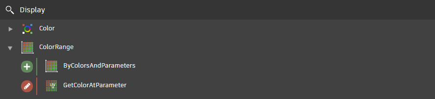
}Note that this will create two elements with none as elementType, named Color and ColorRange, each containing nodes with names that start with DSCore.Color and DSCore.ColorRange respectively:
Adding on to the previous example, a nested element with text Watch is added under Display element. Just like the parent element, nested elements contain keys like text, iconUrl, etc. Note that however, the nested element does not have to contain childElements if it does not need to:
{
  "sections": [
    {
      "text": "default",
      "iconUrl": "",
      "elementType": "section",
      "showHeader": false,
      "include": [],
      "childElements": [
        {
          "text": "Display",
          "iconUrl": "/src/resources/icons/Category.Display.svg",
          "elementType": "category",
          "include": [
            {
              "path": "DSCore.Color",
              "iconUrl": "/src/resources/icons/DSCore.Color.png"
            },
            {
              "path": "DSCore.ColorRange",
              "iconUrl": "/src/resources/icons/DSCore.ColorRange.png"
            }
          ],
          "childElements": [
            {
              "text": "Watch",
              "iconUrl": "Watch",
              "elementType": "group",
              "include": []
            }
          ]
        }]
    }]
}
Since Watch element does not have any child item (i.e. its include list is empty), it will not be rendered in the library. The next section illustrates how leaf items are added under Watch so that it shows up on the screen.
The following example adds three new data types under Watch element:
{
  "sections": [
    {
      "text": "default",
      "iconUrl": "",
      "elementType": "section",
      "showHeader": false,
      "include": [],
      "childElements": [
        {
          "text": "Display",
          "iconUrl": "/src/resources/icons/Category.Display.svg",
          "elementType": "category",
          "include": [
            {
              "path": "DSCore.Color",
              "iconUrl": "/src/resources/icons/DSCore.Color.png"
            },
            {
              "path": "DSCore.ColorRange",
              "iconUrl": "/src/resources/icons/DSCore.ColorRange.png"
            }
          ],
          "childElements": [
            {
              "text": "Watch",
              "iconUrl": "Watch",
              "elementType": "group",
              "include": [
                { "path": "Core.View.Watch" },
                { "path": "Core.View.Watch Image" },
                { "path": "Core.View.Watch 3D" }
              ]
            }
          ]
        }]
    }]
}
This results in library view that looks like the following image:

All items in loadedTypes that are included through layout specification will show up under the default section on the library, as for ones that are not included, they will be displayed under Miscellaneous section.
The tree structure of this section is generated based on the fullyQualifiedName of the items. As an example, if there is a node called Core.Web.Web Request as left-over, the Core category is created:

This is how it looks when the Core category is fully expanded:
 Note: The general rule is that all items in
 loadedTypes should be specified so that Miscellaneous section will not appear in the library.
In addition to the default and Miscellaneous sections, custom sections can also be added alongside them. The following snippet shows how to add a new Add-ons section which displays all items with names that start with pkg://
{
  "sections": [
    {
      "text": "default",
      "iconUrl": "",
      "elementType": "section",
      "showHeader": false,
      "include": [],
      "childElements": [...]
    },
    {
      "text": "Miscellaneous",
      "iconUrl": "/src/resources/ui/add-on.svg",
      "elementType": "section",
      "showHeader": true,
      "include": [],
      "childElements": []
    },
    {
      "text": "Add-ons",
      "iconUrl": "/src/resources/ui/plus-symbol.svg",
      "elementType": "section",
      "showHeader": true,
      "include": [
        {
          "path": "pkg://"
        }
      ],
      "childElements": []
    }
  ]
}
There are two ways of appending elements into the new section. One way is to specify the items the same way we did for the default section. Another way is to simply include them as paths in include.
If the path contains a :// in its prefix, the prefix will be removed from the item name. For example, given an item named pkg://DynamoText.Text.FromStringOriginAndScale, the DynamoText class will be created and rendered as follows:

Similar to the other sections, the tree structure is determined based on the fullyQualifiedName of the items.