-
Notifications
You must be signed in to change notification settings - Fork 0
How to Use Outquote
This guide walks through all of Outquote's options and explains how to use them. For an example of how to use some of these features, check out the example walkthrough.
The content section is where you enter the text to display in the graphic. You can either copy-and-paste or type directly into the text boxes.
This is where the quote should go. The tool will automatically add quotation marks onto each end of the quote, so no need to do that yourself. (Though this can be turned off; see Show quotes below.) You can add line breaks into your quote just by hitting return within the text box. It will also automatically wrap the text for you, so you only need to add line breaks if you want multiple paragraphs in your quote.
The quote attribution is displayed in bold underneath the quote. This might be the person who said the quote, the name of the book or article it's from, etc. The attribution can be optionally hidden.
This subtext displays either underneath or beside the attribution, depending on which options you have selected. It can be used to indicate the group the speaker is from (ex. Varshini Prakash | Sunrise Movement) or their job title (Alexandria Ocasio-Cortez | U.S. House of Representatives, NY-14). This text can also be optionally hidden.
Outquote's options are split into three categories, roughly divided by layout, backgrounds and colors, and including or excluding elements.
These options are for the sizing and general layout of the graphic.
This dropdown has the following options:
- Instagram Post
- Instagram Story
- Twitter/Facebook
The different social media platforms have different aspect ratios that work best for them. An Instagram post is square (1080px by 1080px), an Instagram story is vertical (1080px by 1920px), and a Twitter or Facebook photo is horizontal (1280px by 640px). These ratios and resolutions are the recommended sizes for each platform. The default option is Instagram post.
This option centers the quote and attribution. If you don't have the logo inset into the border, it will also center the logo. The default is unchecked, meaning text will be left-aligned.
This checkbox allows you to toggle the quotation marks that surround the quote text. By default it is checked and the quotes are included.
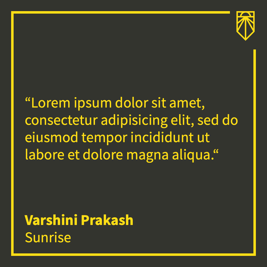
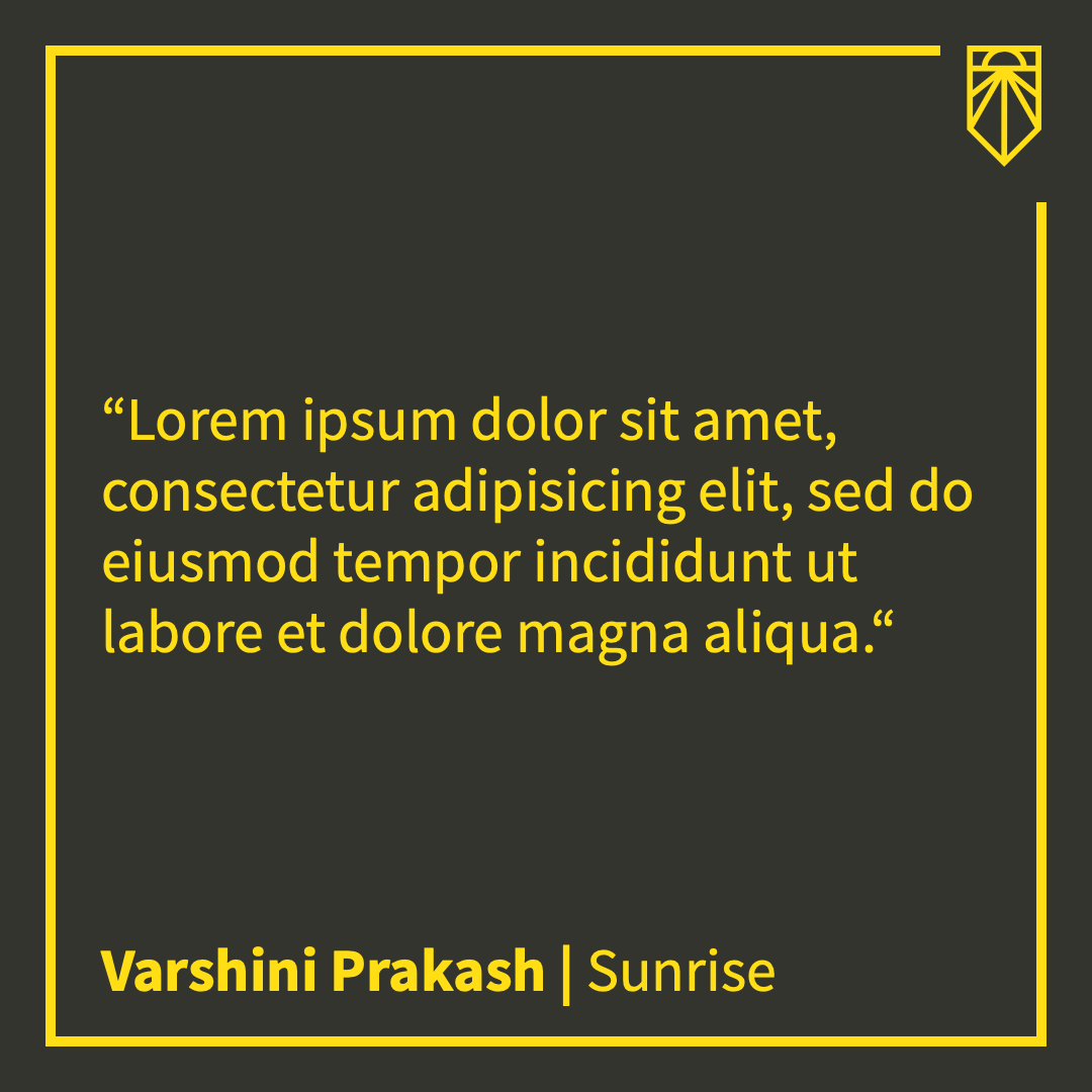
By default, this is checked, meaning that the attribution name will display above the attribution title. Unchecking the box will put both on one line with a pipe (|) between the name and title. Using split attribution is recommended for Instagram posts and stories, as those graphics are thinner. For Twitter/Facebook, attribution on one line will generally work fine.
| Split Attribution | One Line Attribution |
|---|---|
 |
 |
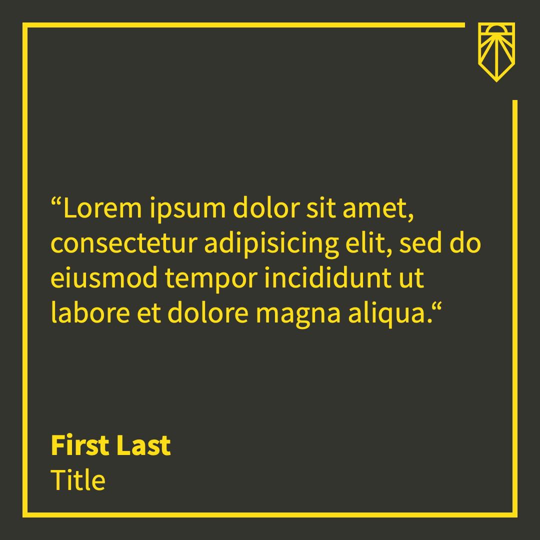
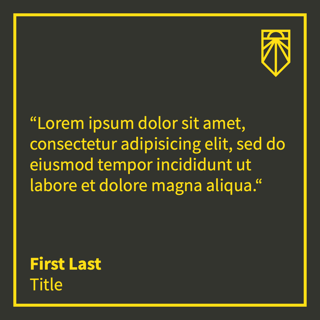
Setting the logo into the border will put it in the top right corner with its top edge aligned with the top border and its right edge aligned with the right-hand border. The border will break around the logo so there's no overlap. This box defaults to checked. If unchecked, the logo will either be centered (if "center text" is checked) or in the right corner with some space between it and the border.
| Inset Logo | Not Inset |
|---|---|
 |
 |
These options are for color schemes and backgrounds.
This dropdown has the following options:
- Orange/Purple Gradient
- Yellow/Purple Gradient
- Yellow/Gray
- Gray/Yellow
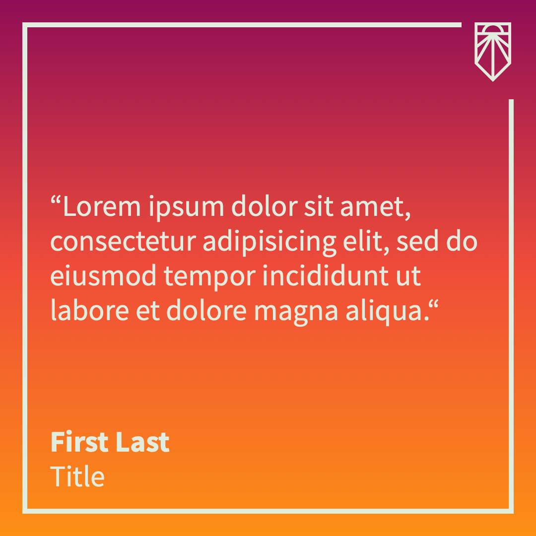
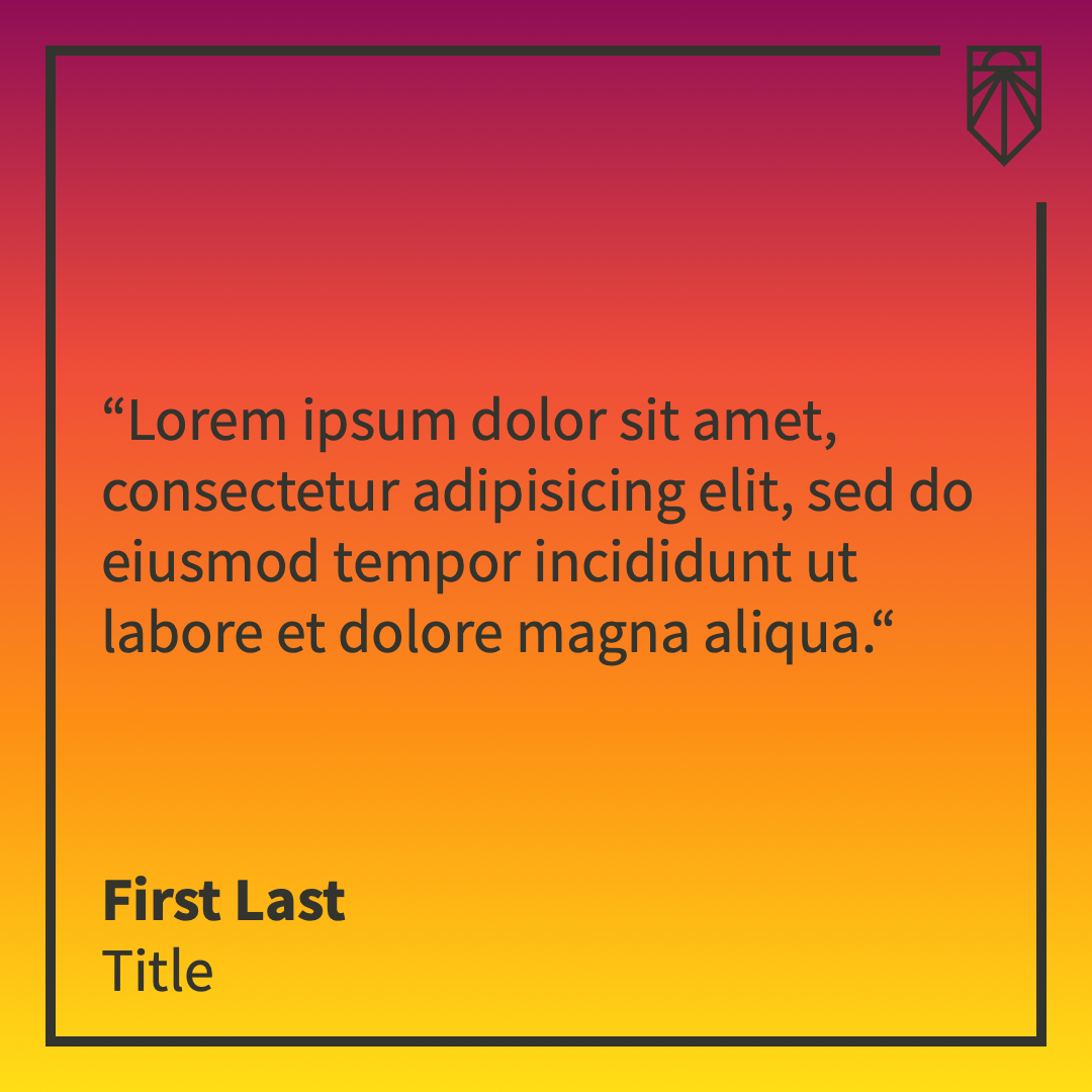
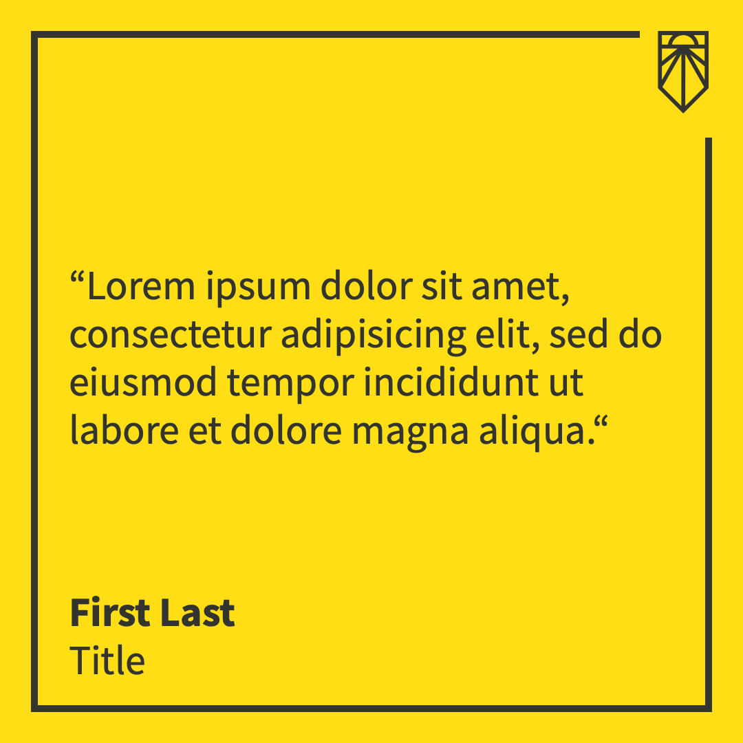
The background color also determines the foreground (border, text, and logo) color. The Orange/Purple Gradient background goes from #8F0D56 (purple) to #EF4C39 (red) to #FD9014 (orange) and the foreground is #E3EDDF (greenish white). The Yellow/Purple Gradient adds the Sunrise yellow at the bottom of the gradient and uses the gray as its foreground color. For the Yellow/Gray option, the background is Sunrise's yellow #FFDE16 and the foreground is our gray #33342E. Gray/Yellow is the inverse of that. The default is Orange/Purple Gradient.
| Orange/Purple Gradient | Yellow/Purple Gradient | Yellow/Gray | Gray/Yellow |
|---|---|---|---|
 |
 |
 |
 |
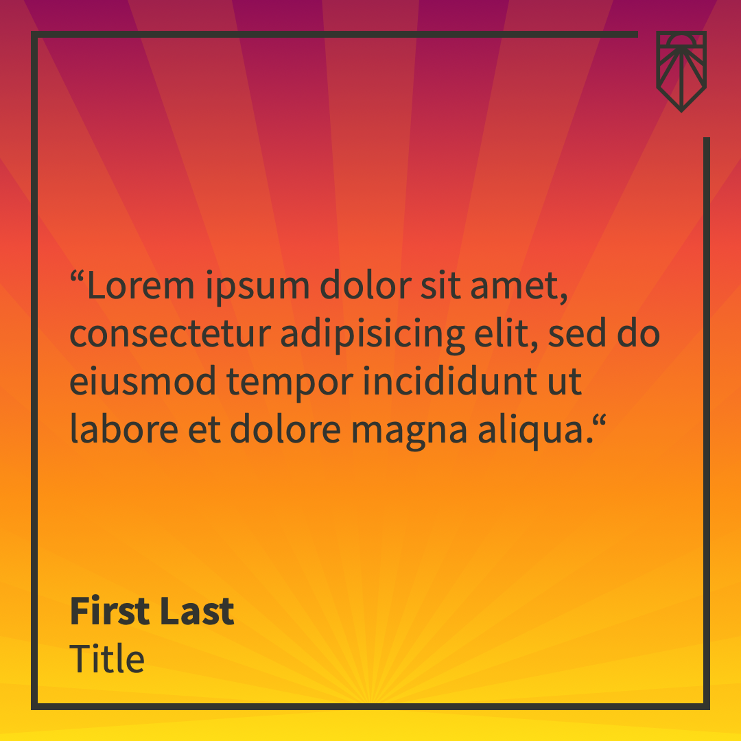
Checking this box will add semi-transparent orange sunrays to the graphic. They originate at the bottom border and expand through the rest of the graphic. They will always be rendered above the background (and background photo, if applicable) but behind the border, text, and logo. By default, this box is unchecked.
| No Sunrays | Sunrays |
|---|---|
 |
 |
Checking this box will allow you to add a background image, which you can select from the background image selector, which will open when you check the box. It is by default unchecked.
Blend mode refers to how the background photo and the background color/gradient are combined. This dropdown has three options:
- Overlay (medium)
- Multiply (dark)
- Hard light (light)
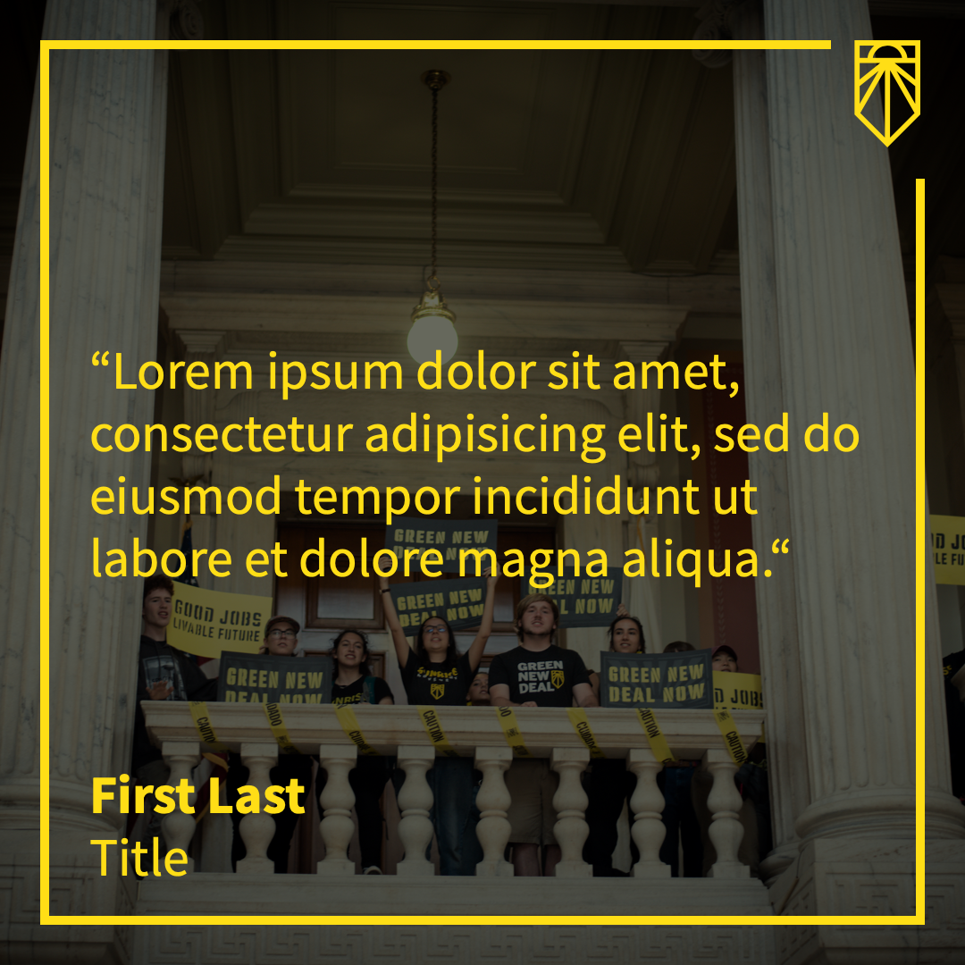
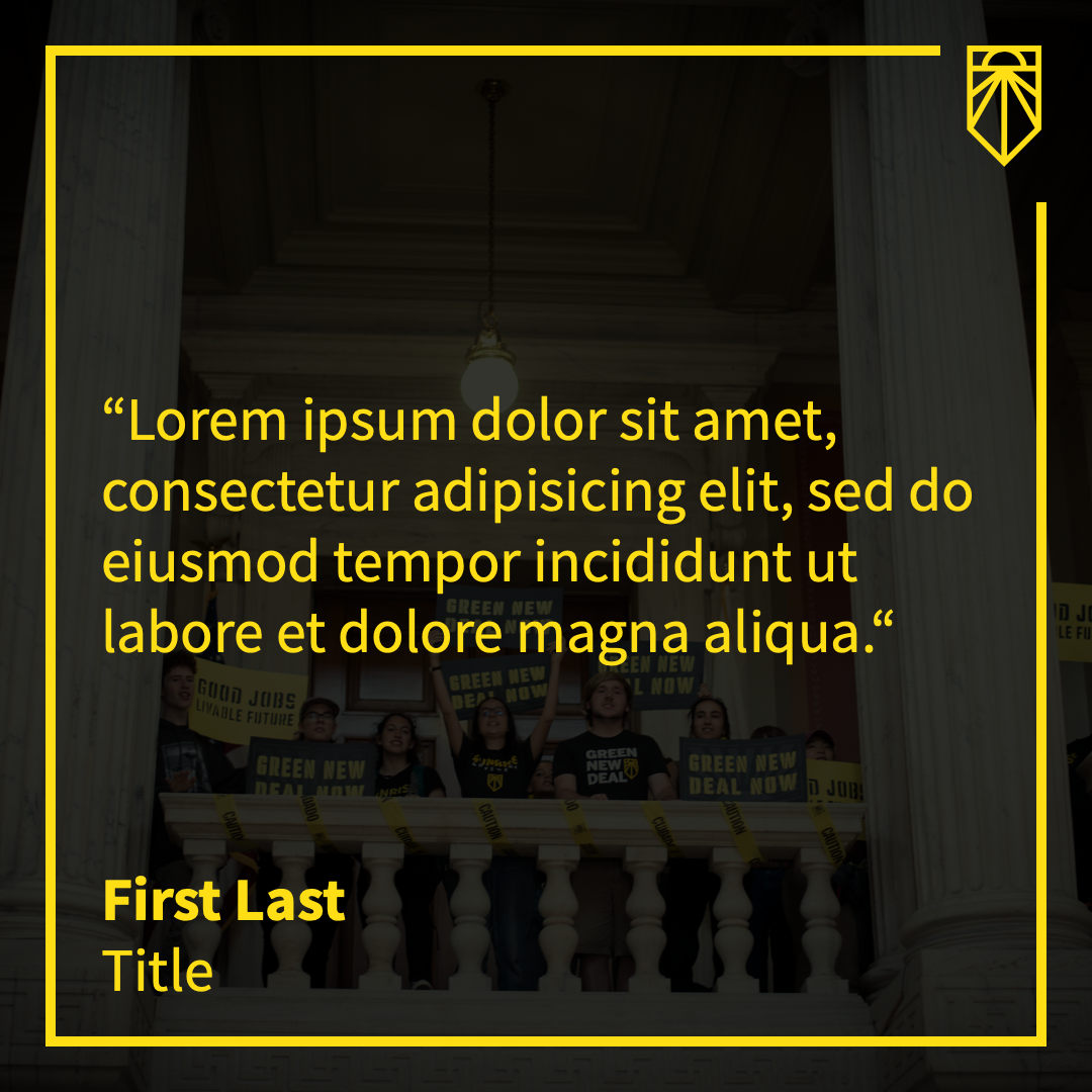
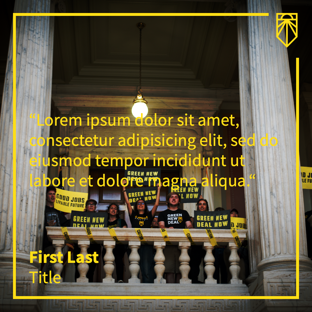
Generally speaking, if you're using a color scheme with a darker foreground text (ex. Yellow/Purple Gradient), hard light will work best. For lighter text (ex. Orange/Purple Gradient), multiply will be better. It'll be different for every image, though, so it's a good idea to play around with them until you get the effect you want. The most important thing is to ensure that your text is easily readable. As you can see in the example below, the hard light option is too light for this particular graphic, as the text is harder to read than with overlay or multiply.
| Overlay (medium) | Multiply (dark) | Hard light (light) |
|---|---|---|
 |
 |
 |
There are 27 background photos to choose from, curated by Sunrise's design team to best represent the movement. Clicking on any image will set it as the background in the graphic. (You may need to scroll up to see this, depending on your screen size.) Be sure to pick a photo that leaves the text still readable. Switching between different blend modes can help as well.
These options are used to include or exclude specific parts of the graphic.
By default, this is checked and both attribution lines (name and title) are included. If you uncheck it, both will be removed from the graphic.
This box, when unchecked, will remove the attribution title but not the name. It's checked by default.
The logo is included by default. Unchecking this box will remove it. If "set logo into border" is checked, the logo will be removed and the border will be completed so there's no empty space.
This dropdown has the following options:
- National logo
- NYC logo
If you have the logo included, you can select which logo to use. This defaults to National's logo. If you're a hub with your own logo, please submit a feature request to get it added.
Clicking the save button will save your graphic to your default downloads folder. It will be called quote.png.
At the very bottom of the page, beneath the save button, are two links; the first is for requesting a feature and the second is for reporting a bug.
If you have an idea of something that Outquote should do that it doesn't already, submit a feature request! Clicking on the link will take you to a page with some fields and a template to fill out. Your name and email are optional, but if you include them I can follow up with you once I've reviewed the request. Please make sure to fill out the template in the "Details" section — it makes it a lot easier for me to understand the request.
If you find something that seems broken or is making it difficult to use Outquote, click on the second link and submit a bug report. This also has optional fields for your name and email. Similar as above, please fill out the template. Including if you're on desktop or mobile as well as what browser you're using is very important, as different devices and browsers often behave differently.