This is a plugin for the Atom Tool Bar package.
You can configure your toolbar buttons with a CSON, JSON, JSON5, js, coffee file
to perform specific actions in Atom
or to open web sites in your default browser.
To edit your config file,
type Flex Tool Bar: Edit Config File in the Atom command palette.
Flex Tool Bar has four types you can configure:
button, url, function and spacer.
-
buttoncreates default buttons for your toolbar.You can use it to set actions like
application:new-file. -
urlcreates buttons pointing to specific web pages.Use this to open any web site, such as your GitHub notifications, in your default browser. See this feature in action in this screencast.
If you have the package browser-plus installed, you can use it to open your links. Just check the box in Flex Tool Bar's settings.
Also Atom URI are allowed. For example
atom://config/packages/flex-tool-barwill open Flex Tool Bar's settings.You can also create dynamic urls with the following placeholders:
{repo-name}The repo name for the current repo{repo-owner}The GitHub user for the current repo{atom-version}The current version of Atom
e.g.
https://github.com/{repo-owner}/{repo-name} -
functioncreates buttons that can call a function with the previous target as a parameterThis requires the config file to be a
.jsor.coffeefile that exports the array of buttons -
spaceradds separators between toolbar buttons.
- multiple callbacks
- function callback
- button icons
- inline button styles
- add class(s) to buttons
- hide/disable a button in certain cases
The default iconset is Octicons (Atom's flavor).
Example:
{
  type: "button"
  tooltip: "New File"
  callback: "application:new-file"
  icon: "file-add"
}
But you can specify the following iconsets:
- Ionicons (
ion) - FontAwesome (
fa) - Foundation (
fi) - IcoMoon (
icomoon) - Devicon (
devicon) - MaterialDesignIcons (
mdi)
Example:
{
  type: "button"
  tooltip: "Save File"
  callback: "core:save"
  icon: "floppy-o"
  iconset: "fa"
}You can use CSS styles per button.
style: {
  color: "red"
  background: "green"
  border: "1px solid blue"
}Using a comma separated list you can add your own class names to buttons. This is great if you want to take advantage of native styles like Font Awesome or if you have your own styles you prefer to keep in a stylesheet.
className: "fa-rotate-90, custom-class"callback: ["callback1", "callback2"]callback: target ->
console.log targetYou can hide or disable buttons when a certain grammar is used in the active file, a specified file is matched, or a package is active.
If you don't know what language to use, see this issue.
If you set disable (show, hide or enable) this way:
disable: {
  grammar: "coffee"
}
It will disable the button if a CoffeeScript file is open.
You can also look for a specific file using globs:
show: {
  pattern: "*.js"
}
You can also look for a specific package using:
show: {
  package: "context-git"
}
Of course, you can set it as an array.
disable: {
  grammar: [
    "json"
    "less"
  ]
}
You can use ! in grammar and package 😆
hide: {
  grammar: "!Markdown"
}
This will hide button when opened any file except Markdown.
show: {
  grammar: "Markdown"
}
This is same above.
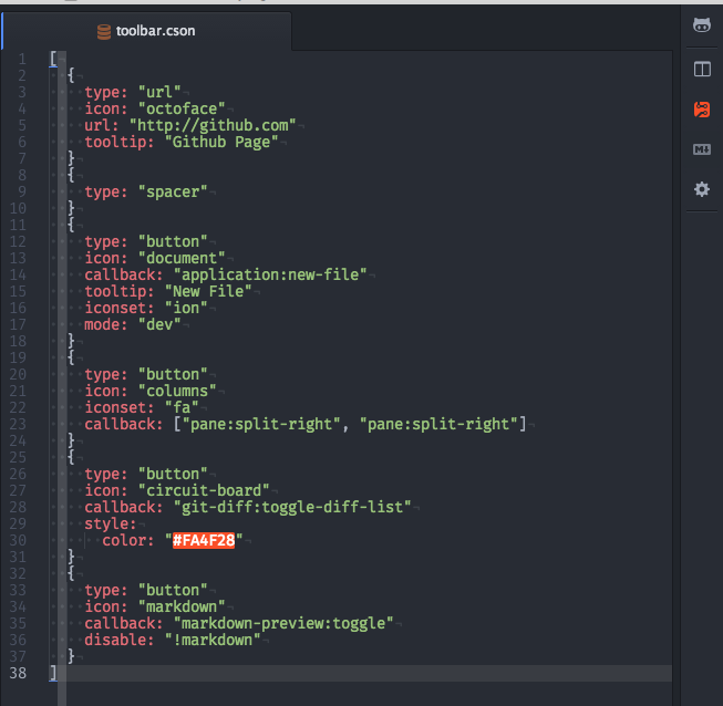
[
  {
    type: "url"
    icon: "octoface"
    url: "https://github.com/"
    tooltip: "Github Page"
  }
  {
    type: "spacer"
  }
  {
    type: "button"
    icon: "document"
    callback: "application:new-file"
    tooltip: "New File"
    iconset: "ion"
    mode: "dev"
  }
  {
    type: "button"
    icon: "columns"
    iconset: "fa"
    callback: ["pane:split-right", "pane:split-right"]
  }
  {
    type: "button"
    icon: "circuit-board"
    callback: "git-diff:toggle-diff-list"
    style:
      color: "#FA4F28"
  }
  {
    type: "button"
    icon: "markdown"
    callback: "markdown-preview:toggle"
    disable: "!markdown"
  }
  {
    type: "button"
    icon: "sitemap"
    iconset: "fa"
    className: "fa-rotate-180"
    tooltip: "This is just an example it does nothing"
  }
]module.exports = [
{
type: "function"
icon: "bug"
callback: (target) ->
console.dir target
tooltip: "Debug Target"
}
{
type: "spacer"
}
{
type: "url"
icon: "octoface"
url: "https://github.com/"
tooltip: "Github Page"
}
{
type: "spacer"
}
{
type: "button"
icon: "document"
callback: "application:new-file"
tooltip: "New File"
iconset: "ion"
mode: "dev"
}
{
type: "button"
icon: "columns"
iconset: "fa"
callback: ["pane:split-right", "pane:split-right"]
}
{
type: "button"
icon: "circuit-board"
callback: "git-diff:toggle-diff-list"
style:
color: "#FA4F28"
}
{
type: "button"
icon: "markdown"
callback: "markdown-preview:toggle"
disable: "!markdown"
}
{
type: "button"
icon: "sitemap"
iconset: "fa"
className: "fa-rotate-180"
tooltip: "This is just an example it does nothing"
}
]If you want buttons that are only for a specific project. Create a toolbar configuration file at the root of your project directory that is listed in the Atom Tree View. All buttons added to the project toolbar will append to the global toolbar buttons.
See more examples on Wiki ✨
| Ryo Narita | Jeroen van Warmerdam |
MIT © Ryo Narita
