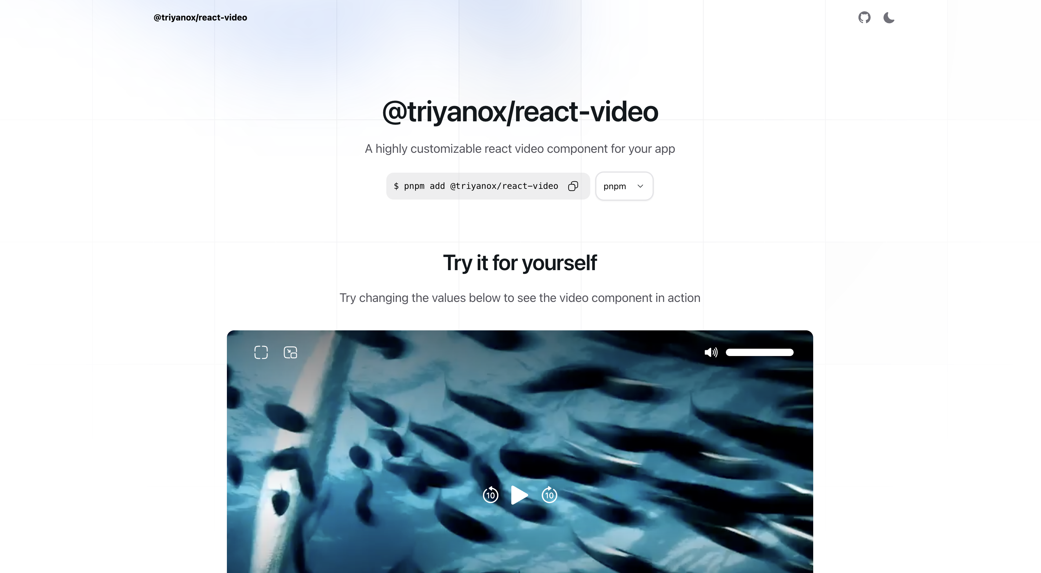
@triyanox/react-video a unified customizable video playback experience across all browsers for react
The @triyanox/react-video component is a highly customizable and easy-to-use React component for playing video content in your react applications inspired by apple tv video player. It offers extensive control over video playback and is fully compatible with TailwindCSS, allowing for seamless styling integration.
To install the component, use the following command:
pnpm add @triyanox/react-videoYou can use the video component simply by importing Video from the package
import { Video } from "@triyanox/react-video";

export default function Page() {
 return (
   <Video
   src="https://vjs.zencdn.net/v/oceans.mp4"
   />
)}-
src: VideoSource: The source of the video. This can be either a string URL or an array of objects containingsrc,type, andlabelfields.- Example:
[
  { src: 'https://example.com/video.mp4', type: 'video/mp4', label: 'SD' },
  { src: 'https://example.com/video.mp4', type: 'video/mp4', label: 'HD' }
]
// or
'https://example.com/video.mp4'
- Example:
-
poster?: string: URL of the video's poster image.- Example:
'https://example.com/poster.jpg'
- Example:
-
title?: string: Title of the video.- Example:
'Video title'
- Example:
-
subtitle?: string: Subtitle of the video.- Example:
'Video subtitle'
- Example:
-
Event Handlers:
onProgress?: (currentTime: number) => void: Called when the video progress changes.onDuration?: (duration: number) => void: Called when the video duration is available.onEnded?: () => void: Called when the video ends.onPlay?: () => void: Called when the video is played.onPause?: () => void: Called when the video is paused.onLoad?: () => void: Called when the video is loaded.onVolumeChange?: (volume: number) => void: Called when the volume changes.onPlaybackRateChange?: (playbackRate: number) => void: Called when the playback rate changes.
-
Styling and Layout:
className?: string: Root CSS class for custom styling.classNames?: object: Object containing CSS classes for various elements (title, subtitle, wrappers, video, backdrop, sliders).
-
Playback Control:
autoPlay?: boolean: Iftrue, the video will start playing as soon as it is ready.loop?: boolean: Iftrue, the video will loop continuously.showControls?: boolean: Iftrue, video controls will be displayed.icons?: object: Custom icons for various video controls (play, pause, forward, etc.).
-
Additional Options:
hideSliderThumb?: boolean: Iftrue, hides the slider thumb.
import React from 'react';
import { Video } from '@triyanox/react-video';

// Import custom icons (assuming these are available in your project)
import {
  CustomPlayIcon,
  CustomPauseIcon,
  CustomForwardIcon,
  CustomBackwardIcon,
  CustomEnterPipIcon,
  CustomExitPipIcon,
  CustomVolumeIcon,
  CustomFullScreenIcon,
  CustomExitFullScreenIcon,
  CustomLoadingIcon,
} from './YourIconPath';

const MyVideoComponent = () => {
  const videoProps = {
    src: [
      {
        src: 'https://example.com/video-sd.mp4',
        type: 'video/mp4',
        label: 'SD',
      },
      {
        src: 'https://example.com/video-hd.mp4',
        type: 'video/mp4',
        label: 'HD',
      },
    ],
    poster: 'https://example.com/poster.jpg',
    title: 'My Amazing Video',
    subtitle: 'An insightful subtitle',
    onProgress: currentTime => console.log(`Current Time: ${currentTime}`),
    onDuration: duration => console.log(`Duration: ${duration}`),
    onEnded: () => console.log('Video Ended'),
    onPlay: () => console.log('Video Played'),
    onPause: () => console.log('Video Paused'),
    onLoad: () => console.log('Video Loaded'),
    onVolumeChange: volume => console.log(`Volume: ${volume}`),
    onPlaybackRateChange: rate => console.log(`Playback Rate: ${rate}`),
    className: 'custom-video-class',
    autoPlay: true,
    loop: true,
    showControls: true,
    icons: {
      play: CustomPlayIcon,
      pause: CustomPauseIcon,
      forwardBy10: CustomForwardIcon,
      backBy10: CustomBackwardIcon,
      enterPip: CustomEnterPipIcon,
      exitPip: CustomExitPipIcon,
      volume: CustomVolumeIcon,
      fullScreen: CustomFullScreenIcon,
      exitFullScreen: CustomExitFullScreenIcon,
      loading: CustomLoadingIcon,
    },
    classNames: {
      base: 'video-base-class',
      title: 'video-title-class',
      subtitle: 'video-subtitle-class',
      topWrapper: 'top-wrapper-class',
      centerWrapper: 'center-wrapper-class',
      bottomWrapper: 'bottom-wrapper-class',
      video: 'video-element-class',
      backdrop: 'video-backdrop-class',
      volumeSlider: {
        root: 'volume-slider-root-class',
        track: 'volume-slider-track-class',
        thumb: 'volume-slider-thumb-class',
        range: 'volume-slider-range-class',
      },
      playbackRateSlider: {
        root: 'playback-rate-slider-root-class',
        track: 'playback-rate-slider-track-class',
        thumb: 'playback-rate-slider-thumb-class',
        range: 'playback-rate-slider-range-class',
      },
    },
    hideSliderThumb: false,
  };

  return <Video {...videoProps} />;
};


export default MyVideoComponent;The video component is fully customizable using TailwindCSS. You can use the className and classNames props to apply your TailwindCSS classes for styling the video player as per your design requirements.
