
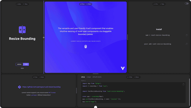
Vue3 Resize Bounding is a simple, highly customizable Vue3 component that allows you to intuitively resize nested content using draggable border panels.
Interactive Grid (Example):
Installation
npm i vue3-resize-bounding
# or
yarn add vue3-resize-bounding
Usage
<!-- @filename: MyComponent.vue -->
<script setup lang="ts">
  import { ref } from "vue";
  import ResizeBounding from "vue3-resize-bounding";

  const container = ref({ width: 320, height: 480 });
</script>

<template>
  <ResizeBounding
    :width="container.width"
    :height="container.height"
    :min-width="240"
    :max-width="480"
    :min-height="120"
    :directions="'hv'"
    :options="{
        knob: {
          show: true
        }
    }"
    :style="{ border: '1px solid gray' }"
    @update:width="(width) => (container.width = width)"
    @update:height="(height) => (container.height = height)"
  >
    <!-- CONTENT START -->
    <div :style="{ width: '100%', height: '100%' }">My Container</div>
    <!-- CONTENT END -->

    <!-- KNOB INNER CONTENT START -->
    <template #knob>
      <div class="some-icon"></div>
    </template>
    <!-- KNOB INNER CONTENT END -->
  </ResizeBounding>
</template>
Register the component globally:
// @filename: main.ts
import App from "@/App";
import { createApp } from "vue";
import ResizeBounding from "vue3-resize-bounding";

const app = createApp(App);
app.use(ResizeBounding, { name: "resize-bounding" });
app.mount("#app");| property | type | default value | description | |
|---|---|---|---|---|
directions
|
PaneDirections |
'' |
||
The literal 'hv' specifies which boundaries should be
enabled for resizing.The order of the characters is not significant. 'hv' is equivalent to 'tblr'
|
||||
| value | description | |||
| 't' | top | |||
| 'r' | right | |||
| 'b' | bottom | |||
| 'l' | left | |||
| 'h' | horizontal alias, equivalent to 'lr' |
|||
| 'v' | vertical alias, equivalent to 'tb' |
|||
disabled
|
boolean |
false |
Disable border selection | |
width
|
number | undefined |
undefined |
Set current container width | |
minWidth
|
number | undefined |
0 |
Minimum value of the width resizing range | |
maxWidth
|
number | undefined |
undefined |
Maximum resizing range value. undefiend
Equivalent to Number.POSITIVE_INFINITY
|
|
height
|
number | undefined |
undefined |
Set current container height | |
minHeight
|
number | undefined |
0 |
Minimum height resizing range value | |
maxHeight
|
number | undefined |
undefined |
The maximum value of the height resizing range.
Equivalent to Number.POSITIVE_INFINITY
|
|
| additional options | ||||
| property | type | value | ||
options
|
Partial <Options>
|
|||
options.prefix
|
||||
| description | Overrides the default class names prefix | |||
| type | string |
|||
| default value |
'resize-bounding-'
|
|||
options.width
|
||||
| description | Set width of splitter in pixels | |||
| type | number |
|||
| default value |
4
|
|||
options.activeAreaWidth
|
||||
| description | Sets the width of the active space within which the border (splitter) selection will be activated | |||
| type | number | undefined |
|||
| default value |
undefined
|
|||
options.position
|
||||
| description | Determines the positioning of the splitter relative to the container boundaries | |||
| type | SplitterPosition |
|||
| default value |
'central'
|
|||
| values: | ||||
'central'
|
||||
'internal'
|
||||
'external'
|
||||
options.touchActions
|
||||
| description | Enable touch actions | |||
| type | boolean |
|||
| default value | true |
|||
options.addStateClasses
|
||||
| description | Adds state classes to a pane element (.normal, .selected, .pressed) | |||
| type | boolean |
|||
| default value | false |
|||
options.knob.show
|
||||
| description | Render the knob | |||
| type | boolean |
|||
| default value | false |
|||
options.knob.normalHidden
|
||||
| description | Render the knob only when focusing or pressing on the splitter | |||
| type | boolean |
|||
| default value | false |
|||
options.cursor.vertical
|
||||
| description | Cursor style for horizontal bounding during Focus and Resize | |||
| type | CSSStyleDeclaration["cursor"] |
|||
| default value | 'row-resize' |
|||
options.cursor.horizontal
|
||||
| description | Cursor style for vertical bounding during Focus and Resize | |||
| type | CSSStyleDeclaration["cursor"] |
|||
| default value | 'col-resize' |
|||
styles
|
IStyles
|
|||
styles.container
|
||||
| description |
Describes custom styles the container element. container is the
element directly in which the user content is located, forwarded
through <slot/>.
|
|||
| type |
IStyle
|
|||
styles.pane
|
||||
| description |
Describes custom styles the pane element. The pane element is a
container responsible for positioning the splitter. Therefore, treat
this component as an empty container, since you may only need to style
it in very rare cases.
Pane receives normal, focused and
pressed classes
|
|||
| type |
IStyle
|
|||
styles.splitter
|
||||
| description |
Describes custom styles the splitter element. splitter is an element
that displays a selected border line
|
|||
| type |
IStyle
|
|||
styles.splitterContainer
|
||||
| description |
Describes custom styles the splitterContainer element. splitterContainer is empty element used to rotating the knob
|
|||
| type |
IStyle
|
|||
styles.knob
|
||||
| description |
Describes custom styles the knob element. Knobis a decorative element
located on top of the splitter. Convenient to use with touch actions,
as it increases the touch area of the splitter by its own size and
has a positive effect on user experience
|
|||
| type |
IStyle
|
|||
| property | type | description | |
|---|---|---|---|
@update:width
|
(width: number) => void |
Emitted every time a container width is updated | |
@update:height
|
(height: number) => void |
Emitted every time a container height is updated | |
@drag:start
|
(direction: PaneDirections) => void |
Emitted when resizing starts. The callback function accepts an
argument of current direction
|
|
@drag:move
|
(direction: PaneDirections) => void |
Emitted when resizing. The callback function accepts an argument of
current direction
|
|
@drag:end
|
(direction: PaneDirections) => void |
Emitted when resizing ends. The callback function accepts an argument
of current direction
|
|
@focus
|
({state: boolean, direction: PaneDirections}) => void |
Emitted when focusing on a specific boundary pane | |
| name | description |
|---|---|
default
|
Content |
knob
|
Knob inner content (icon) |
Overriding:
<template>
  <div class="my-class">
    <ResizeBounding v-bind="$attrs"
      options={{
        knob: {
          show: true,
        },
      }}>
      <slot />
      <template #knob>
        <slot name="knob">
      </template>
    </ResizeBounding>
  </div>
</template>

<script setup lang="ts">
  import ResizeBounding, { type Props } from "vue3-resize-bounding";
  defineProps<Props>();
</script>
Touch Area To increase the touch area, set the value to
options.activeAreaWidthor use increased height of theknobDefault value is undefined
States styling:
By default, to style the active state (both .focused or .pressed), the .actvie class is used;
So the style definition looks like this:
const styles = {
  // Active (focused/pressed) state:
  splitter: {
    [`.${globalClassNames(prefix).pane}.active &`]: {
      background: "cornflowerblue",
    },
  },
  knob: {
    [`.${globalClassNames(prefix).pane}.active &`]: {
      background: "cornflowerblue",
    },
  },
};
To separately configure the focused state or the pressed state of a splitter/knob, use the included :options="{ addStateClasses: true }" flag and the generated state classes:
const styles = {
  splitter: {
    // Focused state:
    [`.${prefix}-pane.focused &`]: {
      backgroundColor: "blue",
    },
    // Pressed state:
    [`.${prefix}-pane.pressed &`]: {
      backgroundColor: "red",
    },
  },

  knob: {
    // Focused state:
    [`.${prefix}-pane.focused &`]: {
      backgroundColor: "blue",
    },
    // Pressed state:
    [`.${prefix}-pane.pressed &`]: {
      backgroundColor: "red",
    },
  },
};
Using css (preprocessors)
Use the included :options="{ addStateClasses: true }" flag to style the .selected and .pressed states separately.
<script setup lang="ts">
  import { ref } from "vue";
  import ResizeBounding from "vue3-resize-bounding";

  const container = ref({ width: 320, height: 480 });
</script>

<template>
  <ResizeBounding
    :width="container.width"
    :height="container.height"
    :min-width="240"
    :max-width="480"
    :min-height="120"
    :directions="'hv'"
    :options="{ addStateClasses: true, knob: { show: true } }"
    :style="{ border: '1px solid gray' }"
    @update:width="(width) => (container.width = width)"
    @update:height="(height) => (container.height = height)"
  >
    <!-- CONTENT START -->
    <div :style="{ width: '100%', height: '100%' }">My Container</div>
    <!-- CONTENT END -->

    <!-- KNOB INNER CONTENT START -->
    <template #knob>
      <div class="some-icon"></div>
    </template>
    <!-- KNOB INNER CONTENT END -->
  </ResizeBounding>
</template>

<style lang="scss">
  $prefix: "resize-bounding-";

  .#{$prefix} {
    &-container {
    }
    &-pane {
      /* Normal state */
      .#{$prefix}splitter {
        &--container {
        }
      }
      .#{$prefix}knob {
      }

      /* * * Default `options` settings * * */

      /* Both selected and pressed states */
      &.active {
        .#{$prefix}splitter {
        }
        .#{$prefix}knob {
        }
      }

      /* * * Separate states ({ addStateClasses: true }) * * */

      /* Normal state */
      &.normal {
        .#{$prefix}splitter {
        }
        .#{$prefix}knob {
        }
      }

      /* Focused state */
      &.focused {
        .#{$prefix}splitter {
        }
        .#{$prefix}knob {
        }
      }

      /* Pressed state */
      &.pressed {
        .#{$prefix}splitter {
        }
        .#{$prefix}knob {
        }
      }
    }
  }
</style><!-- @filename: MyResizeBoundingComponent.vue -->
<script lang="ts">
import ResizeBounding, { PREFIX } from "vue3-resize-bounding";
/* * * Default styles and classes * * */
const options = {
width: 4,
activeAreaWidth: undefined,
position: "central", // 'central' | 'internal' | 'external'
knob: {
show: true,
normalHidden: true,
},
cursor: {
horizontal: "col-resize",
},
touchActions: true,
};
// Below are all the default styles purely for demonstration purposes
// In reality, you can only override the necessary properties
const styles = (prefix: string): IStyles => ({
container: [
globalClassNames(prefix).container,
{ displayName: globalClassNames(prefix).container, position: "relative" },
],
pane: [
globalClassNames(prefix).pane,
{
displayName: globalClassNames(prefix).pane,
position: "absolute",
display: "block",
zIndex: 9999,
touchAction: "none",
},
],
splitter: [
globalClassNames(prefix).splitter,
{
displayName: globalClassNames(prefix).splitter,
position: "absolute",
zIndex: 9999,
transition: "background 125ms ease-out",
[`.${globalClassNames(prefix).pane}.active &`]: {
background: "cornflowerblue",
},
/*
Focused state:
[`.${globalClassNames(prefix).pane}.focused &`]: {},
Pressed state:
[`.${globalClassNames(prefix).pane}.pressed &`]: {}
*/
},
],
splitterContainer: [
globalClassNames(prefix).splitterContainer,
{
displayName: globalClassNames(prefix).splitterContainer,
position: "relative",
top: "50%",
left: "50%",
width: `0px`,
height: `0px`,
},
],
knob: [
globalClassNames(prefix).knob,
{
displayName: globalClassNames(prefix).knob,
position: "relative",
width: "64px",
height: "6px",
background: "gray",
borderRadius: "3px",
transform: "translate(-50%, -50%)",
transition: "background 125ms ease-out",
[`.${globalClassNames(prefix).pane}.active &`]: {
background: "cornflowerblue",
},
/*
Focused state:
[`.${globalClassNames(prefix).pane}.focused &`]: {},
Pressed state:
[`.${globalClassNames(prefix).pane}.pressed &`]: {}
*/
},
],
});
</script>Mikhail Grebennikov - yamogoo
This project is licensed under the terms of the MIT license.