A reusable React component for uploading, previewing, and cropping images built with Shadcn UI.
- 📤 Drag & drop or file selection
- ✅ File type validation
- 📏 File size validation
- 🖼️ Image preview
- ✂️ Interactive crop with zoom and pan
- 📐 Customizable aspect ratio
- 📦 Blob or File output
- 🎨 Built with Shadcn UI components
- 🔧 Fully customizable
- 📋 TypeScript support
git clone https://github.com/yourusername/shadcn-image-uploader.git
cd shadcn-image-uploaderbun install
# or npm install
# or yarn installbun run dev
# or npm run dev
# or yarn devimport { ImageUploader } from "@/components/ImageUploader";
function MyComponent() {
const handleImageCropped = (blob) => {
console.log("Cropped image blob:", blob);
// You can upload the blob to your server or process it further
};
return <ImageUploader onImageCropped={handleImageCropped} />;
}import { ImageUploader } from "@/components/ImageUploader";
function MyAdvancedComponent() {
const handleImageCropped = (blob) => {
// Create a file from the blob
const file = new File([blob], "cropped-image.jpg", { type: "image/jpeg" });
// Upload to server
const formData = new FormData();
formData.append("image", file);
fetch("/api/upload", {
method: "POST",
body: formData,
})
.then((response) => response.json())
.then((data) => console.log("Upload success:", data))
.catch((error) => console.error("Upload error:", error));
};
return (
<ImageUploader
aspectRatio={16 / 9}
maxSize={10 * 1024 * 1024} // 10MB
acceptedFileTypes={["image/jpeg", "image/png", "image/webp"]}
onImageCropped={handleImageCropped}
className="max-w-lg mx-auto"
/>
);
}| Prop | Type | Default | Description |
|---|---|---|---|
| aspectRatio | number | 1 | The aspect ratio of the cropped image (width / height) |
| maxSize | number | 5242880 (5MB) | Maximum file size in bytes |
| acceptedFileTypes | string[] | ['image/jpeg', 'image/png', 'image/webp'] | Allowed file MIME types |
| className | string | undefined | CSS class name for the container |
| onImageCropped | (blob: Blob) => void | undefined | Callback function that receives the cropped image as a blob |
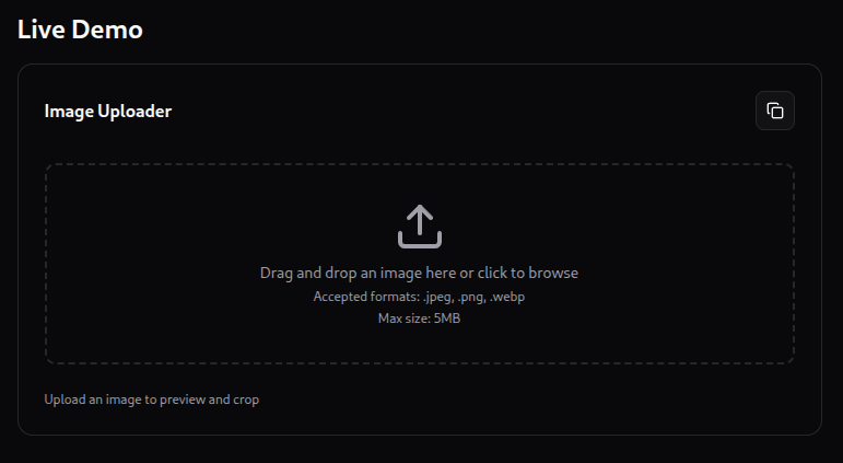
The ImageUploader component provides a seamless user experience for image uploads:
- Upload: User can drag & drop an image file or click to select one
- Validation: The component validates the file type and size
- Crop: User can adjust the crop area, zoom, and pan the image
- Preview: The cropped image is shown as a preview
- Output: The cropped image is provided as a Blob through the
onImageCroppedcallback
- React
- react-easy-crop - For cropping functionality
- Shadcn UI - For UI components
- Lucide React - For icons
To build this application for production:
bun run build
# or npm run build
# or yarn buildMIT
This project uses Vitest for testing. You can run the tests with:
bunx --bun run testThis project uses Tailwind CSS for styling.
Add components using the latest version of Shadcn.
pnpx shadcn@latest add buttonThis project uses TanStack Router. The initial setup is a file based router. Which means that the routes are managed as files in src/routes.
To add a new route to your application just add another a new file in the ./src/routes directory.
TanStack will automatically generate the content of the route file for you.
Now that you have two routes you can use a Link component to navigate between them.
To use SPA (Single Page Application) navigation you will need to import the Link component from @tanstack/react-router.
import { Link } from "@tanstack/react-router";Then anywhere in your JSX you can use it like so:
<Link to="/about">About</Link>This will create a link that will navigate to the /about route.
More information on the Link component can be found in the Link documentation.
In the File Based Routing setup the layout is located in src/routes/__root.tsx. Anything you add to the root route will appear in all the routes. The route content will appear in the JSX where you use the <Outlet /> component.
Here is an example layout that includes a header:
import { Outlet, createRootRoute } from "@tanstack/react-router";
import { TanStackRouterDevtools } from "@tanstack/react-router-devtools";

import { Link } from "@tanstack/react-router";

export const Route = createRootRoute({
  component: () => (
    <>
      <header>
        <nav>
          <Link to="/">Home</Link>
          <Link to="/about">About</Link>
        </nav>
      </header>
      <Outlet />
      <TanStackRouterDevtools />
    </>
  ),
});
The <TanStackRouterDevtools /> component is not required so you can remove it if you don't want it in your layout.
More information on layouts can be found in the Layouts documentation.
There are multiple ways to fetch data in your application. You can use TanStack Query to fetch data from a server. But you can also use the loader functionality built into TanStack Router to load the data for a route before it's rendered.
For example:
const peopleRoute = createRoute({
  getParentRoute: () => rootRoute,
  path: "/people",
  loader: async () => {
    const response = await fetch("https://swapi.dev/api/people");
    return response.json() as Promise<{
      results: {
        name: string;
      }[];
    }>;
  },
  component: () => {
    const data = peopleRoute.useLoaderData();
    return (
      <ul>
        {data.results.map((person) => (
          <li key={person.name}>{person.name}</li>
        ))}
      </ul>
    );
  },
});
Loaders simplify your data fetching logic dramatically. Check out more information in the Loader documentation.
React-Query is an excellent addition or alternative to route loading and integrating it into you application is a breeze.
First add your dependencies:
bun install @tanstack/react-query @tanstack/react-query-devtoolsNext we'll need to create a query client and provider. We recommend putting those in main.tsx.
import { QueryClient, QueryClientProvider } from "@tanstack/react-query";

// ...

const queryClient = new QueryClient();

// ...

if (!rootElement.innerHTML) {
  const root = ReactDOM.createRoot(rootElement);

  root.render(
    <QueryClientProvider client={queryClient}>
      <RouterProvider router={router} />
    </QueryClientProvider>
  );
}
You can also add TanStack Query Devtools to the root route (optional).
import { ReactQueryDevtools } from "@tanstack/react-query-devtools";

const rootRoute = createRootRoute({
  component: () => (
    <>
      <Outlet />
      <ReactQueryDevtools buttonPosition="top-right" />
      <TanStackRouterDevtools />
    </>
  ),
});
Now you can use useQuery to fetch your data.
import { useQuery } from "@tanstack/react-query";

import "./App.css";

function App() {
  const { data } = useQuery({
    queryKey: ["people"],
    queryFn: () =>
      fetch("https://swapi.dev/api/people")
        .then((res) => res.json())
        .then((data) => data.results as { name: string }[]),
    initialData: [],
  });

  return (
    <div>
      <ul>
        {data.map((person) => (
          <li key={person.name}>{person.name}</li>
        ))}
      </ul>
    </div>
  );
}

export default App;
You can find out everything you need to know on how to use React-Query in the React-Query documentation.
Another common requirement for React applications is state management. There are many options for state management in React. TanStack Store provides a great starting point for your project.
First you need to add TanStack Store as a dependency:
bun install @tanstack/storeNow let's create a simple counter in the src/App.tsx file as a demonstration.
import { useStore } from "@tanstack/react-store";
import { Store } from "@tanstack/store";
import "./App.css";

const countStore = new Store(0);

function App() {
  const count = useStore(countStore);
  return (
    <div>
      <button onClick={() => countStore.setState((n) => n + 1)}>
        Increment - {count}
      </button>
    </div>
  );
}

export default App;
One of the many nice features of TanStack Store is the ability to derive state from other state. That derived state will update when the base state updates.
Let's check this out by doubling the count using derived state.
import { useStore } from "@tanstack/react-store";
import { Store, Derived } from "@tanstack/store";
import "./App.css";

const countStore = new Store(0);

const doubledStore = new Derived({
  fn: () => countStore.state * 2,
  deps: [countStore],
});
doubledStore.mount();

function App() {
  const count = useStore(countStore);
  const doubledCount = useStore(doubledStore);

  return (
    <div>
      <button onClick={() => countStore.setState((n) => n + 1)}>
        Increment - {count}
      </button>
      <div>Doubled - {doubledCount}</div>
    </div>
  );
}

export default App;
We use the Derived class to create a new store that is derived from another store. The Derived class has a mount method that will start the derived store updating.
Once we've created the derived store we can use it in the App component just like we would any other store using the useStore hook.
You can find out everything you need to know on how to use TanStack Store in the TanStack Store documentation.
Files prefixed with demo can be safely deleted. They are there to provide a starting point for you to play around with the features you've installed.
You can learn more about all of the offerings from TanStack in the TanStack documentation.
You can view and copy the full component code below or view it on GitHub.
Show/Hide ImageUploader.tsx
import { cn } from "@/lib/utils";
import { Check, Copy, Trash2, Upload, ZoomIn, ZoomOut } from "lucide-react";
import { useCallback, useRef, useState } from "react";
import Cropper from "react-easy-crop";
import { Button } from "./ui/button";
import { Card, CardContent, CardFooter, CardHeader, CardTitle } from "./ui/card";
import { Dialog, DialogContent, DialogHeader, DialogTitle } from "./ui/dialog";
import { Slider } from "./ui/slider";
import { Tooltip, TooltipContent, TooltipProvider, TooltipTrigger } from "./ui/tooltip";

interface Point { x: number; y: number; }
interface Area { x: number; y: number; width: number; height: number; }

/**
 * Props for the ImageUploader component
 */
interface ImageUploaderProps {
  aspectRatio?: number;
  maxSize?: number;
  acceptedFileTypes?: string[];
  className?: string;
  onImageCropped?: (blob: Blob) => void;
}

export function ImageUploader({
  aspectRatio = 1,
  maxSize = 5 * 1024 * 1024,
  acceptedFileTypes = ["image/jpeg", "image/png", "image/webp"],
  className,
  onImageCropped,
}: ImageUploaderProps) {
  const [image, setImage] = useState<string | null>(null);
  const [croppedAreaPixels, setCroppedAreaPixels] = useState<Area | null>(null);
  const [crop, setCrop] = useState<Point>({ x: 0, y: 0 });
  const [zoom, setZoom] = useState(1);
  const [error, setError] = useState<string | null>(null);
  const [previewImage, setPreviewImage] = useState<string | null>(null);
  const [isCropDialogOpen, setIsCropDialogOpen] = useState(false);
  const [isCopied, setIsCopied] = useState(false);
  const inputRef = useRef<HTMLInputElement>(null);
  // ...rest of the implementation