A production-ready, lightweight React theming engine that bridges the gap between Brand Palettes, Semantic Tokens, and CSS Variables. Built for high-performance design systems.

Try it live → react-theme-engine.vercel.app
Explore the full interactive documentation, switch between all built-in theme presets, tweak primary colors in real time, and copy integration code — all in one place.
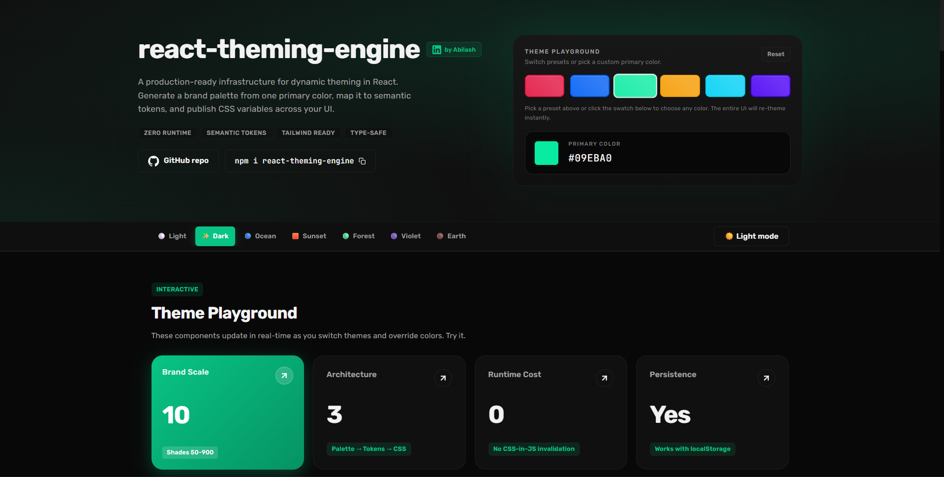
npm install react-theming-engine- 🏗️ 3-Layer Architecture: Brand Palette → Semantic Tokens → CSS Variables.
- 🌓 Dynamic Modes: Native Light and Dark support with smart palette migration.
- 🎨 Runtime Branding: Change primary colors or overrides on-the-fly with
overrideTheme. - ⚡ Zero-Runtime Overhead: Styles are applied via CSS variables for maximum performance.
- 🌪️ Tailwind Friendly: Includes a first-class preset for utility-first workflows.
- 🔒 Type-Safe: Full TypeScript support with exported types for all tokens.
- React (
^18.0.0): Core UI library. - TypeScript (
^5.7.0): Strongly typed programming. - tsup: High-performance library bundler.
- Styling Flexibility: Seamlessly integrate with Vanilla CSS, SCSS, CSS-in-JS, or Tailwind CSS.
npm install react-theming-engineThe ThemeProvider handles state, persistence, and DOM variable injection.
import { ThemeProvider } from 'react-theming-engine';

function App() {
  return (
    <ThemeProvider defaultThemeName="light" storageKey="app-theme">
      <MainLayout />
    </ThemeProvider>
  );
}The engine automatically injects variables like --color-background and --color-accent into the :root.
/* In your CSS files */
.my-card {
  background-color: var(--color-surface);
  border: 1px solid var(--color-border);
  border-radius: var(--radius-md);
}

.my-text {
  color: var(--color-foreground-muted);
}Add the preset to your config to use tokens as utility classes.
/* tailwind.config.js */
import { themePreset } from 'react-theming-engine/tailwind';

export default {
  content: ["./src/**/*.{ts,tsx}"],
  presets: [themePreset],
}
Usage: <div className="bg-surface text-foreground-muted rounded-md" />
The engine exports a rich suite of pure, framework-agnostic utilities to help you work with colors at runtime. These are perfect for calculating hovestates, generating dynamic contrasts, or checking OS preferences.
import {
  lighten,
  darken,
  withOpacity,
  getContrastRatio,
  prefersDarkMode,
  hexToHsl
} from 'react-theming-engine';

// 🔄 Intelligent Manipulation
const hoverColor = lighten('#2563eb', 10);
const mutedBg = withOpacity('#2563eb', 0.1); // Returns #2563eb1a

// ♿ Accessibility & Intelligence
const ratio = getContrastRatio('#ffffff', '#2563eb'); // Result: 5.89 (Passes WCAG AA)
const isDarkMode = prefersDarkMode(); // Boolean based on OS preference

// 🔄 Advanced Conversion
const hsl = hexToHsl('#2563eb'); // Returns { h: 221, s: 83, l: 53 }| Category | Utilities |
|---|---|
| Manipulation | lighten, darken, saturate, desaturate, mixColors, withOpacity |
| Conversion | hexToRgb, rgbToHex, rgbToHsl, hslToHex, hexToHsl, hexToRgba |
| Analysis | getLuminance, getContrastRatio, prefersDarkMode |
You can apply logic-based overrides at any time. This is perfect for "Primary Color Changers" or user-specific branding.
const { overrideTheme } = useTheme();

const updateBrandColor = (newHex: string) => {
  overrideTheme({
    tokens: {
      accent: newHex,
      accentHover: `${newHex}cc`, // 80% opacity
    }
  });
};| Name | Style | Icon |
|---|---|---|
light/dark |
Multi-purpose | ☀️/🌙 |
ocean |
Deep Blues | 🌊 |
sunset |
Warm | 🌅 |
forest |
Organic Greens | 🌲 |
violet |
Modern Purple | 🔮 |
earth |
Neutral Browns | ☕ |
We use a 3-Layer System to ensure UI logic never touches hardcoded colors:
- Brand Palette: Raw color scales (e.g.
blue-500). - Semantic Tokens: Functional roles (e.g.
accent→brand.primary.600). - CSS Variables: The final performance-focused output.
- Theming Guide - Deep dive into tokens and overrides.
- Publishing Guide - NPM & GitHub Package instructions.
- Contributing Guidelines
Built with ❤️ by Abilash. A UI Engineer focused on scalable design systems and developer tools.
MIT © Abilash