Flutter Selectable Radio Cards and Checkbox Cards UI. Easily create radio and checkbox cards with custom styles for your onboarding screens, forms, or any other use case. Flutter Selectable is a versatile package that allows you to create selectable cards with various layouts and designs.
- Multi-select and single-select support
- Use any widget as a selectable
- Customizable layouts: Column, Row, and Wrap
- Included simple card widget, radio checkbox card widget, card image widget or use your own widget
- Easy integration with any Flutter Widget
dependencies:
  flutter_selectable_cards: ^0.0.2
Then, run flutter pub get to install the package.
import 'package:flutter_selectable_cards/flutter_selectable_cards.dart';SelectableCards(
isMultipleSelection: false,
layout: const LayoutWrap(),
children: const [
SimpleCard(
index: 0,
child: Padding(
padding: EdgeInsets.all(8.0),
child: Text('Select Card 1'),
),
),
SimpleCard(
index: 1,
child: Padding(
padding: EdgeInsets.all(8.0),
child: Text('Select Card 2'),
),
),
],
onSelected: (index) {
print('Main.dart Selected card: $index');
},
)SelectableCards(
layout: const LayoutColumn(
crossAxisAlignment: CrossAxisAlignment.start,
),
children: []
),
SelectableCards(
layout: const LayoutRow(),
children: []
),
SelectableCards(
layout: const LayoutWrap(
crossAxisAlignment: WrapCrossAlignment.center,
),
children: []
),Here's a basic example of how to use the Flutter Selectable package:
import 'package:flutter/material.dart';
import 'package:flutter_selectable/flutter_selectable.dart';

void main() {
  runApp(const MyApp());
}

class MyApp extends StatelessWidget {
  const MyApp({super.key});

  @override
  Widget build(BuildContext context) {
    return MaterialApp(
      home: Scaffold(
        appBar: AppBar(
          title: const Text('Selectable Example'),
        ),
        body: DefaultTabController(
          length: 4,
          child: Column(
            children: <Widget>[
              const TabBar(
                isScrollable: true,
                tabs: [
                  Tab(text: 'Selectable Cards'),
                  Tab(text: 'Selectable Radio'),
                  Tab(text: 'Selectable Card With Image'),
                  Tab(text: 'Any Widget'),
                ],
              ),
              Expanded(
                child: TabBarView(
                  children: [
                    SelectableCardsExample(),
                    SelectableRadioExample(),
                    SelectableCardWithImageExample(),
                    AnyWidgetExample(),
                  ],
                ),
              ),
            ],
          ),
        ),
      ),
    );
  }
}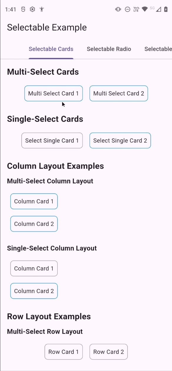
class SelectableCardsExample extends StatelessWidget {
  @override
  Widget build(BuildContext context) {
    return SingleChildScrollView(
      child: Padding(
        padding: const EdgeInsets.all(16.0),
        child: Column(
          crossAxisAlignment: CrossAxisAlignment.start,
          children: [
            const Text(
              'Multi-Select Cards',
              style: TextStyle(fontSize: 20, fontWeight: FontWeight.bold),
            ),
            const SizedBox(height: 10),
            Center(
              child: SelectableCards(
                isMultipleSelection: true,
                layout: const LayoutWrap(crossAxisAlignment: WrapCrossAlignment.center),
                children: const [
                  SimpleCard(index: 0, child: Padding(padding: EdgeInsets.all(8.0), child: Text('Multi Select Card 1'))),
                  SimpleCard(index: 1, child: Padding(padding: EdgeInsets.all(8.0), child: Text('Multi Select Card 2'))),
                ],
                onSelected: (index) {
                  print('Selected card: $index');
                },
              ),
            ),
          ],
        ),
      ),
    );
  }
}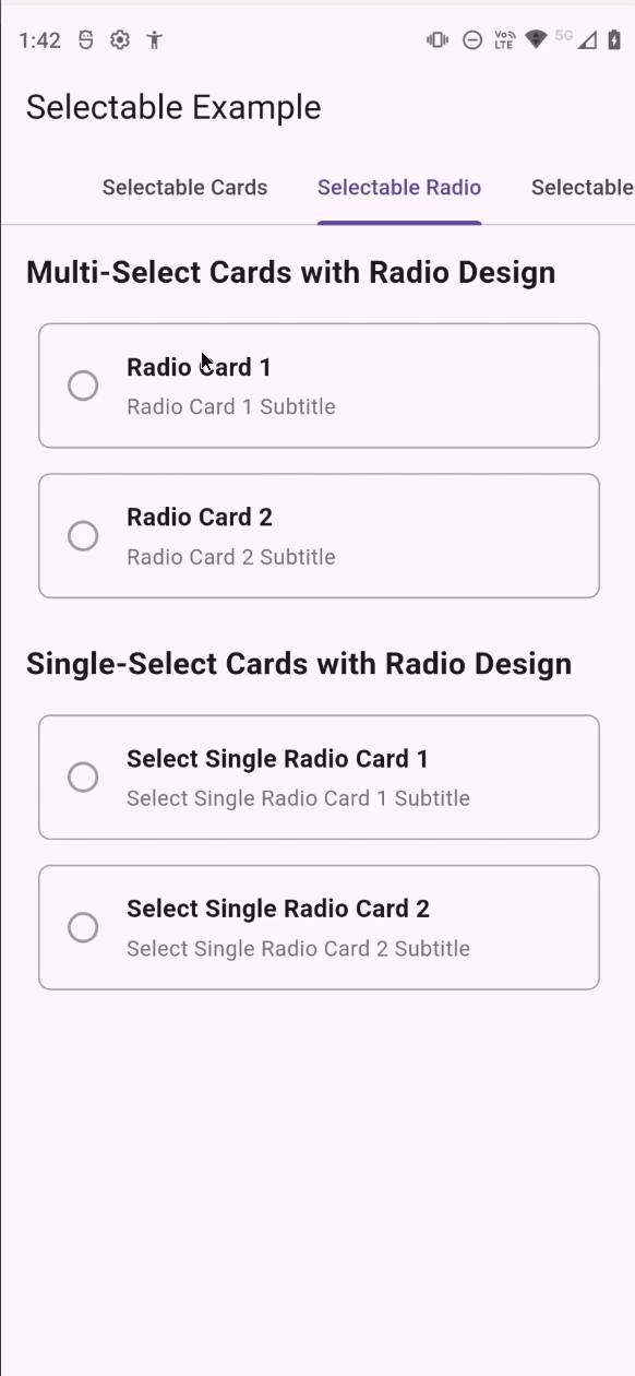
class SelectableRadioExample extends StatelessWidget {
  @override
  Widget build(BuildContext context) {
    return SingleChildScrollView(
      child: Padding(
        padding: const EdgeInsets.all(16.0),
        child: Column(
          crossAxisAlignment: CrossAxisAlignment.start,
          children: [
            const Text(
              'Multi-Select Cards with Radio Design',
              style: TextStyle(fontSize: 20, fontWeight: FontWeight.bold),
            ),
            const SizedBox(height: 10),
            Center(
              child: SelectableCards(
                isMultipleSelection: true,
                layout: const LayoutWrap(crossAxisAlignment: WrapCrossAlignment.center),
                children: const [
                  RadioCard(index: 0, title: 'Radio Card 1', subtitle: 'Radio Card 1 Subtitle'),
                  RadioCard(index: 1, title: 'Radio Card 2', subtitle: 'Radio Card 2 Subtitle'),
                ],
                onSelected: (index) {
                  print('Selected card: $index');
                },
              ),
            ),
          ],
        ),
      ),
    );
  }
}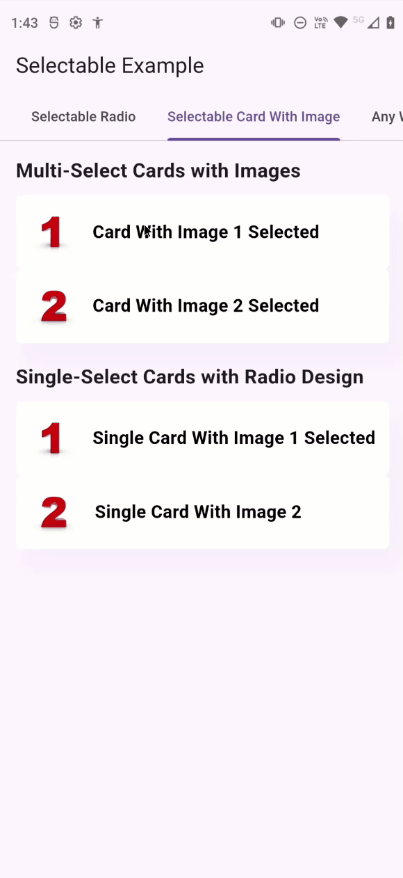
class SelectableCardWithImageExample extends StatelessWidget {
  @override
  Widget build(BuildContext context) {
    return SingleChildScrollView(
      child: Padding(
        padding: const EdgeInsets.all(16.0),
        child: Column(
          crossAxisAlignment: CrossAxisAlignment.start,
          children: [
            const Text(
              'Multi-Select Cards with Images',
              style: TextStyle(fontSize: 20, fontWeight: FontWeight.bold),
            ),
            const SizedBox(height: 10),
            Center(
              child: SelectableCards(
                isMultipleSelection: true,
                layout: const LayoutWrap(crossAxisAlignment: WrapCrossAlignment.center),
                children: [
                  CardWithImage(
                    index: 0,
                    imageUrl: 'https://example.com/image1.jpg',
                    text: 'Card With Image 1',
                  ),
                  CardWithImage(
                    index: 1,
                    imageUrl: 'https://example.com/image2.jpg',
                    text: 'Card With Image 2',
                  ),
                ],
                onSelected: (index) {
                  print('Selected card: $index');
                },
              ),
            ),
          ],
        ),
      ),
    );
  }
}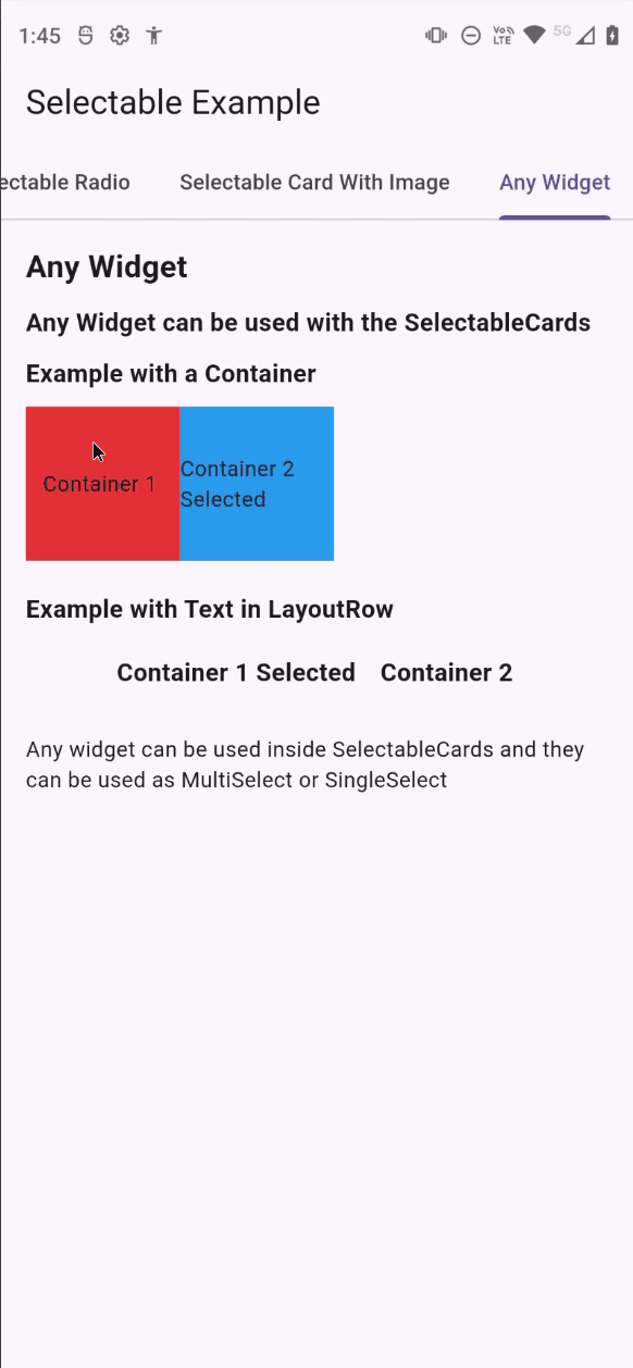
class AnyWidgetExample extends StatelessWidget {
  @override
  Widget build(BuildContext context) {
    return SingleChildScrollView(
      child: Padding(
        padding: const EdgeInsets.all(16.0),
        child: Column(
          crossAxisAlignment: CrossAxisAlignment.start,
          children: [
            const Text(
              'Any Widget',
              style: TextStyle(fontSize: 20, fontWeight: FontWeight.bold),
            ),
            const SizedBox(height: 10),
            const Text(
              'Any Widget can be used with the SelectableCards',
              style: TextStyle(fontSize: 16, fontWeight: FontWeight.bold),
            ),
            const SizedBox(height: 10),
            SelectableCards(
              isMultipleSelection: false,
              layout: const LayoutWrap(crossAxisAlignment: WrapCrossAlignment.center),
              children: [
                Container(
                  width: 100,
                  height: 100,
                  color: Colors.red,
                  child: Center(child: Text('Container 1')),
                ),
                Container(
                  width: 100,
                  height: 100,
                  color: Colors.blue,
                  child: Center(child: Text('Container 2')),
                ),
              ],
              onSelected: (index) {
                print('Selected card: $index');
              },
            ),
          ],
        ),
      ),
    );
  }
}This project is licensed under the MIT License - see the LICENSE file for details.