-
Notifications
You must be signed in to change notification settings - Fork 15
How to set up charts
This chart feature enables to view the records in graphs.
- Log in to Biocollect as Admin and go to Admin → Manage hubs → Edit "hub" (Ex: https://biocollect-test.ala.org.au/acsa/admin/manageHubs)
- Go to Facets tab
- Decide on which page you need to show the graph.
- Next decide on which facet you need to add the graph.
- Select chart type as "Pie"

- Click on "Edit Config" to add pie chart configuration.
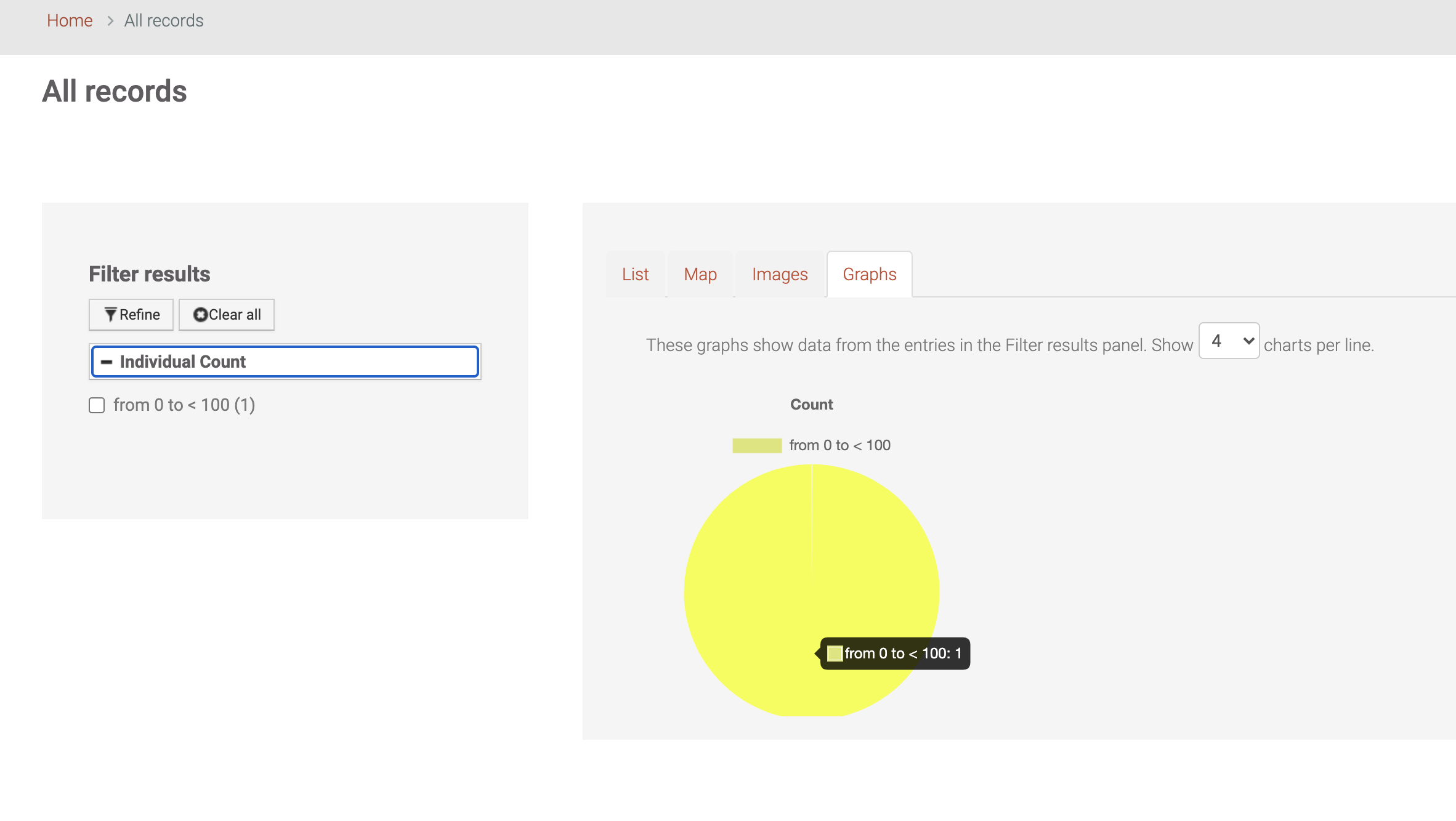
- Following is a sample pie chart configuration.
{ "mainTitleInsertTotalAt": "26", "mainTitlePosition": "top", "dataIsCustomChartData": "false", "dataUseCount": "false", "dataToPercentage": "false", "mainLabels": [ { "newLabel": "from 0 to < 100", "originalLabel": "from 0 to < 100" } ], "hoverOffset": "4", "bgColorsAvailable": [ "rgb(221, 229, 116)", "rgb(19, 28, 20)", "rgb(222, 211, 191)", "rgb(23, 54, 34)" ], "borderColorsAvailable": [ "rgb(221, 229, 116)", "rgb(169, 28, 0)", "rgb(222, 211, 191)", "rgb(237, 154, 34)" ], "mainTitleDisplay": "true", "mainTitle": "Count", "borderWidth": "0", "responsive": "true", "mainLabelsShowAll": "true" }
- The labels should match with the facets labels.
- Add the configuration and click Done.
- Next click on Save.
- The graph should be displayed as following when you visited the page.

- Decide on which page you need to show the graph.
- Next decide on which facet you need to add the graph.
- Select chart type as "Bar"
- Click on "Edit Config" to add bar chart configuration.
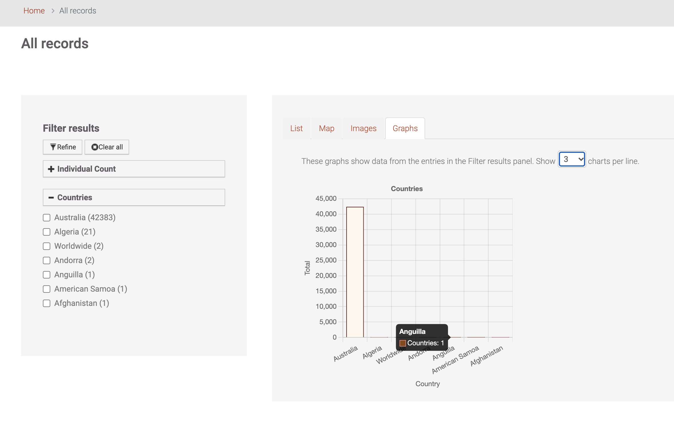
- Following is a sample bar chart configuration.
{ "legendDisplay": "false", "mainTitleInsertTotalAt": "22", "mainTitlePosition": "top", "xDisplay": "true", "dataIsCustomChartData": "false", "dataUseCount": "true", "yDisplay": "true", "yTitleDisplay": "true", "dataToPercentage": "false", "mainLabels": [ { "newLabel": "Australia", "originalLabel": " Australia" }, { "newLabel": "Algeria", "originalLabel": " Algeria" }, { "newLabel": "Worldwide", "originalLabel": " Worldwide" }, { "newLabel": "Andorra", "originalLabel": " Andorra" }, { "newLabel": "Anguilla", "originalLabel": " Anguilla" }, { "newLabel": "American Samoa", "originalLabel": " American Samoa" }, { "newLabel": "Afghanistan", "originalLabel": " Afghanistan" } ], "hoverOffset": "0", "bgColorsAvailable": [ "rgba(255,248,238,1)", "rgba(255,228,196, 1)", "rgba(222,184,135, 1)", "rgba(205,133,63, 1)", "rgba(139,69,19, 1)", "rgba(127,12,7, 1)", "rgba(227,88,127, 51)" ], "borderColorsAvailable": [ "rgba(92, 19, 16, 1)", "rgba(92, 19, 16, 1)", "rgba(92, 19, 16, 1)", "rgba(92, 19, 16, 1)", "rgba(92, 19, 16, 1)", "rgba(92, 19, 16, 1)", "rgba(92, 19, 16, 1)" ], "xType": "category", "yTitle": "Total", "mainTitle": "Countries", "mainTitleDisplay": "true", "borderWidth": "1", "xTitle": "Country", "mainLabelsShowAll": "true", "yBeginAtZero": "true", "xTitleDisplay": "true" }
- The labels should match with the facets labels.
- Add the configuration and click Done.
- Next click on Save.
- The graph should be displayed as following when you visited the page.
