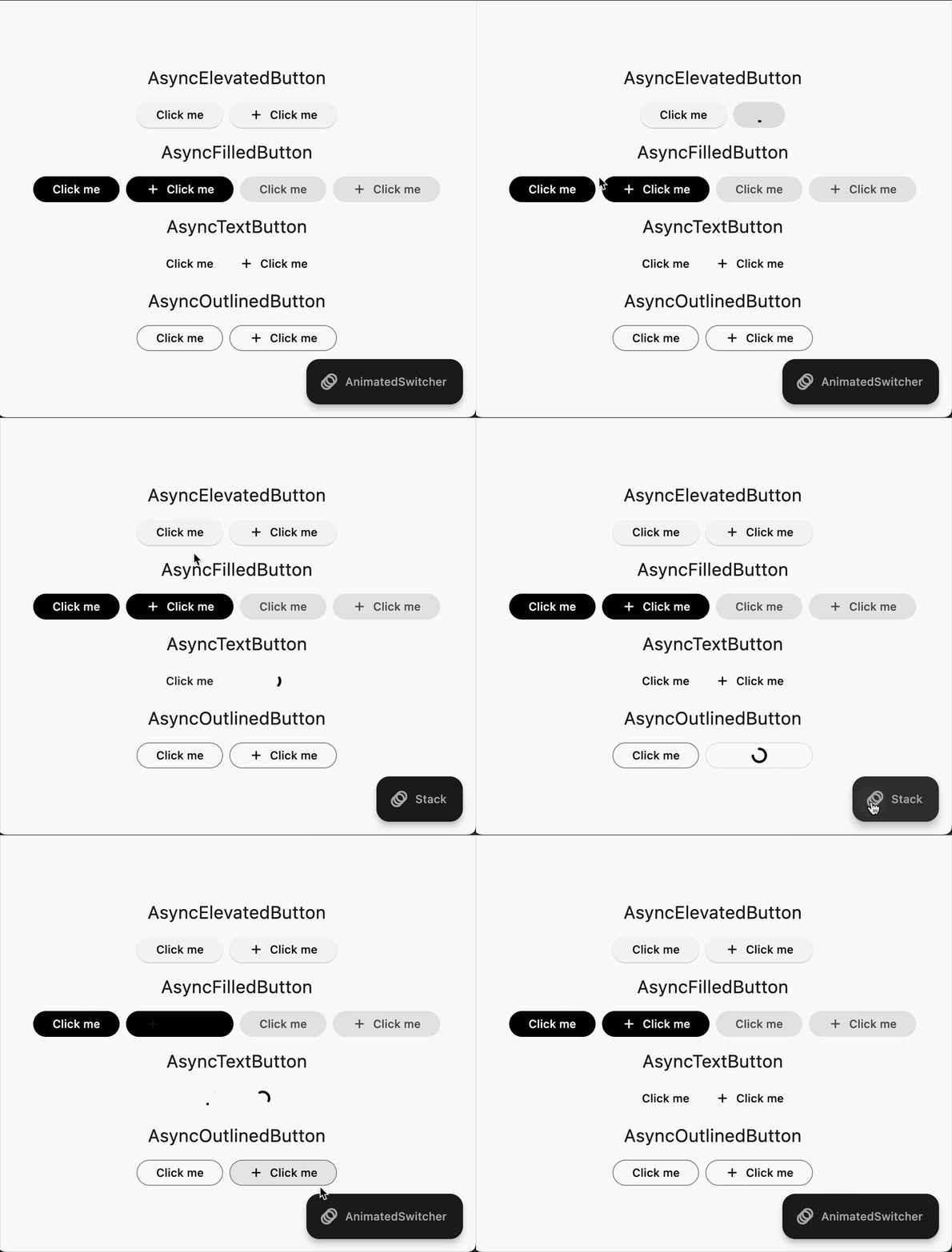
A Flutter package that provides enhanced buttons with built-in loading states and async functionality.
- 🔄 Built-in loading states for:
- ElevatedButton -> AsyncElevatedButton
- FilledButton -> AsyncFilledButton
- TextButton -> AsyncTextButton
- OutlinedButton -> AsyncOutlinedButton
- IconButton -> AsyncIconButton
- FloatingActionButton -> AsyncFloatingActionButton
- ⚡ Async callback support
- 🎨 Multiple transition animations
- 🎯 Icon support with customizable alignment
- 📱 Maintains all standard properties
- ✨ Customizable loading indicators
Add the following to your pubspec.yaml or run:
flutter pub add loadable_buttonsimport 'package:loadable_buttons/loadable_buttons.dart';AsyncElevatedButton(
onPressed: () async {
// Your async operation here
await Future.delayed(const Duration(seconds: 2));
},
child: const Text('Click Me'),
);AsyncElevatedButton(
onPressed: () async {
await Future.delayed(const Duration(seconds: 2));
},
child: const Text('Submit'),
loadingChild: const Text('Loading...'),
);The package supports three types of transitions:
- Stack (Default) : Maintains the size of the button while loading
AsyncElevatedButton(
  // transitionType: TransitionAnimationType.stack,
  onPressed: () async => await yourAsyncFunction(),
  child: const Text('Stack Transition'),
);- AnimatedSwitcher : Animates the size of the button while loading
AsyncElevatedButton(
  transitionType: TransitionAnimationType.animatedSwitcher,
  onPressed: () async => await yourAsyncFunction(),
  child: const Text('AnimatedSwitcher Transition'),
);- CustomBuilder : Allows you to define your own custom transition
AsyncElevatedButton(
  transitionType: TransitionAnimationType.customBuilder,
  onPressed: () async => await yourAsyncFunction(),
  child: const Text('Custom Transition'),
  loadingChild: const Text('Loading...'),
  customBuilder: (bool loading, Widget child, Widget? loadingChild) {
    return AnimatedSwitcher(
      duration: const Duration(milliseconds: 500),
      curve: Curves.easeInOut,
      child: loading
          ? loadingChild!
          : child,
    );
  },
);- Customize animation duration
- Control minimum opacity during loading state
- Full access to ElevatedButton styling
- Manual loading state control
- Icon alignment customization
| Property | Type | Description |
|---|---|---|
onPressed |
FutureOr<void> Function()? |
The callback that is called when the button is tapped |
child |
Widget |
The primary content of the button |
loadingChild |
Widget? |
Widget to show during loading state |
loading |
bool |
Manual control of loading state |
transitionType |
TransitionAnimationType |
Type of loading animation |
animationDuration |
Duration |
Duration of the loading animation |
minimumChildOpacity |
double |
Minimum opacity of child during loading |
This package is designed and tested for the latest Flutter stable version. Due to limitations in older Flutter versions regarding parameter handling, using this package with older versions might lead to unexpected behavior or limitations. Alternatively, since the package is MIT licensed, you can copy the relevant code into your project and adapt it for older versions.
