TStyledCategoryButtons
TStyledCategoryButtons shows a list of buttons with flow or full-size layout, like a classic TCategroyButtons.
You can define StylesFamily/StyleClass/StyleAppearance for every buttons at component level or change the Style on a single "Button" Item.
TStyledCategoryButtons inherits from TCategoryButtons, so you can continue to use it as the VCL component as showed in the Demo:
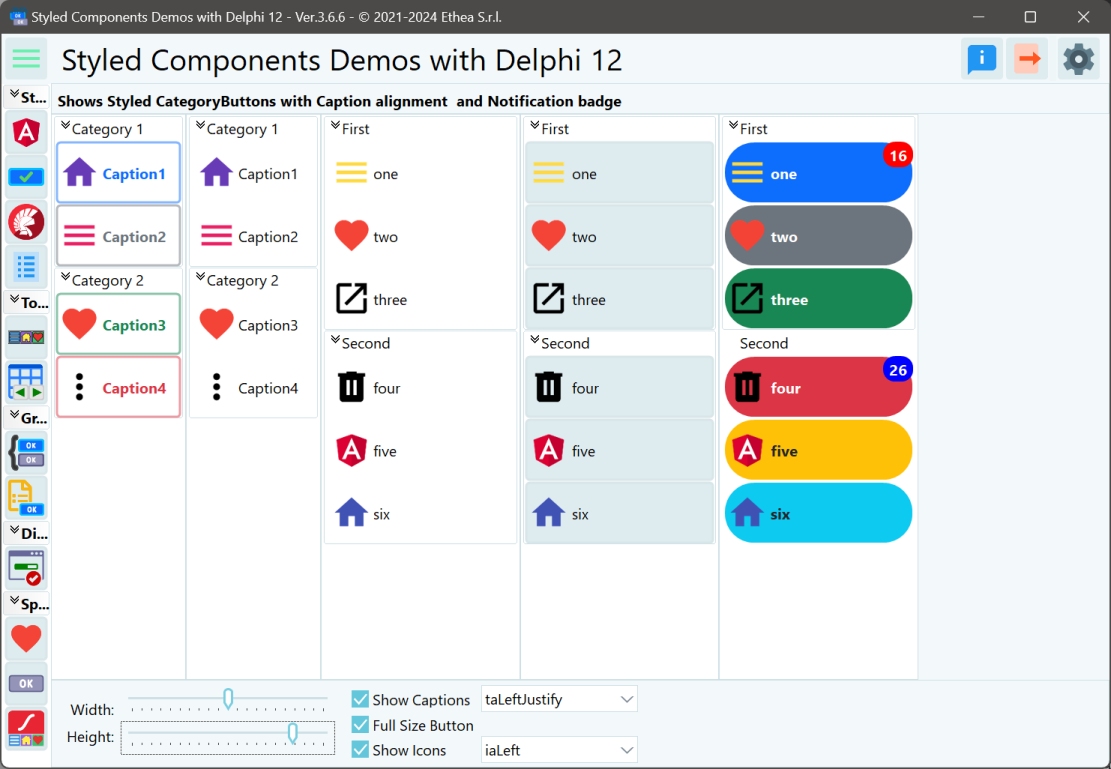
The major differences are:
- You can define a custom style for every buttons in the "Categories"
- You can use a custom style for each button.
- You can specify Flat buttons.
- The Buttons caption can be aligned also at center or right.
- The Buttons icons can be aligned left, top, bottom, right, center.
- Additional Spacing and ImageMargins to control exact position of the Buttons icon and the Caption.
- You can use [Notification Badge]((Notification-Badge-guide) on every Button.