Personal dataset project for DATA 115 at WSU
This project aims to explore the difference between deaths from COVID-19 and Influenza/Pneumonia, largely inspired by claims that COVID-19 is just like the flu.
Data for 2020 COVID-19 deaths was obtained from The COVID Tracking Project and Influenza data was taken from the CDC. 2018 Population data was obtained through Kaggle.
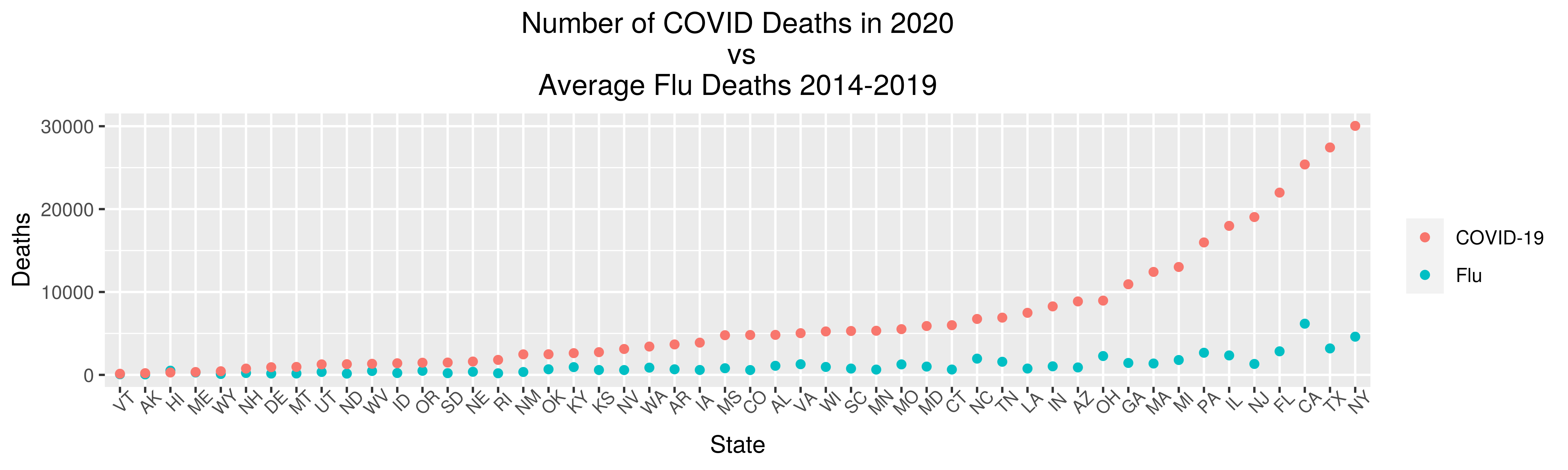 This is a simple visualization comparing the deaths in each state from Influenza/Pneumonia against deaths from COVID-19. The measures put into place to protect against the novel coronavirus would also protect against the flu virus, so for an accurate comparison I took the average of Influenza/Pneumonia deaths each year from 2014-2019 and compared that with all COVID-19 deaths in each state in 2020.
Tukey's five number summary showed a large disparity between the minimum COVID-19 Deaths (136) and maximum (30040). Since a similar, albeit less drastic, disparity presented with the Influenza data, I decided it must be caused by the differences in population from state to state. To compensate for this, I created a two new columns, one for population divided by deaths from each disease.
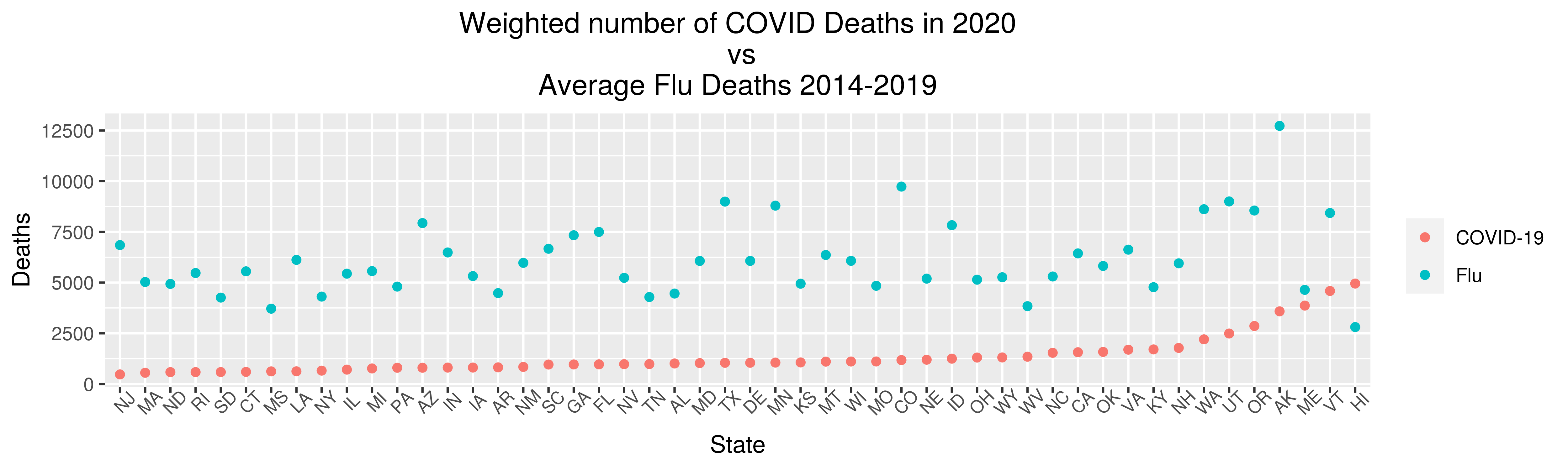
This chart shows the total population divided by the number of deaths; in other words, New Jersey had 1 COVID-19 death for every 500 residents, whereas they averaged only 1 Influenza death for every 7000 people.