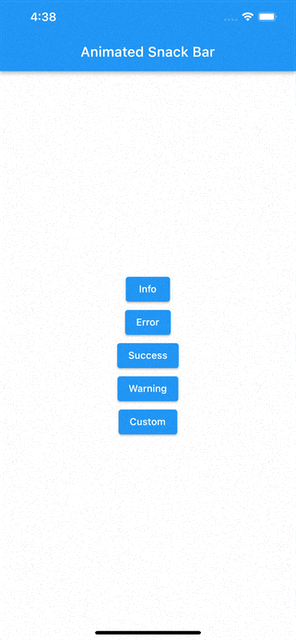
A Flutter package to show beautiful animated snackbars directly using overlay.
- Material-UI


- Colorized rectangle


- Dark rectangle


Add package to pubspec.yaml
flutter pub add animated_snack_barImport the package
import 'package:animated_snack_bar/animated_snack_bar.dart';- Show material ui snackbar
AnimatedSnackBar.material(
    'This a snackbar with info type',
    type: AnimatedSnackBarType.info,
).show(context);- Show colorized rectangle snackbar
AnimatedSnackBar.rectangle(
'Success',
  'This is a success snack bar',
  type: AnimatedSnackBarType.success,
  brightness: Brightness.light,
).show(
  context,
);- Show dark rectangle snackbar
AnimatedSnackBar.rectangle(
'Success',
  'This is a success snack bar',
  type: AnimatedSnackBarType.success,
  brightness: Brightness.dark,
).show(context);- Remove a snackbar
final snackbar = AnimatedSnackBar(
    builder: ((context) {
        return Container(
            padding: const EdgeInsets.all(8),
            color: Colors.amber,
            height: 50,
            child: const Text('A custom snackbar'),
        );
    }),
);
snackbar.show(context);

snackbar.remove()- Remove all snackbars
AnimatedSnackBar.removeAll();-
Show
-
Show a custom snackbar
AnimatedSnackBar(
    builder: ((context) {
        return Container(
            padding: const EdgeInsets.all(8),
            color: Colors.amber,
            height: 50,
            child: const Text('A custom snackbar'),
        );
    }),
).show(context);- Show a custom snackbar with MaterialAnimatedSnackBar content
AnimatedSnackBar(
  builder: ((context) {
    return const MaterialAnimatedSnackBar(
      titleText: 'Custom material snackbar ',
      messageText:
          'This a custom material snackbar with info type',
      type: AnimatedSnackBarType.info,
      foregroundColor: Colors.amber,
      titleTextStyle: TextStyle(
        color: Colors.brown,
      ),
    );
  }),
).show(context);- Changning snackbar pushing position
AnimatedSnackBar.material(
    'This a snackbar with info type',
    type: AnimatedSnackBarType.info,
    mobileSnackBarPosition: MobileSnackBarPosition.bottom, // Position of snackbar on mobile devices
    desktopSnackBarPosition: DesktopSnackBarPosition.topRight, // Position of snackbar on desktop devices
).show(context);- Change snack bar position for mobile
AnimatedSnackBar.material(
    'This a snackbar with info type',
    type: AnimatedSnackBarType.info,
    mobilePositionSettings: const MobilePositionSettings(
      topOnAppearance: 100,
      // topOnDissapear: 50,
      // bottomOnAppearance: 100,
      // bottomOnDissapear: 50,
      // left: 20,
      // right: 70,
    ),
).show(context);You can pass snackBarStrategy as a paramter to determine what should snack bar do
with snackbars which came before it.
- Should it be shown on them like column? use
ColumnSnackBarStrategy - Should it remove them? use
RemoveSnackBarStrategy - Should it just stack on them? use
StackSnackBarStrategy