-
Notifications
You must be signed in to change notification settings - Fork 0
UX UI Design Experiment
Designing interactive systems is not just about the physical design of the system itself but also understanding and choosing how the artifact is going to affect the way people work or live, researching how the user achieves goals within constraints.
This is known as User-Centered Design and it greatly increases the quality of the final product as it tries to meet the user expectations by knowing how they interact with early-stage prototypes since the begining of the whole design process.
In this chapter, we summary a controlled experiment as an evaluation technique to choose between two interface styles done to 20 participants with age ranging from 20 to 50.
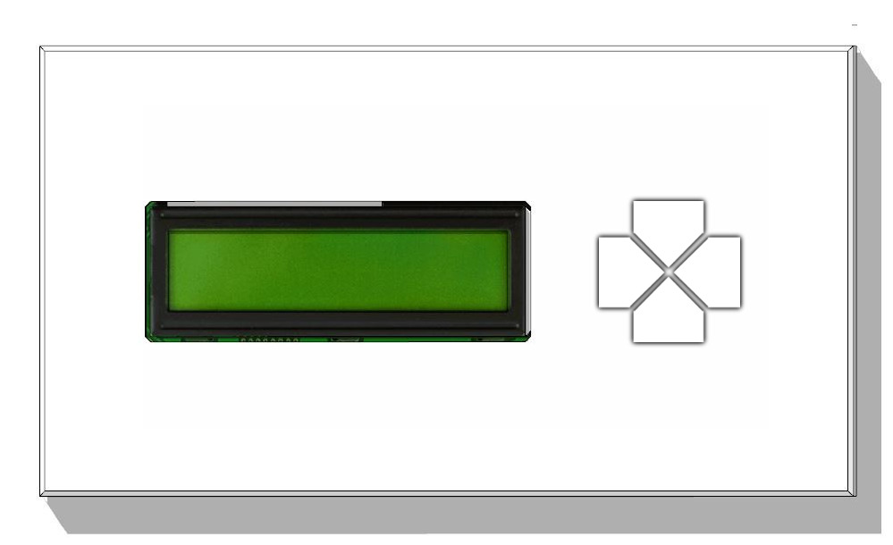
Two styles of button layout design (Crossed vs horizontal layout): which layout is easier to manage?


Crossed Layout (A) ---------------------- Horizontal Layout (B)
- Users will intuitively understand the Up/Down button as Raise/Lower action and Left/Right for select the roller shutter meanwhile there will be no significatively diferences with non-daily basic tasks like configuring modes.
- The null hypothesis is that there will be no difference between horizontal and crossed layout style at all.
A virtual interface has been developed in Processing to test the hyphotesis, simulating the layouts (Crossed and Horizontal) with the feature to record the time elapsed and the count number of pressed buttons.
The session starts with a brief summary of what the system does and which actions can be requested. The first displayed layout is randomized and no priorization has been made between layouts so the learning curve effect is avoided in the dataset.

Independent variables
The options layout. We have two alternatives: Crossed Layout (A) vs Horizontal Layout (B).
Dependent variables
- The count number of pressed buttons to perform the requested action.
- The time elapsed between when an action is requested and the action is actually executed.
The experiment has been splitted in two, one for daily basis tasks and the other for non-daily tasks.
The user is asked to Lower or Raise a random roller shutter.
- Users, on average, are 30% faster performing the task with the layout A.
- In average values, users press 34% less buttons to get the task done with the layout A.

The user is asked to switch on/off the sleep mode forever.
- Users, on average, are 28% faster performing the task with the layout A.
- In average values, users press 23% less buttons to get the task done with the layout A.

As you may notice, the relative variation of the mean number of pressed buttons dropped from 34% in task 1 to 23% in task 2. In the horizontal layout, users pressed less wrongly buttons, comparing both tasks, because the commands icon are shown right above the physical buttons which make it easier for recognition rather than recall at more complicated menus.
- The results consistently show that the user will be 29% faster in the crossed layout.
- Better error prevention in the crossed layout with at least 23% fewer buttons pressed.
Summarizing the results, there is an increased performance according to the analyzed dependent variables in the crossed layout.