

Formerly called Android TV Card
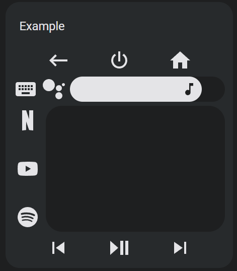
A super customizable universal remote card iterating on the work of several other projects. Featuring:
- Configuration UI.
- Out of the box support for several platforms with default keys and sources lists.
- Android TV (with keyboard via ADB)
- Fire TV (with keyboard)
- Roku (with keyboard)
- Kodi (with keyboard)
- Apple TV
- Samsung TV
- LG webOS
- Support for multiple buttons, touchpads, and sliders using default or user defined custom actions.
- Complete Home Assistant actions support.
- Keyboard and search dialog actions for most platforms.
- Template support for almost all fields using nunjucks.
- Toggleable haptics.
- Remappable touchpad with multi-touch gesture support.
- Remappable slider with vertical orientation support.
- User configurable remote layout.
- Icons and labels for all elements.
- Custom SVG icon support.
- CSS style options for all sub-elements.
This project now has a fully featured configuration user interface! To get started, install this project using HACS. Then go to a dashboard and create a universal remote card or edit an existing one.
The editor has four tabs - General, Layout, Actions, and Icons.
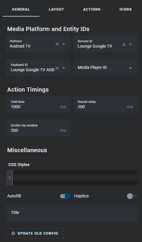
Platform, entity ID, and timing fields set in the general tab will be used for default keys and sources. If you do not set these fields for custom actions and autofill is enabled, they will also use these fields. If you explicitly set one of these fields in a custom action, it will not be overwritten if you change the matching general field until you clear the field in the custom action. To completely clear toggle fields, you must remove them from the config using the code editor.
This card supports several media platforms with default key and source lists. For the most part it uses the Home Assistant integrations for these platforms via their remote and/or media player entities. Some platforms require custom integrations as listed below. Different platforms use the remote and media player entities for different functions as shown below. For platforms with keyboard support, the keyboard entity ID (which doesn't always match the remote and media player entities) can also be provided.
| Platform | Remote | Media Player | Keyboard |
|---|---|---|---|
| Android TV | Default keys and sources | Default slider | ADB remote (preferred) or media player |
| Fire TV | Default keys | Default sources and slider | Remote (preferred) or media player |
| Roku | Default keys | Default sources and slider | Remote for keyboard, media player for search (provide one for keyboard ID and the others in their fields) |
| Kodi | NA | Default keys, sources, and slider | Media player |
| Apple TV | Default keys | Default sources and slider | NA |
| Samsung TV | Default keys | Default sources (requires the SamsungTV Smart Component custom integration) and slider | NA |
| LG webOS | NA | Default keys, sources, and sliders | NA |
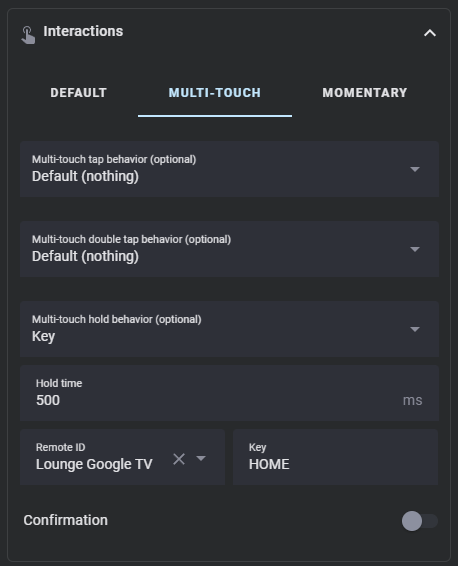
Double tap and hold actions have user adjustable timings to change how they are triggered. These values can be set globally in the general tab or for each custom action.
Hold actions are triggered by holding down on a button for a defined amount of time and then releasing. The default amount of time is 500ms. You can change this by setting Hold time in the hold action to a different number.
By setting a hold action to repeat, the tap action will repeat while the button is held down. The default delay between repeats is 100ms. You can change this by setting Repeat delay in the hold action to a different number.
The following default keys have hold actions set to repeat by default. You can disable this by creating a custom action for them and setting their hold actions to none or a different action. The touchpad direction actions also are set to repeat when held, and can similarly be disabled or remapped by creating a custom action for the touchpad and changing it's hold action.
- up
- down
- left
- right
- volume_up
- volume_down
- delete
- forward_delete
- touchpad up/down/left/right
Double tap actions have a default window of 200ms to trigger before a single tap action is triggered instead. You can change this by setting Double tap window in the double tap action to a different number.
NOTE: Setting Double tap window above or too close to Hold time can result in undesirable behavior, as the hold timer expires before the double tap timer does. If you increase the Double tap window you should also increase Hold time to not be too close to it by at least 100ms if not more. In a custom action without a hold action defined, you can set Hold behavior explicitly to Nothing to render the Hold time field.
Styles can be set and changed for all remote sub-elements using regular CSS and templating. CSS styles have to be encapsulated in a CSS selector like the following.
| CSS Selector | Element |
|---|---|
| :host | Global values. |
| .row | All rows. |
| .column | All columns. |
| .button-pad | All button pads. |
| .empty-button | All empty/null button spaces. |
| remote-button | All buttons. |
| #row-1 | The first row. |
| #column-1 | The first column. |
| #pad-1 | The first button pad. |
.row {
justify-content: center;
}
remote-button {
background: rgb(27, 27, 27);
padding: 8px;
margin: 4px;
border-radius: 24px;
--size: 24px;
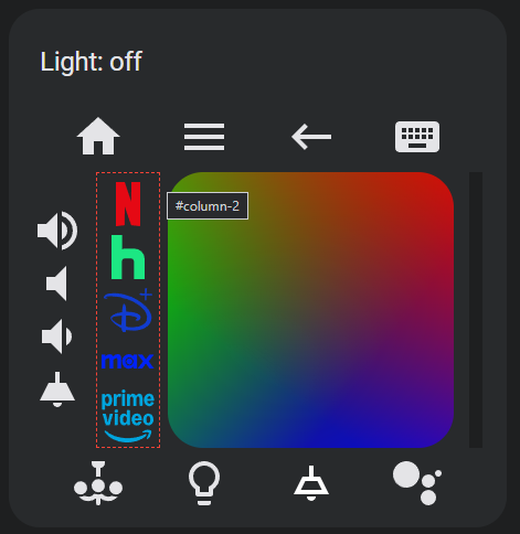
}If you hover over the card preview window, a red dashed outline will appear along with a tooltip showing either the element name or the row, column, or pad ID selector.
When creating custom actions, the card editor will autofill fields using information set in the general tab. This can be disabled by toggling Autofill off. This value can also be set at the custom remote element level. Haptics can be similarly toggled globally or for individual custom remote elements and are enabled by default.
You can add a title to the card with the title field.
If you are updating from an older version of this card, you may find that your configurations no longer work. Sorry! To upgrade them, click the button UPDATE OLD CONFIG at the bottom of the general tab. It should update your configuration to work with newer versions of this card.
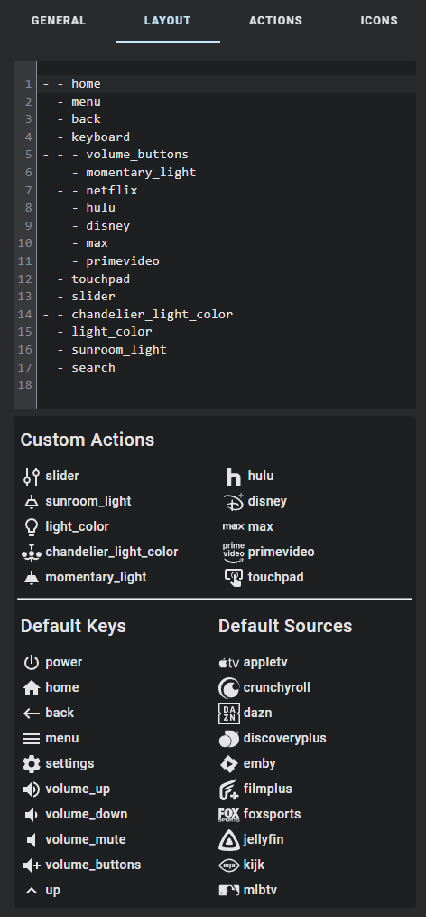
The remote layout is defined using a series of nested arrays. The lowest level of arrays is each row. As you nest arrays further it switches between rows and columns, allowing you to create unique remote layouts.
- - home
  - menu
  - back
  - keyboard
- - - volume_buttons
    - momentary_light
  - - netflix
    - hulu
    - disney
    - max
    - primevideo
  - touchpad
  - slider
- - chandelier_light_color
  - light_color
  - sunroom_light
  - search
The default keys and sources lists for your selected platform are displayed below the layout code editor. If you have configured any custom actions, they will be displayed above this. You can use this as reference as you create your remote, or drag and drop entries from these lists to the editor. The default keys list also includes the default touchpad and slider, along with some special elements for button pads and layouts. Not all special elements are available for all platforms.
| Name | Type | Description |
|---|---|---|
| touchpad | touchpad | A touchpad for navigation. |
| slider | slider | A slider that controls the volume of the entity defined by media_player_id. NOTE: Volume slider support is dependent on the media player supporting the media_player.volume_set action. |
| volume_buttons | button rows | Shorthand to generate a set of volume down, volume mute, and volume up buttons in a row or column. |
| navigation_buttons | button rows | Shorthand to generate a set of up, down, left, right, and center buttons across three rows within a column. |
| dpad | button grid | Shorthand to generate a set of up, down, left, right, and center buttons arranged in a square grid. |
| numpad | button grid | Shorthand to generate a set of 1-9 buttons arranged in a square grid. Does not include n0. |
| xpad | button grid | Shorthand to generate a set of A, B, X, and Y buttons arranged in a square grid. |
| npad | button grid | Shorthand to generate a set of A, B, X, and Y buttons arranged in an alternate square grid. |
In addition to the default keys and sources, you can create your own custom actions. You can also overwrite default keys and sources (including the default touchpad and slider) by setting the custom action name to match a default one. If you do so the default key or source information will be autopopulated if autofill is enabled.
NOTE: If the remote element (default or custom) actions targets are not explicitly set in the UI they will be autofilled (if autofill is enabled) using the custom action entity or global IDs depending on which best matches the perform-action domain.
Click the ADD REMOTE ELEMENT button to add a custom action remote element. Custom action remote elements can be buttons, sliders, or touchpads.
Custom actions in this list can be reordered for organization, but doing so does not have any effect on the the remote card layout. They can also be deleted, copied, and edited.
Every remote element must have a name so that it can be added to your remote.
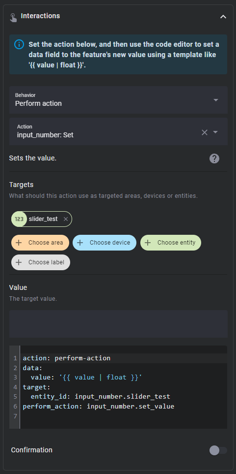
Every remote element can have an entity assigned to it, which is used to track it's internal value. This value can then be used in styles and actions using templates, like {{ value | float }}. By default the value will be derived from the entity state, but it can be changed to an attribute using the corresponding field.
Some additional value logic is applied for certain attributes:
brightness- Converted from the default range of 0-255 to 0-100.media_position- Updated twice per second using the current timestamp and the attributemedia_position_updated_atwhen the entity state isplaying, and locked to a max value using the attributemedia_duration.elapsed- Only for timer entities. Updated twice per second using the the current timestamp and the attributesduration,remaining, andfinishes_at, and locked to a max value using the attributeduration.- NOTE:
elapsedis not an actual attribute of timer entities, but is a possible attribute for timer entities in this card for the purpose of displaying accurate timer elapsed values. Timer entities do have an attributeremaining, which only updates when the timer state changes. The actualremainingattribute can be calculated using the elapsed value and the timer duration attribute.
- NOTE:
If you find that the autofilling of fields in actions or remote element values is causing issues, setting Autofill to false may help. Just remember to set the entity ID of the remote element and the entity, device, area, or label ID of the action target.
Haptics are enabled for remote elements by default, but can be toggled globally or at the custom action level.
Sliders have some additional general options. They have a range Min and Max which defaults to 0 and 1 respectively. They also have a Step size which defaults to 0.01.
Sliders will wait one second before updating their internal values from Home Assistant to prevent it from bouncing between the old and new values. This time can be changed by setting Update after action delay, which defaults to 1000ms
Touchpads have five tabs at the top of their actions page for each direction and it's center. Only the center tab has general options as these apply to the entire touchpad remote element. Each direction and center have their own options for appearance and interactions as described below.
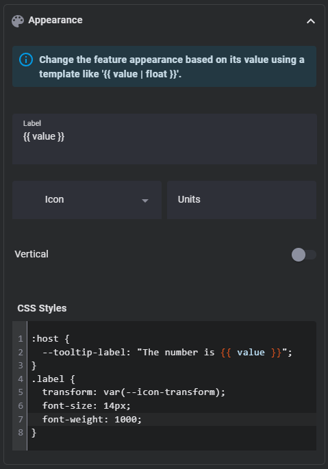
All remote elements can have a Label, Icon, and Units. These fields can also be set using templates. Similar to the general tab, each remote element can have it's CSS styles set (also supports templates).
You may find the following CSS selectors useful for styling:
| CSS Selector | Element |
|---|---|
| :host | The element itself. |
| .icon | The element icon. |
| .label | The element label. |
| button | A button element background. |
| toucharea | A touchpad element background. |
| input | A slider element. |
| .background | A slider element background. |
| .tooltip | A slider element tooltip. |
| .button-pad | All button pads. |
While you can now set most CSS fields directly using their sub-element selectors, you may find the following CSS properties useful, especially for sliders which use and modify them internally.
| Name | Description |
|---|---|
| --size | Height and width of the icon. |
| --thumb-width | Slider thumb width, defaults to 48px. |
| --height | Slider height when horizontal and width when vertical. |
| --tooltip-label | Slider tooltip label template, defaults to '{{ value }}'. |
| --tooltip-transform | Slider tooltip location transform function, defaults to translate(var(--thumb-offset), calc(-0.5 * var(--height) - 0.4em - 10px)) for horizontal sliders and translate(calc(-0.3 * var(--height) - 0.8em - 18px), calc(-1 * var(--thumb-offset))) for vertical sliders. |
| --icon-transform | Slider icon transform function, defaults to translateX(var(--thumb-offset)) for horizontal sliders and translateY(calc(-1 * var(--thumb-offset))) for vertical sliders. |
Sliders have an additional Vertical toggle which rotates it 90 degrees to make it vertical. By default sliders will be horizontal. Vertical slider heights are determined by the slider's sibling elements. If it has no sibling elements or you find that it is not consistently rendering correctly, then you may need to explicitly set it's height using the style options like so:
:host {
  height: 350px;
}Touchpads can have a separate icon and label for the center and each direction. You can also style each of these icons and labels independently using their own CSS Styles fields. General touchpad styles such as those for toucharea like touchpad height should go in the center tab styles.
Almost all fields support nunjucks templating. Nunjucks is a templating engine for JavaScript, which is heavily based on the jinja2 templating engine for Python which Home Assistant uses. While the syntax of nunjucks and jinja2 is almost identical, you may find the nunjucks documentation useful. Most extensions supported by Home Assistant templates are supported by this templating system, but not all and the syntax may vary. Please see the ha-nunjucks repository for a list of available extensions. If you want additional extensions to be added or have templating questions or bugs, please make an issue or discussion on that repository, not this one.
You can include the current value of a remote element and it's units by using the variables value and unit in a label template. You can also include hold_secs in a template if performing a momentary end action. Each remote element can also reference it's configuration using config within templates. config.entity and config.attribute will return the remote element's entity ID and attribute with their templates rendered (if they have them), and other templated config fields can be rendered within templates by wrapping them in the function render within a template.
There are three traditional ways to trigger an action - tap, double tap, and hold. Buttons and touchpad center support all three, touchpad swipes only support tap and hold actions, and sliders only support tap actions. Defining a double tap action that is not none introduces a 200ms delay to single tap actions.
Each action also supports the confirmation field. More information on Home Assistant action confirmations can be found here.
When setting the action for a slider, you must use value within a template in the action data to use the feature value in action. For convenience, a codebox for the action will be displayed below the normal action options.
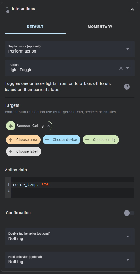
Actions follow the Home Assistant actions syntax. All Home Assistant actions are supported along with some additional ones.
| Action | Description |
|---|---|
| More info | Open the more info dialog. |
| Toggle | Toggle between the target's on and off (or similar) states. |
| Navigate | Navigate to another Home Assistant page. |
| URL | Navigate to an external URL. |
| Perform action | Call any Home Assistant service action. |
| Assist | Open the assist dialog. Uses the mobile dialog if available, like in the Home Assistant app. The pipeline ID and start listening options only work in the mobile assist dialog. |
| Key | Send a key to the media platform via the action remote.send_command. If no hold action is defined, then hold_secs: 0.5 is added when a hold action is fired. |
| Source | Open a source via the action remote.turn_on. |
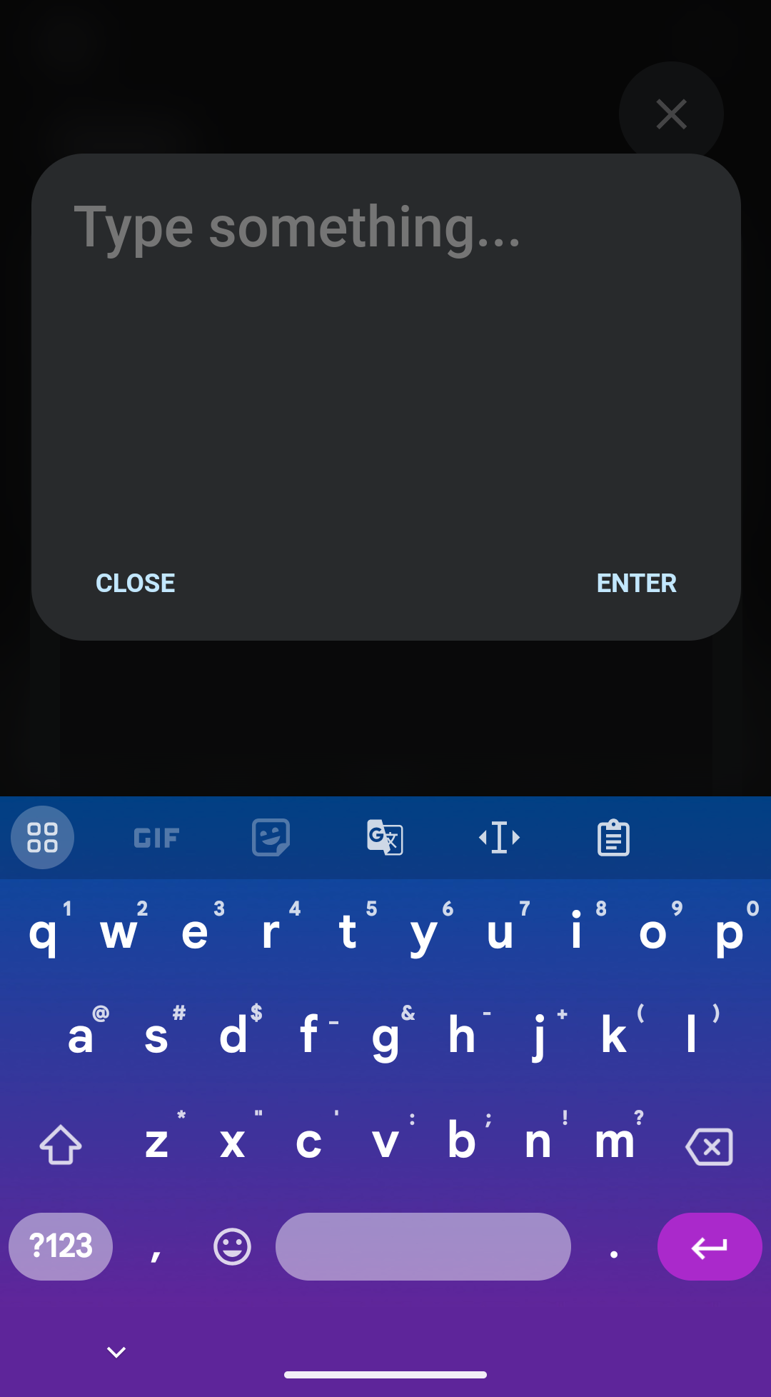
| Keyboard | Open a dialog for sending seamless keyboard input. |
| Textbox | Open a dialog for sending bulk keyboard input. |
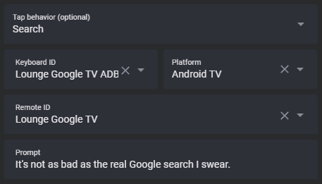
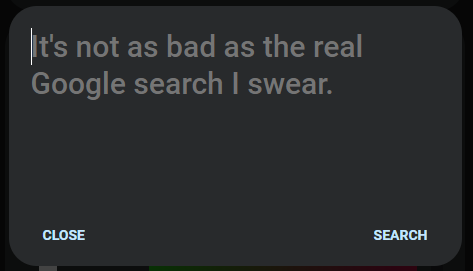
| Search | Open a dialog for sending a global search query. |
| Fire DOM event | Fire a browser dom event using the action object as the event detail. Useful for opening browser mod popup cards. |
| Repeat | Repeat the tap action ten times a second while held. Only applicable to hold. |
| Nothing | Explicilty set a command to do nothing. |
Key and Source are shortcuts for remote.send_command and remote.turn_on respectively. They will use the general remote ID if set but can be overridden at the custom action level.
The key field does not refer to the default key name as it appears in the list, but as the actual key string to be sent in the action data. You should read the documentation for the platform you are using to learn more about available options, or look at the default key and source maps files here.
The source field generally refers to an application to open and varies by platform. For Android TV you may find the Android TV deep linking guide helpful.
If you find keys or sources that are not part of the default lists that you wish to add, please make a feature or even a pull request to add them, especially if they are for a platform other than Android TV (Android TV default list improvements also welcome).
Not all platforms use Key and Source for their default keys and sources, some instead use Perform action to call alternate services.
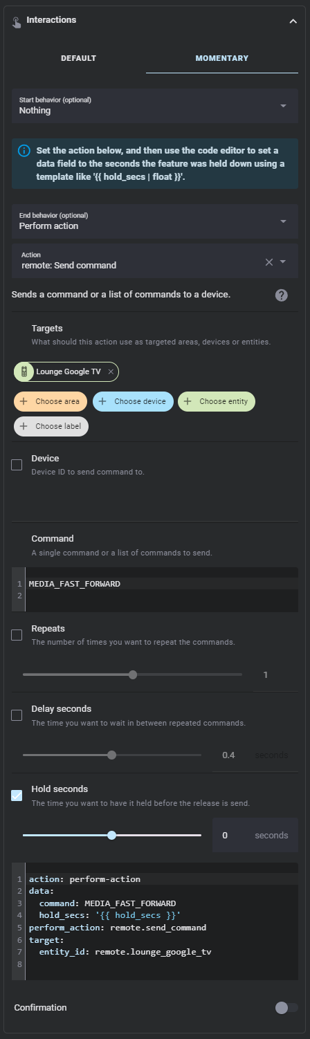
As an alternative to normal tap, hold, and double tap actions, buttons and the touchpad center can also be used in a momentary mode. Configuring this option disables the normal tap, hold, and double tap actions.
The momentary start action is fired when you first press down on a button or touchpad. The momentary end action is fired when you release the button or touchpad. These actions can be used together or separately.
For momentary end actions you can include the number of seconds a button has been held down using hold_secs in a template. For convenience, the momentary end action YAML is included in a code box below the action, like shown above.
The touchpad's center acts like a button, with support for the same actions. The touchpad's direction actions are activated when the user swipes in a direction, and do not support double tap actions or momentary mode.
Touchpads also support multi-touch mode, which fires alternate actions when more than one finger is used with it. This mode is disabled by default but can be enabled by setting a touchpad's multi-touch actions to something other than Nothing. Multi-touch mode supports center tap, double tap, and hold actions, and direction swipe and hold actions.
This card supports sending text to the following platforms:
- Android TV
- Fire TV
- Roku
- Kodi
If the user defined general platform is listed above, then any action set to a keyboard action (that has autofill enabled) will inherit it. Otherwise it will default to Android TV. Keyboard support for more platforms can be added if there is a way to do so through their Home Assistant (or possibly community made) integrations.
When you use any keyboard action, a dialog will open that can be typed into.
You can change the prompt text that appears before you type anything using the Prompt field at the action level.
For Android TV you need to include the Android TV Remote integration remote entity ID at the general or action level as it is used to send the keys enter and delete (backspace).
For Roku make sure to include both the remote and media player IDs at the general or action level, as the remote is used for normal keyboard entry while the media player is used for search.
Send text to your supported media platform seamlessly using the action or default key keyboard. The dialog has several listeners which will send anything you type to your media platform immediately. You can also paste by holding or typing CTRL + V into the dialog.
Because we do not have a way to retrieve the currently on screen text of most media platforms, the dialog and platform text may become out of sync if a message gets dropped due to a network issue, you attempt to erase more than one character at a time, you try to modify the middle of the entered text, or if you prematurely close the dialog window. The keyboard dialog will attempt to prevent you from doing things that would cause this, but please remember that if you make a mistake you have to backspace all the way to the incorrect character from the end of your input text one character at at a time. In my testing the dialog always kept in sync with the platform text unless I attempted to delete more than one character. This does not apply to Kodi, which sets the text field to the entire dialog text every time it's action is called.
ADB can be slow and you may notice some delay in what you type and what appears on your Android or Fire TV device. Make sure to use the newer ADB integration remote entity for a faster typing experience.
Send text to your supported media platform in bulk using the action or default button textbox. The dialog will not send any information until you tap the send button. It is highly recommended that you also create buttons for delete and enter so you can easily delete the text you send and quickly search using it.
Send a global search query to your media platform using the action or default button search. Like the bulk entry method, the dialog will not send any information until you tap the search button. This method cannot be used to enter text into currently visible text fields.
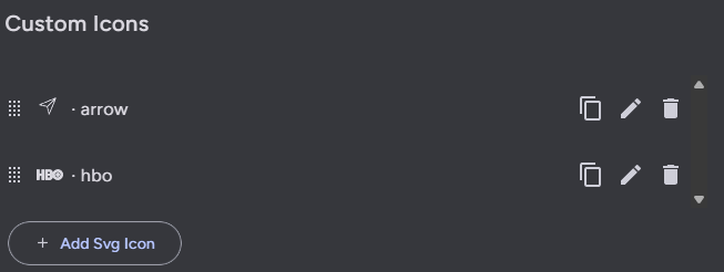
You can add custom SVG path icons to use with this card using the icons tab. The custom icons list works the same as the custom actions list, except that there is only one type of custom icon you can add.
Each custom icon has to have a name and a SVG path. The SVG path must generate a 24x24 pixel icon to properly render in the remote. A preview of the icon is shown below the path. I highly recommend using a tool like this SVG path editor to modify SVG paths to work with this card.
Once setup, you can reference these icons in custom actions in the icon field by name. Many default sources similarly use SVG paths instead of the Home Assistant built in icons. If you have an SVG icon you wish to add to this project, you can create a feature or pull request to do so.
While all configuration can now be done through the user interface, these YAML examples can provide some insight on layout basics.
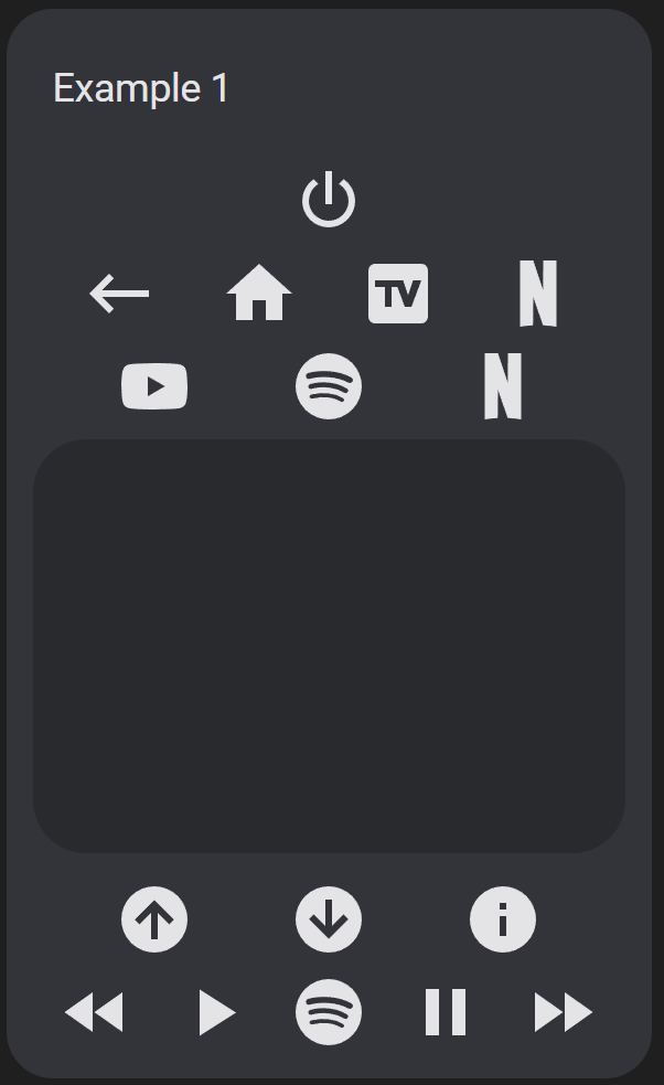
Playing with order, moving and repeating buttons.
type: custom:android-tv-card
remote_id: remote.google_chromecast
media_player_id: media_player.google_chromecast
title: Example 1
rows:
  - - power
  - - back
    - home
    - tv
    - netflix
  - - youtube
    - spotify
    - netflix
  - - touchpad
  - - slider
  - - channel_up
    - channel_down
    - info
  - - rewind
    - play
    - spotify
    - pause
    - fast_forward
Result:
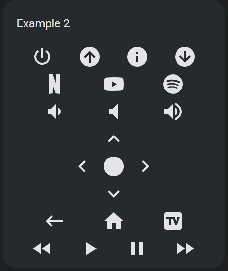
Buttons, buttons everywhere!
type: custom:android-tv-card
remote_id: remote.google_chromecast
title: Example 2
rows:
  - - power
    - channel_up
    - info
    - channel_down
  - - netflix
    - youtube
    - spotify
  - - volume_buttons
  - - dpad
  - - back
    - home
    - tv
  - - rewind
    - play
    - pause
    - fast_forward
Result:
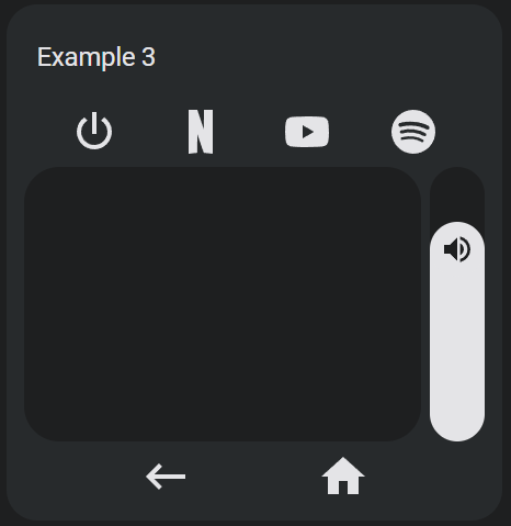
Using less and a vertical slider.
type: custom:android-tv-card
remote_id: remote.google_chromecast
media_player_id: media_player.google_chromecast
title: Example 3
rows:
  - - power
    - netflix
    - youtube
    - spotify
  - - touchpad
    - slider
  - - back
    - home
custom_actions:
  - type: slider
    name: slider
    range:
      - 0
      - 1
    step: 0.01
    value_attribute: volume_level
    tap_action:
      action: perform-action
      perform_action: media_player.volume_set
      data:
        volume_level: '{{ value | float }}'
    vertical: true
    icon: mdi:volume-high
Result:
In any row, if you add a null item, there will be an empty button sized space.
type: custom:android-tv-card
rows:
  - - back
    - home
    - tv
  - - rewind
    - null
    - null
    - fast_forward
A tablet layout using nexted row and columns.
type: custom:android-tv-card
remote_id: remote.google_chromecast
rows:
  - - - - back
        - null
        - home
        - null
        - menu
      - - volume_down
        - null
        - volume_mute
        - null
        - volume_up
      - - rewind
        - null
        - play_pause
        - null
        - fast_forward
      - - netflix
        - disney
        - hulu
        - max
        - primevideo
      - - plex
        - vudu
        - youtube
        - spotify
    - - - keyboard
        - search
      - - touchpad
custom_actions:
  - type: touchpad # All of this except styles will be autofilled
    name: touchpad # when you create a custom touchpad with the name touchpad
    tap_action:
      action: key
      key: DPAD_CENTER
    up:
      tap_action:
        action: key
        key: DPAD_UP
      hold_action:
        action: repeat
    down:
      tap_action:
        action: key
        key: DPAD_DOWN
      hold_action:
        action: repeat
    left:
      tap_action:
        action: key
        key: DPAD_LEFT
      hold_action:
        action: repeat
    right:
      tap_action:
        action: key
        key: DPAD_RIGHT
      hold_action:
        action: repeat
    styles: |-
      toucharea {
        height: 300px;
      }
Result:
Combining Apple TVs wakeup and suspend keys into one custom power action and using an icon for the touchpad background.
type: custom:android-tv-card
remote_id: remote.apple_tv
platform: Apple TV
autofill_entity_id: true
rows:
  - - power
    - menu
    - home
  - - skip_backward
    - play
    - pause
    - skip_forward
  - - touchpad
  - - appletv
    - netflix
    - disney
    - primevideo
    - allente
  - - nrktv
    - tv2play
    - max
    - skyshowtime
    - plex
  - - viaplay
    - discovery
    - spotify
    - youtube
custom_actions:
  - type: button
    name: power
    tap_action:
      action: key
      key: wakeup
    icon: mdi:power
    hold_action:
      action: key
      key: suspend
  - type: touchpad
    name: touchpad
    tap_action:
      action: key
      key: select
    up:
      tap_action:
        action: key
        key: up
      hold_action:
        action: repeat
    down:
      tap_action:
        action: key
        key: down
      hold_action:
        action: repeat
    left:
      tap_action:
        action: key
        key: up
      hold_action:
        action: repeat
    right:
      tap_action:
        action: key
        key: right
      hold_action:
        action: repeat
    styles: |-
      .icon {
        --size: 250px;
      }
    double_tap_action:
      action: key
      key: menu
    icon: mdi:apple
Result:
A user's Kodi remote.
type: custom:android-tv-card
keyboard_id: media_player.kodi
media_player_id: media_player.kodi
platform: Kodi
rows:
  - - back
    - home
    - menu
  - - info
    - play_pause
  - - - volume_buttons
    - touchpad
    - - textbox
      - null
      - search
custom_actions:
  - type: touchpad
    name: touchpad
    tap_action:
      action: perform-action
      perform_action: kodi.call_method
      data:
        method: Input.Select
    up:
      tap_action:
        action: perform-action
        perform_action: kodi.call_method
        data:
          method: Input.Up
      hold_action:
        action: repeat
    down:
      tap_action:
        action: perform-action
        perform_action: kodi.call_method
        data:
          method: Input.Down
      hold_action:
        action: repeat
    left:
      tap_action:
        action: perform-action
        perform_action: kodi.call_method
        data:
          method: Input.Left
      hold_action:
        action: repeat
    right:
      tap_action:
        action: perform-action
        perform_action: kodi.call_method
        data:
          method: Input.Right
      hold_action:
        action: repeat
    styles: |-
      toucharea {
        height: 200px;
        background-image: url("https://upload.wikimedia.org/wikipedia/commons/thumb/2/25/Kodi-logo-Thumbnail-light-transparent.png/600px-Kodi-logo-Thumbnail-light-transparent.png?20141126003611");
        background-size: contain;
        background-repeat: no-repeat;
        background-position: center;
        opacity: 1.0;;
      }
    hold_action:
      action: perform-action
      perform_action: kodi.call_method
      data:
        method: Input.ContextMenu
    double_tap_action:
      action: perform-action
      perform_action: kodi.call_method
      data:
        method: Input.Back
Result:
Sony Bravia KD.xx TV. Note that newer Sony Bravia TVs come with Android/Google TV.
type: custom:android-tv-card
remote_id: remote.sony_bravia
rows:
  - - touchpad
custom_actions:
  - type: touchpad
    name: touchpad
    tap_action:
      action: key
      key: DpadCenter
    up:
      tap_action:
        action: key
        key: Up
      hold_action:
        action: repeat
    down:
      tap_action:
        action: key
        key: Down
      hold_action:
        action: repeat
    left:
      tap_action:
        action: key
        key: Left
      hold_action:
        action: repeat
    right:
      tap_action:
        action: key
        key: Right
      hold_action:
        action: repeat
    double_tap_action:
      action: key
key: BackA touchpad remapped to work with a Denon/Marantz Receiver.
type: custom:android-tv-card
media_player_id: media_player.marantz_sr7013
autofill_entity_id: true
rows:
  - - touchpad
custom_actions:
  - type: touchpad
    name: touchpad
    tap_action:
      action: perform-action
      perform_action: denonavr.get_command
      data:
        command: /goform/formiPhoneAppDirect.xml?MNENT
    up:
      tap_action:
        action: perform-action
        perform_action: denonavr.get_command
        data:
          command: /goform/formiPhoneAppDirect.xml?MNCUP
      hold_action:
        action: repeat
    down:
      tap_action:
        action: perform-action
        perform_action: denonavr.get_command
        data:
          command: /goform/formiPhoneAppDirect.xml?MNCDN
      hold_action:
        action: repeat
    left:
      tap_action:
        action: perform-action
        perform_action: denonavr.get_command
        data:
          command: /goform/formiPhoneAppDirect.xml?MNCLT
      hold_action:
        action: repeat
    right:
      tap_action:
        action: perform-action
        perform_action: denonavr.get_command
        data:
          command: /goform/formiPhoneAppDirect.xml?MNCRT
      hold_action:
        action: repeat
    styles: |-
      toucharea {
        height: 200px;
      }
    double_tap_action:
      action: perform-action
      perform_action: denonavr.get_command
      data: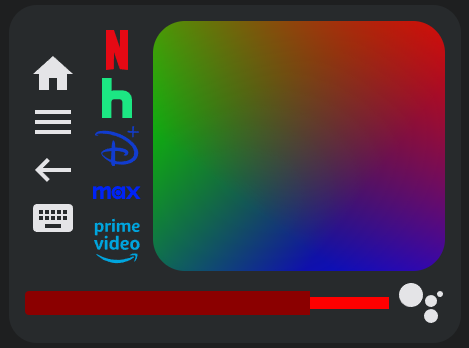
command: /goform/formiPhoneAppDirect.xml?MNRTNEven more disorder with columns and special elements in the same row as buttons, stylized everything, and a label to display the slider value.
type: custom:android-tv-card
remote_id: remote.google_chromecast
media_player_id: media_player.google_chromecast
rows:
  - - - home
      - menu
      - back
      - keyboard
    - - netflix
      - hulu
      - disney
      - max
      - primevideo
    - touchpad
  - - slider
    - search
custom_actions:
  - type: button
    name: netflix
    tap_action:
      action: source
      source: netflix://
    icon: mdi:netflix
    styles: |-
      :host {
        --icon-color: rgb(229, 9, 20);
      }
  - type: button
    name: hulu
    tap_action:
      action: source
      source: hulu://
    icon: mdi:hulu
    styles: |-
      :host {
        --icon-color: rgb(28, 231, 131);
      }
  - type: button
    name: disney
    tap_action:
      action: source
      source: https://www.disneyplus.com
    icon: disney
    styles: |-
      :host {
        --icon-color: rgb(17, 60, 207);
      }
  - type: button
    name: max
    tap_action:
      action: source
      source: market://launch?id=com.wbd.stream
    icon: max
    styles: |-
      :host {
        --icon-color: rgb(0, 35, 246);
      }
  - type: button
    name: primevideo
    tap_action:
      action: source
      source: https://app.primevideo.com
    icon: primevideo
    styles: |-
      :host {
        --icon-color: rgb(0, 165, 222);
      }
  - type: slider
    name: slider
    range:
      - 0
      - 0.6
    step: 0.01
    value_attribute: volume_level
    tap_action:
      action: perform-action
      perform_action: media_player.volume_set
      data:
        volume_level: '{{ value | float }}'
    styles: |-
      :host {
        height: 24px;
        border-radius: 4px;
        --background-height: 12px;
        --color: darkred;
        --background: red;
        --thumb-border-radius: 0;
      }
      .icon {
        display: none;
      }
      .label {
        {% if not states(config.entity, 'on') %}
        display: none;
        {% endif %}
        transform: var(--icon-transform);
        font-size: 14px;
        font-weight: 1000;
        color: var(--primary-text-color);
      }
      .tooltip {
        display: none;
      }
    label: '{{ (value * 100 ) | int }}%'
  - type: touchpad
    name: touchpad
    tap_action:
      action: key
      key: DPAD_CENTER
    up:
      tap_action:
        action: key
        key: DPAD_UP
      hold_action:
        action: repeat
    down:
      tap_action:
        action: key
        key: DPAD_DOWN
      hold_action:
        action: repeat
    left:
      tap_action:
        action: key
        key: DPAD_LEFT
      hold_action:
        action: repeat
    right:
      tap_action:
        action: key
        key: DPAD_RIGHT
      hold_action:
        action: repeat
    styles: |-
      toucharea {
        background: linear-gradient(217deg, rgba(255,0,0,.8), rgba(255,0,0,0) 70.71%), linear-gradient(127deg, rgba(0,255,0,.8), rgba(0,255,0,0) 70.71%), linear-gradient(336deg, rgba(0,0,255,.8), rgba(0,0,255,0) 70.71%);
      }
Result:
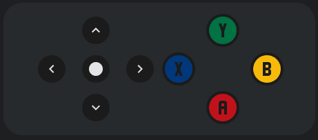
A simple gamepad.
type: custom:android-tv-card
remote_id: remote.google_chromecast
rows:
  - - dpad
    - xpad
custom_actions:
  - type: button
    name: a
    tap_action:
      action: key
      key: BUTTON_A
    icon: mdi:alpha-a-circle
    styles: |-
      :host {
        padding: 0;
        margin: 0;
        --size: 48px;
        --icon-color: #C1121C;
      }
  - type: button
    name: b
    tap_action:
      action: key
      key: BUTTON_B
    icon: mdi:alpha-b-circle
    styles: |-
      :host {
        padding: 0;
        margin: 0;
        --size: 48px;
        --icon-color: #F7BA0B;
      }
  - type: button
    name: x
    tap_action:
      action: key
      key: BUTTON_X
    icon: mdi:alpha-x-circle
    styles: |-
      :host {
        padding: 0;
        margin: 0;
        --size: 48px;
        --icon-color: #00387b;
      }
  - type: button
    name: 'y'
    tap_action:
      action: key
      key: BUTTON_Y
    icon: mdi:alpha-y-circle
    styles: |-
      :host {
        padding: 0;
        margin: 0;
        --size: 48px;
        --icon-color: #007243;
      }
styles: |-
  remote-button {
    background: rgb(27,27,27);
    padding: 8px;
    margin: 4px;
    border-radius: 24px;
    --size: 24px;
  }
  .row {
    justify-content: center;
  }
Result:
Samsung TV.
type: custom:android-tv-card
remote_id: remote.samsung_tv
media_player_id: media_player.samsung_tv
platform: Samsung TV
rows:
  - - power
    - null
    - volume_mute
  - - slider
  - - ch_up
    - ch_down
  - - netflix
    - youtube
    - dazn
    - primevideo
  - - touchpad
  - - back
    - home
  - - n1
    - n2
    - n3
    - n4
    - n5
  - - n6
    - n7
    - n8
    - n9
- n0Conditional layouts using templating and an input select.
type: custom:android-tv-card
remote_id: remote.google_tv
media_player_id: media_player.google_tv
rows:
  - - next_thing
  - |
    {% if is_state("input_select.select_test", "A") %}
    - touchpad
    - - slider
    {% elif is_state("input_select.select_test", "B") %}
    - dpad
    - - volume_buttons
    {% elif is_state("input_select.select_test", "C") %}
    - numpad
    {% endif %}
custom_actions:
  - icon: mdi:skip-next-circle
    name: next_thing
    tap_action:
      data:
        cycle: true
      target:
        entity_id: input_select.select_test
      action: perform-action
      perform_action: input_select.select_next
    type: button
    entity_id: input_select.select_test
RGB Remote using Broadlink RM4 Pro.
type: custom:android-tv-card
remote_id: remote.rm4_pro
title: TV RGB
rows:
  - - power
    - null
    - poweroff
  - - up
    - null
    - down
  - - 1
    - 2
    - 3
  - - 4
    - 5
    - 6
  - - 7
    - 8
    - 9
  - - 10
    - 11
    - 12
custom_actions:
  - icon: mdi:circle
    tap_action:
      action: perform-action
      perform_action: remote.send_command
      data:
        device: Office TV Led
        command: red
    name: '1'
    type: button
    styles: |-
      :host {
        --size: 42px;
        --icon-color: red;
      }
  - icon: mdi:circle
    tap_action:
      action: perform-action
      perform_action: remote.send_command
      data:
        device: Office TV Led
        command: green
    name: '2'
    type: button
    styles: |-
      :host {
        --size: 42px;
        --icon-color: green;;
      }
  - icon: mdi:circle
    tap_action:
      action: perform-action
      perform_action: remote.send_command
      data:
        device: Office TV Led
        command: dark_blue
    name: '3'
    type: button
    styles: |-
      :host {
        --size: 42px;
        --icon-color: darkblue;;
      }
  - icon: mdi:circle
    tap_action:
      action: perform-action
      perform_action: remote.send_command
      data:
        device: Office TV Led
        command: yellow
    name: '4'
    type: button
    styles: |-
      :host {
        --size: 42px;
        --icon-color: yellow;;
      }
  - icon: mdi:circle
    tap_action:
      action: perform-action
      perform_action: remote.send_command
      data:
        device: Office TV Led
        command: yellow-orange
    name: '5'
    type: button
    styles: |-
      :host {
        --size: 42px;
        --icon-color: goldenrod;;
      }
  - icon: mdi:circle
    tap_action:
      action: perform-action
      perform_action: remote.send_command
      data:
        device: Office TV Led
        command: orange
    name: '6'
    type: button
    styles: |-
      :host {
        --size: 42px;
        --icon-color: orange;;
      }
  - icon: mdi:circle
    tap_action:
      action: perform-action
      perform_action: remote.send_command
      data:
        device: Office TV Led
        command: orange-light
    name: '7'
    type: button
    styles: |-
      :host {
        --size: 42px;
        --icon-color: lightsalmon;;
      }
  - icon: mdi:circle
    tap_action:
      action: perform-action
      perform_action: remote.send_command
      data:
        device: Office TV Led
        command: cyan
    name: '8'
    type: button
    styles: |-
      :host {
        --size: 42px;
        --icon-color: cyan;;
      }
  - icon: mdi:circle
    tap_action:
      action: perform-action
      perform_action: remote.send_command
      data:
        device: Office TV Led
        command: blue
    name: '9'
    type: button
    styles: |-
      :host {
        --size: 42px;
        --icon-color: blue;;
      }
  - icon: mdi:circle
    tap_action:
      action: perform-action
      perform_action: remote.send_command
      data:
        device: Office TV Led
        command: pink
    name: '10'
    type: button
    styles: |-
      :host {
        --size: 42px;
        --icon-color: magenta;;
      }
  - icon: mdi:circle
    tap_action:
      action: perform-action
      perform_action: remote.send_command
      data:
        device: Office TV Led
        command: green_light
    name: '11'
    type: button
    styles: |-
      :host {
        --size: 42px;
        --icon-color: mediumseagreen;;
      }
  - icon: mdi:circle
    tap_action:
      action: perform-action
      perform_action: remote.send_command
      data:
        device: Office TV Led
        command: white
    name: '12'
    type: button
    styles: |-
      :host {
        --size: 42px;
        --icon-color: white;;
      }
  - type: button
    name: power
    tap_action:
      action: perform-action
      perform_action: remote.send_command
      data:
        device: Office TV Led
        command: 'on'
    icon: mdi:power
    styles: |-
      :host {
        --icon-color: green;
      }
  - icon: mdi:power
    tap_action:
      action: perform-action
      perform_action: remote.send_command
      data:
        device: Office TV Led
        command: 'off'
    name: poweroff
    type: button
    styles: |-
      :host {
        --icon-color: red;
      }
  - type: button
    name: up
    tap_action:
      action: perform-action
      perform_action: remote.send_command
      data:
        device: Office TV Led
        command: brightness+
    hold_action:
      action: repeat
    icon: mdi:chevron-up
  - type: button
    name: down
    tap_action:
      action: perform-action
      perform_action: remote.send_command
      data:
        device: Office TV Led
        command: brightness-
    hold_action:
      action: repeat
    icon: mdi:chevron-down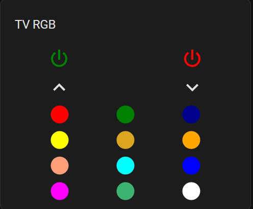
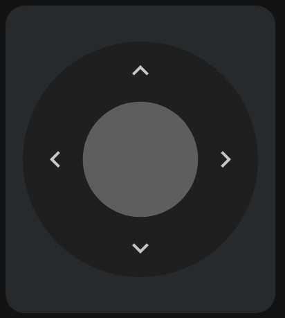
Style the dpad to be like the Google TV app remote.
type: custom:android-tv-card
remote_id: remote.google_tv
rows:
  - - navigation_buttons
custom_actions:
  - type: button
    name: center
    tap_action:
      action: key
      key: DPAD_CENTER
    icon: mdi:checkbox-blank-circle
    styles: |-
      :host {
        --icon-color: rgb(94, 94, 94);
        --size: 200px;
        background: rgb(31, 31, 31);
        border-radius: 200px;
        margin: -70px;
        padding: 70px;
      }
  - type: button
    name: up
    tap_action:
      action: key
      key: DPAD_UP
    hold_action:
      action: repeat
    icon: mdi:chevron-up
    styles: |-
      :host {
        --icon-color: rgb(197, 199, 197);
        z-index: 2;
        top: 25px;
        height: 90px;
        width: 300px;
      }
  - type: button
    name: down
    tap_action:
      action: key
      key: DPAD_DOWN
    hold_action:
      action: repeat
    icon: mdi:chevron-down
    styles: |-
      :host {
        --icon-color: rgb(197, 199, 197);
        z-index: 2;
        bottom: 25px;
        height: 90px;
        width: 300px;
      }
  - type: button
    name: left
    tap_action:
      action: key
      key: DPAD_LEFT
    hold_action:
      action: repeat
    icon: mdi:chevron-left
    styles: |-
      :host {
        --icon-color: rgb(197, 199, 197);
        z-index: 2;
        left: 30px;
        height: 170px;
        width: 90px;
      }
  - type: button
    name: right
    tap_action:
      action: key
      key: DPAD_RIGHT
    hold_action:
      action: repeat
    icon: mdi:chevron-right
    styles: |-
      :host {
        --icon-color: rgb(197, 199, 197);
        z-index: 2;
        right: 30px;
        height: 170px;
        width: 90px;
      }
styles: |-
  #row-1 {
    justify-content: center;
  }
  #row-2 {
    justify-content: center;
  }
  #row-3 {
    justify-content: center;
  }
A music player with multiple sliders for volume and media position and a touchpad for media controls and album art.
type: custom:android-tv-card
media_player_id: media_player.spotify
rows:
  - - touchpad
    - volume
  - - media_position
custom_actions:
  - type: slider
    name: volume
    value_attribute: volume_level
    tap_action:
      action: perform-action
      perform_action: media_player.volume_set
      data:
        volume_level: '{{ value | float }}'
    icon: mdi:spotify
    vertical: true
    styles: |-
      :host {
        --tooltip-label: "{{ (100 * value) | int }}%";
      }
    haptics: true
  - type: slider
    name: media_position
    value_attribute: media_position
    range:
      - 0
      - '{{ state_attr(config.entity, "media_duration") }}'
    tap_action:
      action: perform-action
      perform_action: media_player.media_seek
      data:
        seek_position: '{{ value }}'
    step: 1
    styles: |-
      :host {
        --thumb-width: 5px;
        --tooltip-label: '{{ (value / 60) | int }}:{{ 0 if (value - 60*((value / 60) | int)) < 10 else "" }}{{ (value - 60*((value / 60) | int)) | int }}';
        height: 14px;
      }
      .label {
        filter: invert(1);
        mix-blend-mode: difference;
      }
    label: |2-
        {% set minutes = (value / 60) | int %} {% set seconds = (value - 60 * minutes)
        | int %} {{ minutes }}:{{ 0 if seconds < 10 else "" }}{{ seconds | int }}/{{ (state_attr(config.entity, "media_duration") / 60) | int }}:{{ 0 if
        (state_attr(config.entity, "media_duration") - 60*((state_attr(config.entity,
        "media_duration") / 60) | int)) < 10 else "" }}{{ (state_attr(config.entity,
        "media_duration") - 60*((state_attr(config.entity, "media_duration") / 60) |
        int)) | int }}
  - type: touchpad
    name: touchpad
    tap_action:
      action: perform-action
      perform_action: media_player.media_play_pause
    up:
      tap_action:
        action: none
      hold_action:
        action: none
    down:
      tap_action:
        action: none
      hold_action:
        action: none
    left:
      tap_action:
        action: perform-action
        perform_action: media_player.media_next_track
      hold_action:
        action: none
      icon: mdi:skip-previous
    right:
      tap_action:
        action: perform-action
        perform_action: media_player.media_previous_track
      hold_action:
        action: none
      icon: mdi:skip-next
    styles: |-
      toucharea {
        background-color: rgb(0, 0, 0, 0);
        background-image: url("http://homeassistant.local:8123{{ state_attr(config.entity, 'entity_picture') }}");
        background-repeat: no-repeat;
        background-size: contain;
        background-position: center;
        height: 400px;
        --size: 48px;
      }
    hold_action:
      action: more-info
    icon: mdi:play-pause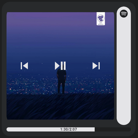
Multiple sliders for light color control.
type: custom:android-tv-card
rows:
  - - brightness
    - color_temp
    - hs_color
custom_actions:
  - type: slider
    vertical: true
    entity_id: light.sunroom_ceiling
    value_attribute: brightness
    range:
      - 0
      - 100
    step: 1
    tap_action:
      action: perform-action
      perform_action: light.turn_on
      data:
        brightness_pct: '{{ value | int }}'
      target:
        entity_id: '{{ config.entity }}'
    styles: |
      :host {
        height: 400px;
        border-radius: 4px;
        --height: 36px;
        --thumb-width: 18px;
        --color: rgb({{ state_attr(config.entity, "rgb_color") }});
        --thumb-border-radius: 4px;
      }
      .background {
        height: 24px;
      }
    name: brightness
  - type: slider
    vertical: true
    entity_id: light.sunroom_ceiling
    value_attribute: color_temp
    range:
      - '{{ state_attr(config.entity, "min_mireds") }}'
      - '{{ state_attr(config.entity, "max_mireds") }}'
    step: 1
    tap_action:
      action: perform-action
      data:
        color_temp: '{{ value | int }}'
      perform_action: light.turn_on
      target:
        entity_id: '{{ config.entity }}'
    styles: |
      :host {
        height: 400px;
        --color: rgba(0, 0, 0, 0.2);
        --background: linear-gradient(-90deg, rgb(255, 167, 87), rgb(255, 255, 251));
        --thumb-box-shadow: none;
      }
      .icon {
        filter: invert(1);
        mix-blend-mode: difference;
      }
    name: color_temp
    icon: mdi:thermometer
  - type: slider
    range:
      - 0
      - 360
    value_attribute: hs_color[0]
    tap_action:
      action: perform-action
      perform_action: light.turn_on
      data:
        hs_color:
          - '{{ value | int }}'
          - 100
      target:
        entity_id: '{{ config.entity }}'
    vertical: true
    step: 0.1
    icon: mdi:palette
    styles: |-
      :host {
        height: 400px;
        color: hsl({{ value | int }}, 100%, 50%);
        --color: rgba(0, 0, 0, 0.5);
        --background: linear-gradient(to right, #f00 0%, #ff0 17%, #0f0 33%, #0ff 50%, #00f 66%, #f0f 83%, #f00 100%);
        --thumb-box-shadow: none;
      }
    entity_id: light.sunroom_ceiling
    name: hs_color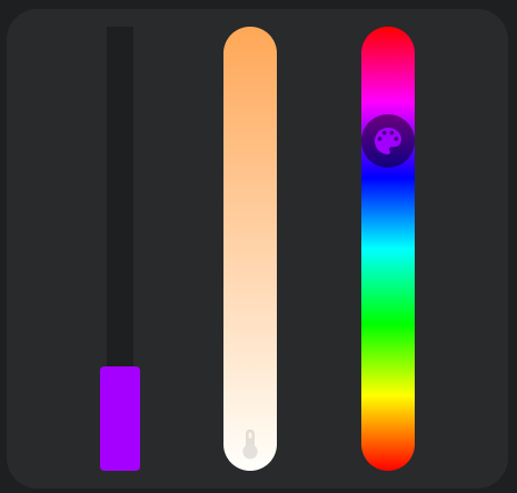