
A highly optimized, production-ready Markdown Editor for React with live preview and VS Code style interface
| Light theme | Dark Mode | Features Demo |
|---|---|---|
 |
 |
 |
- 🎯 Monaco Editor Integration - The same powerful editor that powers VS Code
- 📝 GitHub Flavored Markdown - Full GFM support with tables, task lists, and more
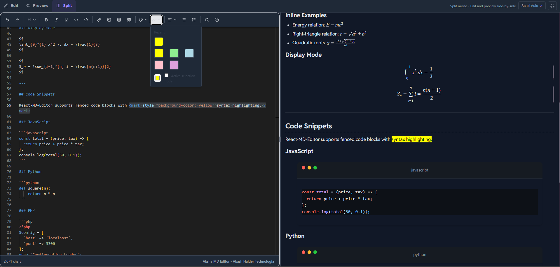
- 🧮 Math Equations - LaTeX syntax with KaTeX rendering (inline
$...$and block$$...$$) - 🎨 Syntax Highlighting - Code blocks with 100+ language support
- 🌗 Theme Support - Light, dark, and auto (system preference) themes
- 👁️ Multiple View Modes - Edit-only, Preview-only, or Split view
- ⌨️ Keyboard Shortcuts - Familiar shortcuts for productivity
- 🛠️ Rich Toolbar - Comprehensive formatting options
- 📱 Responsive - Works seamlessly on all screen sizes
- ⚡ Performance Optimized - Debounced updates and efficient rendering
- 🎯 TypeScript - Full type safety with comprehensive type definitions
- 📦 Tree-shakable - Import only what you need
Complete guides, API reference, and examples are available in our documentation site: Visit the full documentation →
> npm install aksha-md-editor> yarn add aksha-md-editor> pnpm add aksha-md-editorimport { useState } from 'react';
import { MarkdownEditor } from 'aksha-md-editor';
import 'aksha-md-editor/styles.css';
export default function App() {
const [markdown, setMarkdown] = useState("# Hello World\n\nStart editing!");
return (
<div
style={{
borderRadius:"10px",
}}
>
<MarkdownEditor
value={markdown}
onChange={setMarkdown}
theme="light"
height="600px"
defaultViewMode="split"
/>
</div>
);
}| Prop | Type | Default | Description |
|---|---|---|---|
value |
string |
- | Controlled value |
defaultValue |
string |
"# Hello, Markdown!" |
Initial value (uncontrolled) |
onChange |
(value: string) => void |
- | Change handler |
theme |
"light" | "dark" | "auto" |
"auto" |
Editor theme |
defaultViewMode |
"edit" | "preview" | "split" |
"split" |
Initial view mode |
height |
string |
"600px" |
Editor height |
onSave |
(value: string) => void |
- | Save handler (Ctrl+S) |
readOnly |
boolean |
false |
Read-only mode |
wordWrap |
"on" | "off" |
"on" |
Word wrap setting |
import { Editor, Preview, EditorTabs } from 'aksha-md-editor';
import 'aksha-md-editor/styles.css';

function CustomLayout() {
  const [markdown, setMarkdown] = useState('# Custom Layout');
  const [viewMode, setViewMode] = useState<'edit' | 'preview' | 'split'>('split');

  return (
    <div>
      <EditorTabs
        viewMode={viewMode}
        onViewModeChange={setViewMode}
      />

      {viewMode !== 'preview' && (
        <Editor
          value={markdown}
          onChange={setMarkdown}
          height="500px"
        />
      )}

      {viewMode !== 'edit' && (
        <Preview content={markdown} />
      )}
    </div>
  );
}function ReadOnlyPreview() {
const content = '# Documentation\n\nThis is read-only content.';
return (
<MarkdownEditor
value={content}
readOnly={true}
defaultViewMode="preview"
enableToolbar={false}
/>
);
}function LargeDocumentEditor() {
const [largeDoc, setLargeDoc] = useState('');
return (
<MarkdownEditor
value={largeDoc}
onChange={setLargeDoc}
performanceMode={true}
minimap={false}
height="100vh"
/>
);
}- ✅ GitHub Flavored Markdown - Tables, task lists, strikethrough
- ✅ Math Equations - Inline
$E=mc^2$and block$$...$$with KaTeX - ✅ Syntax Highlighting - 100+ languages via highlight.js
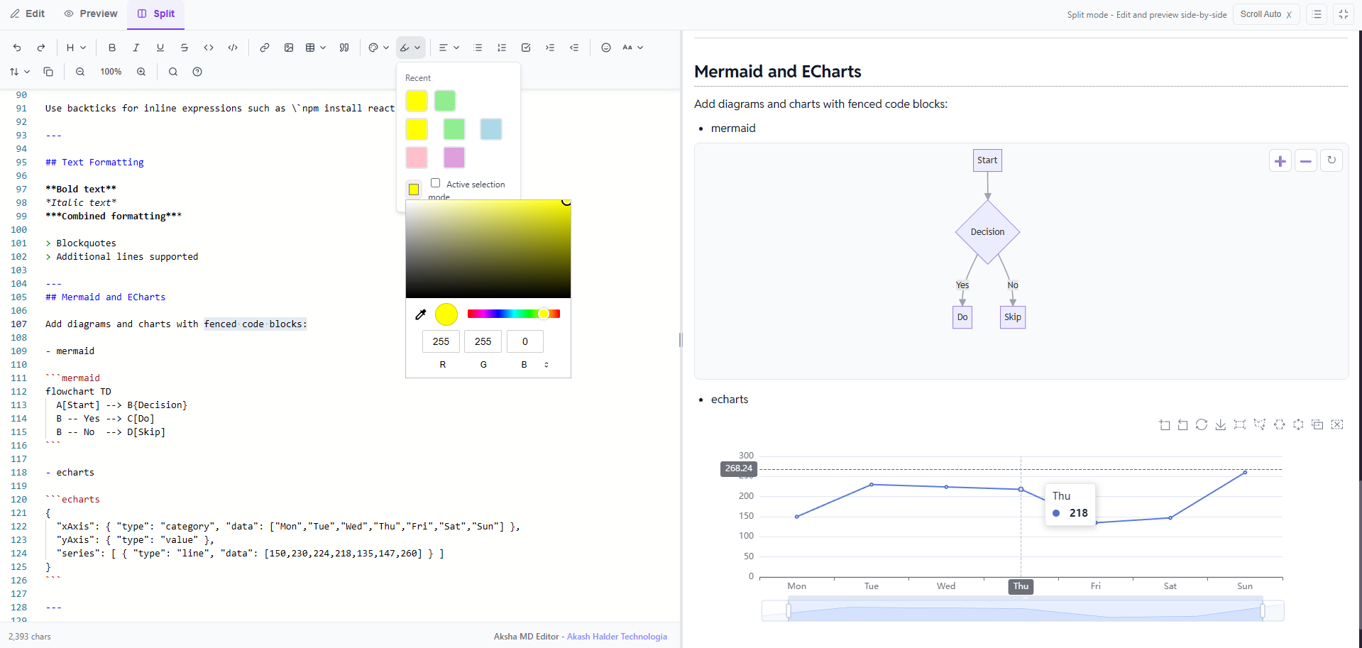
- ✅ Diagrams - Mermaid flowcharts via fenced blocks
- ✅ Charts - Apache ECharts via fenced blocks
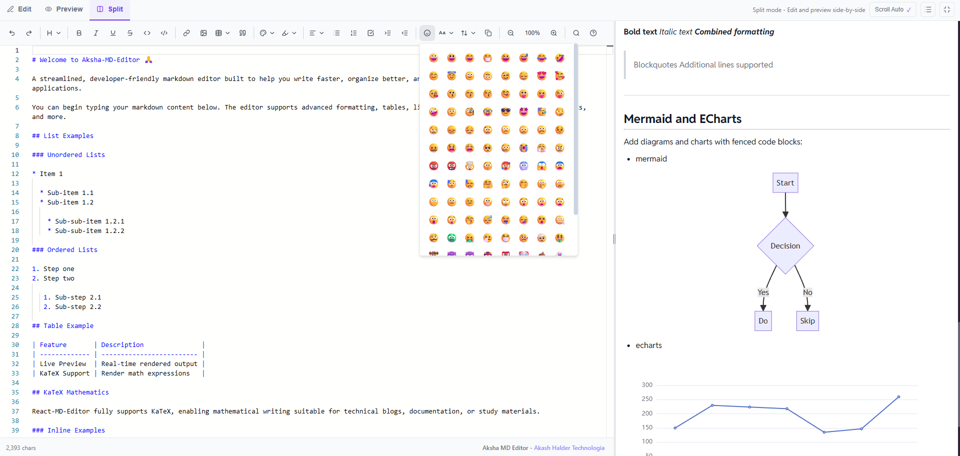
- ✅ Emoji - Noto Color Emoji font support
- ✅ Live Preview - Real-time markdown rendering
- ✅ Multiple Themes - Light, dark, and auto (follows system)
- ✅ View Modes - Edit, Preview, or Split view
- ✅ Auto Scroll - Preview follows editor scroll in split view
- ✅ Keyboard Shortcuts - Standard shortcuts (Ctrl+B, Ctrl+I, etc.)
- ✅ Fully Typed - Complete TypeScript support
| Shortcut | Action |
|---|---|
Ctrl/Cmd + B |
Bold text |
Ctrl/Cmd + I |
Italic text |
Ctrl/Cmd + K |
Insert link |
Ctrl/Cmd + S |
Save (if onSave provided) |
Ctrl/Cmd + Z |
Undo |
Ctrl/Cmd + Y |
Redo |
import {Preview}  from 'aksha-md-editor';
import 'aksha-md-editor/styles.css';

function MarkdownPreview() {
  const markdown = `
# Math Example

Inline math: $E = mc^2$

Block math:
$$
\\int_{-\\infty}^{\\infty} e^{-x^2} dx = \\sqrt{\\pi}
$$
  `;

  return <Preview content={markdown} theme="light" />;
}Add diagrams and charts with fenced code blocks:
```mermaid
flowchart TD
  A[Start] --> B{Decision}
  B -- Yes --> C[Do]
  B -- No  --> D[Skip]
```

```echarts
{
  "xAxis": { "type": "category", "data": ["Mon","Tue","Wed","Thu","Fri","Sat","Sun"] },
  "yAxis": { "type": "value" },
  "series": [ { "type": "line", "data": [150,230,224,218,135,147,260] } ]
}
```
Mermaid and ECharts are loaded on-demand from CDN and respect the current theme.
A Styled Download Button to download the markdown.
function DownloadButton({ text }) {
  const handleDownload = () => {
    const blob = new Blob([text], { type: "text/markdown" });
    const url = URL.createObjectURL(blob);
    const a = document.createElement("a");
    a.href = url;
    a.download = "document.md";
    a.click();
    URL.revokeObjectURL(url);
  };
  return (
    <button
      onClick={handleDownload}
      style={{
        padding: "8px 16px",
        background: "#7c3aed",
        color: "white",
        border: "none",
        borderRadius: "6px",
        cursor: "pointer",
        fontWeight: "500",
        marginTop: "10px",
      }}
    >
      Download .md
    </button>
  );
}View mode switcher component.
| Prop | Type | Default | Description |
|---|---|---|---|
viewMode |
'edit' | 'preview' | 'split' |
Required | Current view mode |
onViewModeChange |
(mode: ViewMode) => void |
Required | View mode change callback |
isFullscreen |
boolean |
false |
Fullscreen state |
onFullscreenToggle |
() => void |
undefined |
Fullscreen toggle callback |
Custom hook for theme management with system preference detection.
import {useTheme} from 'aksha-md-editor';

function MyComponent() {
  const { theme, resolvedTheme, setTheme } = useTheme();

  return (
    <button onClick={() => setTheme('dark')}>
      Current theme: {resolvedTheme}
    </button>
  );
}
Returns:
theme: Current theme setting ('auto' | 'light' | 'dark')resolvedTheme: Actual theme in use ('light' | 'dark')setTheme: Function to change theme
Custom hook for debouncing values.
import { useDebounce } from 'aksha-md-editor';

function SearchComponent() {
  const [searchTerm, setSearchTerm] = useState('');
  const debouncedSearch = useDebounce(searchTerm, 300);

  useEffect(() => {
    // API call with debouncedSearch
  }, [debouncedSearch]);

  return <input onChange={(e) => setSearchTerm(e.target.value)} />;
}type ViewMode = 'edit' | 'preview' | 'split';type ThemeMode = 'auto' | 'light' | 'dark';type WordWrap = 'on' | 'off' | 'wordWrapColumn';type ToolbarGroup = 'undo-redo' | 'formatting' | 'lists' | 'insert';The library automatically includes pre-built styles for markdown rendering (tables, code blocks, math formulas, etc.) when you import the component. No additional CSS imports are required.
You can override styles using CSS custom properties:
.markdown-editor {
  --editor-bg: #ffffff;
  --editor-text: #000000;
  --editor-border: #e5e7eb;
  --editor-toolbar-bg: #f9fafb;
}

.markdown-editor.dark {
  --editor-bg: #1f2937;
  --editor-text: #f9fafb;
  --editor-border: #374151;
  --editor-toolbar-bg: #111827;
}- Use performanceMode: For documents > 10,000 characters
- Disable minimap: Reduces memory usage
- Debounce onChange: Already implemented (300ms)
- Use controlled mode sparingly: For large documents, consider uncontrolled mode
Contributions are welcome! Please feel free to submit a Pull Request. For major changes, please open an issue first to discuss what you would like to change.
- Fork the repository
- Create your feature branch (
git checkout -b feature/AmazingFeature) - Commit your changes (
git commit -m 'Add some AmazingFeature') - Push to the branch (
git push origin feature/AmazingFeature) - Open a Pull Request
This project is licensed under the MIT License - see the LICENSE file for details.
- Built with Monaco Editor
- Markdown parsing powered by unified
- Math rendering by KaTeX
- Syntax highlighting by highlight.js
Made with ❤️ by Akash Halder