-
Notifications
You must be signed in to change notification settings - Fork 8
Geo And Time Series Data

http://infographics.quantecdc.es:8080/dashboard
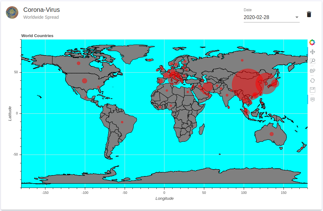
From January 2020 on the Corona virus started with some reported regional cases in China. Now at the end of February the disease is evidently revealed as being a worldwide phenomena, since it is spreading out easily in our interconnected world even with increasing speed recently.
The data source used for the infographics app is provided by the link https://www.kaggle.com/sudalairajkumar/novel-corona-virus-2019-dataset with a permissive license CC0: Public Domain. The data was collected by Johns Hopkins University and from WHO, CDC, NHC and DXY in the first place. Thanks for the regular update.
To present the data e.g. the worldwide spread we make use of our recently proposed framework of Bokeh module in python together with the reactive Angular front-end. Both the back- and the front-end fit perfectly together. The data processing is done with high convenience in the python back-end, the charts could easily be created within the Bokeh module and then embedded in the front-end with even improved data control, since any event can now lead to a redraw of the presented data.
One interesting aspect of the Corona virus worldwide spread is the geographical location. Luckily the contours of all countries are available on github without any restrictive license (https://github.com/johan/world.geo.json). The contours may then be drawn as patches. In Bokeh this is done with some lines of code:
import bokeh.plotting as bkp
import bokeh.models as bkm

p = bkp.figure(width=1000, height=600, tools=tools, title="World Countries", x_axis_label="Longitude", y_axis_label="Latitude")
p.background_fill_color = "aqua"
p.x_range = bkm.Range1d(start=-180, end=180)
p.y_range = bkm.Range1d(start=-90, end=90)
p.patches("xs", "ys", color="grey", line_color="black", source=countries)
circles = p.circle(x="y", y="x", radius="radius", color="red", alpha=0.5, source=self.circle_source, name="map-circles")
The confirmed number of infections of the Corona virus we show by a half transparent circle in red color. The area should be mostly proportional to the counted number but since the outrages number of several ten-thousands of infections in China compared to numbers elsewhere of reported numbers less than 10 we have to make a compromise: the minimum radius is 1 and the maximum radius is 20 (in internal data-space units).
The position of the circles are connected to the country to which the number belongs. The coordinates of the countries we get from Nominatim which is provided in a python module named geopy.geocoders.
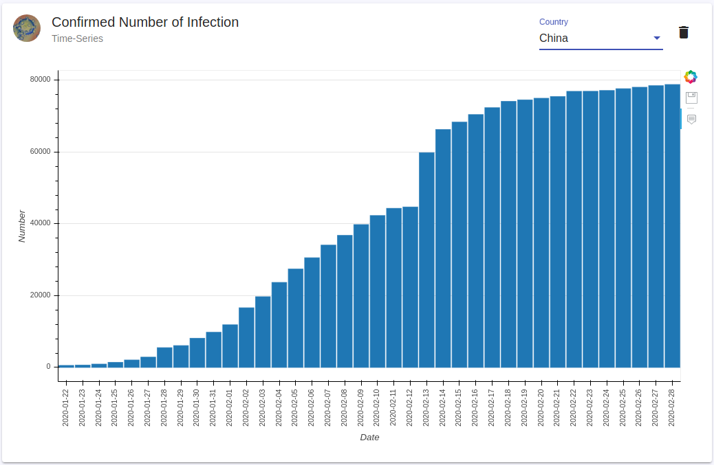
Since the data is inherently time dependent we made the date as a user selectable parameter. Thus the user may follow at least roughly the world wide spread by changing the date successively from the 22nd January when the data starts until today. As already said before: since the number of infections in China is overwhelmingly large the observation is a little bit biased. So let's take a closer look on each country.
The time dependency may be better observed by extracting the data of each country individually. This is done in the bar chart below.

Here we would like to present some techniques in pandas which may be helpful for working with this kind of data. Reading in csv data within pandas is as easy as
import pandas as pd

data = pd.read_csv("2019_nCoV_data.csv")
data['ObservationDate'] = data['ObservationDate'].apply(pd.to_datetime)
The second line changes the observation data column into a python datetime format which is the end a comparable object in contrast to a string date. Since we are not interested in the data of each city or province we accumulate the data with respect to the country column and the observation date column.
cases = pd.DataFrame(data.groupby(['Country/Region', 'ObservationDate'])["Confirmed"].sum())
cases["Index"] = cases.index
# get new index count
cases.index = np.arange(0, len(cases))
# get new single Date date
cases["Date"] = [x["Index"][1] for i,x in cases.iterrows()]
cases["Country"] = [x["Index"][0] for i,x in cases.iterrows()]
To rearange the index and create then again a separate country and date column we use the last three lines, which is also not so obvious with pandas. The user may now select one of the countries and receives the bar chart instantly.
Angular is implemented and build upon an inherent event driven mechanism, that's why it is evidently very attractive to combine Python's async paradigm with Angular event detection.
On Python side the most mature web server which deals with async is aiohttp. It offers also a simple possibility to open up a websocket server onto which the Angular client can connect to.
Last time we have published the combination of Angular with Bokeh charts we sent the chart in json format via the websocket connection to angular. But we relied upon the ajax calls for update since the BokehJS API offers mainly the black boxed embed method for embedding charts. After investigating the API a little bit deeper it seems very viable not to use the embed method but to go through the embedding step by step. Thus we have been able to extract the bokeh Document object and from this object we got access to the data source.
Since there are very view examples available on the internet we decided to give a little bit of insight into what you can do with the source object and how we can in fact use it to change the update paradigm to event driven.
We are now focusing on the Angular side. First of all we create a service in which we connect to the global Bokeh object
declare var Bokeh: any;
interface Roots {[index: string]: any};
The Bokeh lib is inlcuded in the html file with the following two lines:
<script src="https://cdn.pydata.org/bokeh/release/bokeh-1.4.0.min.js"></script>
<script src="https://cdn.pydata.org/bokeh/release/bokeh-api-1.4.0.min.js"></script>
After receiving the chart-item produced in Python in json format as item we may produce a bokeh document object from which we can extract the most relevant document source
const doc = Bokeh.Document.from_json(item.doc);
const source = doc.get_model_by_name('map-circles').data_source
where it is important to use the same name 'map-circles' also in the backend for the data model. The actual embedding now works like
const element = document.getElementById(id);
const roots: Roots = {[item.root_id]: element};
element.classList.add(Bokeh.embed.BOKEH_ROOT);
Bokeh.embed.add_document_standalone(doc, element, roots, false);
The third line is somehow mandatory for the hover tools to work properly. Now that we have access to the source it is not so difficult to proceed with our usual event driven update.
public updateChartData(source: any, chartId: string) {
    const callbackId = 'updateChartData_' + chartId;
    this.messageService.awaitMessage().pipe(filter(msg => msg.name === callbackId))
        .subscribe(
        msg => {
            console.log(msg.args.data);
            source.data = msg.args.data;
            source.change.emit();
        });
}
Whenever a relevant websocket message arrives in the MessageService, the source change event is emitted, which causes an inherent chart redraw event. This subscription must be done only once for any new source and it should be made sure, that when the chart component is removed the subscription is unsubscribed.
In our next article we will give more insight in the python back-end handling of the events. We will argue that from our point of view it has some advantages to use websocket connection since it gives also the possibility for displaying back-end events which would be impossible with a bare web api.