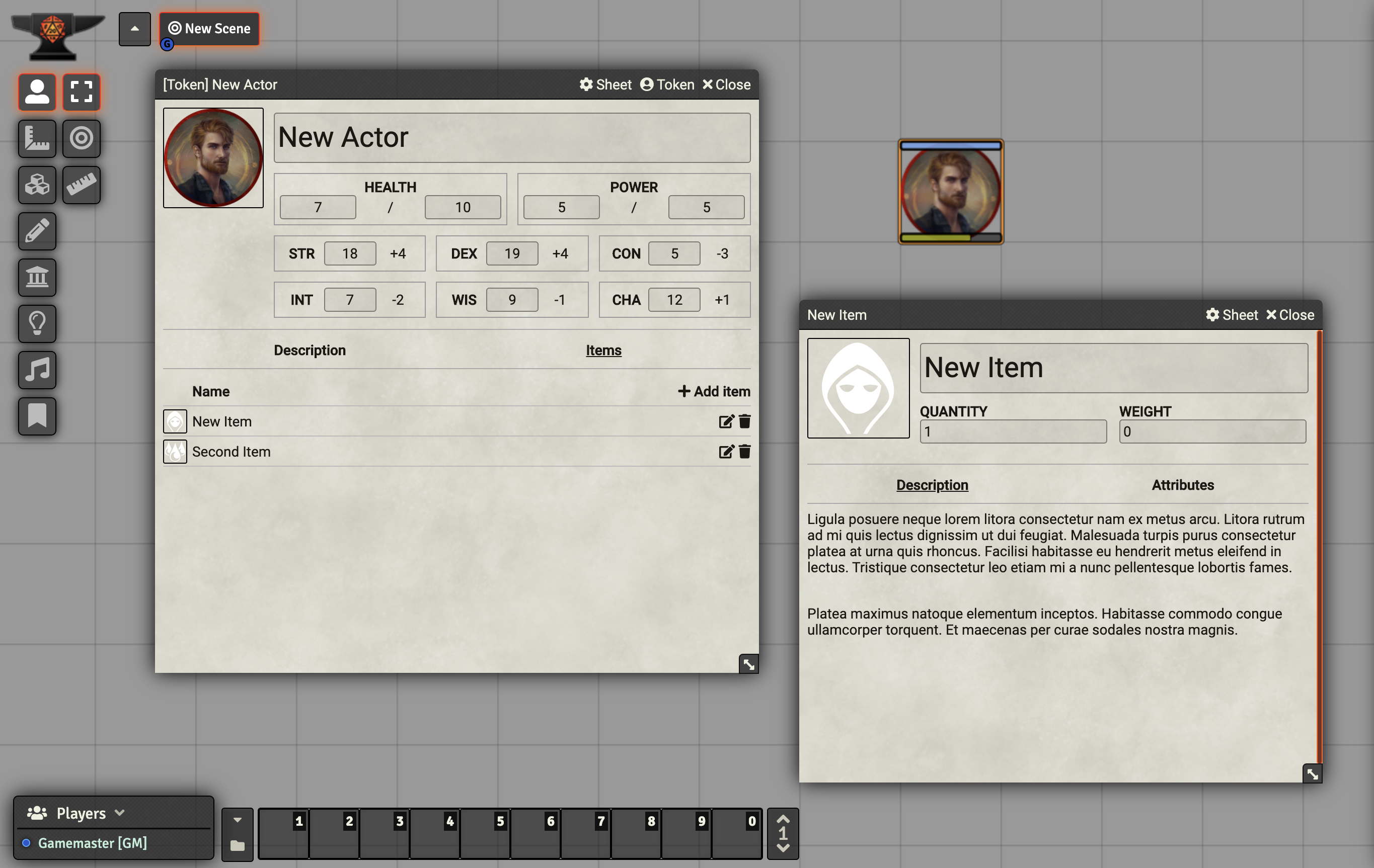
This system is a boilerplate system that you can use as a starting point for building your own custom systems. It's similar to Simple World-building, but has examples of creating attributes in code rather than dynamically through the UI.
Before installing this system, you should rename any files that have boilerplate in their filename to use whatever machine-safe name your system needs, such as adnd2e if you were building a system for 2nd edition Advanced Dungeons & Dragons. In addition, you should search through the files for boilerplate and Boilerplate and do the same for those, replacing them with appropriate names for your system.
This project is also available as generator that can be run with npm: https://www.npmjs.com/package/generator-foundry
Alternatively, there's another build of this system that supports using Vue 3 components (ES module build target) for character sheet templates.
Head over to the Vue3Boilerplate System repo if you're interested in using Vue!
For much more information on how to use this system as a starting point for making your own, see the full tutorial on the Foundry Wiki!
This system includes a handful of helper CSS classes to help you lay out your sheets if you're not comfortable diving into CSS fully. Those are:
flexcol: Included by Foundry itself, this lays out the child elements of whatever element you place this on vertically.flexrow: Included by Foundry itself, this lays out the child elements of whatever element you place this on horizontally.flex-center: When used on something that's using flexrow or flexcol, this will center the items and text.flex-between: When used on something that's using flexrow or flexcol, this will attempt to place space between the items. Similar to "justify" in word processors.flex-group-center: Add a border, padding, and center all items.flex-group-left: Add a border, padding, and left align all items.flex-group-right: Add a border, padding, and right align all items.grid: When combined with thegrid-Ncolclasses, this will lay out child elements in a grid.grid-Ncol: ReplaceNwith any number from 1-12, such asgrid-3col. When combined withgrid, this will layout child elements in a grid with a number of columns equal to the number specified.
This repo includes both CSS for the theme and SCSS source files. If you're new to CSS, it's probably easier to just work in those files directly and delete the SCSS directory. If you're interested in using a CSS preprocessor to add support for nesting, variables, and more, you can run npm install in this directory to install the dependencies for the scss compiler. After that, just run npm run gulp to compile the SCSS and start a process that watches for new changes.

