-
Notifications
You must be signed in to change notification settings - Fork 40
Styling
Styling is done using the CSS file format and with a file named styles.css.
Valid directories for this file are C:/Users/{username}/.config/yasb/ or path where YASB is Installed. A good starting point is the default style.
The main YASB window can be styled with the following:
.yasb-bar
Each widget group can be styled individually with the following:
.container-left.container-center.container-right
A style with the .widget selector would affect all the widgets. In practice, you may prefer to use more specific .*-widget selectors.
Example how to target clock widget
.clock-widget {
	border-top-left-radius: 18px;
	border-bottom-left-radius: 18px;
}
The main YASB windows carry a class tag with the name of the output this window is shown on.
* { font-size: 13px;color: #cdd6f4; }
Example above will set the default font size and color of all elements unless overridden later on.
Icons can be styled with the following:
.icon
.icon class above will affect all icons inside the span tag in configuration file.
label: "<span>\uf4bc</span> {virtual_mem_free}"
You can specify different icon class in the configuration file as shown below.
label: "<span class=\"icon-1"\">\uf4bc</span> {virtual_mem_free}"
Text can be styled with the following:
.label
Each icon and text is wrapped in a container. This container can be styled with the following:
.widget-container
Example how to target widget container
.clock-widget .widget-container {
    background-color: #1e1e1e;
    border-radius: 10px;
}
.media-widget .widget-container {
    background-color: #1e1e1e;
    border-radius: 10px;
}
Note: Keep the mind YASB is written in Python and styled with CSS is very limited. You can't use CSS3 or any other advanced CSS features.
YASB can follow the OS theme, if you have OS dark style YASB will add class .dark on the root element, if you want to have different light and dark themes you can use the following CSS to achieve this.
.yasb-bar {
    /* background color for light style */
    background-color: #1e1e1e;
}
.yasb-bar.dark {
    /* background color for dark style */
    background-color: #1e1e1e;
}
.yasb-bar .label {
    /* text color for light style */
    color: #000000;
}
.yasb-bar.dark .label {
    /* text color for dark style */
    color: #ffffff;
}
.icon {
    color: #cdd6f4;
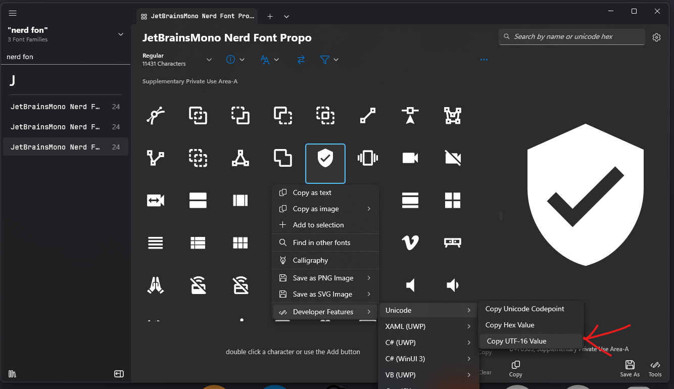
}There is a nice app at Character Map UWP where you can select a font, click on icons, and copy the UTF-16 value. Alternatively, you can visit the Nerd Fonts site and do the same under the icons section.

- Home
- Installation
- Configuration
- Styling
- YASB CLI
- FAQ
- Widgets:
- Active Windows Title
- Applications
- Battery
- Bluetooth
- Brightness
- CPU
- Clock
- Custom
- Github
- GlazeWM Workspaces
- GlazeWM Tiling Direction
- Home
- Disk
- Language
- Libre Hardware Monitor
- Media
- Memory
- Microphone
- OBS
- Server Monitor
- Traffic
- Taskbar
- Power Menu
- Update Check
- Volume
- Wallpapers
- Weather
- WiFi
- WHKD
- Windows-Desktops
- Komorebi Workspaces
- Komorebi Layout
- Writing Widget