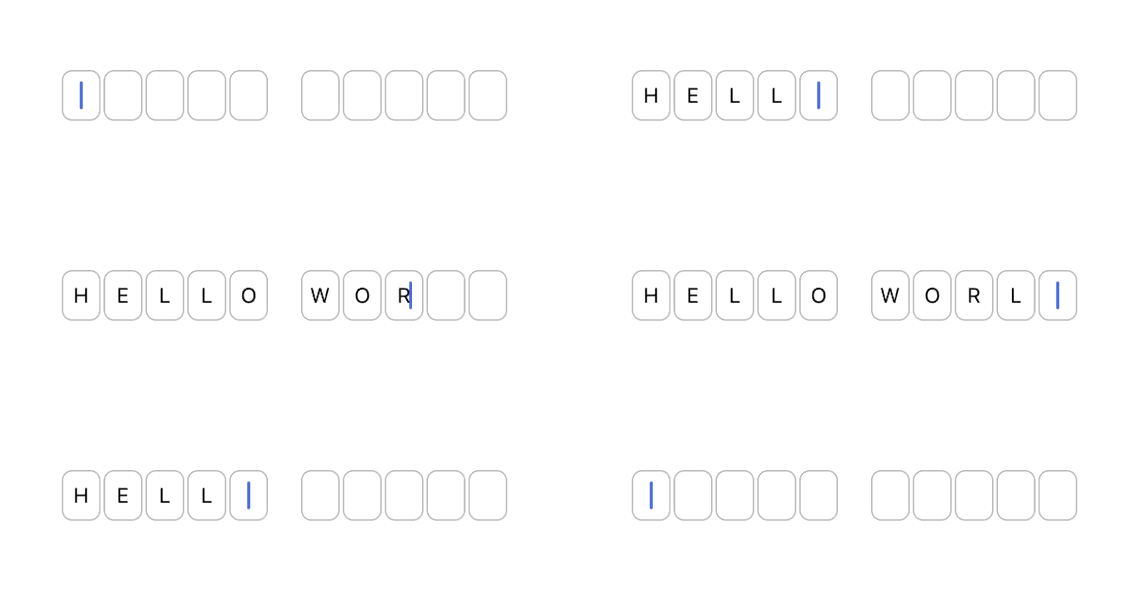
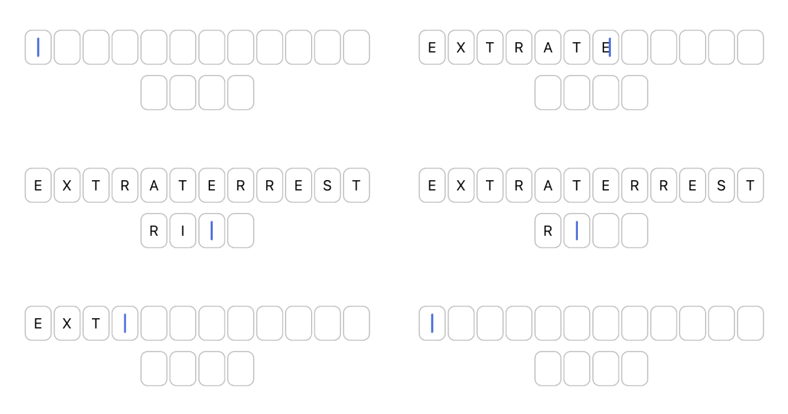
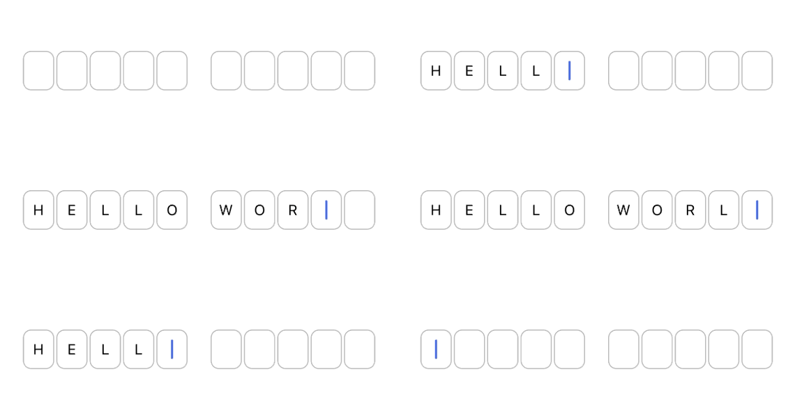
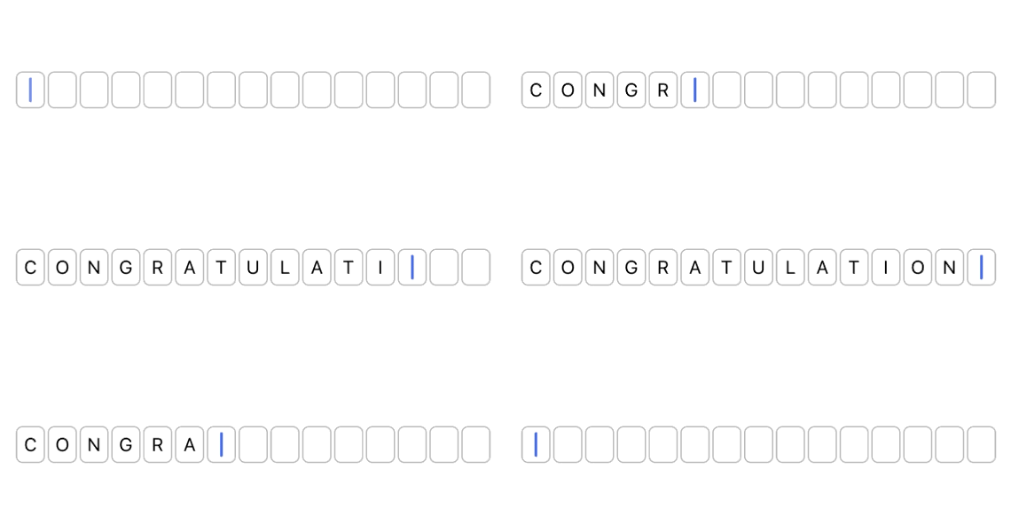
react-native-quiz-input is a React-Native package that allows the creation of individual character text inputs. While typing, focus will automatically move to the next input or to the previous one (in case of backspace). Spaces are also supported, therefore it is suitable for Quiz-like interfaces, Credit Card inputs, OTP screens and so on.
with Yarn:
yarn add react-native-quiz-input
or NPM:
npm install react-native-quiz-input --save
Import the component in your project:
import { QuizInput } from 'react-native-quiz-input';Use the component:
<QuizInput
    wordStructure={ [ true, true, true, false, true, true, true ] }
    onChange={ onChange }
/>
const onChange = ( data ) => {
console.log(data);
// your code goes here
};| Name | Type | Description | Example | isRequired? |
|---|---|---|---|---|
| wordStructure | TWordStructure |
Array representation of the words, where true is a letter and false is a space |
[true, true, false, true, true, true] |
yes |
| onChange | (TCallbackData) => void |
Callback function. It will return the input content as an array and as a string | check types section for data structure | yes |
| maxBoxesPerLine | number |
Max input boxes per line. When set, it will automatically create multiple rows when needed. Default: 0 (off) |
13 |
no |
| lineBreakOnSpace | boolean |
Create a new row for each word. Default: false |
true |
no |
| autoFocus | boolean |
Autofocus first input when component is loaded. Default: true |
true |
no |
| backgroundColor | string |
Background color of each input box. Default: transparent |
#7FDCFF |
no |
| textColor | string |
Text color of each input box. Default: #000 |
#001F3F |
no |
| borderColor | string |
Border color of each input box. Default: #BBB |
#DDD |
no |
| size | small | medium | large |
Size of each input. Default: medium |
large |
no |
type TWordStructure = ReadonlyArray<boolean>;Word structure is defined by providing an array of booleans where true means letter and false mean space.
Example:
Hello World
[ true, true, true, true, true, false, true, true, true, true, true ]
type TCallbackData = {
    wordArray: ReadonlyArray<string | false>;
    wordString: string;
};
The callback returns an object with 2 properties:
An array with the input content. Each row in the array is either a string with the letter or false in case of a space.
The input content as a string
Example:
{
    wordArray: ['H', 'E', 'L', 'L', 'O', false, 'W', 'O', 'R', 'L', 'D' ],
    wordString: 'HELLO WORLD'
}
const wordStructure = [ true, true, true, true, true, false, true, true, true, true, true ];

<QuizInput
    wordStructure={ wordStructure }
    onChange={ onChange }
    lineBreakOnSpace={ true }
/>const wordStructure = [ true, true, true, true, true, true, true, true, true, true, true, true, true, true, true, true ];
<QuizInput
wordStructure={ wordStructure }
onChange={ onChange }
maxBoxesPerLine={ 12 }
/>const wordStructure = [ true, true, true, true, true, false, true, true, true, true, true ];
<QuizInput
wordStructure={ wordStructure }
onChange={ onChange }
size={ 'big' }
/>const wordStructure = [ true, true, true, true, true, true, true, true, true, true, true, true, true, true, true ];
<QuizInput
wordStructure={ wordStructure }
onChange={ onChange }
size={ 'small' }
/>You can try out the component in different environments (including your device) on Expo.io
This library is currently used in Flipping Cards, an iOS/Android flashcards app availble in the App Store and Play Store. If you want to see the component in action just download the app and try out Challenge Mode.
Are you using this library in your project? Feel free to let me know by opening an issue. I will be happy to feature your app here.
Developed and maintained by @antoniocosentino
Many thanks to @demchenkoalex for creating the boilerplate that I used for this repo.
Please open an issue. PRs are also welcome 😉
