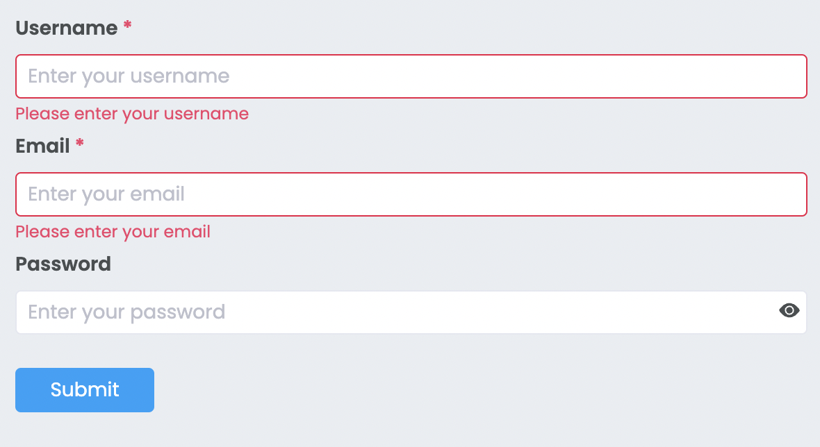
React Ezy Form is a simple yet powerful form generator that supports validation out of the box. It's designed to be intuitive and easy to integrate into any React project.
- Form generator with built-in validation
- Customizable form items with flexible validation rules
- Horizontal or vertical form layout
This component is suitable for you if you need:
- A quick and easy form generator
- Validation for form fields (including custom validation)
To install via NPM, run:
npm install --save react-ezy-formHere's a basic example of how to use the form generator with validation. In this form, we add fields for username, email, and password, with custom validation for each field.
import { Form, FormItem, Input, PasswordInput, ValidationType } from 'react-ezy-form';

<Form onSubmit={(formValues) => console.log(formValues)}>
  <FormItem
    label="Username"
    name="username"
    rules={[
      {
        type: ValidationType.required,
        message: 'Please enter your username',
      },
    ]}
  >
    <Input placeholder="Enter your username" />
  </FormItem>

  <FormItem
    label="Email"
    name="email"
    rules={[
      {
        type: ValidationType.required,
        message: 'Please enter your email',
      },
      {
        type: ValidationType.regex,
        message: 'Invalid email address',
        regexPattern: /^\w+([\.-]?\w+)*@\w+([\.-]?\w+)*(\.\w{2,3})+$/,
      },
    ]}
  >
    <Input placeholder="Enter your email" />
  </FormItem>

  <FormItem
    label="Password"
    name="password"
    rules={[
      {
        type: ValidationType.custom,
        message: 'Your password is too weak',
        validationFunction: (formValue) => {
          return formValue['password'] !== '123';
        },
      },
    ]}
  >
    <PasswordInput placeholder="Enter your password" />
  </FormItem>

  <button type="submit" className="button button--primary">
    Submit
  </button>
</Form>;| Prop Name | Type | Description |
|---|---|---|
| onSubmit* | (formValues) => void | Callback that is triggered when the form is submitted, with form values passed as a parameter. |
| horizontal | boolean | Set this to true to render the form in a horizontal layout (default is vertical). |
Within the FormItem component, the child input component must accept the following props:
id: stringname: stringvalue: FormValueTypeonChange: (name: string, value: FormValueType) => void
const Input = ({ onChange, name, id, value = '' }) => {
  const handleInputChange = (event) => {
    const value = event.currentTarget.value.trim();
    onChange(name, value);  // Trigger onChange from FormItem
  };

  return (
    <input
      name={name}
      id={id}
      onChange={handleInputChange}
      value={value}
      type="text"
      placeholder="Username"
    />
  );
};| Prop Name | Type | Description |
|---|---|---|
| name* | string | Name used for the form value that will be returned to the onSubmit callback. |
| valuePropName | string | Key of the value sent to your component inside the FormItem (default is value). |
| style | CSSProperties | Custom styles for FormItem. |
| rules | Rule[] | Array of validation rules for the FormItem. |
interface Rule {
  type: ValidationType;  // "required", "regex", or "custom"
  message: string;       // Error message shown when validation fails
  regexPattern?: RegExp; // For "regex" validation type
  validationFunction?: (formValue: FormValues) => boolean; // For "custom" validation type
}You can explore and test this component in Storybook:
- Visit the online Storybook
- Or run it locally by cloning the repository and running the following commands:
git clone https://github.com/barzin144/react-ezy-form.git
cd react-ezy-form
npm install
npm startFeel free to contribute by creating issues or submitting pull requests. All contributions are welcome!
