-
Notifications
You must be signed in to change notification settings - Fork 4
Design System
This page outlines the Design System to support the Vue 3 Scaffold.
- Design System Reference
- Headings
- Colours
- Button
- Datatable
- Toggle
- Action button
- Side panel
- Modal
- Toast
A hierarchy of design systems currently exists to support new applications built using the Vue 3 Scaffold. These should be considered the default overarching design systems for British Columbia development projects using this scaffold. All decisions should also align with Web Content Accessibility Guidelines (WCAG) 2.0 AA Conformance.
The British Columbia DevHub Design System supports development with components and style reference material, but is not specific to Vue.
British Columbia Government web standards and guides, including the Web style guide and Writing for the web support development with standards and guides.
This scaffold uses PrimeVue for default Vue 3 components, which have further component documentation.
Headings
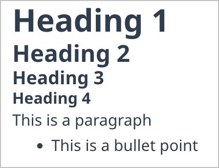
Use heading levels as described by the World Wide Web Consortum to ensure WCAG 2.0 conformance. H1 headings are appropriate for main level page topics. Lower headings of each level should always be contained under higher heading levels. H3 can only appear under H2, H2 can only appear under H1, and so on.
Headings must be descriptive but brief. H1s should uniquely describe primary topics.
See Writing for the Web: Writing headings and page titles for more guidance on headings.
Colours are based on the British Columbia DevHub Design System Colour Palette and Design Guidelines for the B.C. Visual Identity Program. This scaffold may include additional colours that support the core colours, any other colours chosen when using the scaffold should do this as wlel.

Button components are provided in three default styles, with or without icons. Icons may be used if the imagery clearly describes the action, but should only be used if there is a clear relation between the icon chosen and resulting action. Primary style is intended for default journey patterns or main action choices, typically only used once per page or area within a page, such as a grouping of buttons. Secondary style is intended for supporting action choices. A button can also be disabled to prevent its use and is greyed out. A danger button is intended for actions with impactful consequences, such as deletion. A danger button can be styled in full colour like a primary button for the most dire consequences, such as permanent deletion.
British Columbia DevHub Design System offers further guidance on buttons:


Datatables are used to display data in a tabular format. Use column sorting in cases where alphanumeric sorting is advantageous for the user, such as in standard columns displaying text or numbers. Toggles and action buttons may be used.
See PrimeVue DataTable.
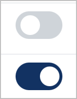
Use toggles where two options exist for a user to select, usually when an "on" state enables a feature and an "off" state disables a feature.

Action buttons use Font Awesome free icons to portray action concepts. Use hover/tooltips to portray the meaning of action buttons in as few words as possible. To be consistent, use only one implied meaning per icon throughout a website/application, such as a trash can icon always meaning delete.
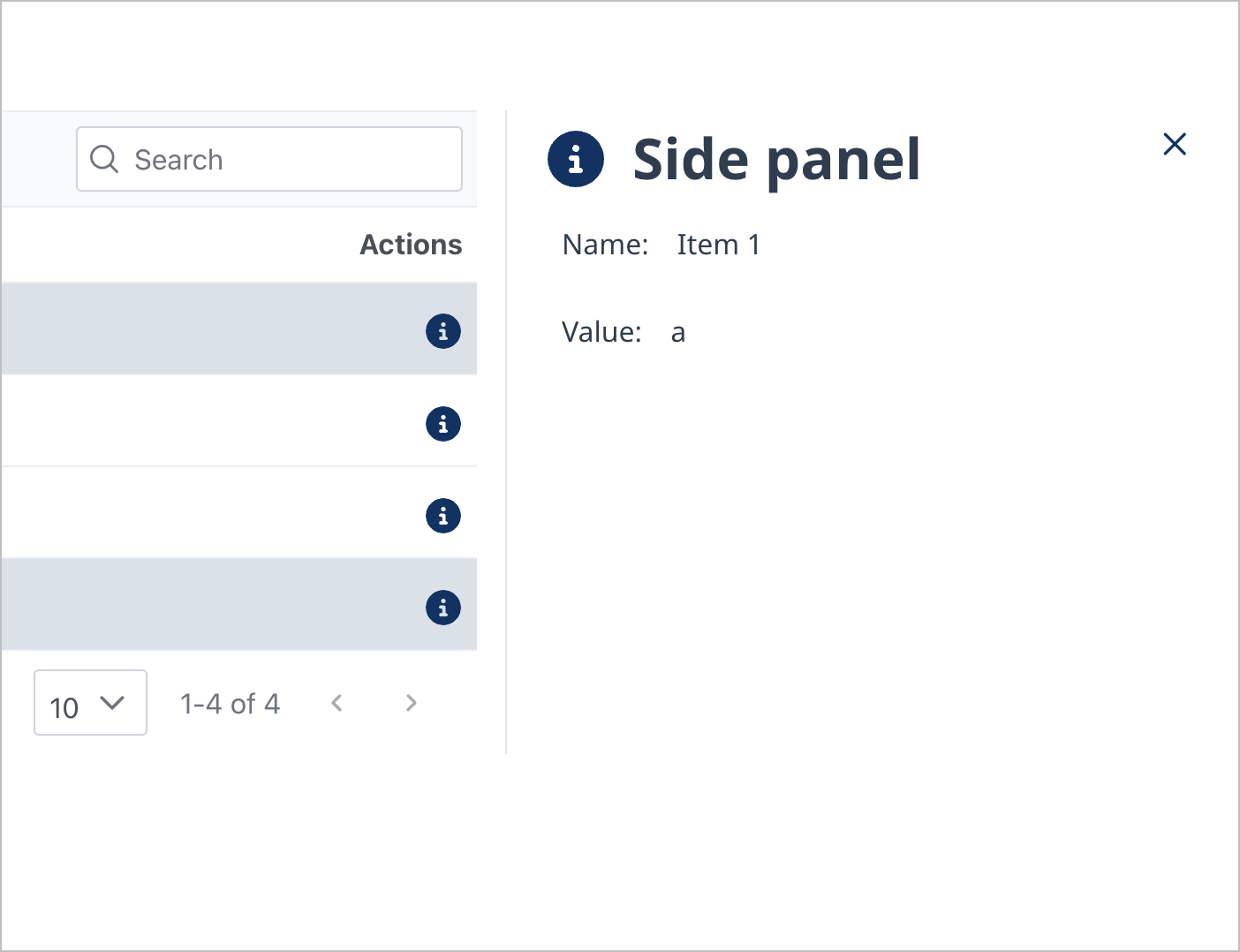
A side panel may be used to portray additional information, such as extra details related to a row in a datatable.
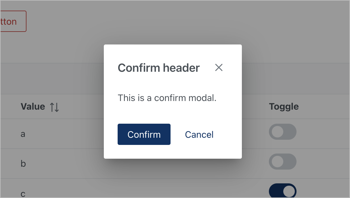
Confirm modals allow a user to confirm an action or cancel it. The "X" icon also closes the modal, acting as a cancel.
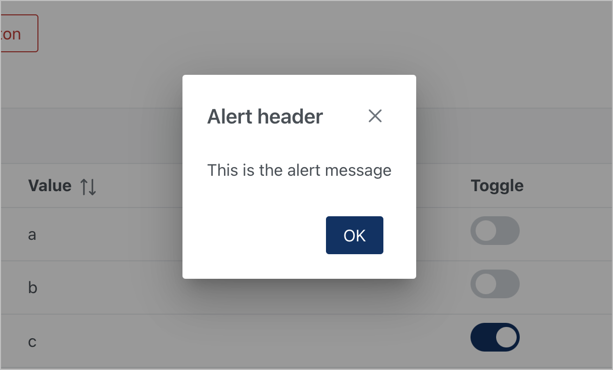
Alert modals make a user aware of an important piece of information that is of more importance than a toast might indicate, requiring the user observe and acknowledge the information in a modal.

An input modal is an example of a form within a modal, requiring user input. Use descriptions below input fields to explain the purpose or syntax of the input field. Asterisks denote required fields.


Toasts use B.C. Government alert styling (DevHub) to portray information in a brief status message.
- Use success toasts to notify someone that a task is fully completed or a disruption is resolved.
- Use error toasts if a user has been prevented from achieving their goal or a task has not been completed.
- Use information toasts if more information is relevant to the user but is not related to the success status of the toast.
- Use warning toasts if an exception has occurred or an action has only been partially completed.
Return Home