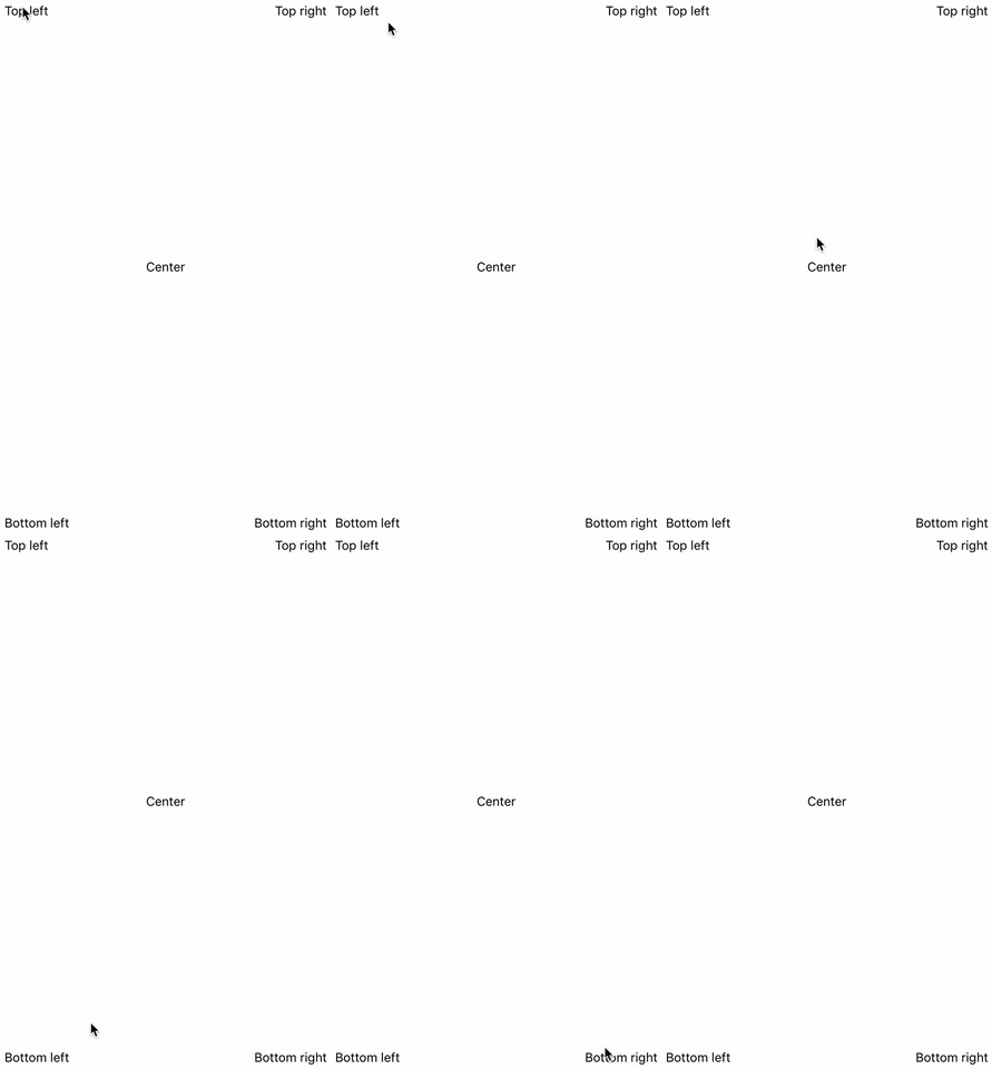
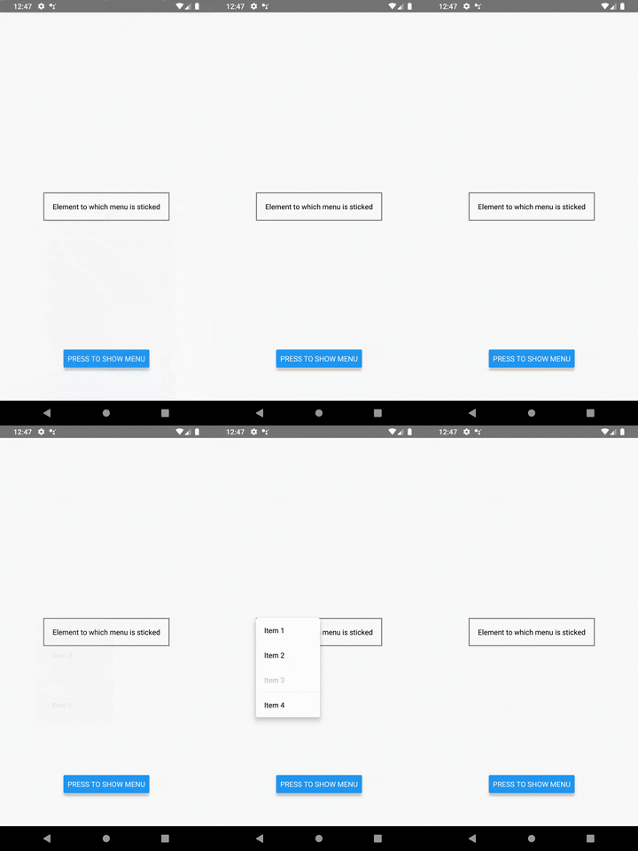
| Positioning | Description |
|---|---|
| snap positioning | Allows to snap menu to any element's border |
| stick to center of element | Allows to show menu by the center of element's width |
| dynamic positioning | Allows to add dynamic offsets to base menu position |
| position constraints | Automatically applies constraints to never allow to go beyond screen borders. You always will see full menu |
| Animations | Description |
|---|---|
| Right-to-Left support | Not implemented. See #1 |
Pure TypeScript material menu component for React Native.
npm install "@breeffy/react-native-popup-menu" --saveyarn add "@breeffy/react-native-popup-menu"
| Library version | React Native version | Description |
|---|---|---|
| 0.7.0 | React Native 0.62.2 | Shows how to use react-native-popup-menu with Typescript |
| 0.7.0 | React Native 0.62.2 | Shows how to use react-native-popup-menu with Javascript |
...
export const App = () => {
  let elementRef = React.createRef<View>();
  let menuRef: Menu | null = null;

  const setMenuRef: (instance: Menu | null) => void = (ref) => (menuRef = ref);
  const hideMenu = () => menuRef?.hide();
  const showMenu = () => {
    menuRef?.show(elementRef.current, Position.TOP_LEFT);
  };
  const onPress = () => showMenu();

  return (
    <View
      style={{
        width: '100%',
        height: '100%',
        alignItems: 'center',
        justifyContent: 'center'
      }}
    >
      <ElementToStick ref={elementRef} />
      <Button
        style={{ position: 'absolute', bottom: 64 }}
        title={'Press to show menu'}
        onPress={onPress}
      />
      <Menu ref={setMenuRef}>
        <MenuItem onPress={hideMenu}>Item 1</MenuItem>
        <MenuItem onPress={hideMenu}>Item 2</MenuItem>
        <MenuItem onPress={hideMenu} disabled>
          Item 3
        </MenuItem>
        <MenuDivider />
        <MenuItem onPress={hideMenu}>Item 4</MenuItem>
      </Menu>
    </View>
  );
};| name | description | type | default |
|---|---|---|---|
| children | Components rendered in menu (required) | Node | - |
| style | Menu style (optional) | Style | - |
| onHidden | Callback when menu has become hidden (optional) | Function | - |
| name | description |
|---|---|
| show() | Shows menu |
| hide() | Hides menu |
| name | description | type | default |
|---|---|---|---|
| ref | React reference to component (required) | Reference | - |
| stickTo | To which component border(s) we will stick menu (optional) | Position | Position.TOP_LEFT |
| extraOffset | Additional offset to stickTo (optional) | Object | { left: 0, top: 0 } |
| computeOffset | Additional computed offset to stickTo (optional) | Function | { left: 0, top: 0 } |
stickTo parameter set relative base position of menu, it is always relative to component.
| value | description |
|---|---|
| TOP_LEFT | Show the menu at the top left of the component |
| TOP_RIGHT | Show the menu at the top rigth of the component |
| TOP_CENTER | Show the menu at the top center of the component |
| BOTTOM_LEFT | Show the menu at the bottom left of the component |
| BOTTOM_RIGHT | Show the menu at the bottom right of the component |
| BOTTOM_CENTER | Show the menu at the bottom center of the component |
extraOffset parameter set additional offset to base position of menu. It's used if you want customize stickTo, adding additional offset. extraOffset is an Object with the following allowed properties.
| value | description | type |
|---|---|---|
| top | Offset the top edge from menu base position | Number |
| bottom | Offset the bottom edge from menu base position | Number |
| left | Offset the left edge from menu base position | Number |
| right | Offset the right edge from menu base position | Number |
| Notes | Example |
|---|---|
| extraOffset can have duplicate properties (they all will be applied correctly) | { top: 10, top: -5, top: 15 } |
| extraOffset values can be negative too | { top: 10, top: -5, top: 15 } |
computeOffset parameter is a callback function which will be called with position and size of component (computeOffset(left, top, width, height)). It's used if you want to customize stickTo dynamically and your computed offset depends on component position / size (for example to show menu centered you need to know component width).
| name | description | type |
|---|---|---|
| left | position of component on the horizontal axis (from top left window corner) | Number |
| top | position of component on the vertical axis (from top left window corner) | Number |
| width | width of component | Number |
| height | height of component | Number |
computeOffset callback should return Object with the same properties as extraOffset Object.
/* Example of computeOffset return value */
{
  top: 10,
  left: 15,
  bottom: -3,
  right: 15,
  top: 12
}| Notes |
|---|
You can use extraOffset parameter or computeOffset or both parameters simultaneously. So, the final position of menu is calculated as basePosition + extraOffset + computeOffset(left, top, width, height) |
| name | description | type | default |
|---|---|---|---|
| children | Rendered text (required) | String | - |
| disabled | Disabled flag | Bool | false |
| disabledTextColor | Disabled text color | String | "#BDBDBD" |
| onPress | Called function on press | Func | - |
| style | Container style | Style | - |
| textStyle | Text style | Style | - |
| underlayColor | Pressed color | String | "#E0E0E0" |
| name | description | type | default |
|---|---|---|---|
| color | Line color | String | "rgba(0,0,0,0.12)" |


