Branches ui mods #463
Open
Branches ui mods #463
Conversation
This file contains hidden or bidirectional Unicode text that may be interpreted or compiled differently than what appears below. To review, open the file in an editor that reveals hidden Unicode characters.
Learn more about bidirectional Unicode characters
added 2 commits
January 22, 2019 13:31
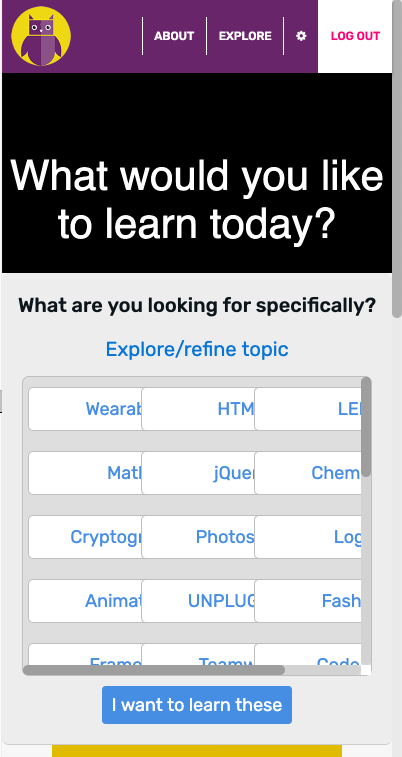
…rger dialog which drops down over the center and whose visibility can be toggled. Added spot for large image with accompanying text to be displayed at the top of the page on the branches and filtered activities views.
Member
|
tagging @eemshi to see what she thinks |
Sign up for free
to join this conversation on GitHub.
Already have an account?
Sign in to comment
Add this suggestion to a batch that can be applied as a single commit.
This suggestion is invalid because no changes were made to the code.
Suggestions cannot be applied while the pull request is closed.
Suggestions cannot be applied while viewing a subset of changes.
Only one suggestion per line can be applied in a batch.
Add this suggestion to a batch that can be applied as a single commit.
Applying suggestions on deleted lines is not supported.
You must change the existing code in this line in order to create a valid suggestion.
Outdated suggestions cannot be applied.
This suggestion has been applied or marked resolved.
Suggestions cannot be applied from pending reviews.
Suggestions cannot be applied on multi-line comments.
Suggestions cannot be applied while the pull request is queued to merge.
Suggestion cannot be applied right now. Please check back later.
This makes the changes addressed in Issues #461 and #462.
Note. The menu I implemented for filtering by tags looks slightly different than the one in #462. The number of tags made the menu extend very far down. I thought it looked better truncated at a certain point, which necessitated the scroll bar. I then added the slight color difference to distinguish the inside and outside of the scrollable area. Let me know what you think.