Learn how to create a realistic split-flap display where each character is physically divided by the horizontal line, just like the original mechanical displays from airports and train stations.
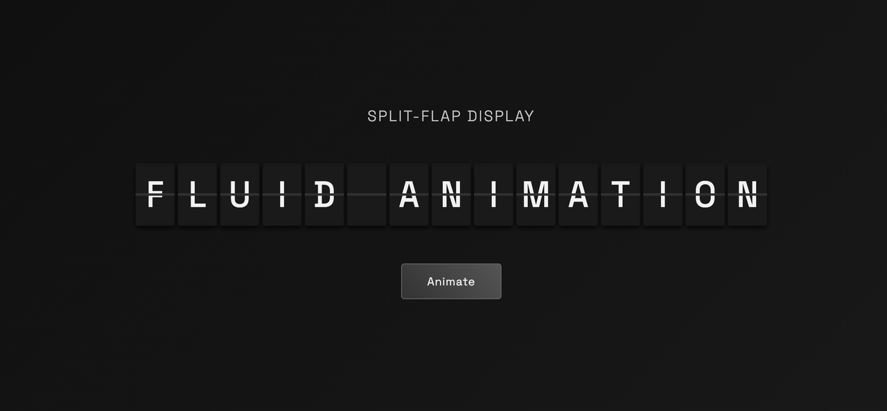
In authentic split-flap displays:
- Each character is cut in half by a horizontal divider
- Top half: Shows only the upper portion of the letter (like the top bars of "F")
- Bottom half: Shows only the lower portion of the letter (like the bottom bar of "F")
- When flaps rotate, they reveal new character pieces that combine to form complete letters
Start with a clean structure focused on the display itself:
<!DOCTYPE html>
<html lang="en">
<head>
    <meta charset="UTF-8">
    <meta name="viewport" content="width=device-width, initial-scale=1.0">
    <title>Authentic Split-Flap Display</title>
    <link rel="stylesheet" href="styles.css">
    <link rel="preconnect" href="https://fonts.googleapis.com">
    <link rel="preconnect" href="https://fonts.gstatic.com" crossorigin>
    <link href="https://fonts.googleapis.com/css2?family=Space+Mono:wght@400;700&display=swap" rel="stylesheet">
</head>
<body>
    <div class="container">
        <h1 class="title">Split-Flap Display</h1>
        <div class="display-container">
            <div class="split-flap-row" id="displayRow"></div>
        </div>
        <button class="animate-btn" onclick="animateDisplay()">Animate</button>
    </div>
    <script src="script.js"></script>
</body>
</html>
Key Elements:
- Space Mono font: Perfect monospace font for technical displays
- Container: Centers everything
- Display Row: Where individual flaps will be created
- Animate Button: Triggers the flip animation
:root {
    --bg-color: #0f0f0f;
    --text-color: #f2f2f2;
    --flap-bg: #1a1a1a;
    --divider-color: #333;
    --shadow-color: rgba(0, 0, 0, 0.4);
}

* {
    margin: 0;
    padding: 0;
    box-sizing: border-box;
}

body {
    font-family: "Courier New", monospace;
    background: linear-gradient(135deg, #0f0f0f 0%, #1a1a1a 100%);
    color: var(--text-color);
    min-height: 100vh;
    display: flex;
    align-items: center;
    justify-content: center;
    padding: 2rem;
}

.container {
    text-align: center;
}

.display-container {
    display: flex;
    justify-content: center;
    gap: 0.5rem;
    margin: 3rem 0;
}Each flap needs three elements: top half, bottom half, and flip element:
.character-flap {
    position: relative;
    width: 50px;
    height: 80px;
    background-color: var(--flap-bg);
    border-radius: 3px;
    overflow: hidden;
    perspective: 1000px;
    box-shadow: 0 3px 6px var(--shadow-color);
}

.flap-top, .flap-bottom, .flap-flip {
    position: absolute;
    width: 100%;
    height: 50%;
    display: flex;
    align-items: center;
    justify-content: center;
    font-size: 2.2rem;
    font-weight: bold;
    color: var(--text-color);
    background-color: var(--flap-bg);
    overflow: hidden; /* This is crucial for character division */
}This is the key technique that makes characters appear cut in half:
.flap-top {
    top: 0;
    border-bottom: 1.5px solid var(--divider-color);
    align-items: flex-end; /* Push content to bottom of top half */
    padding-bottom: 1px;
}

.flap-top .char-text {
    margin-bottom: -1.1rem; /* Negative margin hides bottom of character */
}

.flap-bottom {
    bottom: 0;
    border-top: 1.5px solid var(--divider-color);
    align-items: flex-start; /* Push content to top of bottom half */
    padding-top: 1px;
}

.flap-bottom .char-text {
    margin-top: -1.1rem; /* Negative margin hides top of character */
}
How it works:
- Top half: Character is positioned at the bottom (
align-items: flex-end) with negative bottom margin, so only the top portion shows - Bottom half: Character is positioned at the top (
align-items: flex-start) with negative top margin, so only the bottom portion shows - Overflow hidden: Clips the character at the container boundaries
.flap-flip {
    top: 0;
    transform-origin: bottom center; /* Rotates from the divider line */
    backface-visibility: hidden;
    z-index: 3;
    border-bottom: 1.5px solid var(--divider-color);
    align-items: flex-end;
    padding-bottom: 1px;
}

.flap-flip .char-text {
    margin-bottom: -1.1rem; /* Same division as top half */
}@keyframes flipChar {
0% {
transform: rotateX(0deg);
}
50% {
transform: rotateX(90deg);
}
100% {
transform: rotateX(180deg);
}
}
.flipping {
animation: flipChar 0.6s cubic-bezier(0.4, 0.0, 0.2, 1) forwards;
}const phrase = "FLUID ANIMATION";
const charset = "ABCDEFGHIJKLMNOPQRSTUVWXYZ0123456789 ";
function getRandomChar() {
return charset[Math.floor(Math.random() * charset.length)];
}function createFlap(char) {
const flap = document.createElement('div');
flap.className = 'character-flap';
flap.dataset.targetChar = char;
// Top half - shows upper portion of character
const topHalf = document.createElement('div');
topHalf.className = 'flap-top';
const topText = document.createElement('span');
topText.className = 'char-text';
topText.textContent = getRandomChar();
topHalf.appendChild(topText);
// Bottom half - shows lower portion of SAME character
const bottomHalf = document.createElement('div');
bottomHalf.className = 'flap-bottom';
const bottomText = document.createElement('span');
bottomText.className = 'char-text';
bottomText.textContent = topText.textContent; // Same character!
bottomHalf.appendChild(bottomText);
// Flip element - animates the transition
const flipHalf = document.createElement('div');
flipHalf.className = 'flap-flip';
const flipText = document.createElement('span');
flipText.className = 'char-text';
flipText.textContent = topText.textContent;
flipHalf.appendChild(flipText);
flap.appendChild(topHalf);
flap.appendChild(bottomHalf);
flap.appendChild(flipHalf);
return flap;
}Important: Notice that topText.textContent, bottomText.textContent, and flipText.textContent all use the same character. The visual division happens through CSS positioning and overflow.
function initializeDisplay() {
    const container = document.getElementById('displayRow');
    container.innerHTML = '';

    // Create a flap for each character in the phrase
    phrase.split('').forEach(char => {
        const flap = createFlap(char);
        container.appendChild(flap);
    });
}function animateFlap(flap, targetChar) {
const topText = flap.querySelector('.flap-top .char-text');
const bottomText = flap.querySelector('.flap-bottom .char-text');
const flipText = flap.querySelector('.flap-flip .char-text');
const flipContainer = flap.querySelector('.flap-flip');
let shuffleCount = 0;
const maxShuffles = 3 + Math.floor(Math.random() * 4); // 3-6 shuffles
function shuffle() {
if (shuffleCount >= maxShuffles) {
// Final flip to target character
flipText.textContent = topText.textContent;
flipContainer.classList.add('flipping');
setTimeout(() => {
// Update all parts to show the target character
topText.textContent = targetChar;
bottomText.textContent = targetChar;
flipText.textContent = targetChar;
// Reset flip element
flipContainer.classList.remove('flipping');
flipContainer.style.transform = '';
}, 300);
return;
}
// Shuffle to random character
const currentChar = topText.textContent;
const nextChar = shuffleCount === maxShuffles - 1
? targetChar
: getRandomChar();
// Start flip animation
flipText.textContent = currentChar;
flipContainer.classList.add('flipping');
setTimeout(() => {
// Update to next character
topText.textContent = nextChar;
bottomText.textContent = nextChar; // Always the same!
// Reset flip
flipContainer.classList.remove('flipping');
flipContainer.style.transform = '';
shuffleCount++;
// Continue shuffling
setTimeout(shuffle, 150);
}, 300);
}
shuffle();
}function animateDisplay() {
const flaps = document.querySelectorAll('.character-flap');
flaps.forEach((flap, index) => {
const targetChar = flap.dataset.targetChar;
// Stagger animation: center-out pattern
const centerIndex = Math.floor(flaps.length / 2);
const distanceFromCenter = Math.abs(index - centerIndex);
const delay = distanceFromCenter * 100; // 100ms per step from center
setTimeout(() => {
animateFlap(flap, targetChar);
}, delay);
});
}// Initialize when page loads
document.addEventListener('DOMContentLoaded', () => {
initializeDisplay();
// Start animation after a brief delay
setTimeout(() => {
animateDisplay();
}, 1000);
});The character division effect relies on these key techniques:
- Same Character Everywhere: Top, bottom, and flip elements all contain the same character
- Strategic Positioning:
- Top half:
align-items: flex-endpushes text to bottom - Bottom half:
align-items: flex-startpushes text to top
- Top half:
- Negative Margins: Hide portions of the character
- Top:
margin-bottom: -1.1remhides bottom portion - Bottom:
margin-top: -1.1remhides top portion
- Top:
- Overflow Hidden: Clips the character at container boundaries
Full Character "F":    Top Half Shows:    Bottom Half Shows:
┌─────────────┐       ┌─────────────┐     ┌─────────────┐
│ ███████████ │       │ ███████████ │     │             │
│ ███         │  →    │ ███         │  +  │             │
│ ███████     │       │ ███████     │     │ ███████     │
│ ███         │       │ ███    ──── │     │ ███         │
│ ███         │       └─────────────┘     │ ███         │
└─────────────┘                           └─────────────┘
Hope you like it and use for your own web projects.