-
Notifications
You must be signed in to change notification settings - Fork 0
PUICard
Elijah Cobb edited this page May 13, 2021
·
3 revisions
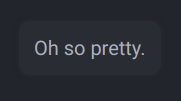
A PUICard is a component that created a styled div around its children. It takes a few optional props like className, onClick, etc. Almost all components use a PUICard internally for styling. If you want to make custom UI elements that look like the others, just wrap them in a PUICard.
import {PUICard} from "./pstdl-ui";
import {ReactElement} from "react";

export function TestBed(): ReactElement {

	return <div className={"TestBed"}>
		<PUICard>
			<span>Oh so pretty.</span>
		</PUICard>
	</div>
}
Created by Elijah Cobb at the Planetary Surface Technology Development Lab located at Michigan Technological University
- PUIGage
- PUIImmutableBinaryStatus
- PUIImmutableNumericStatus
- PUILog
- PUIMutableBinaryStatus
- PUIMutableNumericStatus
- PUIPicker
- PUISegmentedPicker
- PUIAlert
- PUIToast
- PUICard
- PUITopBar
- PUIAppController
- PUIKeyboardController
- PUIGamepadController
- PUIHookAlert
- PUIHookLog
- PUIHookState
- PUIHookToast
- PUIApp
- PUIColor
- PUIContext