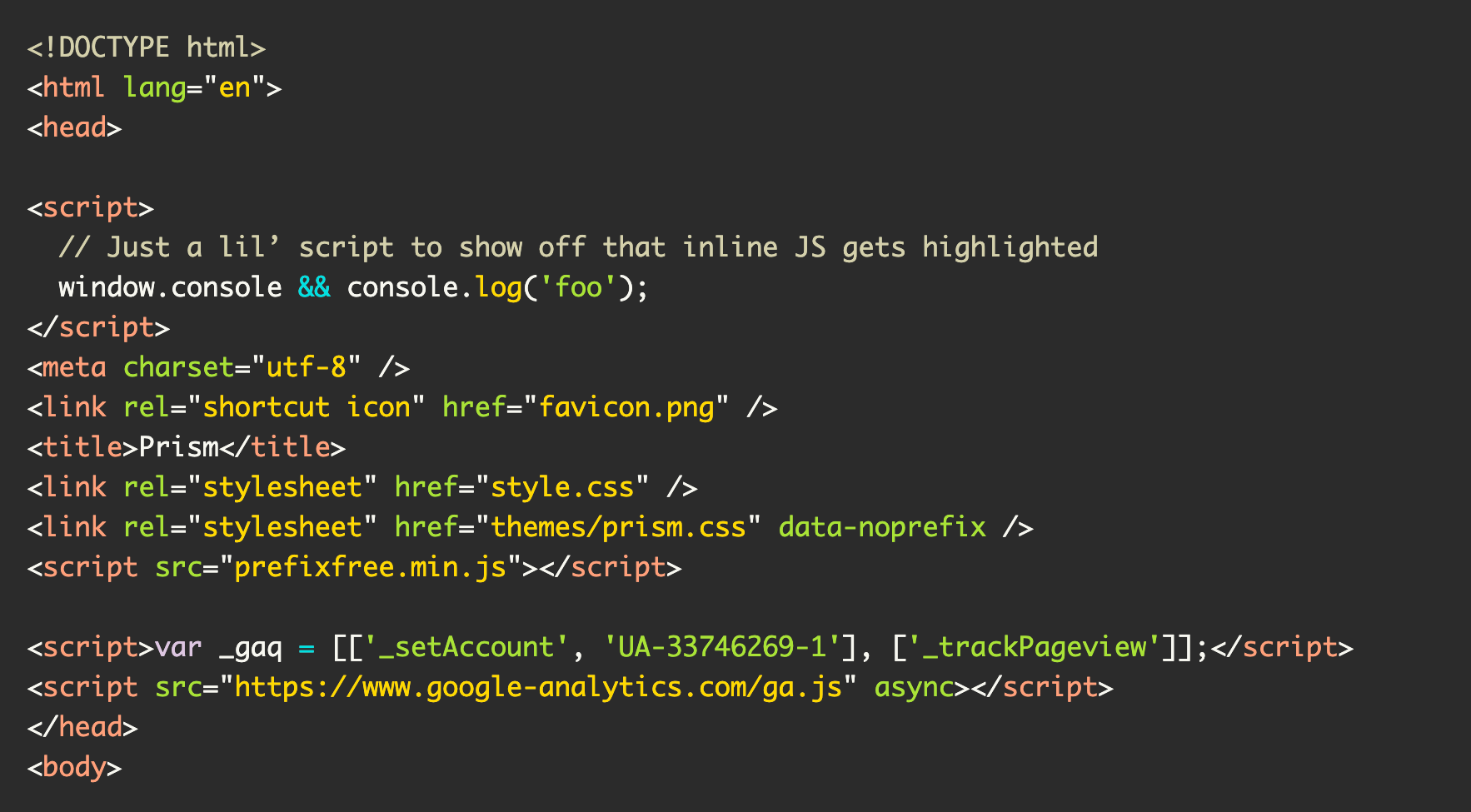
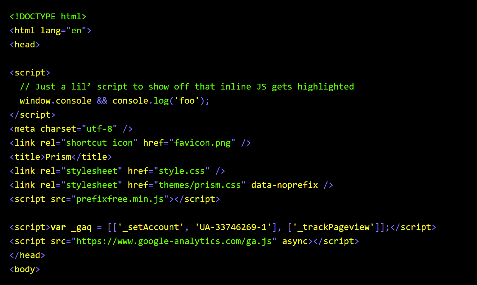
Accessible light and dark syntax highlighting themes. Supports WCAG level AA contrast requirements (good for most websites and apps).
You can download the files directly, or use NPM. After that you can either link to the CSS you need directly, or incorporate it into your build sustem.
Other services are also supported.
- Light text on a dark background.
- Background color of
#2B2B2B. - WCAG AAA compliant for color contrast.
| Color | Hex | Ratio | Normal Text | Large Text |
|---|---|---|---|---|
| Background | #2B2B2B |
N/A | N/A | N/A |
| No token | #F8F8F2 |
13.28:1 | AAA | AAA |
| Comment | #D4D0AB |
9.04:1 | AAA | AAA |
| Blue | #00E0E0 |
8.58:1 | AAA | AAA |
| Green | #ABE338 |
9.28:1 | AAA | AAA |
| Gray | #F8F8F2 |
13.28:1 | AAA | AAA |
| Orange | #F5AB32 |
7.25:1 | AAA | AAA |
| Purple | #DCC6E0 |
8.89:1 | AAA | AAA |
| Red | #FFA07A |
7.12:1 | AAA | AAA |
| Yellow | #FFD700 |
10.09:1 | AAA | AAA |
- Dark text on a light background.
- Background color of
#FEFEFE. - WCAG AA compliant for color contrast. WCAG AAA compliance forces the values on a light background to be too similar to each other to be used effectively for syntax highlighting.
| Color | Hex | Ratio | Normal Text | Large Text |
|---|---|---|---|---|
| Background | #FEFEFE |
N/A | N/A | N/A |
| No token | #545454 |
7.5:1 | AAA | AAA |
| Comment | #802200 |
9.69:1 | AAA | AAA |
| Blue | #007299 |
5.38:1 | AA | AAA |
| Green | #008000 |
5.09:1 | AA | AAA |
| Gray | #696969 |
5.44:1 | AA | AAA |
| Orange | #A85D00 |
4.92:1 | AA | AAA |
| Purple | #9400D3 |
6.5:1 | AA | AAA |
| Red | #D91E18 |
5.01:1 | AA | AA |
| Yellow | #856514 |
5.38:1 | AA | AAA |
Both themes have enhanced support for Windows High Contrast Mode when possible:
a11y-light-on-light-dark-on-dark: This theme contains both light text on a dark background and dark text on a light background visual treatments for code. It is set to show a light background color for code when your operating system's light mode is active, and a dark background color when your operating system's dark mode is active.a11y-dark-on-light-light-on-dark: This theme contains both light text on a dark background and dark text on a light background visual treatments for code. It is set to show a dark background color for code when your operating system's light mode is active, and a light background color when your operating system's dark mode is active.a11y-light: This theme uses a light background color for code for an operating system's light and dark modes.a11y-dark: This theme uses a dark background color for code for an operating system's light and dark modes.- Files that end with
.min.css: These themes have had their contents compressed to be used in production environments. a11y-dark-legacy.css,a11y-dark-legacy.min.cssa11y-light-legacy.css,a11y-light-legacy.min.css: These files are for Internet Explorer support.
The current version of each syntax file uses features not supported by Internet Explorer. These features include:
- Cascade layers,
root:,:where(),- CSS Custom Properties,
hsla()color syntax,- Dark and light mode media queries, and the
- Forced Colors media query.
Only use the legacy files if you need to support Internet Explorer. Otherwise, syntax highlighting will not work for this browser.
Don't use a11y.css or a11y.min.css, as they use the prefers-color-scheme media query. Pick either a11y-light-on-dark.min.css or a11y-dark-on-light.min.csss depending on what you want.
Naming things is hard. I had to redo them to have better control between light and dark modes, as well as normalization across different services.
forced-colors is a cross-browser standard derived from the propritary -ms-high-contrast declaraction. It has a slightly different syntax, but will also honor legacy -ms-high-contrast code.
-ms-high-contrast will not honor forced-colors code. The situation is a bit of a mess, honestly. You can read more about the difference between Windows High Contrast Mode and cross-browser Forced Colors mode in this Smashing Magazine article.
I noticed that the colors in the Forced Color Mode screenshot don't all look like they have high enough contrast?
This is by design. These colors are dynamic, and can be adjusted by the person using the theme to make the experience work for their vision needs.
Check your Cascade Layer order. These themes use the vendor-prism and vendor-highlight namespaces, respectively.
Possibly! Raise an issue and let's talk about it.
I'm not interested in that, but modifying the CSS Custom Property values is a good starting point. Just make sure to check the foreground's color value against the background color value to make sure it passes level AA.
- aaron-gustafson.com
- cssnano
- Eleventy
- hidde.blog
- Kieran Barker
- Mark Llobrera
- Melanie Richards
- Oddbird CSS Sandbox
- Paul Kinchla
- Quarto
- Sarah Higley
- W3C Design System
Run across it being used elsewhere? Let me know!
- Michael Ball, for the idea.
- Scott Vinkle, Carie Fischer, and Scott O'Hara for the encouragement.
- Aaron Gustafson, for suggesting line highlighting support.
- Reuben L. Lillie, for Vi/Vim support.
- Elly Loel, for the nudge to modernize the CSS.
- Brandon Mathis, for help with hex code color conversion.


