网上一般Chart.js的教程都是,多条折线图的数据,X轴都必须要在一样的,没有这种不同时间段不同数据的折线图。
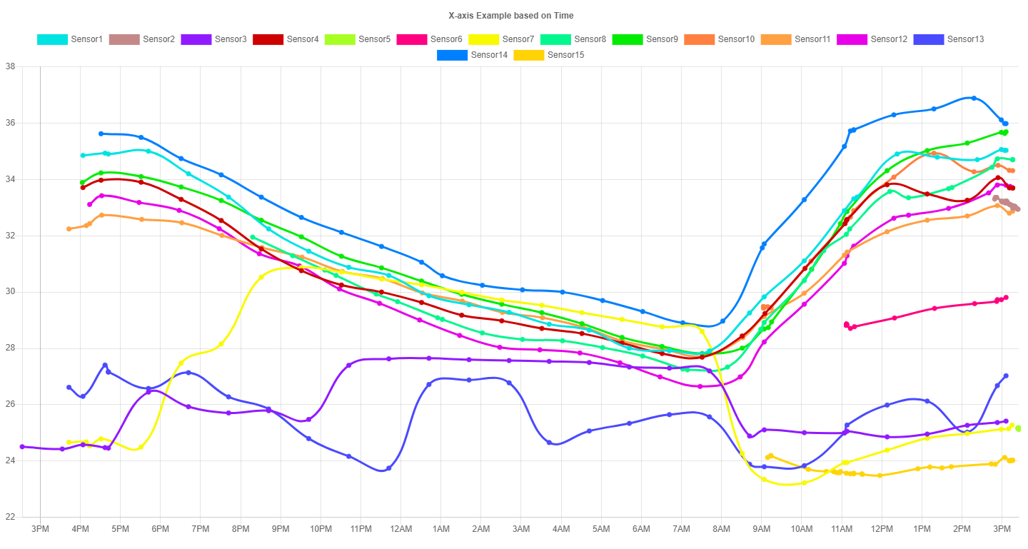
此例子是:多个传感器在不同的时间分别发出温度的数据,而制成的折线对比图。
The general Chart.js tutorials on the Internet are that the data of multiple line charts must have the same X axis. There is no such line chart with different data in different time periods.
This example is: a comparison chart of the broken line made by the temperature data of multiple sensors respectively at different times.
可以参照https://www.chartjs.org/docs/latest/axes/cartesian/time.html?h=moment.js
时间格式必须按照moment.js的格式(例子中是用lll的格式)
详情请直接看代码!
You can refer to https://www.chartjs.org/docs/latest/axes/cartesian/time.html?h=moment.js
The time format must follow the format of moment.js (in the example, the format is lll)
See the code directly for details!
