Smooth, animated theme transitions for React Native. Expo Go compatible, powered by Reanimated.


| iOS | Android |
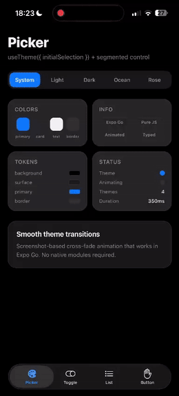
|
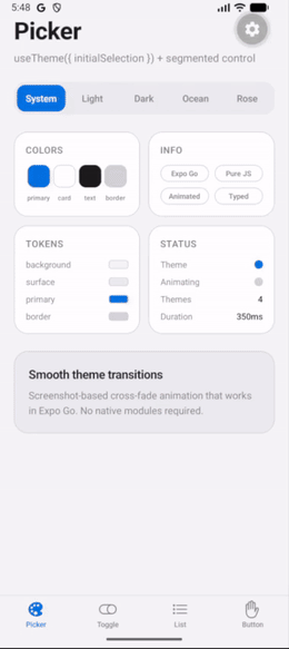
|
- Smooth cross-fade transitions — powered by Reanimated on the native UI thread (60-120 FPS)
- Expo Go compatible — no native code, no prebuilds required
- Multi-theme support — define as many themes as you need with full TypeScript inference
- System theme sync — follows OS appearance automatically with zero-flash startup
- Native UI sync — alerts, keyboards, and date pickers automatically match your active theme
- Transition safe — blocks concurrent transitions and exposes
isTransitioning - React Compiler ready — all hooks follow the Rules of React
- Lightweight — ~2.7 kB gzipped, zero runtime dependencies
For full docs, API reference, examples, and recipes, visit react-native-theme-transition.vercel.app.
# Expo (SDK 54+ already has reanimated and view-shot)
npx expo install react-native-theme-transition react-native-worklets

# React Native CLI
npm install react-native-theme-transition react-native-reanimated react-native-view-shot react-native-worklets
Add react-native-worklets/plugin as the last plugin in your babel.config.js.
// theme.ts
import { createThemeTransition } from 'react-native-theme-transition';

export const { ThemeTransitionProvider, useTheme } = createThemeTransition({
  themes: {
    light: { background: '#ffffff', text: '#000000', primary: '#007AFF' },
    dark:  { background: '#000000', text: '#ffffff', primary: '#0A84FF' },
  },
});
// App.tsx
import { ThemeTransitionProvider } from './theme';
export default function App() {
return (
<ThemeTransitionProvider initialTheme="system">
<MyApp />
</ThemeTransitionProvider>
);
}// MyScreen.tsx
import { useTheme } from './theme';
function MyScreen() {
const { colors, name, setTheme, isTransitioning } = useTheme();
return (
<View style={{ flex: 1, backgroundColor: colors.background }}>
<Text style={{ color: colors.text }}>Current: {name}</Text>
<Pressable
onPress={() => setTheme(name === 'light' ? 'dark' : 'light')}
disabled={isTransitioning}
>
<Text style={{ color: colors.primary }}>Toggle theme</Text>
</Pressable>
</View>
);
}Contributions are welcome! Please read the contributing guide and open an issue first to discuss what you'd like to change.
MIT