QuickStart
DORF (Domain Object Reactive Forms) is a library for Angular, which speeds up the creation of Dynamic Forms.
First part of DORF QuickStart tutorial covers the following topics:
- what is the target form structure,
- how to use CSS libraries together with DORF,
- how to play with basic DORF annotations
It may be useful to read the following tutorials on Angular:
The latter from the list was a direct inspiration for DORF.
Library has to have a catchy name and DORF sounds better than ORF (only Germans are allowed to disagree :)). The term is taken from the Domain Driven Design approach (DDD), where system is divided into separate parts (domains). It's not like every object in the system should have its own form. It is needed for the selected, main ones. And those can be called Domain Objects even if the architecture is not DDD.
We are going to create a simple form, getting to know DORF better and better with each step.
In order to start we should generate/download an app according to Angular QuickStart.
Then it is needed to install DORF, e.g. by using npm install dorf --save command.
DORF is very configurable. Especially when it comes to the CSS classes. From the beginning, the main idea was to leave a choose of CSS framework to the end library user.
For the tutorial let's choose Bootstrap, while the library's GitHub examples use rather Pure. It is enough to include just CSS part from the library, so the changed index.html can look like this:
<!doctype html>
<html>

<head>
  <meta charset="utf-8">
  <title>DORF App</title>
  <base href="/">

  <meta name="viewport" content="width=device-width, initial-scale=1">
  <link rel="icon" type="image/x-icon" href="favicon.ico">
  <link rel="stylesheet" href="https://unpkg.com/bootstrap@4.0.0-alpha.6/dist/css/bootstrap.min.css">
</head>

<body>
  <app-root>Loading...</app-root>
</body>

</html>DORF can be imported in a way, which matches our needs. Let’s keep things simple and define the following requirements:
- Form for the user (login, password, acceptance of terms and conditions)
- 1 field per line
- Label and field in the same line as here
- Checkbox with just one label as here
- 1 button for submitting the form
To understand how to configure CSS in DORF, let's take a look at the skeleton of the form generated by the library:
<dorf-form-component>
  <form class="form">
    <fieldset class="fieldset"><!-- optional -->
      <section class="section">
        <dorf-field-wrapper class="wrapper"><!--...--></dorf-field-wrapper>
        <dorf-field-wrapper class="wrapper"><!--...--></dorf-field-wrapper>
        <!-- ... -->
      </section>
      <dorf-group-wrapper><!--...--></dorf-group-wrapper>
      <dorf-group-wrapper><!--...--></dorf-group-wrapper>
      <section class="section">
        <!--...-->
      </section>
      <!-- ... -->
    </fieldset>
    <dorf-buttons><!--...--></dorf-buttons>
  </form>
</dorf-form-component>
In general:
-
dorf-form-component- Angular component created by the library consumer to manage the form -
form- standard HTML element; first place where classes can be set during importing DORF module (formproperty) -
fieldset- optional parameter. Visible whenrenderFieldsetAroundFieldsset totrueinside@DorfFormannotation. CSS classes for this can be set when importing DORF module (fieldsetproperty). This mainfieldsetdoesn't contain anylegend(unlike thefieldsetfromdorf-group-wrapper) -
section- HTML element; it is always arounddorf-field-wrapperelements. When importing DORF module, there is acolumnsNumberproperty which defines how manydorf-field-wrapperelements should be inside eachsection. Section CSS classes can by set when importing DORF module (sectionproperty) -
dorf-field-wrapper- DORF component which "wraps" the field context. It stores label, field and the error message. It is described in detail later. CSS classes for this component can be assigned at many levels, but always with awrapperproperty -
dorf-group-wrapper- another DORF component, used when nesting DORF Objects. We are not going to use this in this tutorial and CSS classes cannot be assigned directly at its level anyway -
dorf-buttons- DORF component for storing form buttons. When importing DORF module, there isrenderWithoutButtonsproperty and when it is set totrue,dorf-buttonswon't be presented. CSS classes cannot be set directly on the component, but later, within its body
The content of dorf-field-wrapper looks like this:
<dorf-field-wrapper class="wrapper">
  <label class="label">...</label>
  <dorf-field class="fieldGeneralization">
    <dorf-input class="dorfField"><!--...--></dorf-input>
    <dorf-radio class="dorfField"><!--...--></dorf-radio>
    <dorf-select class="dorfField"><!--...--></dorf-select>
    <dorf-checkbox class="dorfField"><!--...--></dorf-checkbox>
    <!--...-->
  </dorf-field>
  <div class="error">...</div>
</dorf-field-wrapper>
In short words:
-
labeland error are within standard HTML elements. CSS classes for them can be set thanks tolabelanderrorproperties -
dorf-fieldis a DORF component which allows operating on fields without going into detail. It stores both out of the box fields and the custom ones, added withdorfFieldsproperty when importing DORF module. At the end only one of the fields listed withindorf-fieldbody is presented. Therefore the good way of thinking about this component is "field generalization". Therefore CSS classes can be assigned to this, with afieldGeneralizationproperty -
dorf-input,dorf-radio,dorf-select,dorf-checkbox- out of the box DORF components. Each one represents a different HTML field. As mentioned above, only one of them would be presented under thedorf-fieldunder the concrete conditions. It is possible to assign CSS classes at this level withdorfFieldproperty
DORF is written in a very modular way, that's why each field is defined by its own component.
We can divide out of the box fields into 2 groups: those which support additional labeling and those which don't. Knowing HTML, you can guess that dorf-checkbox and dorf-radio are supporting additional labeling (inner label).
Inner label means here that we have a label around the field. Let's take a look at the simplified content of dorf-radio:
<label *ngFor class="innerLabel">
  <input type="radio" class="htmlField"> ...
</label>
Each option is wrapped with the label. Label can have CSS classes, defined by an innerLabel property. Options are standard HTML input elements which can have CSS classes assigned with htmlField property. Worth mentioning that innerLabel is independent from label underneath dorf-field-wrapper, so it is possible to have 2 labels, to have just a chosen one or to not have any at all.
On the other hand, dorf-select and dorf-input don't support inner labels. Simplified template of dorf-input looks like this:
<input class="htmlField" />Nothing fancy :) once again, htmlField property is strictly connected with the HTML representation of the form field.
The last DORF component is pretty simple when it comes to its body:
<section class="group">
  <button class="save">Save</button>
  <button class="reset">Reset</button>
</section>
There are 2 predefined buttons, grouped within the section HTML element. CSS classes can be assigned to them thanks to group, save and reset properties.
From the requirements we can figure out that just input and checkbox fields should be used. When configuring CSS classes, it is good to have as much as possible at the general level and override just a couple of styles at the field level. Then, in rare cases, everything can be overriden at the definition level. DORF approach to CSS is similar to the well-known browser one - the closer the element, the more likely to be assigned.
At the end app.module can look like this:
import { BrowserModule } from '@angular/platform-browser';
import { NgModule } from '@angular/core';
import { FormsModule } from '@angular/forms';
import { HttpModule } from '@angular/http';

import { DorfModule, DorfField } from 'dorf';

import { AppComponent } from './app.component';

@NgModule({
  declarations: [
    AppComponent
  ],
  imports: [
    BrowserModule,
    FormsModule,
    HttpModule,
    DorfModule.forRoot({
      css: {
        section: 'row',
        wrapper: 'form-group col-12 row',
        label: 'col-2 col-form-label',
        fieldGeneralization: 'col-10',
        htmlField: 'form-control'
      },
      dorfFields: [{
        tag: DorfField.CHECKBOX,
        css: {
          wrapper: 'checkbox col-12 row',
          htmlField: 'checkbox'
        }
      }]
    })
  ],
  providers: [],
  bootstrap: [AppComponent]
})
export class AppModule { }
Importing DorfModule at the beginning is needed in order to use it under the imports module property. Then, the configuration is done by executing forRoot static method on the module level and passing IDorfService object as a parameter. Many things are defined at the general, css level. CSS classes are taken from the Bootstrap examples and mapped according to the knowledge about the rendering:
- each
sectionshould be a separate block element ('row'), - something, which groups field and label (
wrapper) should be both'form-group'and'row'; it is already under the'row', so we should add'col-12'at this level as well, - in order to have
labeland field in the same line,'col-'classes should be assigned (tolabeland tofieldGeneralization), -
htmlFieldgot'form-control'class
The only exception from those patterns is dorf-checkbox. In order to assign CSS classes just to this kind of field (and override the previous classes if exist), dorfFields array is used. It can change existing fields and/or add new ones. tag property is the required key for elements in this array (in our case key was taken from imported DorfField class).
For the simple requirements we have here, there is a simple model to be created. It's a good idea to start with a "contract". Let's create a file src/app/user/model.ts with a following interface inside:
export interface IUser {
  _login: string;
  _password: string;
  _acceptance: boolean;
}
Interface defines what will be returned from our form. Interface properties have to match the future annotated Domain Object class properties. Let's create a class now and enrich it with a constructor, consuming the interface. Let's act as guys who care about the security (the usage of btoa and stuff):
export class User {
  private _login: string;
  private _password: string;
  private _acceptance: boolean;

  constructor(options?: IUser) {
    if (options) {
      this._login = options._login;
      this._password = options._password;
      this._acceptance = options._acceptance;
    }
  }

  update(options?: IUser) {
    if (options) {
      this._login = options._login;
      this._password = options._password;
      this._acceptance = options._acceptance;
    }
  }

  get login() { return this._login; }
  get password() { return btoa(this._password); }
  get acceptance() { return this._acceptance; }

  get basicAuth() {
    if (this._login && this._password) {
      return btoa(`${this._login}:${this._password}`);
    }
  }
}
Model is almost ready. The last part is to make it DORF! The final shape of model.ts can look like this:
import { Validators } from '@angular/forms';
import { DorfObject, InputType, DorfInput, DorfCheckbox } from 'dorf';

export interface IUser {
  _login: string;
  _password: string;
  _acceptance: boolean;
}

@DorfObject()
export class User {
  @DorfInput({
    label: 'Username',
    type: 'input' as InputType,
    validator: Validators.required
  })
  private _login: string;

  @DorfInput({
    label: 'Password',
    type: 'password' as InputType,
    validator: Validators.required
  })
  private _password: string;

  @DorfCheckbox({
    innerLabel: 'I accept the terms and conditions',
    validator: Validators.requiredTrue
  })
  private _acceptance: boolean;

  constructor(options?: IUser) {
    if (options) {
      this._login = options._login;
      this._password = options._password;
      this._acceptance = options._acceptance;
    }
  }

  update(options?: IUser) {
    if (options) {
      this._login = options._login;
      this._password = options._password;
      this._acceptance = options._acceptance;
    }
  }

  get login() { return this._login; }
  get password() { return btoa(this._password); }
  get acceptance() { return this._acceptance; }

  get basicAuth() {
    if (this._login && this._password) {
      return btoa(`${this._login}:${this._password}`);
    }
  }
}
It is OK to put DORF annotations on the private fields. It is a property name which matters here, not an access modifier. And the above piece of code, should prove that DORF is about Model-driven forms within the model.
To finalize the app, we need just one more piece from the Angular library - component which consumes DorfObject. Here is the example code of user-form.component.ts from src/app/user/ directory:
import { Component, Output, EventEmitter } from '@angular/core';
import { IDorfForm, DorfForm, DorfObjectInput, DorfConfigService } from 'dorf';

import { IUser, User } from './model';

@DorfForm()
@Component({
  selector: 'app-user-form'
})
export class UserFormComponent implements IDorfForm {
  @DorfObjectInput() user: User;

  constructor(public config: DorfConfigService) { }

  onDorfSubmit() {
    this.user.update(this['form'].value as IUser);
  }
}
A couple of things worth mentioning:
-
DorfFormis a special annotation, which should be placed overComponentannotation; ifComponenthas notemplatenortemplateUrl, thenDorfFormgenerates the template for us!DorfFormcan consume an interface with 3 options:additionalTags,renderFieldsetAroundFieldsandrenderWithoutButtons -
IDorfFormis a helper interface, something like e.g.OnChangefrom Angular which forces us to haveDorfConfigServicesomewhere inside the component -
DorfObjectInputworks like AngularInput, but should be used once within the component in order to point out an object marked asDorfObjectpreviously -
DorfConfigServiceis needed within the component; it should be injected and used in the constructor e.g. to disable all the fields -
onDorfSubmitis a special method, connected with DORF save button fromdorf-buttons;this['form'].valueis the way of getting an object with actual form values (which can be casted toIUserin our case)
UserFormComponent has to be presented inside the main module declarations array.
At the end of the first iteration, we should update AppComponent:
import { Component } from '@angular/core';

import { User } from './user/model';

@Component({
  selector: 'app-root',
  templateUrl: './app.component.html',
  styleUrls: ['./app.component.css']
})
export class AppComponent {
  title = 'My DORF App';

  // object to be passed to the form
  user: User = new User();
}
And its HTML:
<main class="container">
  <h1>
    {{title}}
  </h1>

  <app-user-form [user]="user"></app-user-form>

  <!-- the evidence that the user has changed -->
  <hr> Basic {{user.basicAuth}}
</main>First version is ready. It can be run with npm start command and verified on localhost:4200. And here, there is an online version: http://embed.plnkr.co/TV4H5K/. On the other hand, there are a couple of things, which can be disturbing:
- There are no indicators on the required fields; in our case all the fields are required, but anyway...
- There are 2 buttons visible and just the first one is doing something
- First button is
'Save'instead of'Submit' -
updatefunction is not the perfect way of acting with DORF Object
Putting a characteristic red star after the label of the required field is really trivial in DORF. All you need is requiredWithStar set to true somewhere inside DorfModule.forRoot method in app.module.
Currently we are having 2 buttons and one of them is not needed. Also, they are ugly. The solution for this - once again - is a modification of DorfModule.forRoot method. The end result can look like this:
DorfModule.forRoot({
  css: {
    section: 'row',
    wrapper: 'form-group col-12 row',
    label: 'col-2 col-form-label',
    fieldGeneralization: 'col-10',
    htmlField: 'form-control',
    buttons: {
      save: 'btn btn-primary',
      reset: 'hidden-xs-up'
    }
  },
  dorfFields: [{
    tag: DorfField.CHECKBOX,
    css: {
      wrapper: 'checkbox col-12 row',
      htmlField: 'checkbox'
    }
  }],
  requiredWithStar: true
})
Styles are taken directly from Bootstrap.
Time for something harder. In the current version of DORF, there are no mechanisms for customizing button text. But we can still achieve our goal by:
- Overriding DORF component(s)
- Talking with DORF in a different way
Let’s take a look at the first option.
DORF is written in a modular way. Dependencies are presented below:
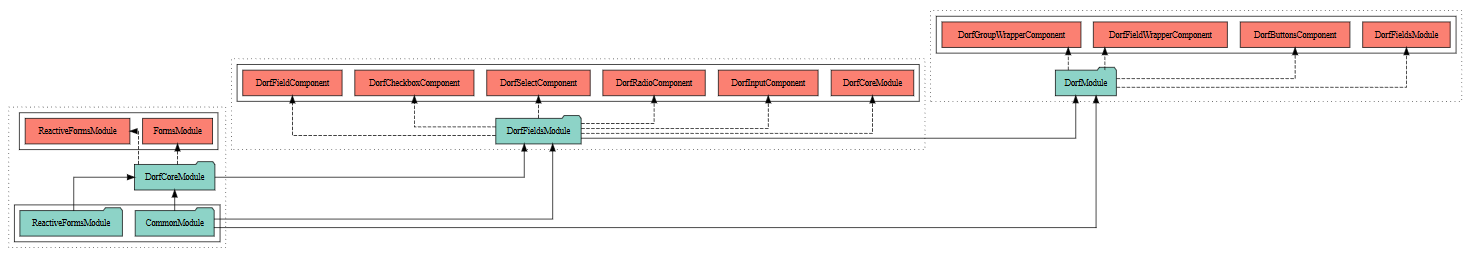
There are 3 main modules:
-
DorfCoreModule- an essence, which exports the configuration,ReactiveFormsModulefrom Angular and abstract TypeScript classes, used later by the fields. -
DorfFieldsModule- module which collects field-related stuff: input, select, radio, checkbox and the field generalization. The idea behind one module for all the field components is simple - it should allow an easy switch. E.g. it is doable to define components with DORF-like selectors which use e.g. Angular Material behind the scenes. Then, a new module containing them should be used on top ofDorfCoreModule. Sooner or later DORF should be improved to allow even an easier way for overriding the default fields. -
DorfModule- final module, which uses the previous ones and adds wrappers and buttons.
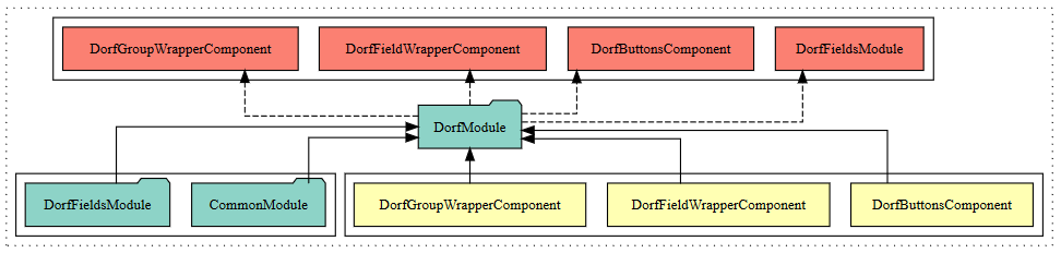
As written above, DorfModule stores buttons component. Let’s take a deeper look at this:
What needs to be done is similar to what happened in definition-extras example from the official DORF repository. DorfButtonsComponent has HTML template which is the source of our problem. And the solution is to create a new component, e.g. src/app/ext/custom-buttons-component.ts:
import { Component } from '@angular/core';
import { DorfButtonsComponent } from 'dorf';

@Component({
  selector: 'dorf-buttons',
  template: `
  <section [ngClass]="config.css.buttons?.group">
    <button (click)="submit()" [ngClass]="config.css.buttons?.save" [disabled]="!form || !form.valid">Submit</button>
  </section>
  `
})
export class CustomButtonsComponent extends DorfButtonsComponent { }
HTML was modified to match our requirements. We even removed unneeded "Reset" button. Hints:
- The selector has to match the original
- It may be useful to extend the original component
New component should be registered in the module:
import { BrowserModule } from '@angular/platform-browser';
import { NgModule } from '@angular/core';
import { FormsModule } from '@angular/forms';
import { HttpModule } from '@angular/http';

import {
  DorfFieldsModule,
  DorfField,
  DorfFieldWrapperComponent,
  DorfGroupWrapperComponent
} from 'dorf';

import { CustomButtonsComponent } from './ext/custom-buttons-component';

import { UserFormComponent } from './user/user-form.component';
import { AppComponent } from './app.component';

@NgModule({
  declarations: [
    UserFormComponent,
    AppComponent,
    CustomButtonsComponent,
    DorfFieldWrapperComponent,
    DorfGroupWrapperComponent
  ],
  imports: [
    BrowserModule,
    FormsModule,
    HttpModule,
    DorfFieldsModule.forRoot({
      css: {
        section: 'row',
        wrapper: 'form-group col-12 row',
        label: 'col-2 col-form-label',
        fieldGeneralization: 'col-10',
        htmlField: 'form-control',
        buttons: {
          save: 'btn btn-primary'
        }
      },
      dorfFields: [{
        tag: DorfField.CHECKBOX,
        css: {
          wrapper: 'checkbox col-12 row',
          htmlField: 'checkbox'
        }
      }],
      requiredWithStar: true
    })
  ],
  providers: [],
  bootstrap: [AppComponent]
})
export class AppModule { }
Note that we switched from DorfModule to DorfFieldsModule, so it was needed to register DorfFieldWrapperComponent and DorfGroupWrapperComponent "manually".
The end result for this part is available here.
Overriding DORF pieces is a powerful technique, but it is too much in our case. Let’s undo the last changes and modify DorfForm decorator on UserFormComponent:
@DorfForm({
  renderWithoutButtons: true
})
Then, let’s add <button class="btn btn-primary">Submit</button> manually to the template of AppComponent.
What if I told you that you can use DORF and enjoy the [(ngModel)]-like experience? Let’s start the modification with removing the update function from our model. Then, for every field we want an immediate updating, we have to add updateModelOnChange: true option:
@DorfObject()
export class User {
  @DorfInput({
    label: 'Username',
    type: 'input' as InputType,
    validator: Validators.required,
    updateModelOnChange: true
  })
  private _login: string;

  @DorfInput({
    label: 'Password',
    type: 'password' as InputType,
    validator: Validators.required,
    updateModelOnChange: true
  })
  private _password: string;

  @DorfCheckbox({
    innerLabel: 'I accept the terms and conditions',
    validator: Validators.requiredTrue,
    updateModelOnChange: true
  })
  private _acceptance: boolean;

  constructor(options?: IUser) {
    if (options) {
      this._login = options._login;
      this._password = options._password;
      this._acceptance = options._acceptance;
    }
  }

  get login() { return this._login; }
  get password() { return btoa(this._password); }
  get acceptance() { return this._acceptance; }

  get basicAuth() {
    if (this._login && this._password) {
      return btoa(`${this._login}:${this._password}`);
    }
  }
}
Bonus: you can specify debounce parameter, to delay an update. It expects a number of milliseconds as a value. It is similar to one of ngModelOptions parameter from Angular 1.3.
That’s it. Having such updating, it is possible to consume user directly in AppComponent.
We fulfilled all the requirements from the previous part and extended our DORF knowledge:
-
DorfModule.forRootmethod allows not only assigning CSS classes to fields, but also to buttons; it also has additional parameters, e.g. for setting a red star on the required fields - DORF is modular and its components can be overridden pretty easily
- DORF allows for
[(ngModel)]-like updating. Behind the scenes, immediate updating uses events, so it is a reactive way, not a two-way binding
Finished app is presented here: http://embed.plnkr.co/0LqHQa/.
DORF is still under the development, but its code already allows for handling plenty of use cases and scenarios, which are not yet presented in tutorials.
- Advanced options and further overriding of DORF components
- Nested objects and a column layout
- Adding custom fields
- Testing DORF