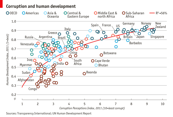
This project recreates the Economist's "Corruption and Human Development" plot using R and ggplot2. The visualization showcases the relationship between the Corruption Perceptions Index (CPI) and the Human Development Index (HDI) across regions, with annotations for selected countries.
Below is the original plot from the Economist:
Below is my version of the plot created using R:
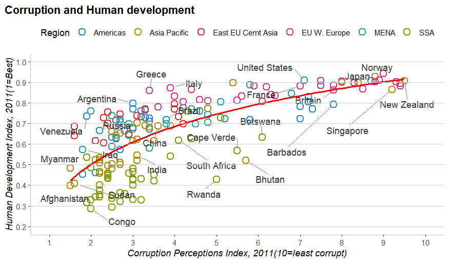
- Scatter Plot: Points represent countries, colored by region.
- Trend Line: A red logarithmic regression line shows the general trend.
- Country Labels: Selected countries are labeled with connecting lines to avoid overlap.
- Custom Legend: A horizontal legend is placed at the top.
- Styled Axes: Axis titles are italicized, with customized scales and breaks.
- Grid Lines: Minor grid lines are removed, and horizontal grid lines are manually added.
This plot effectively replicates the Economist's original visualization, showcasing the relationship between corruption and human development while maintaining a clean and professional style.