
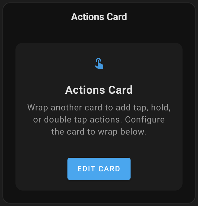
A custom card that wraps another card and adds tap, hold, double-tap, and swipe actions.
Actions Card is a wrapper for any Home Assistant card that adds interactive gestures and actions. Transform any standard or custom card into an interactive element without modifying the original card. With Actions Card, you can navigate to different views, toggle entities, call services, open URLs, and more—all from cards that normally don't support these interactions.
- Add tap, hold, double-tap, and swipe actions to any card
- Swipe gestures in four directions (left, right, up, down) with touch and mouse support
- Multiple action types:
- Toggle entities
- Navigate to other views
- Open URLs
- Call services
- Show more-info dialogs
- Open the Assist dialog
- Fire custom DOM events
- Confirmation dialogs for actions
- Configurable hold time
- Smart scrolling: automatically preserves normal scrolling on scrollable content
- Option to prevent default entity dialogs
- Visual editor support with card picker
- Works with both standard and custom cards
- Open HACS
- Search for "Actions Card" and install it
Or click this button to open the repository page in HACS:

- Open HACS
- Click on the three dots in the top right corner
- Select "Custom repositories"
- Add this repository URL (https://github.com/nutteloost/actions-card)
- Click "Add"
- Search for "Actions Card" and install it
- Download
actions-card.jsfrom the latest release - Copy it to
config/www/actions-card/actions-card.js - Add the following to your configuration.yaml:
lovelace:
  resources:
    - url: /local/actions-card/actions-card.js
      type: module
- Restart Home Assistant
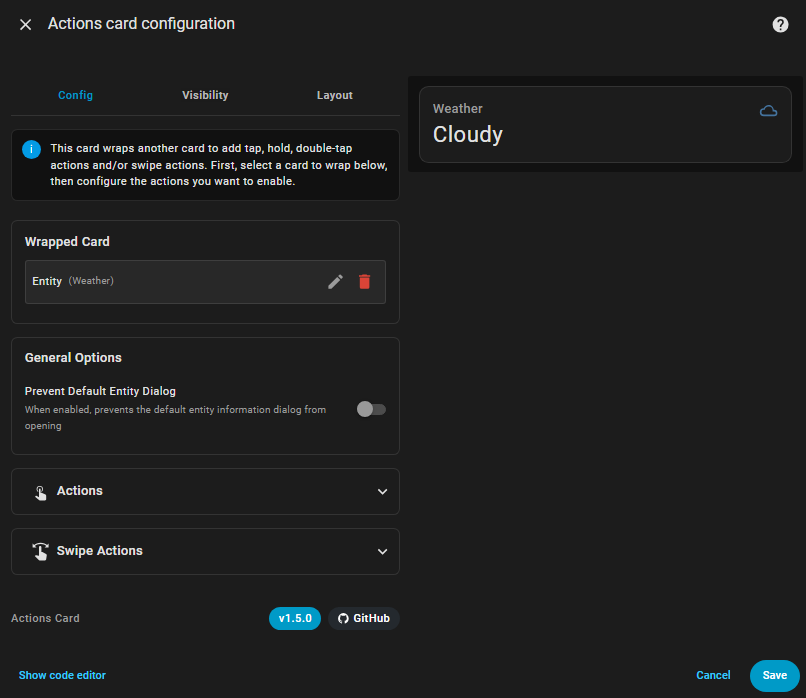
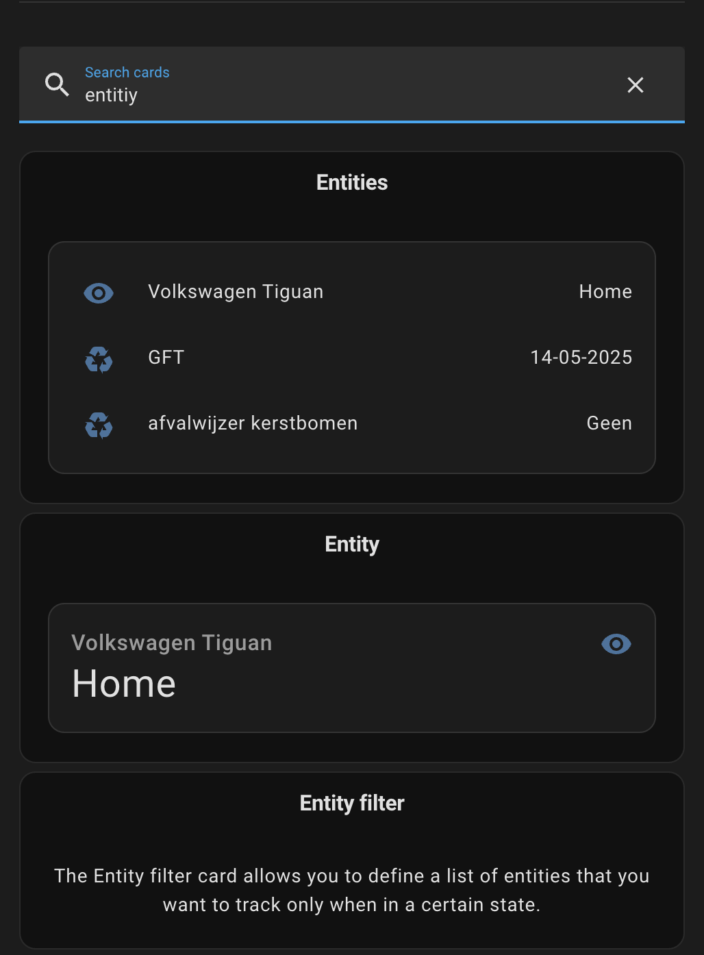
The Actions Card includes a visual editor that appears when you add or edit the card through the Home Assistant UI. Features include:
- Card picker to select the card to wrap
- Configurable action options for tap, hold, and double-tap
- Entity selection for toggle and more-info actions
- Service configuration with YAML editor
- Confirmation dialog options
- Hold time adjustment
This card can be configured using the visual editor or YAML.
| Name | Type | Default | Description |
|---|---|---|---|
card |
object | Required | The card configuration to wrap |
tap_action |
object | none |
Action to perform on tap |
hold_action |
object | none |
Action to perform on hold |
double_tap_action |
object | none |
Action to perform on double tap |
swipe_left_action |
object | none |
Action to perform on swipe left |
swipe_right_action |
object | none |
Action to perform on swipe right |
swipe_up_action |
object | none |
Action to perform on swipe up |
swipe_down_action |
object | none |
Action to perform on swipe down |
prevent_default_dialog |
boolean | false |
Prevent the default entity dialog from opening |
The prevent_default_dialog option, when enabled, prevents Home Assistant from showing its standard entity information dialog when the wrapped card is interacted with. This is particularly useful when you've configured custom actions on the card and want to ensure they execute without the system's default dialog appearing. For example, if you've set up a tap action to navigate to another view, enabling this option will prevent the entity dialog from opening first, resulting in a smoother user experience.
Each action (tap_action, hold_action, double_tap_action) can use these configurations:
Toggles the state of an entity (lights, switches, etc.).
action: toggle
entity: light.living_room  # Optional - will use the entity from the wrapped card if not specified
Options:
entity(optional): Entity to toggle. If not specified, uses the entity from the wrapped card.
Navigate to different Lovelace views or dashboards.
action: navigate
navigation_path: /lovelace/0
navigation_replace: false  # Optional - replace or push state to history
Options:
navigation_path(required): Path to navigate to (e.g.,/lovelace/0,/lovelace/lights)navigation_replace(optional): Replace current history state instead of pushing new state
Open external URLs or internal Home Assistant pages.
action: url
url_path: https://www.home-assistant.io
target: _blank  # Optional - _blank or _self
Options:
url_path(required): URL to opentarget(optional):_blank(new tab) or_self(same tab)
Execute any Home Assistant service with custom data.
action: call-service
service: light.turn_on
service_data:
  entity_id: light.living_room
  brightness: 255
Options:
service(required): Service to call in formatdomain.serviceservice_data(optional): Data to pass to the service
Show the entity information dialog.
action: more-info
entity: light.living_room  # Optional - will use the entity from the wrapped card if not specified
Options:
entity(optional): Entity to show info for. If not specified, uses the entity from the wrapped card.
Open the Home Assistant Assist dialog.
action: assist
pipeline_id: last_used  # Optional
start_listening: true   # Optional
Options:
pipeline_id(optional): Specific assistant pipeline to use (default:last_used)start_listening(optional): Start listening immediately when dialog opens
Fire custom DOM events for advanced integrations.
action: fire-dom-event
event_type: custom-event
event_data:  # Optional
  example: value
Options:
event_type(required): Name of the event to fireevent_data(optional): Custom data to include with the event
You can add a confirmation dialog to any action:
confirmation: "Are you sure?"confirmation:
text: "Are you sure you want to proceed?"
title: "Confirmation" # Optional
confirm_text: "Yes" # Optional (default: Confirm)
dismiss_text: "No" # Optional (default: Cancel)Confirmation Options:
text(required): Confirmation message to displaytitle(optional): Dialog titleconfirm_text(optional): Text for confirm button (default: "Confirm")dismiss_text(optional): Text for cancel button (default: "Cancel")
Customize the hold time for hold actions (default is 500ms):
hold_action:
  action: toggle
  entity: light.living_room
  hold_time: 700  # Time in milliseconds
  show_progress: true  # Show visual progress indicator
Hold Action Options:
hold_time: Duration in milliseconds to hold before triggering (range: 100-2000ms, default: 500ms)show_progress: Show a circular progress ring during hold (default: false)- Displays a visual indicator showing how long to hold
- Ring fills clockwise as time progresses
- Fires action on release when ring completes
- Automatically adjusts size for touch vs mouse input
You can customize the hold progress indicator using CSS variables with card-mod or themes.
Available CSS Variables:
--actions-card-hold-progress-color: Color of the progress ring (default: theme's primary color)--actions-card-hold-progress-inactive-color: Color of the inactive/background ring (default: same as progress color)--actions-card-hold-progress-inactive-opacity: Opacity of the inactive ring (default: 0.2)--actions-card-hold-progress-opacity: Opacity of the progress ring (default: 1)--actions-card-hold-progress-width: Width of the progress ring stroke in pixels (default: 4)
Example configuration
type: custom:actions-card
card:
  type: button
  entity: light.living_room
  name: Living Room
hold_action:
  action: toggle
  show_progress: true
  hold_time: 500
card_mod:
  style: |
    :host {
      --actions-card-hold-progress-color: #ff6b6b;
      --actions-card-hold-progress-opacity: 80;
}Configure swipe actions in four directions: left, right, up, and down. Each swipe gesture can trigger any of the supported action types.
Swipe gestures work with both touch and mouse input, making them accessible on all devices. A swipe is detected when you quickly drag across the card—the gesture needs to cover at least 20 pixels and complete within one second. The direction is determined by the dominant axis of movement: if you swipe more horizontally than vertically, it registers as left or right; if you swipe more vertically, it registers as up or down.
The card intelligently preserves normal scrolling behavior on scrollable content. When you try to swipe vertically on a card with scrollable content (like a long list), the swipe action is automatically disabled in that direction, allowing you to scroll naturally. The same applies to horizontal swipes on horizontally scrollable content. This ensures your swipe actions never interfere with basic navigation.
type: custom:actions-card
card:
  type: entities
  entities:
    - light.living_room
    - light.bedroom
swipe_left_action:
  action: navigate
  navigation_path: /lovelace/1
swipe_right_action:
  action: navigate
  navigation_path: /lovelace/0
swipe_up_action:
  action: call-service
  service: light.turn_on
  service_data:
    entity_id: all
swipe_down_action:
  action: call-service
  service: light.turn_off
  service_data:
    entity_id: all
confirmation: "Turn off all lights?"Smart Scene Control:
type: custom:actions-card
card:
  type: button
  entity: scene.movie_night
  name: Movie Night
  icon: mdi:movie
tap_action:
  action: call-service
  service: scene.turn_on
  service_data:
    entity_id: scene.movie_night
hold_action:
  action: call-service
  service: light.turn_off
  service_data:
    entity_id: all
  confirmation:
    text: "Turn off all lights?"
    title: "Confirm Action"
    confirm_text: "Yes, turn off"
    dismiss_text: "Cancel"
double_tap_action:
  action: navigate
  navigation_path: /lovelace/scenes
swipe_left_action:
  action: call-service
  service: scene.turn_on
  service_data:
    entity_id: scene.romantic
swipe_right_action:
  action: call-service
  service: scene.turn_on
  service_data:
    entity_id: scene.bright
prevent_default_dialog: true
Multiple Entity Control:
type: custom:actions-card
card:
  type: entities
  title: All Lights
  entities:
    - light.living_room
    - light.kitchen
    - light.bedroom
tap_action:
  action: call-service
  service: light.toggle
  service_data:
    entity_id:
      - light.living_room
      - light.kitchen
      - light.bedroom
hold_action:
  action: call-service
  service: light.turn_off
  service_data:
    entity_id: all
  confirmation: "Turn off all lights in the house?"
swipe_up_action:
  action: call-service
  service: light.turn_on
  service_data:
    entity_id: all
    brightness: 255
swipe_down_action:
  action: call-service
  service: light.turn_on
  service_data:
    entity_id: all
    brightness: 50
Browser Mod Integration:
type: custom:actions-card
card:
  type: button
  name: Control Popup
tap_action:
  action: fire-dom-event
  event_type: browser_mod
  event_data:
    service: browser_mod.popup
    data:
      title: "Device Control"
content: "popup-card-content"Check out my other custom cards for Home Assistant:
- Todo Swipe Card - A specialized swipe card for todo lists in Home Assistant with custom styling
- Simple Swipe Card - A swipeable container card for Home Assistant that allows you to add multiple cards and swipe between them
Enjoying my cards? Consider donating a beer (or two)! It will keep me going.