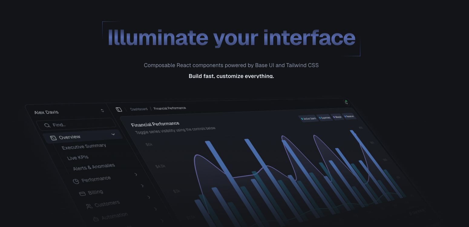
A collection of accessible, customizable React components built on Base UI and styled with Tailwind CSS. Own your components, control your design system.
English | 简体中文 | Official Website
Lumi UI gives you production-ready React components with a unique twist: every component comes in two flavors.
- Composites - Pre-assembled components for rapid development
- Primitives - Granular building blocks for complete control
Start fast with composites, drop down to primitives when you need custom layouts. No compromises.
- Accessibility built-in - ARIA, keyboard navigation, and focus management handled by Base UI
- Complete code ownership - Copy components into your project, modify freely
- Dual-layer architecture - Choose between speed (composites) and control (primitives)
- AI-friendly - Flat exports and clear patterns optimize for AI-assisted development
- Themeable - Uses shadcn/ui's CSS variable system for easy customization
- TypeScript - Fully typed with excellent IntelliSense support
Interactive areas are forgiving. We use pseudo-elements to separate visual highlights from clickable regions, creating a more natural UX.
Flat semantic exports and composites as living examples help AI assistants generate correct, idiomatic code on the first try.
Shared animation utilities and consistent interaction patterns across all components.
We welcome contributions! Whether it's:
- 🐛 Bug reports and fixes
- 💡 Feature requests and implementations
- 📖 Documentation improvements
- 🎨 New themes or component variants
This project is licensed under the MIT License. See the LICENSE file for details.
- Base UI: For providing the accessible and unstyled component primitives that form the foundation of Lumi UI.
- shadcn/ui: For the inspiration behind the architectural patterns and developer experience.
- Fumadocs: For the exceptional documentation framework that powers our website.
Ready to build? Get started with the installation guide.