A high-performance, customizable, and sliver-based grid dashboard for Flutter.
sliver_dashboard provides a robust foundation for building dynamic, user-configurable layouts.
Perfect for analytics dashboards, IoT control panels, project management tools, or any application that requires a draggable and resizable grid layout.
- 🚀 High Performance: Built on Flutter's
Sliverprotocol with smart caching. It only renders visible items and prevents unnecessary rebuilds of children during drag/resize operations. - 🧩 Sliver Composition: Integrate the dashboard's grid seamlessly with other slivers like
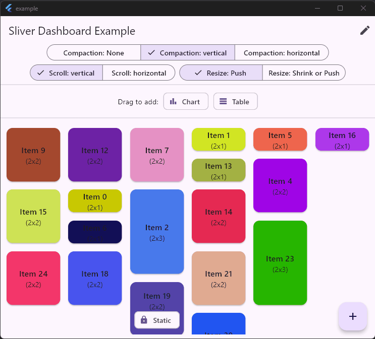
SliverAppBarandSliverListwithin a singleCustomScrollView. - 🎨 Fully Customizable: Control the number of columns, aspect ratio, spacing, grid and handles style. Items can be draggable, resizable, and static.
↔️ Horizontal & Vertical Layouts: Supports both vertical (default) and horizontal scrolling directions.- 💥 Smart Collision Detection: Choose your desired behavior:
- Push: Items push each other out of the way to avoid overlap.
- Push or Shrink: Items can be shrinked or pushed when resizing a neighbour item.
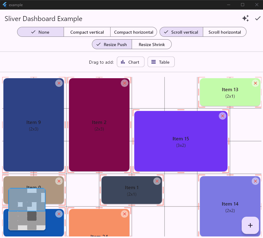
- 🧲 Compaction: Choose your desired behavior:
- None: Free positioning. Items are not compacted.
- Vertical: Items are compacted to top.
- Horizontal: Items are compacted to left.
- Custom: Implement
CompactorDelegateto define custom rules (e.g., specific gravity, fixed zones).
- 🗑️ Built-in Trash: Easy-to-implement drag-to-delete functionality. Or implement your own using available callbacks.
- ✨ Custom Feedback: Customize the appearance of items while they are being dragged. Use onInteractionStart callback for haptic feedback...
- 📥 Drag From Outside: Drop new items from external sources directly into the grid with auto-scrolling support.
- 💡 Guidance: Optional contextual tooltips/guidance messages.
- 📱 Responsive Layouts: Automatically adapt the number of columns (
slotCount) based on the screen width using the built-inbreakpointsproperty. - ♿ Accessibility: Full keyboard navigation support (Tab, Arrows, Space, Enter, customizable keys) and Screen Reader announcements (TalkBack/VoiceOver).
- 🗺️ Mini-Map: A customizable widget to visualize the entire dashboard layout and current viewport, perfect for large grids.
- 🖱️ Multi-Selection: Select and move multiple items at once using
Shift+ Click (customizable keys). - 💾 Utilities: Import/Export, find free cells, get last row, Auto Layout & Bulk Add.
- Getting Started
- Advanced Sliver Composition
- API Showcase
- Controlling Edit Mode
- Adding and Removing Items
- Scroll direction
- Allowing free positioning
- Dragging From Outside
- Drag to Delete (Trash Bin)
- Custom Drag Feedback
- Interaction Callbacks
- Guidance Messages
- Configuration & Styles
- Import / Export (Persistence)
- Responsive Layouts
- Mini Map
- Auto Layout bulk add
- Accessibility and Keyboard Navigation
- Multi Selection and Cluster Drag
- Layout Optimizer
- Custom Compaction Strategy
- Utilities
- Contributing
- Roadmap
Add sliver_dashboard to your pubspec.yaml:
dependencies:
sliver_dashboard: ^.. # Replace with the latest versionThe DashboardController is the brain of your dashboard. It manages the layout and all interactions.
import 'package:sliver_dashboard/sliver_dashboard.dart';

// Create a controller and define your initial layout.
final controller = DashboardController(
  initialSlotCount: 5,
  initialLayout: [
    const LayoutItem(id: 'a', x: 0, y: 0, w: 2, h: 2),
    const LayoutItem(id: 'b', x: 2, y: 1, w: 1, h: 2),
    const LayoutItem(id: 'c', x: 3, y: 0, w: 2, h: 1, isStatic: true), // A static item
  ],
);For basic usage, use the Dashboard widget. It handles the scroll view creation for you.
import 'package:flutter/material.dart';
import 'package:sliver_dashboard/sliver_dashboard.dart';

class MyDashboardPage extends StatelessWidget {
  const MyDashboardPage({super.key});

  @override
  Widget build(BuildContext context) {
    return Scaffold(
      appBar: AppBar(title: const Text('My Dashboard')),
      body: Dashboard(
        controller: controller,
        itemBuilder: (context, item) {
          // Build your custom widget for each item.
          // Ideally, look up your business data using item.id
          return Card(
            child: Center(child: Text('Item ${item.id}')),
          );
        },
      ),
    );
  }
}For advanced layouts (e.g., collapsing app bars, mixed lists and grids), use DashboardOverlay and SliverDashboard.
DashboardOverlay: Wraps yourCustomScrollView. It handles gestures, auto-scrolling, the background grid, and the trash bin.SliverDashboard: Renders the grid items inside the scroll view.
- Grid Clipping behavior:
- When using
SliverDashboardto compose with others slivers, the grid stops precisely at the content end (allowing subsequent slivers to be visible). If no subsequent slivers to be visible (eg.SliverAppBar+SliverDashboard), you can setfillViewportto true to extend grid in viewport. - While using
Dashboardwidget, in anExpanded, the grid fills the viewport, andfillViewporthas no action.
- When using
  // You must provide the same ScrollController to both the Overlay and the ScrollView
final scrollController = ScrollController();

@override
Widget build(BuildContext context) {
  return Scaffold(
    // 1. Wrap with DashboardOverlay
    body: DashboardOverlay(
      controller: controller,
      scrollController: scrollController,

      // Define grid styling here so it renders behind the slivers
      gridStyle: const GridStyle(lineColor: Colors.red),
      padding: const EdgeInsets.all(8),
      // grid stops precisely at the content of the dashboard
      // to not draw grid behind subsequent slivers
      fillViewport: false,

      // Handle external drops here
      onDrop: (data, item) => 'new_id',

      // Used for drag feedback rendering
      itemBuilder: (ctx, item) => MyCard(item),

      // 2. Your CustomScrollView
      child: CustomScrollView(
        controller: scrollController,
        slivers: [
          const SliverAppBar(
            title: Text('My Dashboard'),
            floating: true,
            expandedHeight: 200,
          ),

          // 3. The Dashboard Sliver
          SliverPadding(
            padding: const EdgeInsets.all(8),
            sliver: SliverDashboard(
              itemBuilder: (ctx, item) => MyCard(item),
            ),
          ),

          // 4. Other Slivers
          SliverList(
            delegate: SliverChildBuilderDelegate(
              (ctx, index) => ListTile(title: Text('Item $index')),
              childCount: 20,
            ),
          ),
        ],
      ),
    ),
  );
}Toggle edit mode to enable/disable dragging and resizing.
IconButton(
    icon: const Icon(Icons.edit),
    onPressed: () => controller.toggleEditing(),
)Programmatically add or remove items from the dashboard.
void addNewItem() {
  final newItem = LayoutItem(
    id: DateTime.now().millisecondsSinceEpoch.toString(),
    x: 0,
    y: 0, // The engine will find the best spot
    w: 1,
    h: 1,
  );
  controller.addItem(newItem);
}

void deleteItem(String id) {
  controller.removeItem(id);
}Simply change the scrollDirection. The dashboard and all interactions will adapt.
Dashboard(
    scrollDirection: Axis.horizontal,
    controller: controller,
    itemBuilder: (context, item) { /* ... */ },
)By default, items push each other. You can disable this to allow free positioning items without compaction.
// To allow free positioning:
controller.setCompactionType(CompactType.none);

// To re-enable push behavior:
controller.setCompactionType(CompactType.vertical);You can drag items from another widget into the Dashboard. The Dashboard handles auto-scrolling and placement.
// 1. The Source
Draggable<MyData>(
  data: MyData(title: 'New Item'),
  child: Text('Drag Me'),
  feedback: Card(child: Text('Dragging...')),
)

// 2. The Target (Dashboard or DashboardOverlay)
Dashboard<MyData>(
  controller: controller,
  // Called when the item is dropped.
  // 'item' contains the target coordinates (x, y) calculated by the dashboard.
  onDrop: (MyData data, LayoutItem item) {
    final newId = 'new_${DateTime.now().millisecondsSinceEpoch}';

    // Add your data
    myData[newId] = data;

    // Return the new ID to the controller to finalize the placement
    return newId;
  },
  // Optional: Customize the placeholder shown while hovering
  externalPlaceholderBuilder: (context, item) {
    return Container(color: Colors.blue.withOpacity(0.2));
  },
)The package handles the logic for detecting when an item is dropped over a specific area. It offers two ways to implement a "trash bin" to delete items by dragging them.
The easiest way. The package handles the display, the hit-testing (detecting if the item is over the trash), the arming delay (to prevent accidental deletions), and the removal logic.
Dashboard( // or DashboardOverlay
  controller: controller,
  // 1. Define how the trash bin looks.
  // It receives 'isHovered' and 'isArmed' (hovered long enough).
  trashBuilder: (context, isHovered, isArmed, activeItemId) {
      return Align(
        alignment: Alignment.bottomCenter,
        child: Container(
            margin: const EdgeInsets.all(20),
            padding: const EdgeInsets.all(10),
            decoration: BoxDecoration(
              color: isArmed ? Colors.red : (isHovered ? Colors.orange : Colors.grey),
              borderRadius: BorderRadius.circular(10),
            ),
          child: Icon(isArmed ? Icons.delete_forever : Icons.delete),
      ),
    );
  },
  // 2. Optional: Configure the delay before the trash becomes "armed".
  // Defaults to 800ms.
  trashHoverDelay: const Duration(milliseconds: 800),
  // Use predefined position for the trash
  // trashLayout: TrashLayout.bottomCenter,
  // Or use custom
  trashLayout: TrashLayout(
    visible: TrashLayout.bottomCenter.visible.copyWith(bottom: 80),
    hidden: TrashLayout.bottomCenter.hidden,
  ),
  // 3. Optional: Confirm deletion before it happens.
  // Return true to delete, false to cancel.
  onWillDelete: (items) async {
    return await showDialog<bool>(
      context: context,
      builder: (ctx) => AlertDialog(
        title: const Text('Confirm Delete'),
        content: Text('Are you sure you want to delete ${items.length} items?'),
        actions: [
          TextButton(
            onPressed: () => Navigator.pop(ctx, false),
            child: const Text('Cancel'),
          ),
          TextButton(
            onPressed: () => Navigator.pop(ctx, true),
            child: const Text('Delete'),
          ),
        ],
      ),
    ) ?? false;
  },
  // 4. Handle batch deletion.
  // Item are AUTOMATICALLY removed from the controller before this callback.
  onItemsDeleted: (items) {
    // You just need to remove your corresponding business data.
    myData.removeItems(items);
  },
)Use this if your trash bin is located outside the Dashboard widget tree (e.g., in a static BottomNavigationBar or AppBar).
// 1. Define state and a GlobalKey to locate your external trash widget
final GlobalKey _trashKey = GlobalKey();
bool _isHoveringTrash = false;

// 2. In your build method
Dashboard( // or DashboardOverlay
  controller: controller,
  // Detect drag updates to perform manual hit-testing
  onItemDragUpdate: (item, globalPosition) {
    final renderBox = _trashKey.currentContext?.findRenderObject() as RenderBox?;
    if (renderBox == null) return;

    // Check if the drag position is inside your custom widget
    final localPos = renderBox.globalToLocal(globalPosition);
    final isHovering = renderBox.hitTest(BoxHitTestResult(), position: localPos);

    if (_isHoveringTrash != isHovering) {
      setState(() => _isHoveringTrash = isHovering);
    }
  },
  // Handle the drop
  onItemDragEnd: (item) {
  if (_isHoveringTrash) {
    // Manually remove the item
    controller.removeItem(item.id);
    myData.remove(item.id);
    // Perform other cleanup...
    }
    setState(() => _isHoveringTrash = false);
  },
)

// 3. Your Custom Trash Widget (can be anywhere)
Container(
  key: _trashKey, // Important: Attach the key!
  color: _isHoveringTrash ? Colors.red : Colors.grey,
  child: const Icon(Icons.delete),
)Customize the look of the item while it is being dragged (e.g., add transparency or elevation).
Dashboard(
  controller: controller,
  itemFeedbackBuilder: (context, item, child) {
    return Opacity(
      opacity: 0.7,
      child: Material(
        elevation: 10,
        child: child, // The original widget
      ),
    );
  },
)Hook into the lifecycle of drag and resize events.
Dashboard(
  controller: controller,
  onItemDragStart: (item) => print('Started dragging ${item.id}'),
  onItemDragUpdate: (item, offset) => print('Dragging at $offset'), // Useful for custom hit-testing
  onItemDragEnd: (item) => print('Stopped dragging ${item.id}'),
  onItemResizeStart: (item) => print('Started resizing ${item.id}'),
  onItemResizeEnd: (item) => print('Stopped resizing ${item.id}'),
)On mobile platforms, you may want to use haptic feedback for drag and resize start events.
final controller = DashboardController(
  // This can be used to trigger haptic feedback, logging, or other custom
  // actions. The specific [LayoutItem] being interacted with is provided.
  onInteractionStart: (item) {
    HapticFeedback.mediumImpact();
  },
  // ...
);Display contextual help messages to users during interactions. This feature is enabled by providing a DashboardGuidance object. If the guidance parameter is null, the feature is disabled.
You can also use DashboardGuidance.byDefault for default English guidance, or set your custom translated guidance as below:
Dashboard(
  controller: controller,
  // Provide a DashboardGuidance object to enable the feature.
  // You can override default messages for translation or customization.
  guidance: const DashboardGuidance(
    move: InteractionGuidance(SystemMouseCursors.grab, 'Click/Drag to move'),
    tapToResize: 'Tap and hold to change size',
  ),
  itemBuilder: (context, item) { /* ... */ },
)Dashboard(
controller: controller,
scrollDirection: Axis.vertical, // or Axis.horizontal
resizeBehavior: ResizeBehavior.push, // or ResizeBehavior.shrink
gridStyle: const GridStyle(
lineColor: Colors.black12, // Color of resize handles
lineWidth: 1,
fillColor: Colors.black12, // Highlight color for active item slot
),
// Define the aspect ratio of a single slot (1x1)
slotAspectRatio: 1.0,
// Spacing between items
mainAxisSpacing: 10,
crossAxisSpacing: 10,
// Padding around the grid
padding: const EdgeInsets.all(10),
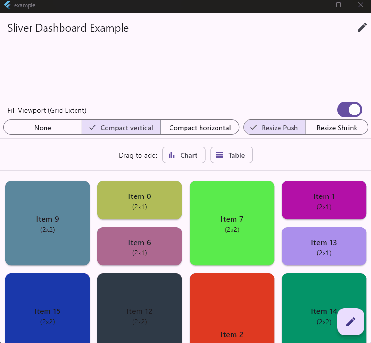
)In native Sliver integration mode, the grid naturally stops drawing at the last item's position. To force the grid to fill the entire visible screen area (viewport) when your content is sparse, use the fillViewport parameter.
Dashboard(Wrapper): This widget setsfillViewport: trueby default.SliverDashboard/DashboardOverlay: Set this manually.
// Example of forcing the grid to fill the entire screen height
DashboardOverlay(
  // ...
  fillViewport: true,
  // ...
)Easily save and restore layouts using JSON-compatible Maps. Can be used for persisting the user's dashboard configuration to a database or shared preferences. Note: importLayout automatically validates the data, corrects bounds if the slot count has changed, and resolves overlaps.
// 1. Export to JSON-ready list of maps
final List<Map<String, dynamic>> layoutData = controller.exportLayout();
// Save to your DB...
await myDatabase.save('dashboard_layout', layoutData);

// 2. Import from JSON
final List<dynamic> loadedData = await myDatabase.get('dashboard_layout');
controller.importLayout(loadedData);You can automatically adapt the number of columns (slotCount) based on the available width by passing a breakpoints map.
Smart Layout Memory: The controller remembers the specific arrangement of items for each column count. If a user organizes their dashboard on Desktop (8 cols), switches to Mobile (4 cols), and comes back to Desktop, their original Desktop arrangement is restored.
Dashboard(
  controller: controller,
  // Define breakpoints:
  // Mobile: 0-599px -> 4 cols
  // Tablet: 600-1199px -> 8 cols
  // Desktop: 1200px+ -> 12 cols
  breakpoints: {
    0: 4,
    600: 8,
    1200: 12
  },
  // The callback provides the slotCount (breakpoint)
  onLayoutChanged: (items, slotCount) {
    // Save layout specifically for this screen size
    final key = 'layout_$slotCount';
    myStorage.save(key, items);
  },
)For large dashboards, you can add a Mini-Map to visualize the layout and the current viewport.
Stack(
  children: [
    Dashboard(
      controller: controller,
      scrollController: scrollController, // Required
      // ...
    ),
    Positioned(
      right: 20,
      bottom: 20,
      child: Material(
        elevation: 4,
        borderRadius: BorderRadius.circular(8),
        clipBehavior: Clip.antiAlias,
        child: Container(
          // Vertical: Fixed width (120), Flexible height (max 200)
          // Horizontal: Fixed height (120), Flexible width (max 300)
          width: isVertical ? 120 : null,
          height: isVertical ? null : 120,
          constraints: BoxConstraints(
            maxHeight: isVertical ? 200 : 120,
            maxWidth: isVertical ? 120 : 300,
          ),
          decoration: BoxDecoration(
            border: Border.all(color: Colors.grey),
            borderRadius: BorderRadius.circular(8),
          ),
          child: DashboardMinimap(
            controller: controller,
            scrollController: scrollController, // Must match Dashboard's controller
            // Pass width only in vertical mode to enforce width-based scaling
            width: isVertical ? 120 : null,
            style: const MinimapStyle(
              itemColor: Colors.grey,
              viewportColor: Color(0x332196F3),
            ),
          ),
        ),
      ),
    ),
  ],
)Generate a layout automatically or add items without specifying positions (set x/y to -1).
// Create fresh new page with auto placement
final items = placeNewItems(
  existingLayout: [],
  newItems: ['A', 'B', 'C'].map((id) => LayoutItem(
    id: id,
    x: -1, y: -1, // auto-placement
    w: 2, h: 2,
  )).toList(),
  cols: 8,
);
controller.layout.value = items;

// You can add items at a specific position, or let the controller place them automatically by using `-1`.

// Add item at a specific position (x: 2, y: 0)
controller.addItem(
  LayoutItem(id: 'fixed', x: 2, y: 0, w: 2, h: 2),
);

// Add item automatically at the bottom (Auto-placement)
// The controller will find the next available row.
controller.addItem(
  LayoutItem(id: 'new_item', x: -1, y: -1, w: 2, h: 2),
);

// Bulk add (Efficient)
// Mixes fixed and auto-placed items.
controller.addItems([
  LayoutItem(id: 'a', x: -1, y: -1, w: 2, h: 2), // Auto
  LayoutItem(id: 'b', x: 0, y: 0, w: 2, h: 2),   // Fixed
]);The dashboard is fully accessible out of the box. When Edit Mode is enabled, users can navigate and manipulate the grid using only the keyboard.
| Key | Action |
|---|---|
| Tab | Focus the next item. |
| Space / Enter | Grab the focused item (arm dragging). |
| Arrow Keys | Move the grabbed item (Up, Down, Left, Right). |
| Space / Enter | Drop the item at the new position. |
| Esc | Cancel the move and return the item to its original position. |
Screen Readers: The dashboard integrates with SemanticsService to announce:
- Item selection ("Item {id} grabbed").
- Movement updates ("Row {y}, Column {x}").
- Drop and Cancel actions.
Customization:
You can translate messages using DashboardGuidance and customize key bindings using DashboardShortcuts.
Dashboard(
  controller: controller,
  // 1. Customize Messages (i18n)
  guidance: DashboardGuidance(
    move: InteractionGuidance(SystemMouseCursors.grab, 'Move'),
    a11yGrab: (id) => 'Item $id grabbed. Use arrows to move.',
    a11yDrop: (x, y) => 'Dropped on Row $y, Column $x.',
    a11yMove: (x, y) => 'Row $y, Column $x',
    a11yCancel: 'Cancelled.',
    semanticsHintGrab: 'Press Space to grab',
    semanticsHintDrop: 'Press Space to drop',
  ),
);

// 2. Customize Keys (e.g. WASD)
controller.shortcuts = DashboardShortcuts(
  moveUp: {const SingleActivator(LogicalKeyboardKey.keyW)},
  moveLeft: {const SingleActivator(LogicalKeyboardKey.keyA)},
  moveDown: {const SingleActivator(LogicalKeyboardKey.keyS)},
  moveRight: {const SingleActivator(LogicalKeyboardKey.keyD)},
  // Keep defaults for others
  grab: DashboardShortcuts.defaultShortcuts.grab,
  drop: DashboardShortcuts.defaultShortcuts.drop,
  cancel: DashboardShortcuts.defaultShortcuts.cancel,
);Users can select multiple items by holding Shift (or Ctrl/Cmd) while clicking.
Dragging any item in the selection moves the entire group ("Cluster Drag").
Programmatic Selection:
// Select multiple items
controller.toggleSelection('item_1', multi: true);
controller.toggleSelection('item_2', multi: true);

// Clear selection
controller.clearSelection();

// Check selection
print(controller.selectedItemIds.value);

// 2. Customize Multi-Selection Keys
controller.shortcuts = DashboardShortcuts(
  multiSelectKeys: [LogicalKeyboardKey.altLeft],
);If your dashboard becomes fragmented (full of gaps) after many moves, you can use the optimizer to compact the layout. It uses a "Visual Bin Packing" algorithm that fills gaps while preserving the visual order (top-left to bottom-right) of your items. Static items act as obstacles and are not moved.
// Call this when you want to compact the grid
controller.optimizeLayout();If the default vertical/horizontal compaction doesn't fit your needs (e.g., you want a Tetris-like gravity or specific sorting rules), you can implement your own strategy.
- Create a class that extends
CompactorDelegate. - Implement
compactandresolveCollisions. - Inject it into the controller.
class MyCustomCompactor extends CompactorDelegate {
  @override
  List<LayoutItem> compact(List<LayoutItem> layout, int cols, {bool allowOverlap = false}) {
    // Your custom logic here...
    // You can use helpers like sortLayoutItems, getFirstCollision, etc.
    return layout;
  }

  @override
  List<LayoutItem> resolveCollisions(List<LayoutItem> layout, int cols) {
    // Logic to push items away during drag
    return layout;
  }
}

// Usage
controller.setCompactor(MyCustomCompactor());The controller provides useful getters to help you interact with the layout programmatically.
// Gets the Y-coordinate of the bottom-most edge of the layout.
// Useful for adding an item below all existing content.
int nextRow = controller.lastRowNumber;

// Find all empty rectangular spaces in the grid.
List<LayoutItem> emptySpaces = controller.availableFreeAreas;

// Find all contiguous horizontal free spaces in each row.
List<LayoutItem> horizontalSpaces = controller.availableHorizontalFreeAreas;

// Find the first empty space in the grid, starting top-left.
LayoutItem? firstSpace = controller.firstFreeArea;

// Find the first empty space in the last row that contains items.
LayoutItem? spotInLastRow = controller.lastRowFreeArea;

// Check if an item of a certain size can fit anywhere on the board.
final itemToCheck = const LayoutItem(id: '_', x: 0, y: 0, w: 2, h: 2);
if (controller.canItemFit(itemToCheck)) {
  print("A 2x2 item can fit!");
}

// You can then use this information to add a new item precisely.
if (spotInLastRow != null) {
  final newItem = LayoutItem(
    id: 'new',
    x: spotInLastRow.x,
    y: spotInLastRow.y,
    w: spotInLastRow.w,
    h: 1, // Only take 1 row of the available space
  );
  controller.addItem(newItem);
}- Setup: /test/engine/benchmark.dart in AOT mode, on Ryzen 2600, Windows 11. Dart only, requires to comment immutable annotation in layout_item.dart
┌──────────────────────────────────────────────────────────────────────────┐
│                         BENCHMARK RESULTS                                │
├──────────────────────────────────────────────────────┬───────────────────┤
│ Test                                                 │ Time              │
├──────────────────────────────────────────────────────┼───────────────────┤
│ COMPACTION                                           │                   │
├──────────────────────────────────────────────────────┼───────────────────┤
│   Vertical (100 items)                               │             17 µs │
│   Horizontal (100 items)                             │             17 µs │
│   Vertical (500 items)                               │            100 µs │
│   Horizontal (500 items)                             │            101 µs │
│   Vertical (1000 items)                              │            238 µs │
│   Horizontal (1000 items)                            │            223 µs │
│ MOVE                                                 │                   │
├──────────────────────────────────────────────────────┼───────────────────┤
│   Move Element (100 items)                           │             73 µs │
│   Move Element (500 items)                           │           1.41 ms │
│ SORT                                                 │                   │
├──────────────────────────────────────────────────────┼───────────────────┤
│   Sort Layout (100 items)                            │              6 µs │
│   Sort Layout (500 items)                            │             43 µs │
│   Sort Layout (1000 items)                           │            103 µs │
│ OPTIMIZE                                             │                   │
├──────────────────────────────────────────────────────┼───────────────────┤
│   Defrag (100 items)                                 │           4.78 ms │
│   Defrag (500 items)                                 │         849.88 ms │
└──────────────────────────────────────────────────────┴───────────────────┘
Contributions are welcome! To ensure the project remains high-quality, reliable, and consistent, please follow the guidelines below when contributing code.
Before submitting a pull request, make sure to familiarize yourself with the following resources:
- Architecture Guide: A deep dive into the State, Logic, and View layers, including the caching strategy and Sliver protocol.
- AI Context & Rules: Coding standards, architectural constraints, and specific patterns (useful for AI assistants).
This package tries to maintain strict code quality standards with high test coverage and strict guidelines in place. All contributions must adhere to the following quality standards:
- Core Engine (
LayoutEngine): > 95% coverage - Controller (
DashboardController): > 95% coverage - Global Package: > 90% coverage
- The project uses Dart formatting and linting rules. Before submitting any changes, ensure your code is properly formatted.
- Uses
dart analyzeto enforce coding best practices, and any warnings or errors will result in a failed build. - Formatting: Always run
dart format .to automatically fix any formatting issues.
Before submitting your pull request, it’s important to run the tests locally to verify everything works as expected. To run the tests and check the coverage:
- Run the following command to execute the tests and collect coverage:
flutter test --coverage- If you have
lcovinstalled, you can generate a human-readable coverage report:
genhtml coverage/lcov.info -o coverage/htmlThis will generate an HTML report that you can open in your browser to check the code coverage and ensure the tests are passing.
Every pull request and push to the main branch automatically triggers a set of checks, including:
- Code Formatting: Ensures all code is formatted correctly according to Dart style guide.
- Static Code Analysis: Runs
flutter analyzeto catch potential errors, warnings, and linting issues. - Unit Tests: Runs the test suite to verify that the code behaves as expected, with code coverage being tracked to maintain high standards.
The CI pipeline will fail if:
- Linting violations are detected.
- Static analysis reveals warnings or errors.
- Tests fail, or the code coverage decreases below the required threshold.
Pull requests should pass all checks before they can be merged into the
mainbranch.
- ✅ SliverDashboard: Compose a dashboard with others slivers in your
CustomScrollView. - ✅ Accessibility: Enhanced screen reader support and keyboard navigation with configurable keys and messages.
- ✅ Layout Optimizer: Visual Bin Packing.
- ✅ Mini-map: Display and navigate via a minimap.
- ✅ Multi-Selection: Multi item selection and dragging.
- 🔲 Sticky Headers: Special item to create "barrier" for defining sections in layout.
- 🔲 Nested dashboard: Special "folder" item where you can drag&drop items from main dashboard to a "folder" dashboard, and vice-versa.