-
Notifications
You must be signed in to change notification settings - Fork 11
Gauge
Michal Töpfer edited this page Mar 1, 2021
·
1 revision
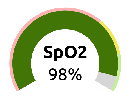
Displays one value, possibly with an indication to which interval the value belongs (whether it's low or high).

-
config: Config – chart configuration object describing the value and ranges-
Config:
-
value: number – the displayed value -
min: number – minimum of the gauge's range -
max: number – maximum of the gauge's range -
arcs: Arc[] – array of interval definitions
-
-
Arc:
-
color: color – color of the interval -
from: number – beginning of the interval -
to: number – end of the interval
-
-
Config:
-
height: number – the height of the chart in pixels margin: Margin-
backgroundColor: color – color of the background of the bar. Defaults to"#d6d6d6". -
barColor: color – color of the bar representing the value. If not set, the color of the current interval (arc) is used. -
getBarColor: function – function to convert thebarColoror arc'scolorproperty to the final color of bar. Defaults to identity. -
withAxis: boolean – to be implemented -
leftAngle: number – angle in degrees defining the left border of the gauge. The angle is measured clockwise from the up direction, meaning that one usually wants negative values for theleftAngle. Defaults to-120. -
rightAngle: number – angle in degrees defining the right border of the gauge. The angle is measured clockwise from the up direction, meaning that one usually wants positive values for therightAngle. Defaults to120. -
innerRadius: number – the radius of the inner side of the bar. Defaults to80. -
barWidth: number – the width of the bar in pixels. Defaults to40. -
arcWidth: number – the width of the bar representing the arcs (intervals). Defaults to5. -
arcPadding: number – padding between the bar and the arcs. Defaults to0. -
withValue: boolean – displays the value as number in the center of the gauge. Defaults totrue. -
valueRender: func – function to render the value in the center of the gauge. The returned value is rendered in a<g>tag with top left position equal to the center of the gauge. By default, it returns a<text>element withtextAnchor="middle" dominantBaseline="middle" className={props.valueClass}to display the text in the center of the gauge. This function receivespropsas its only argument. -
valueClass: string – CSS class to be used in the defaultvalueRenderfunction -
needleWidth: number – Unless this value is specified, the bar starts atleftAngle. If this value is specified, the angular width of the bar is set toneedleWidth. -
clampValue: boolean – If se to true, values smaller thanminare rendered as equal tominand values larger thanmaxare rendered asmax. Defaults totrue.
The outer radius of the bar is equal to innerRadius + barWidth + arcWidth + some padding.