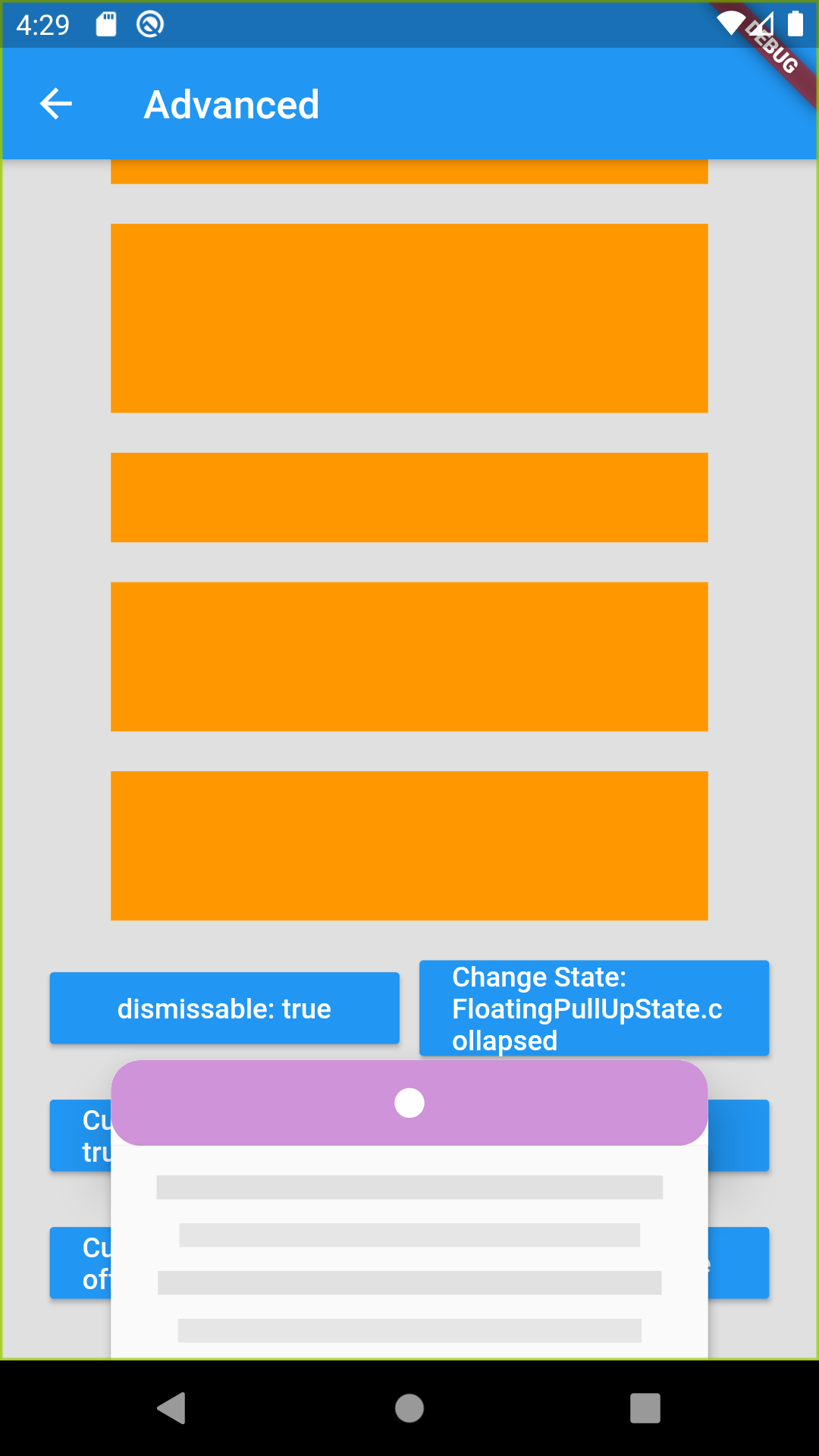
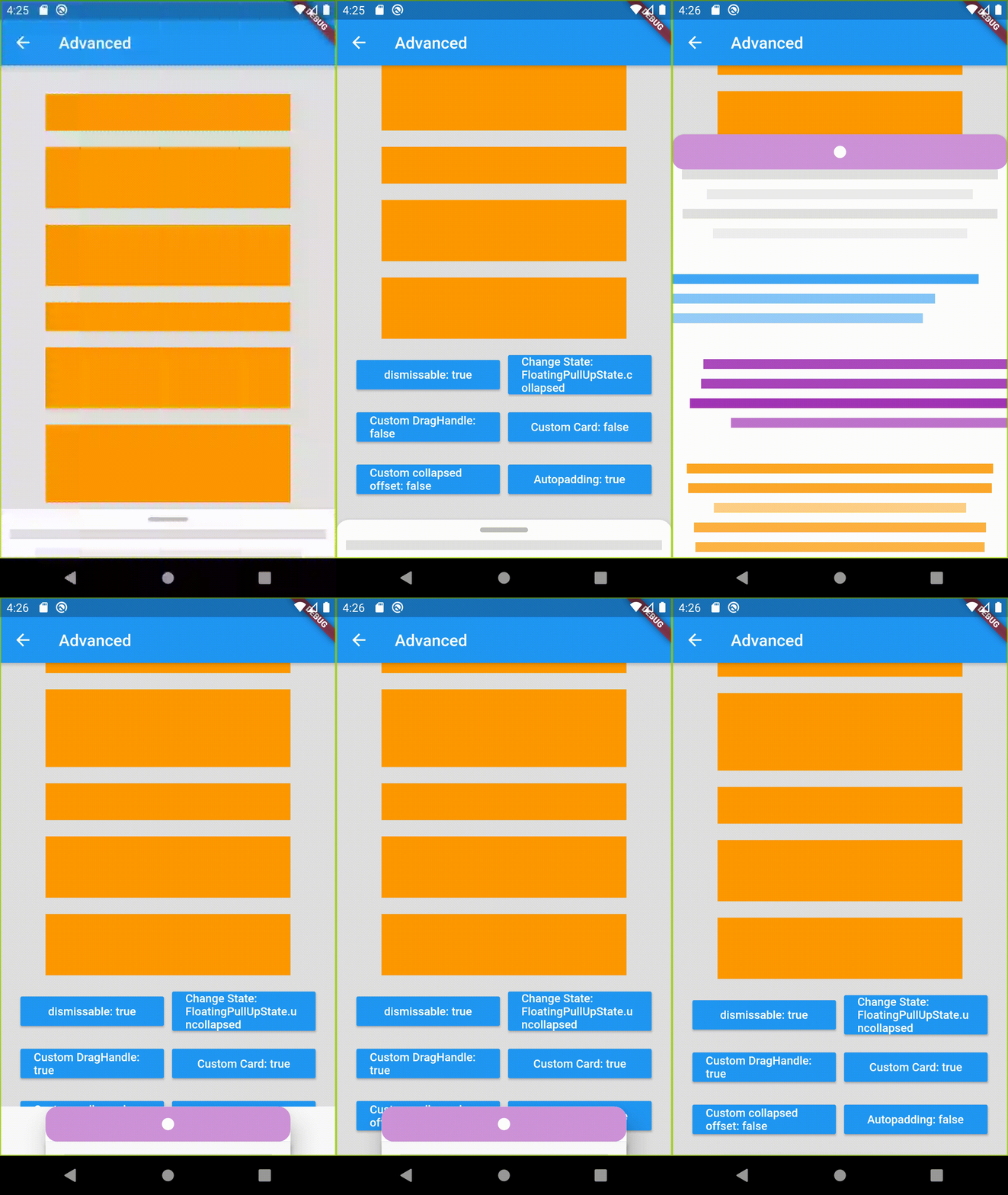
A beautiful and custom floating pull up style Card for flutter
In the dependencies: section of your pubspec.yaml, add the following line:
dependencies:
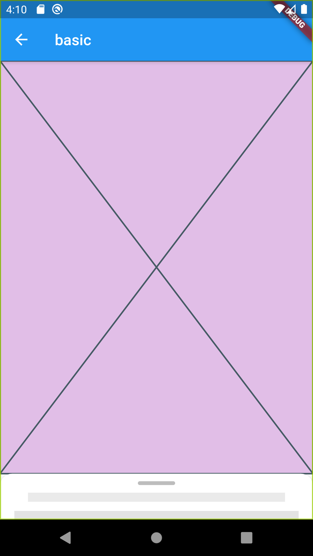
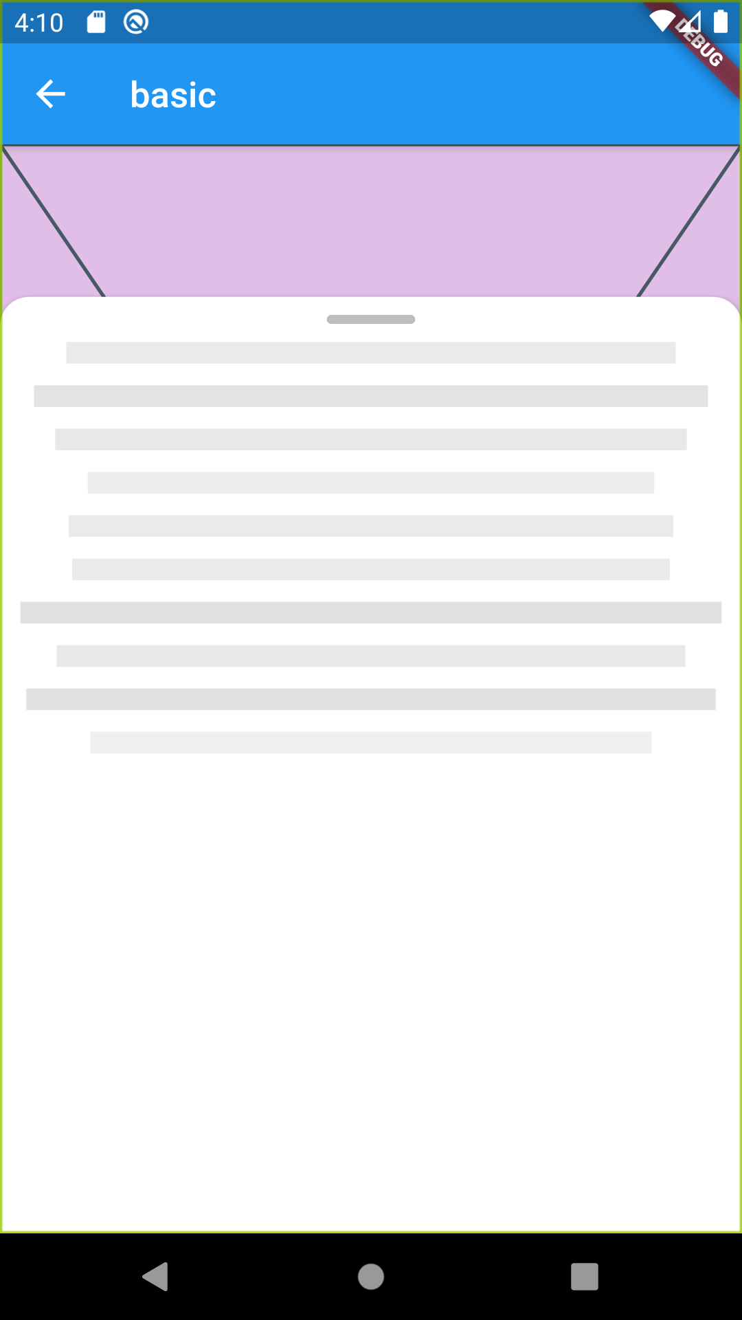
floating_pullup_card: <latest version>You can get started really simple, just add
FloatingPullUpCardLayout(
    child: Container(
        decoration: BoxDecoration(color: Colors.purple[100]),
        child: Placeholder(),
    ),
    body: Column(
        children: <Widget>[
            PlaceholderLines(
                count: 10,
                align: TextAlign.center,
            ),
        ],
    ),
),
where body is a Widget that is nested inside the card and child is the main layout content
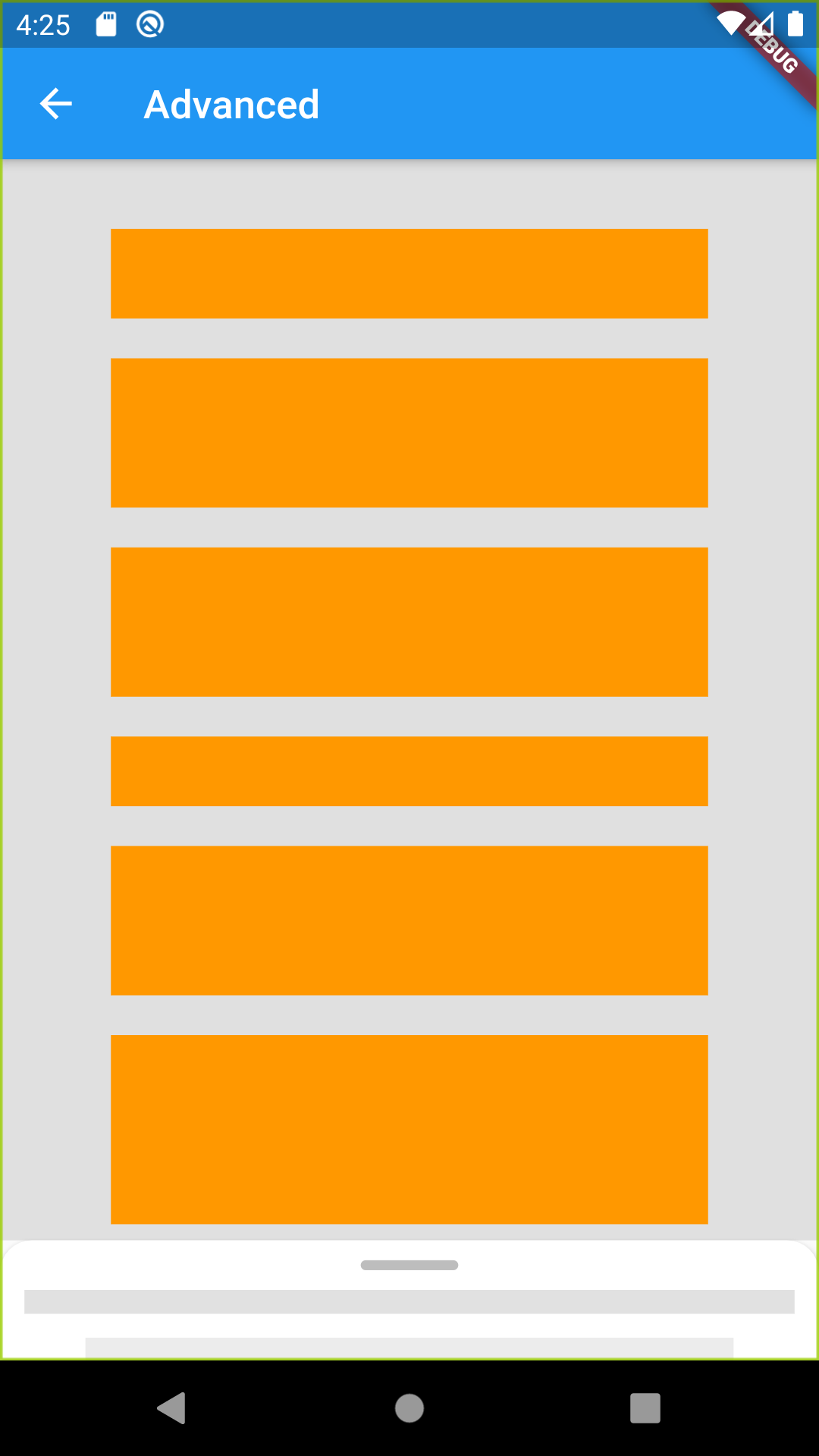
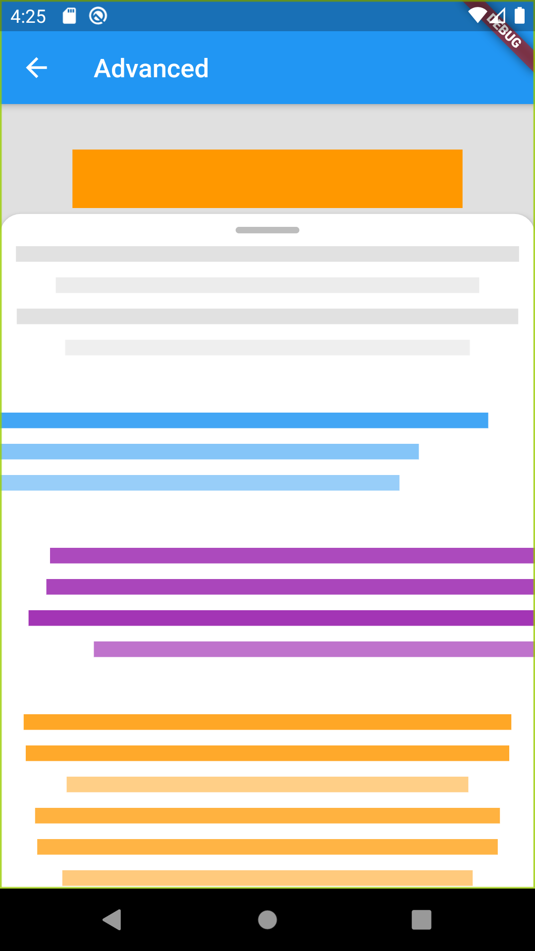
You can highly customize by defining custom builders, or properties as width , height, color, etc
FloatingPullUpCardLayout(
        dismissable: _dismissable,
        state: _floatingCardState,
        dragHandleBuilder: _customDragHandle ? _customDragHandleBuilder : null,
        cardBuilder: _customCard ? _customCardBuilder : null,
        collpsedStateOffset:
            _customCollapsedOffset ? (maxHeight, _) => maxHeight * .75 : null,
        autoPadding: _autoPadd,
        body: Container(
          // padding: EdgeInsets.all(16),
          child: SingleChildScrollView(
            child: Column(
              children: <Widget>[
                PlaceholderLines(
                  count: 4,
                  align: TextAlign.center,
                ),
                /// ... more content
              ],
            ),
          ),
        ),
        child: Container(
          decoration: BoxDecoration(color: Colors.grey[300]),
          height: double.infinity,
          width: double.infinity,
          child: SingleChildScrollView(
            child: // ... Some content
            ),
          ),
        ),
For more info, please check the demo provided :)
/// The [Widget] to be used as the content of the main layout, not the card content
  final Widget child;

  /// The [Widget] to be used as the content of the floating card
  final Widget body;

  /// Set a custom [height] for the floating card,
  /// defaults to `86%` of total height of parent container or screen height if no finite height can be assumed
  final double height;

  /// Set a custom [width] for the floating card,
  /// defaults to `100%` of total width of parent container or screen width if no finite width can be assumed
  final double width;

  /// Set a [cardElevation] for the material,
  /// defaults to `4`
  final double cardElevation;

  /// If true , the card can be dragged until it's hidden from screen
  /// defaults to [false]
  final bool dismissable;

  /// Sets the [state] of the floating card,
  /// See enum [FloatingPullUpState] for more details
  /// Defaults to [FloatingPullUpState.collapsed]
  final FloatingPullUpState state;

  /// Set a custom card [color] to the card background
  /// defaults to [Colors.white]
  ///
  /// This doesnt take any effect if using [cardBuilder] is defined
  final Color cardColor;

  /// Called each time the [FloatingPullUpState] is changed
  final ValueChanged<FloatingPullUpState> onStateChange;

  /// Defines a custom [dragHandleBuilder]
  final DragHandleBuilder dragHandleBuilder;

  /// Defines a custom [cardBuilder]
  final FloatingCardBuilder cardBuilder;

  /// Set a custom [borderRadius] of the default Card material
  ///
  /// This doesnt take any effect if using [cardBuilder] is defined
  final BorderRadius borderRadius;

  /// if true , this automatically adds padding to the [child] container,
  /// avoiding the card to float on top of [child] content
  /// defaults to [true]
  final autoPadding;

  /// Sets a custom function that return a custom `Y Offset`  for state [FloatingPullUpState.collapsed]
  /// Please take into account that offset start from top to bottom
  StateOffsetFunction collpsedStateOffset;

  /// Sets a custom function that return a custom `Y Offset`  for state [FloatingPullUpState.hidden]
  /// Please take into account that offset start from top to bottom
  StateOffsetFunction hiddenStateOffset;

  /// Sets a custom function that return a custom `Y Offset`  for state [FloatingPullUpState.uncollapsed]
  /// Please take into account that offset start from top to bottom
  StateOffsetFunction uncollpsedStateOffset;

  /// Defines a callback to be called when a user taps outside the card
  /// If function returns [FloatingPullUpState] it will change state to the returned one
  /// Take into account that this is not getting called if a widget inside body is already handling a `Gesture`
  final FloatingPullUpState Function() onOutsideTap;

  /// If true, this will show an overlay behind the card tht obscures content behind
  /// Defaults to[false]
  final bool withOverlay;

  /// Defines the `color` of the overlay , this only takes effect of [withOverlayOption] is true
final Color overlayColor;This project is a starting point for a Dart package, a library module containing code that can be shared easily across multiple Flutter or Dart projects.
For help getting started with Flutter, view our online documentation, which offers tutorials, samples, guidance on mobile development, and a full API reference.
