A Jetpack Compose library for building interactive option selectors with a draggable thumb and track.
It’s useful when you want a slider-like UI but with discrete labeled options instead of continuous values.
- Select options via drag or tap
- Fully customizable colors, shapes, and typography
- Compose-first, built with idiomatic patterns (
rememberOptionsRowState) - State-driven API for clean architecture
- Easy to integrate into existing Compose layouts
Import the library:
implementation("io.github.zohrevand.options:compose-options:0.1.0")Here’s a quick example of how to use the OptionsRow composable in your project.
Create a list of Option data classes, each containing the text for the track and the thumb.
val options = listOf(
    Option(trackText = "Small"),
    Option(trackText = "Medium"),
    Option(trackText = "Large")
)Use rememberOptionsRowState to manage the selected option's state. This function returns an OptionsRowState object that holds the current selection and handles changes.
val optionsState = rememberOptionsRowState(
    options = options,
    selectedOptionIndex = 1, // Start with "Medium" selected
    onOptionIndexChange = { newIndex ->
        // Handle option change
    }
)Pass the optionsState to the OptionsRow composable.
@Composable
fun MyScreen() {
    val options = listOf(
        Option(trackText = "1", thumbText = "Option 1"),
        Option(trackText = "2", thumbText = "Option 2"),
        Option(trackText = "3", thumbText = "Option 3"),
    )

    val optionsState = rememberOptionsRowState(options)

    OptionsRow(state = optionsState)
}You can customize the appearance of the OptionsRow using its parameters.
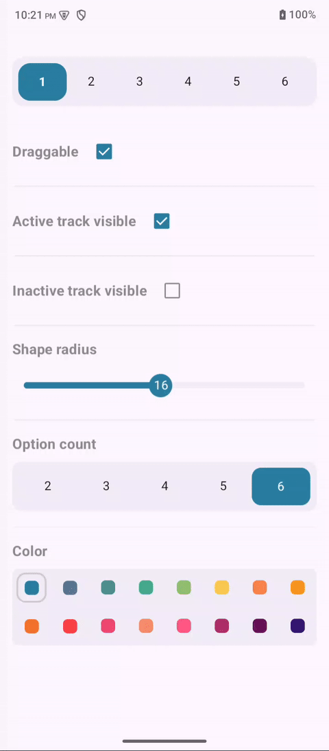
state: TheOptionsRowStatethat controls the component.modifier: StandardModifierfor layout customization.trackTextStyle:TextStylefor the text on the track.thumbTextStyle:TextStylefor the text on the draggable thumb.colors: The color scheme for the row, defined byOptionsColors.activeTrackVisible: Set totrueto show the active track color.inactiveTrackVisible: Set totrueto show the inactive track color.draggable: Set tofalseto disable dragging the thumb.containerHeight: The height of the entire row.shape: The shape of the row container.contentPadding: Padding around the contents of the row.
Use the OptionsDefaults.colors to create a custom color scheme.
OptionsRow(
    state = optionsState,
    colors = OptionsDefaults.colors(
        containerColor = MaterialTheme.colorScheme.surfaceContainer,
        thumbColor = primaryColor,
        activeTrackColor = primaryColor.copy(alpha = 0.3f),
        inactiveTrackColor = primaryColor.copy(alpha = 0.1f),
        trackTextColor = MaterialTheme.colorScheme.onSurface,
        thumbTextColor = MaterialTheme.colorScheme.onPrimary,
    )
)Copyright 2024 Hasan Zohrevand
Licensed under the Apache License, Version 2.0 (the "License");
you may not use this file except in compliance with the License.
You may obtain a copy of the License at
http://www.apache.org/licenses/LICENSE-2.0
Unless required by applicable law or agreed to in writing, software
distributed under the License is distributed on an "AS IS" BASIS,
WITHOUT WARRANTIES OR CONDITIONS OF ANY KIND, either express or implied.
See the License for the specific language governing permissions and
limitations under the License.