Design
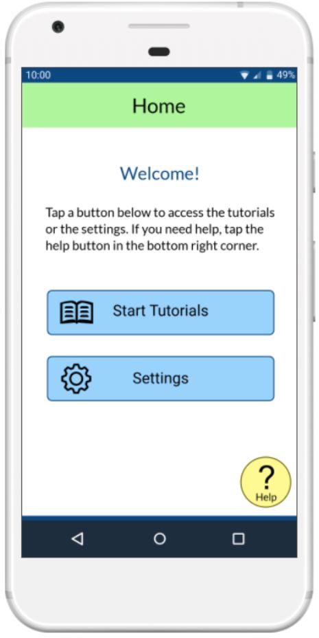
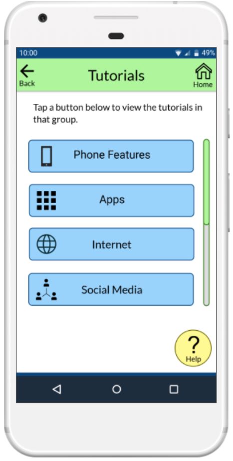
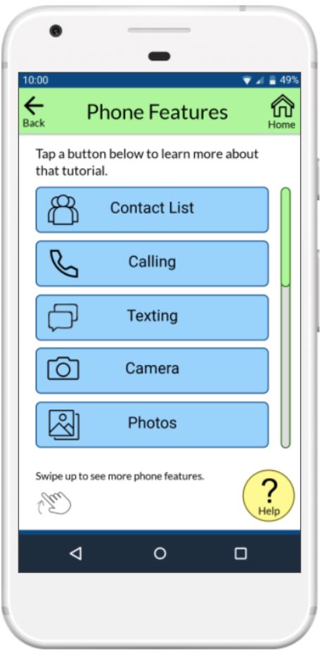
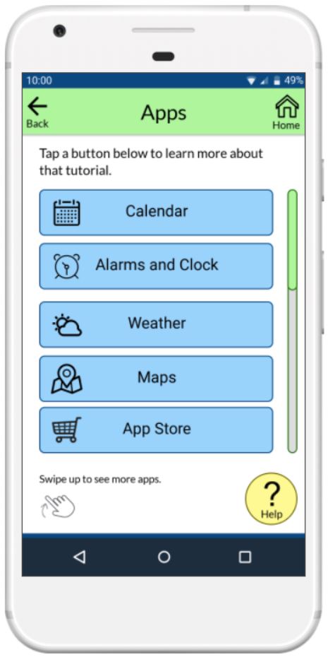
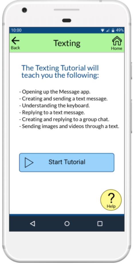
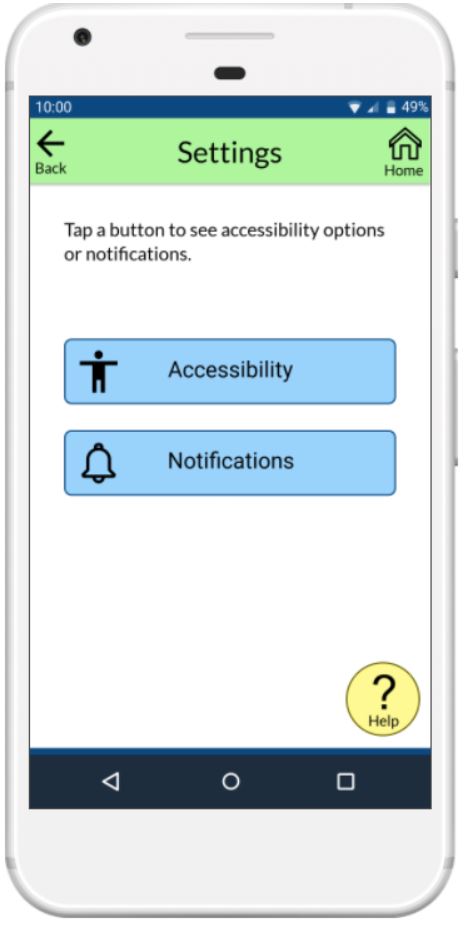
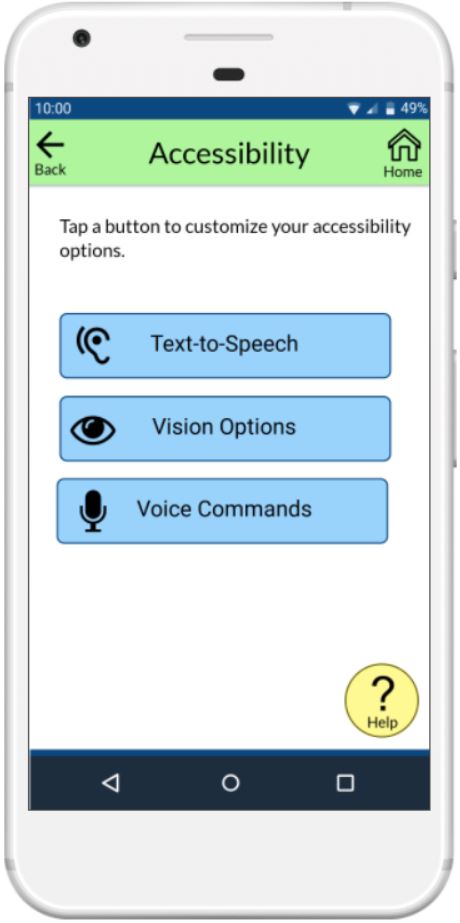
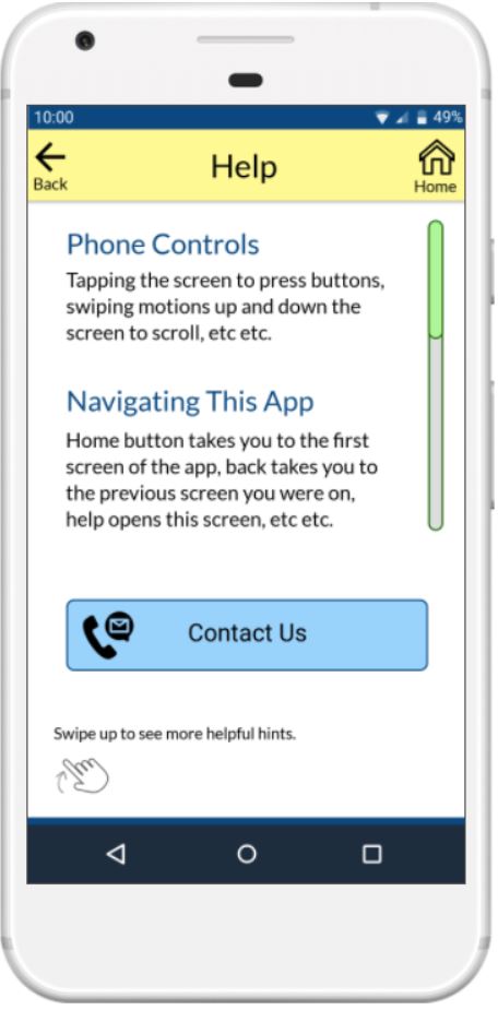
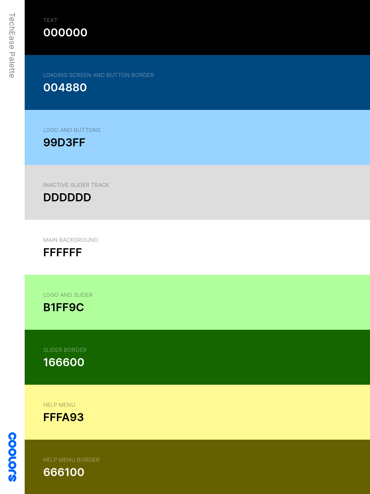
We chose neutral, calming colors of blue and green for the buttons and navigation menu of the app respectively, while light yellow color is used for the Help button to contrast against the blue and green colors. We spent time ensuring the colors we chose maintained a high color contrast for the users who have vision problems.
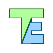
We wanted our app icon to be simple and easily recognizable for our target audience. With the app name chosen to be TechEase, we came up with an icon design that combines the "T" and "E" of the app name and uses the blue and green colors from our color palette.
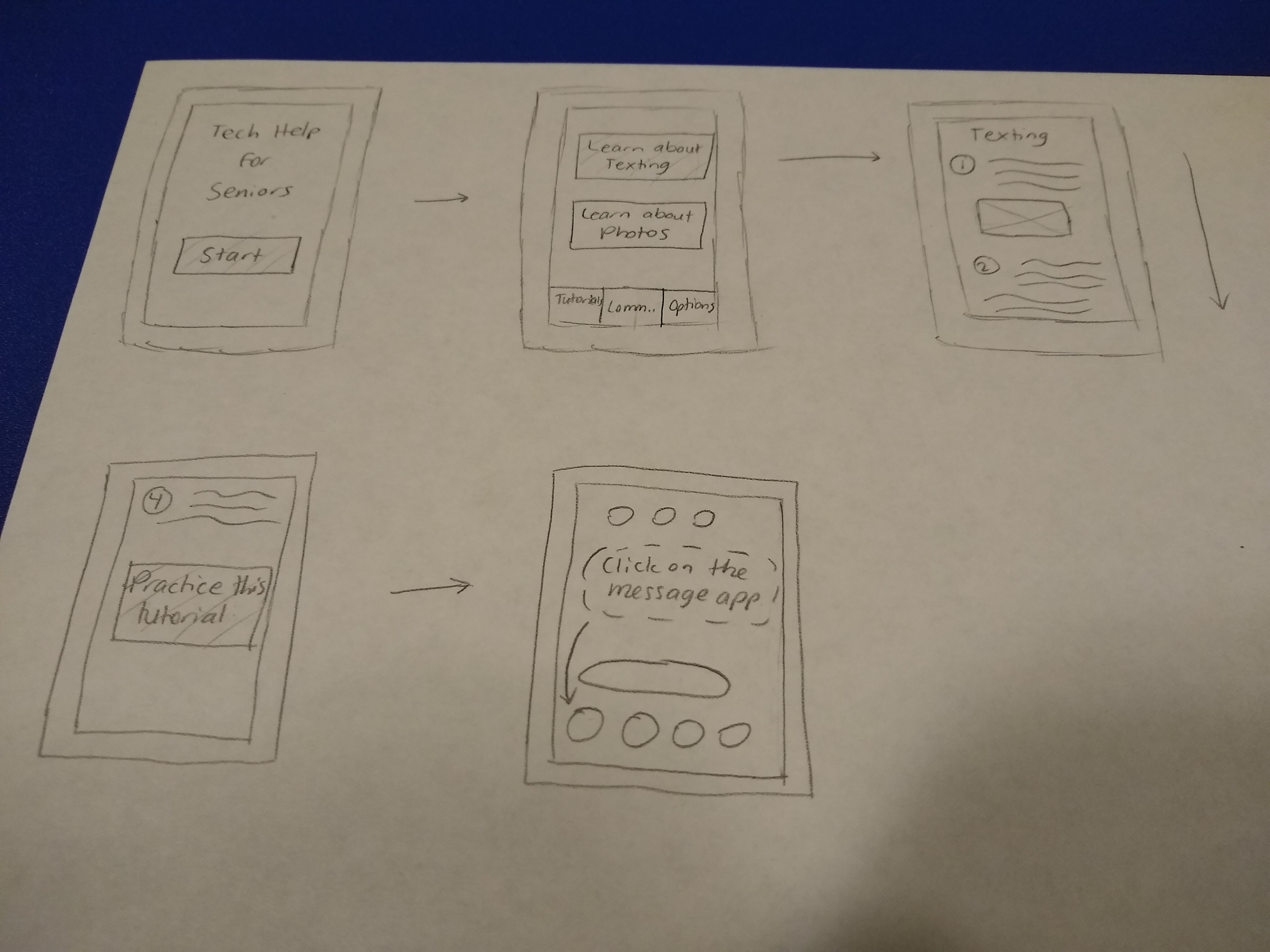
Our first low-fidelity prototype was created using paper and pencil.
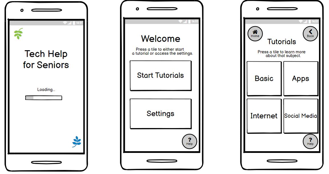
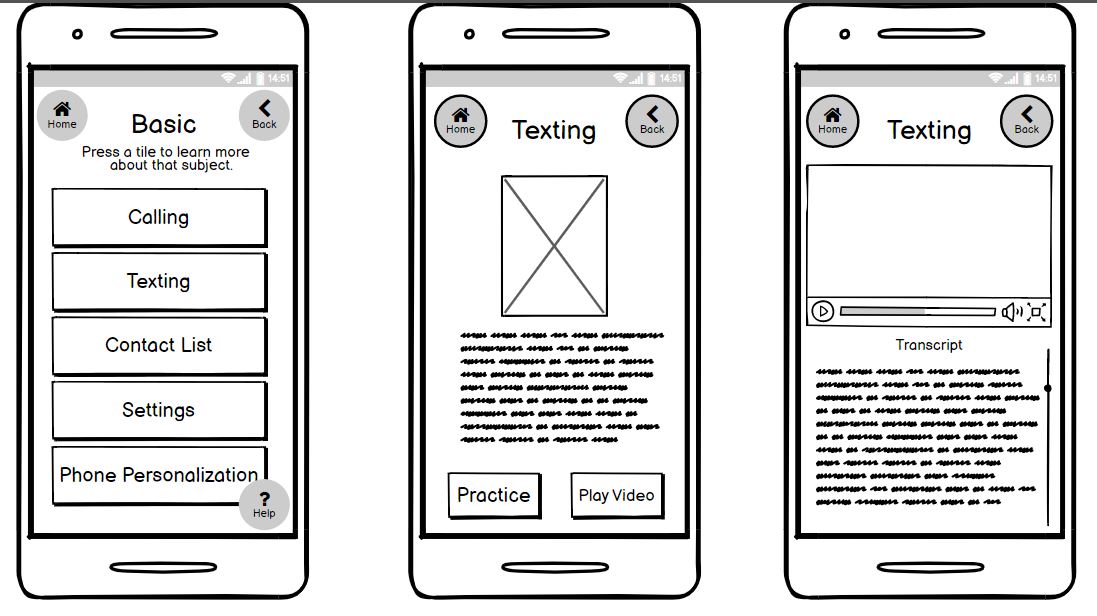
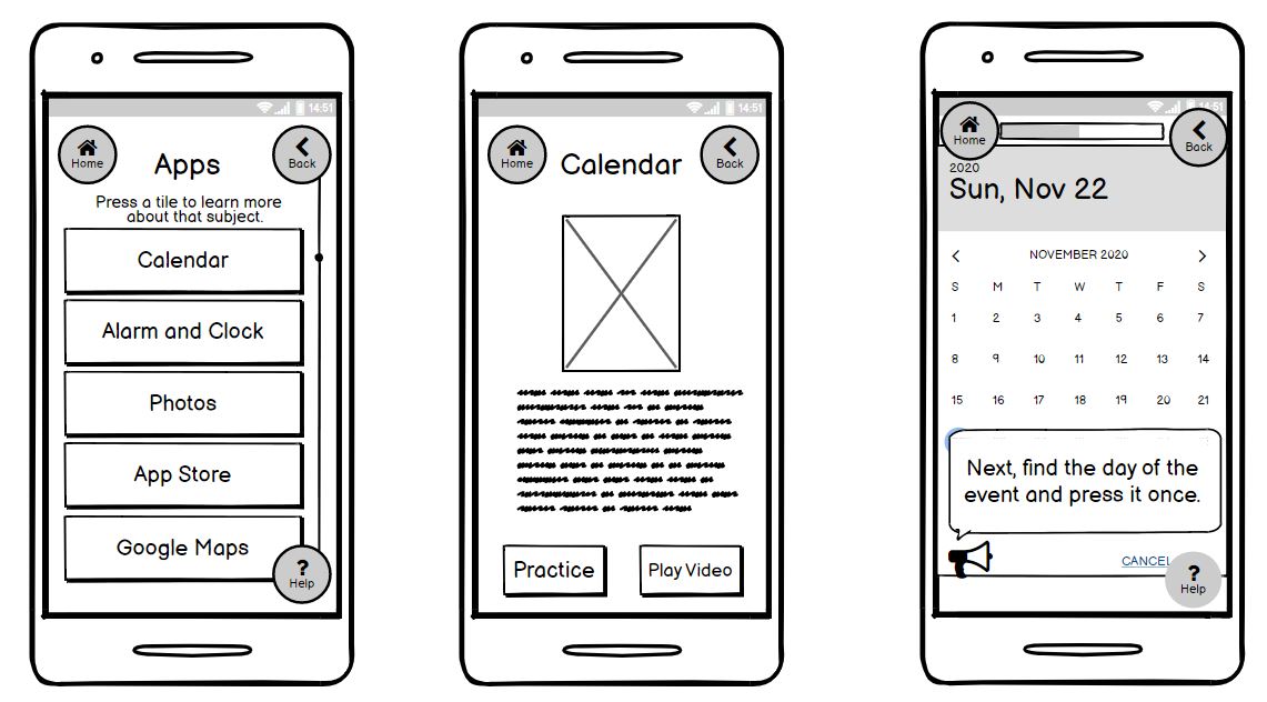
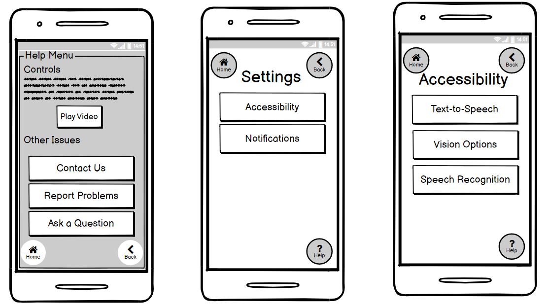
We iterated off this version using Balsamiq to create a more polished low-fidelity prototype.
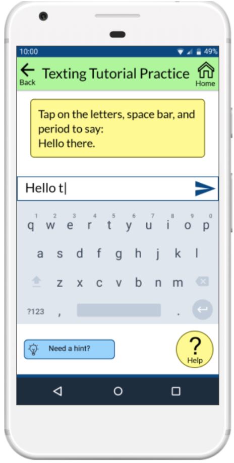
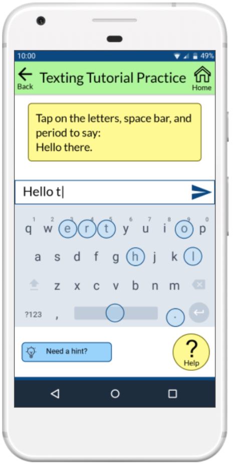
We then designed our high-fidelity prototype using Marvel App.