-
Notifications
You must be signed in to change notification settings - Fork 11
Component design guidelines
This document lists requirements centered around common elements in components. Most are purely for visual consistency.
Some of the rules in this document are here to make sure contradicting visuals are not produced when the room is built by smaller components. Therefore, some rules may, but should not, be disregarded if the component fills a whole room (mask 777). Use your best judgement.
Before you start designing components:
- Make sure you understand the mask mechanic. If you don't, ask someone. Components with faulty masks can be game breaking, hindering progression through a dungeon.
- Make sure you understand the primary and secondary tiles section in the tileset article for guidelines on placing statues, wall statues and tileset specific tiles.
- If you are designing obstacles or puzzles, make sure you understand the technical requirements for the component type.
In fact, just read all articles under assets.
We want as few tiles as possible.
- Be creative.
- Use larger repeated patterns instead of several tiles if possible, resize a block tile instead of using several.
- Mix layers and tile ordering layer to achieve the look you want with fewer tiles, like below.

If you design in accordance with this document, the component should look good in every tileset. This should not discourage you from reviewing the component in each tileset family.
A good practice is to design in a tileset from the brick family, which is suitable for identifying tiling and alignment issues and then switch through the other tileset families when you think you're done. Cave and ice are notably tricky.
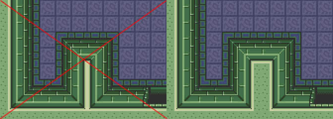
Most tilesets have walls that repeat every 16px. If this is not respected the component can look really weird in some tilesets.
- Make sure the wall aligns to corners in accordance to these examples:


All components must be designed for the possibility of being put on top of a tiled floor. This creates a 16x16px "grid". Observe that this is offset by 8px from the grid available in the quest editor. In this document "the grid" refers to the grid made apparent by a tiled floor.
- All 16x16 and 32x32 tiles should align to the grid.
- floor_small must be aligned to the grid regardless of size. The floor_border tiles placed outside of this tile.
- 32x32 tiles may be centered horizontally, breaking the grid alignment, but not vertically.
- barrier and barrier_big tiles are tricky, but should always placed be against the wall, above the wall_border tiles. They should preferably align to the grid in all other manners.


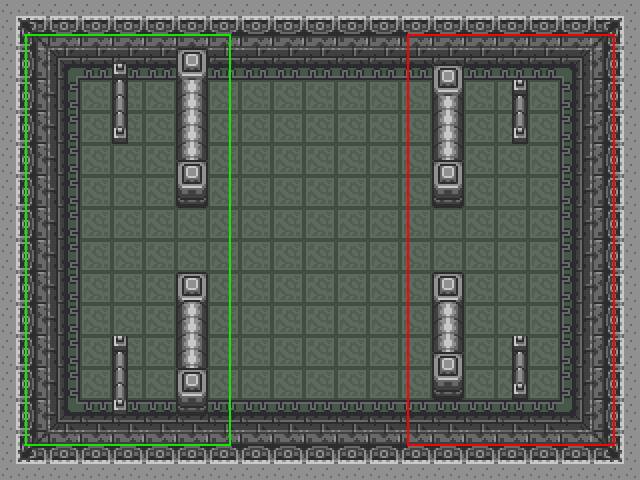
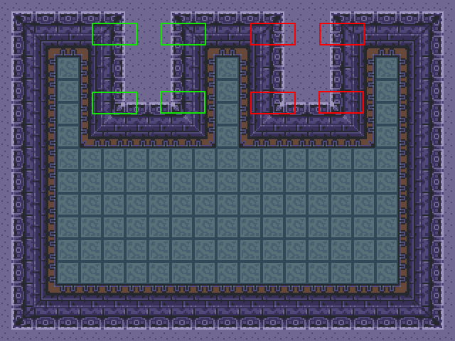
Protruding walls should have a width of at least 16px to avoid unwanted tileset artifacts. It may look good when building it, but it will not work well with all tilesets.
- Protruding walls must have a width of at least 16px.
Doors output by component script or by the room has a wall_top tile which extends a bit beyond the door. Wall statues or other wall ornaments will be obscured by this if placed to close to doors.

The top is 80px for north and south, and 64px for east and west.
- Do not put wall_statues, pillars, wall_torches etc. too close to the doors.

Unless a block or torch is to be used by a script, put tiles instead of entities.
When using tiles, avoid putting out individual tiles for each element, like pikes. Instead, if possible, stretch the tile. Keeping down the number of tiles in a map is always a goal.
The small_floor tile should be used as a nice setting for a chest or a visual element.
- Use only floor_small.2. For variation, the color will be changed per dungeon programmatically.
- All tiles of floor_small must be surrounded by a floor_border (see example under floor_border).

- The dungeon entrance in door_entrance must be surrounded by floor_border.1.
- Any floor_small must use floor_border.2

Wall_border tiles are in 8x16 or 16x8 sizes. As such sometimes the wall_border needs to longer than the wall it is intended for. this is often solved by letting it extend under a wall_border_corner tile. Problem solved. The problem is the cave tilset family has semi-transparent wall_border tiles, therefore if a wall_border must be put under a corner at any end of a wall, it should be under a concave corner (corner_tile, not corner_reverse tile).
- wall_border should be used around all walls.
- wall_border must align to the grid.
- wall_border must not not extend under a corner_reverse tile.
- wall_border should not be used around holes (see hole section).
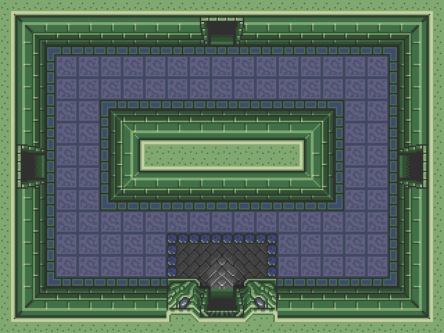
A puzzle with blocks might be paired with fillers with blocks. Trying to push all blocks in a room can be time consuming. and tedious. Because of this we are limiting the number of blocks placed in components.
These rules apply to every component type, and regardless of whether the block can be pushed/pulled or not..
- Do not put more than 3 blocks in a corner component (400, 500, 300, 100, 004, 005, 001, 003)
- Do not put more than 6 block in a half-room component (700, 770, 077, 007, 444, 555, 333, 111)
- Do not put more than 12 blocks in a full-room component (777, 707, 757)
You get the picture.
Do not pots or blocks on the other side of a hole or moat in such a manner that the player can hookshot to it (shown in example below). Chances are he/she won't be able to hookshot from it, breaking the game progress. You cannot know which items the player has when he/she encounters the component.

It is however fine to build it in such a manner that it can be hookshot to but not landed on, leaving the player to fall and take damage and respawn on the "right" side of the obstacle.
Do not build lower levels with out the means to climb up, unless you use borders to block acess to the lower level.
- Pikes may only be placed in such a manner and in such a direction that it cannot possibly move outside of it's mask.
- Pikes may only be placed in full width or full height components.
- Pikes (auto or detect) should not preferably move from over a floor to over a hole.
- Pikes (fixed) should not be put as enemies. Instead, use the pike tile in the tileset.
- Pikes should not (and cannot) bounce on pots.
Wall_holes are nice but can create contradicting perspectives. We want to avoid at all cost the possibility of different components in the same room using wall_hole in the same direction.
Keep it simple. Full-room give more freedom with wall_hole tiles but this does not mean a modest approach to perspectives shouldn't be used.
- All holes must use wall_hole., hole. or both.
- Wall_hole tiles must only be used in full-height, full-width or full-room components
- Wall_hole tiles can only placed in the direction the component controls by it's spatial mask.
- Hole.* tiles
- Holes must align with the 16x16 grid, the exception being wall_hole tiles against wall tiles.
- Holes must not be surrounded by a wall_border
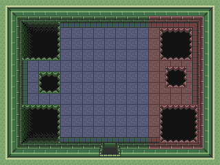

Water tiles are tricky as they are 16x16. Shallow_water can be obscured by their frame to make them fit in a component but transparent_water cannot as the tile must be place above the wall_low with an offset by 8px.
When possible, always align the water tiles and frames to the grid.
If place against the wall transparent water with wall_lower tiles should be put against the wall, ignoring the wall_border tiles while shallow_water with frame should be align to the wall_border.
If a pool of transparent_water is not blocked by a barrier or similar, it must have a jumper and a water_pool_ladder.
- Water_shallow, water, water_transparent must not be mixed.
- Water_shallow must only be used in full-width, full-height or full-room components.
- Water_shallow must be framed by water_shallow border tiles.
- Water_shallow must be placed against the wall, unless the component allows for it to be placed around the wall of the whole room, in which case it is preferred.
- Water_shallow does not have to be aligned to the grid.
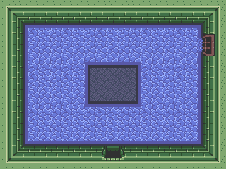

- Water must only be used in full-width, full-height or full-room components.
- Try to align the water elements to the grid using barriers to take care of the mismatch the 16x16 nature of water gives.
- Water and water_transparent must be framed by wall_low tiles, where the water is offset by 8px.
- Use floor.19 and floor_water_drain as a bottom for pools with transparent water.
- Use wall_statue.6, waterfall tiles and water_wall.drain_gate where applicable.
- Use jumpers with water and water_transparent tiles, if the pool is not blocked by a barrier or similar.
- Do not put jumpers in the 8x8px corners of wall_low corners, this may allow the player to jump and get stuck in the wall_low above the water.
- Use pool_ladder.

- Curtains must be accompanied by pillars.

- Do not use the spikes tiles, they do not behave as intended.
- Avoid diagonal walls, there is a bug in Solarus 1.3 which causes diagonal wall types to not function properly on tiles bigger than 8x8. Read more: https://github.com/christopho/solarus/issues/486
- Use barrier tiles to cover "problems" such as tile mismatches.
